Sense Engineering

Sense Engineering

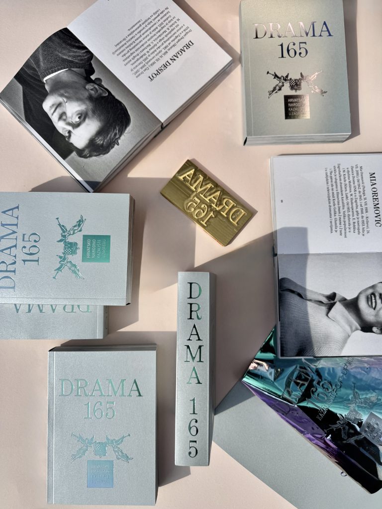
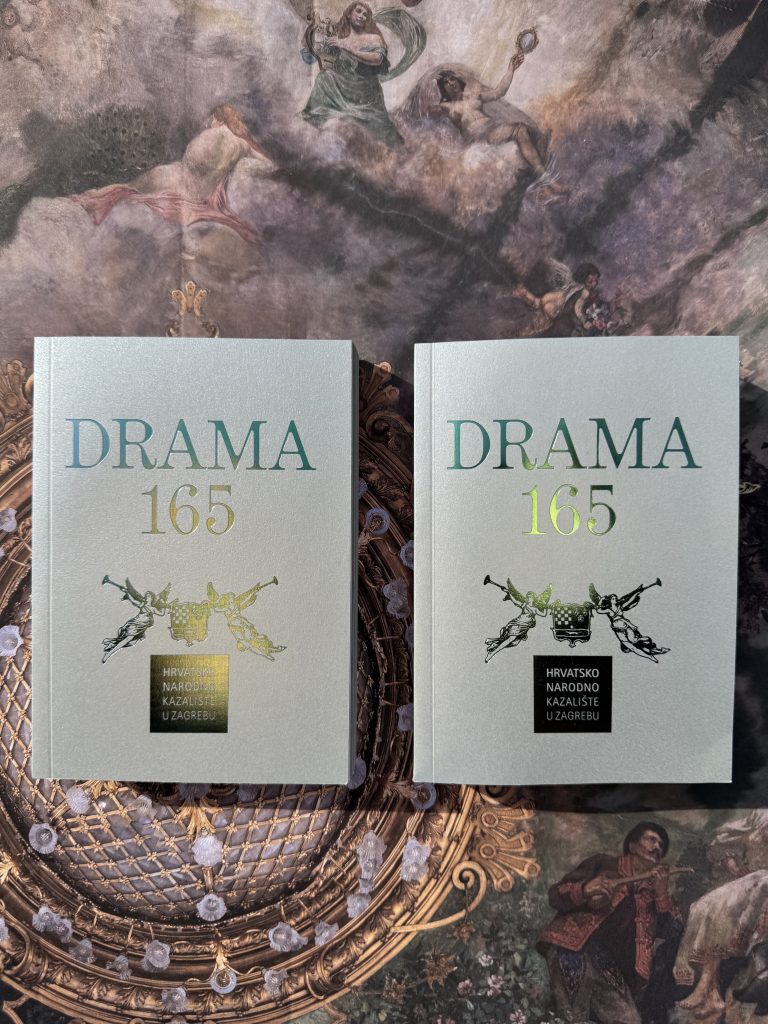
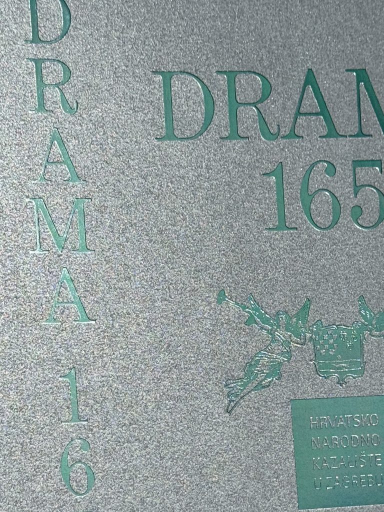
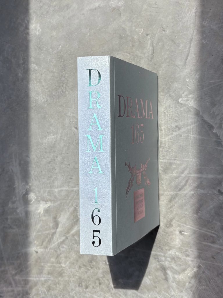
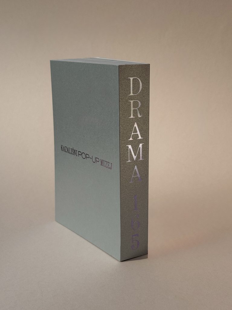
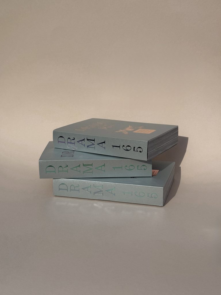
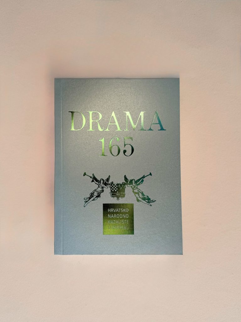
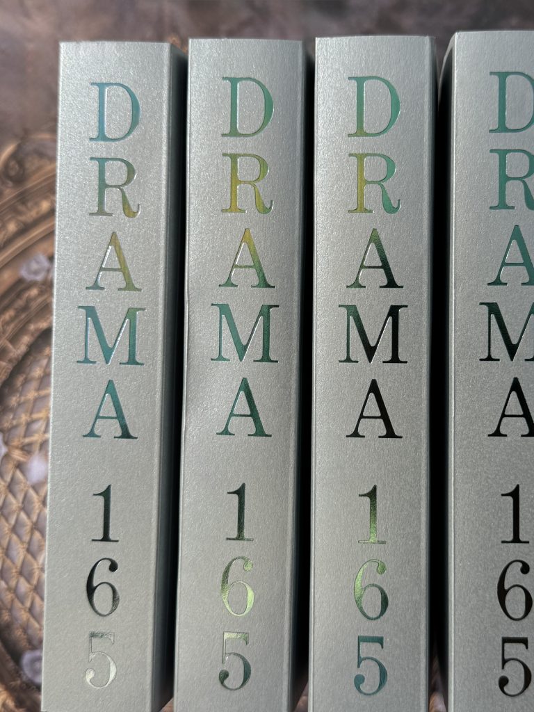
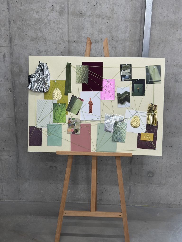
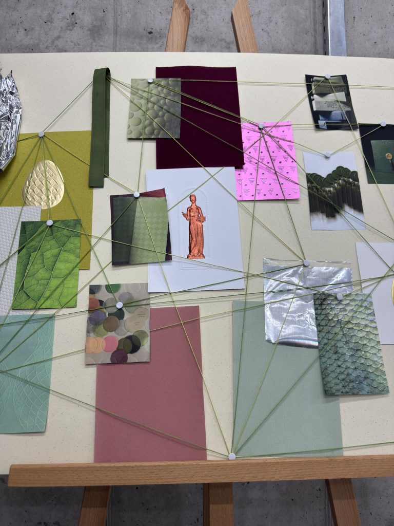
From visual overload to louder logos and endless “quiet luxury” claims: for too long, branding has focused on what we see on screen, while overlooking how we feel. As a response to the digital fatigue, the idea was created to showcase how physical products, from packaging to books, resonate within all our senses: vision, hearing, smell, taste and touch.

Sense Engineering™

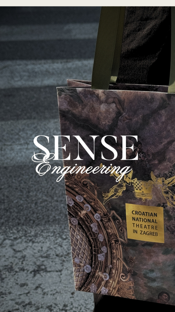
Sense Engineering ™ is a framework exploring how the five human senses shape perception, influence emotion and transform materials into memorable brand experiences. 

We’ll break down each sense and reveal the psychology, craftsmanship and design decisions behind them, as they play big role in marketing and printing industry. 

Because the strongest brands aren’t just seen. They’re sensed.  

Industry

Marketing, FMCG, creative industry, kreativna industrija, kultura, printing industry, tiskarstvo

Tags

#SenseEngineering #LuxuryPackaging #PrintDesign #BrandDNA #Craftsmanship #Foilprint #Foliotisak #zlatotisak #humansenses #senses

Sense 01:

VISION

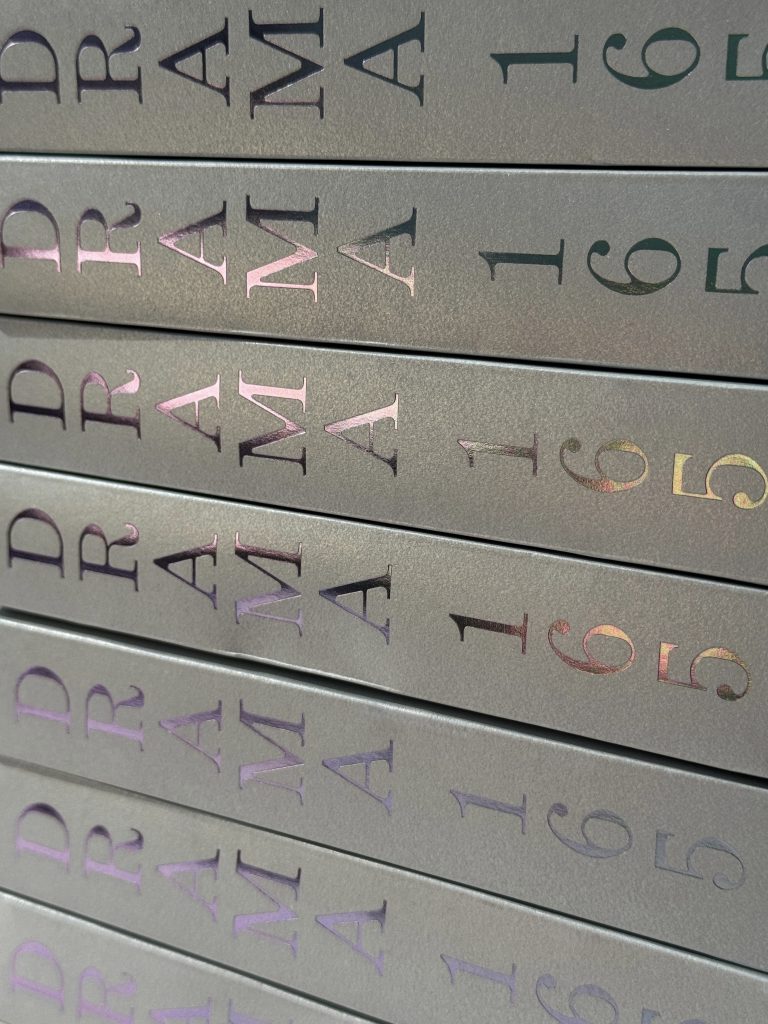
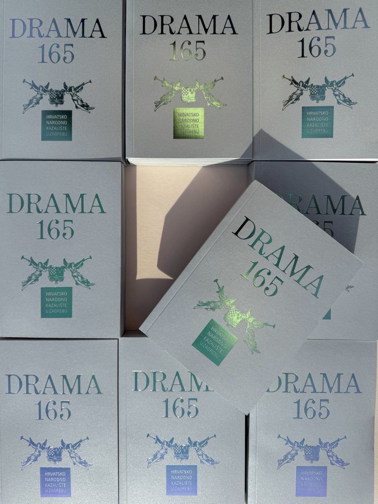
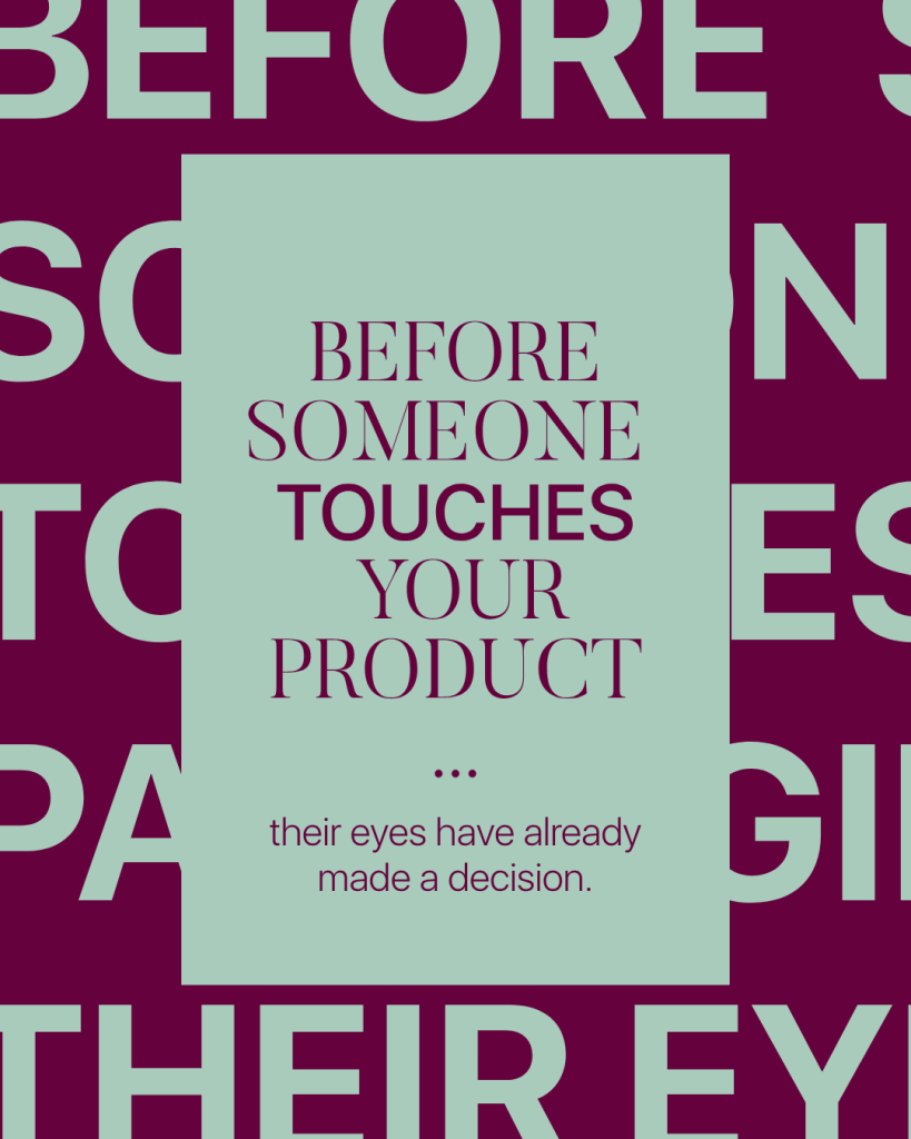
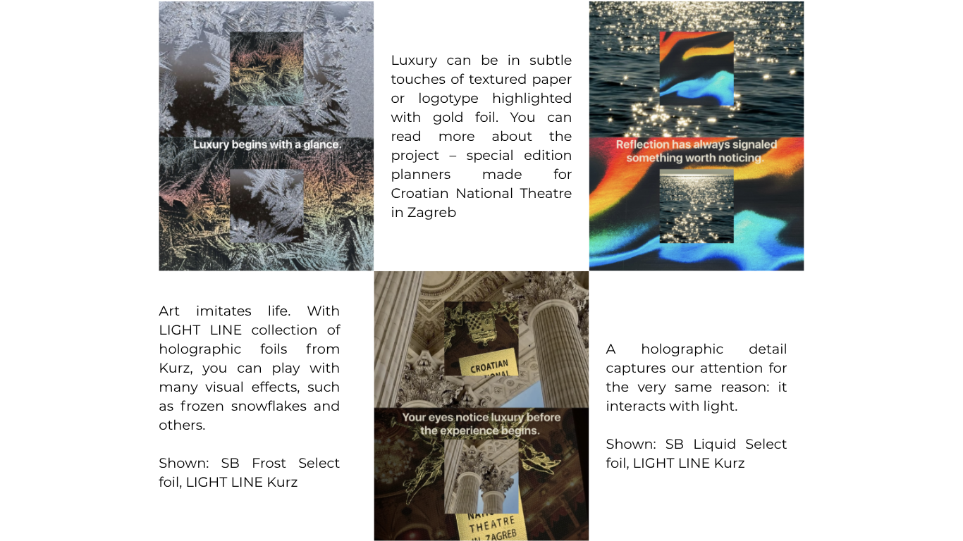
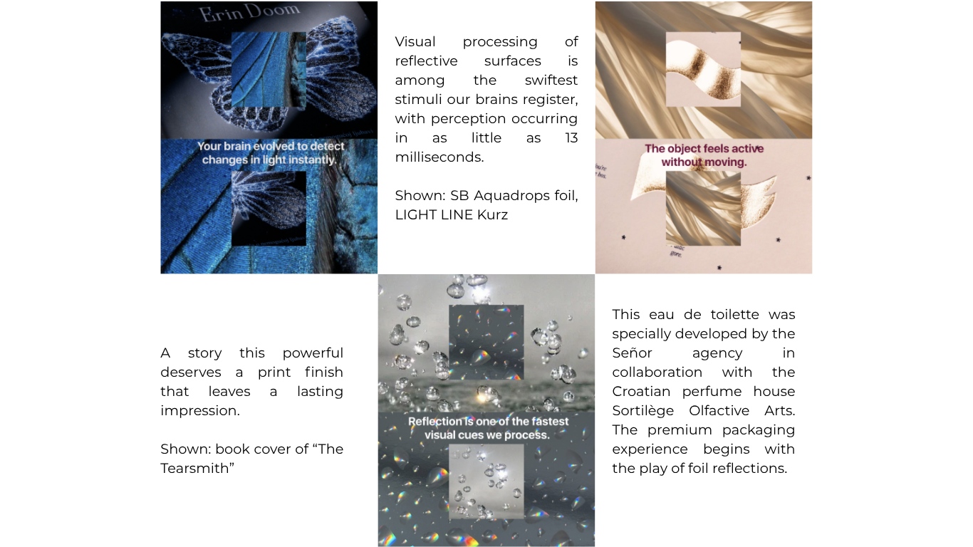
𝙔𝙤𝙪𝙧 𝙚𝙮𝙚𝙨 𝙣𝙤𝙩𝙞𝙘𝙚 𝙡𝙪𝙭𝙪𝙧𝙮 𝙗𝙚𝙛𝙤𝙧𝙚 𝙮𝙤𝙪𝙧 𝙢𝙞𝙣𝙙 𝙛𝙞𝙣𝙙𝙨 𝙩𝙝𝙚 𝙬𝙤𝙧𝙙𝙨.Long before we touch an object, long before we judge its craftsmanship, long before we decide whether we like it - we see it.Our brains are remarkably efficient visual processors. They constantly search for changes in light, contrast and movement, a survival instinct shaped over thousands of years. Water shimmered. Wet surfaces reflected sunlight. Polished stone revealed its form. Reflection often signaled something worth noticing.That instinct never disappeared in modern world, and it is a significant factor for all creative industries, including marketing, graphic and printing industry. It evolved into Sense Engineering™. Before you touch any product, your eyes have already made a decision.

How to incorporate this sense in your design?

Collapse all

Sense 02:

HEARING

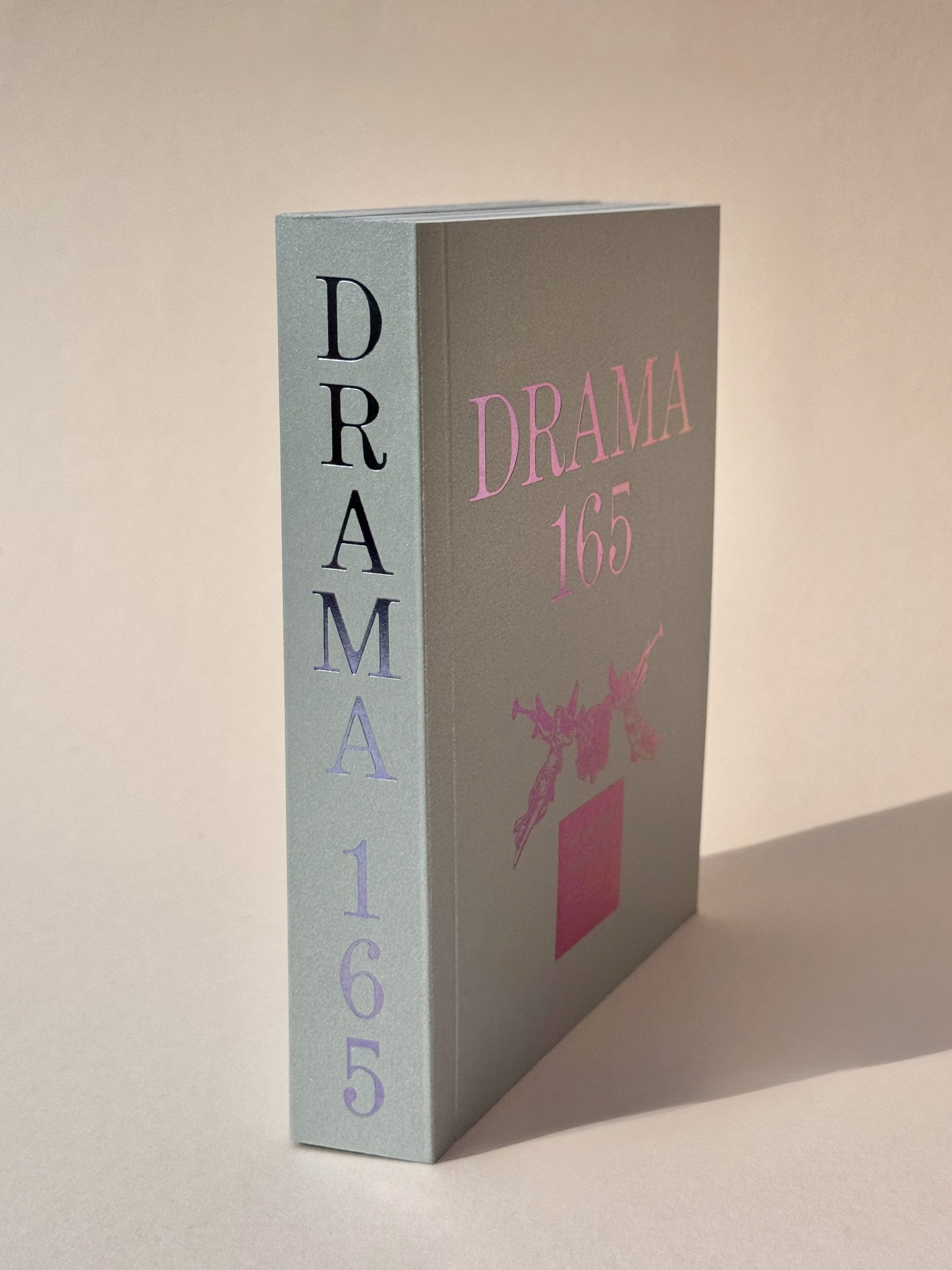
Print begins with a sound. Not the printer, but the experience. The brush of fingertips across textured paper. The slow turn of a heavyweight page. The gentle lift of a rigid box. The whisper of tissue paper unfolding. The satisfying click of a magnetic closure. Every sound tells the brain something before the product is even revealed. Sound signals quality through confidence, not volume.We rarely think of hearing as part of brand design. Yet some of the world's most memorable products are recognized by sound alone. The closing of a luxury car door. The click of a mechanical watch. The opening of a beautifully crafted box.These aren't accidents. They're designed and print is no different. Because print isn't only seen, it’s also heard through Sense Engineering™.

How to incorporate this sense in your design?


The first step is to design with the entire customer experience in mind. Before choosing materials or production techniques, consider the feeling you want your audience to have. Should opening your packaging feel luxurious and deliberate? Exciting and energetic? Calm and understated? Once you've defined the emotional response you want to create, every design decision can support that vision. 

Material selection plays a significant role in the sounds your printed product makes. Heavier paper stocks tend to produce quieter, more muted sounds when handled, creating a sense of quality, stability, and sophistication. Lighter-weight papers, on the other hand, often generate a crisper rustle that can make a product feel more dynamic, playful, or approachable. 

The way your packaging opens is another important consideration. A magnetic closure creates a satisfying click that signals quality and precision. A rigid box lid lifting away slowly produces a gentle release of air, adding a sense of anticipation. Sleeves, folds, ribbons, and pull-tabs all create distinct sounds that become part of the unboxing experience. Rather than treating these as incidental, think of them as design features that enhance the story your packaging tells. 

Thoughtfully chosen materials, finishes, and construction methods transform ordinary interactions into memorable moments, making your print not only seen and felt, but heard as well. That's why companies carefully design packaging sounds to create a positive first impression before you even use the product. 

Collapse all

Sense 03:

SMELL

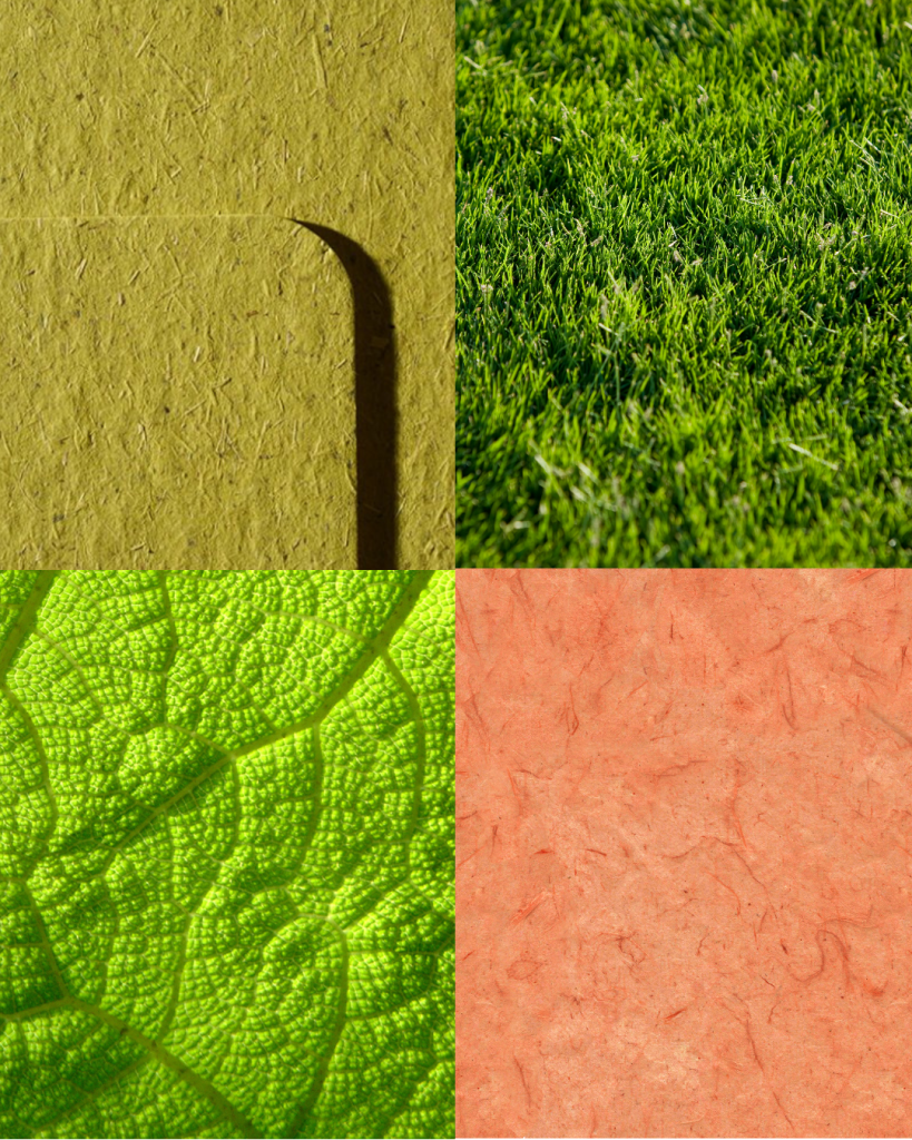
Smell the moment. Whether is the smell of new book, your favourite perfume, freshly cut grass or simply packaging of new product, every scent is created by a unique combination of materials, molecules, and processes. A single scent can trigger recognition, create associations and bring back memories.Sense Engineering™ shows that print isn't just visual, even the smell becomes part of the final experience. Your nose can recognize thousands of different smells, so it’s important to pay attention to every single detail. The choice of paper, inks, coatings, and finishing techniques influences not only how a final product looks and feels, but also how it is experienced through scent.Smell is one of the most powerful human senses, directly connected to areas of the brain responsible for memory and emotion. Smell is an important part of how we perceive quality, craftsmanship and emotion.

How to incorporate this sense in your design?

Designing with scent doesn't necessarily mean adding fragrance to your printed products. Often, the most memorable sensory experiences come from carefully selecting materials that have their own natural character.

Start by choosing paper intentionally. Uncoated and premium cotton papers often retain their natural fibre scent, creating a warm, authentic impression. Coated papers, on the other hand, have a cleaner, more neutral smell, making them suitable when you want the focus to remain on the design itself.

Consider your printing and finishing techniques. Different inks, varnishes and laminates can subtly alter the scent of a finished product. If smell is an important part of the experience, request production samples and evaluate them once they have fully cured, as freshly printed materials often smell very different from the final product.

For a more immersive experience, explore scented finishes or microencapsulated fragrance coatings. These specialised finishes release a fragrance when rubbed or handled, making them particularly effective for perfume, cosmetics, food, hospitality and luxury brands. As with any design element, the fragrance should complement your brand identity rather than overpower it.


Collapse all

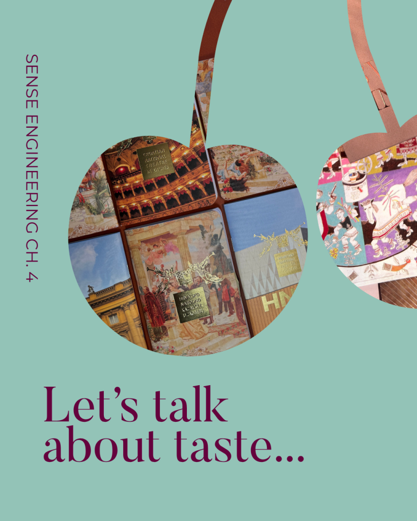
Every scent tells a story. Your next favourite memory might start with a smell.

Sense 04:

TASTE

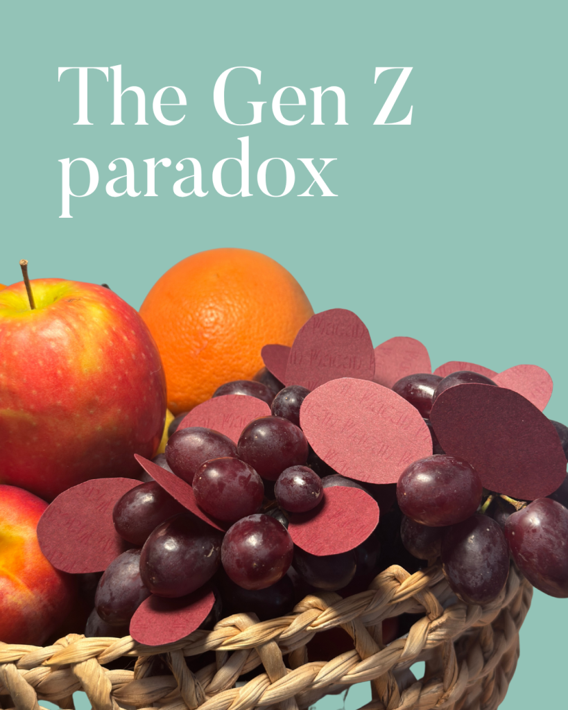
When we talk about taste, it’s not about aesthetics or literal taste. It's not luxury, it's not personal preference. It's judgement - the ability to know what deserves to exist in the first place.So what becomes valuable when creation and production become abundant?A PwC study on “The Gen Z paradox: Spending less, expecting more”, shows that the hesitation to spend less isn't driven by frugality, but by intentionality.The volume is just too high to evaluate individually, so they stop trying altogether. They outsource the decision to someone they trust. The question every brand should now be asking is simple: Is that someone you?And the next time you're approving a piece of work, ask yourself: Why does this deserve to exist?

How to incorporate this sense in your design?

Great design starts with the courage to think beyond the expected. A brand book should provide direction, not limitations. Don't be afraid to explore new formats, materials, techniques or ideas that challenge the usual approach. Creativity often begins when you allow yourself to experiment, test new possibilities and question what has always been done. At the same time, creativity needs to work hand in hand with practicality. Understand the capabilities of different production methods and use them as part of the creative process. The best designs work with production, not against it, turning technical considerations into opportunities rather than restrictions. Finally, create a memorable moment. It doesn't matter whether your approach is minimal or expressive - the key is having an element that makes people stop and remember. This could be an unexpected structure, a unique material, a tactile finish or an innovative printing technique. Stay curious about new technologies and production possibilities, as they continue to expand what can be achieved in print. The goal is not to add more for the sake of it, but to create something purposeful, distinctive and worth experiencing. Tasteful does not mean safe or predictable. The best designs still surprise. When every detail earns its place, it is an experience that feels memorable and valuable.

Collapse all

Sense 05:

TOUCH

When we talk about taste, it’s not about aesthetics or literal taste. It's not luxury, it's not personal preference. It's judgement - the ability to know what deserves to exist in the first place.So what becomes valuable when creation and production become abundant?A PwC study on “The Gen Z paradox: Spending less, expecting more”, shows that the hesitation to spend less isn't driven by frugality, but by intentionality.The volume is just too high to evaluate individually, so they stop trying altogether. They outsource the decision to someone they trust. The question every brand should now be asking is simple: Is that someone you?And the next time you're approving a piece of work, ask yourself: Why does this deserve to exist?

How to incorporate this sense in your design?

In an increasingly digital world while screens capture attention, materials create connection and the simple act of holding thoughtfully made product has become more worthwhile. Texture, weight, and finish aren't just design choices, they're powerful branding tools that transform ordinary product into unforgettable experience.

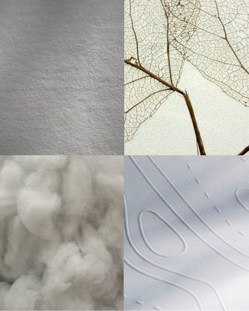
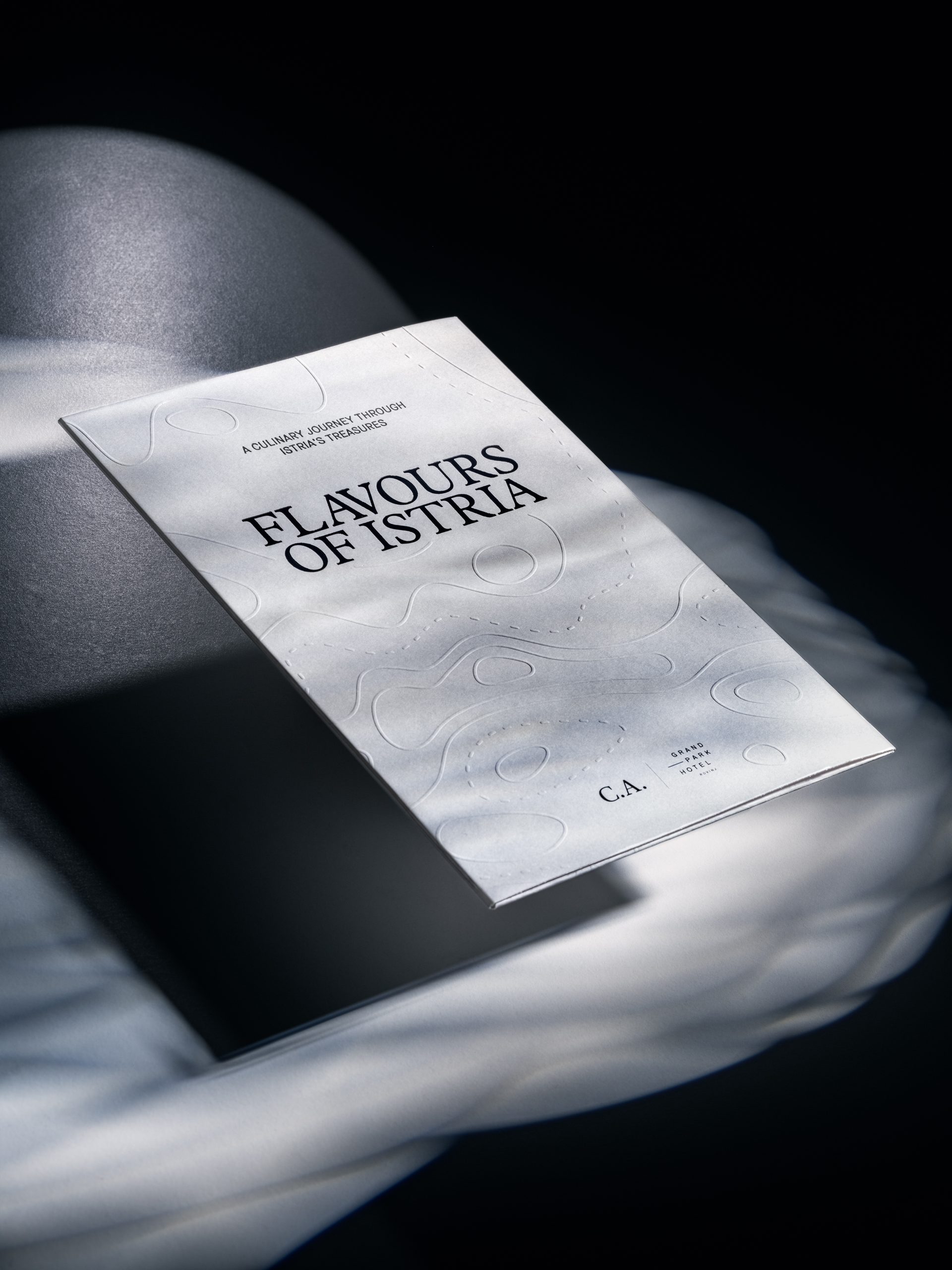
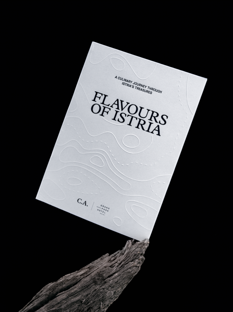
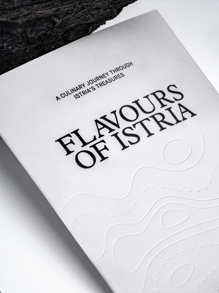
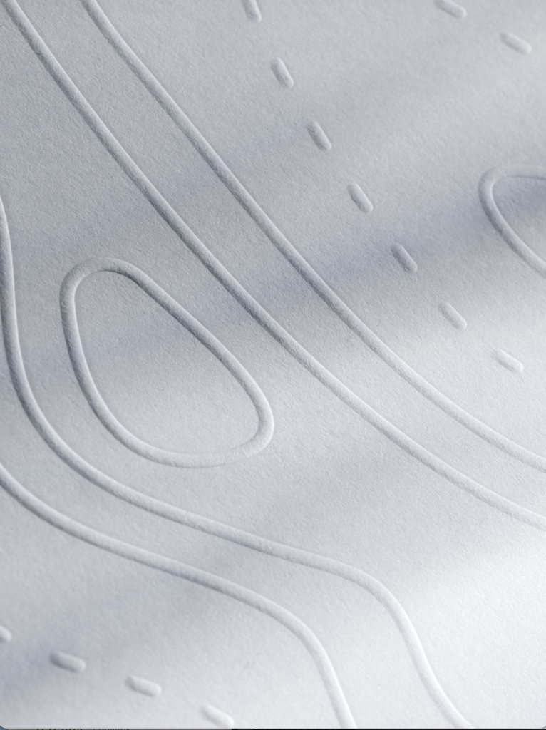
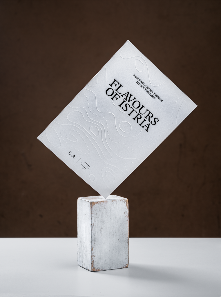
Explore texture to create a more memorable interaction. Embossing, debossing, textured finishes and specialty papers invite people to engage physically with the product. A raised logo, a subtle pattern or a unique surface can turn a simple printed piece into something people want to touch and explore. The attention to texture can be either on micro-level with micro embossing, that plays with the illusion of texture, or the mega tactile approach with 3D embossing and debossing that creates multiple levels in the paper.

Finishing techniques can further shape how a product is perceived. Soft-touch coatings create a smooth, velvety experience that often feels premium and modern, while spot varnishes, raised effects and specialty coatings can transform certain details into moments of surprise.

Touch is one of the most powerful ways we experience the world.

Collapse all

Sense Engineering

In a time when more experiences are becoming digital, physical design has gained a new kind of importance. Experience cannot be measured in pixels. It cannot be compressed into a screen. It exists only in the physical world.Sense Engineering™ is the sound of cotton paper. The resistance of an embossed surface beneath your fingertips. The shimmer of foil as light moves across it. The subtle click of opening a beautifully crafted box. The instinctive feeling that tells you, this is worth keeping.Screens can deliver information instantly, but they cannot replicate the emotional connection created through all of our senses. This is where printing becomes more than production. It becomes a way of expressing craftsmanship and directly interact with your senses. Every choice, from the paper to the way a product is opened, contributes to the story a brand tells.

The most powerful designs are not simply seen. They are experienced.

HNK BAGS

HNK paper bags

Client

Category

Production

Year

Share

Croatian National Theatre in Zagreb

Packaging

Macan Atelier

2026

+ About project

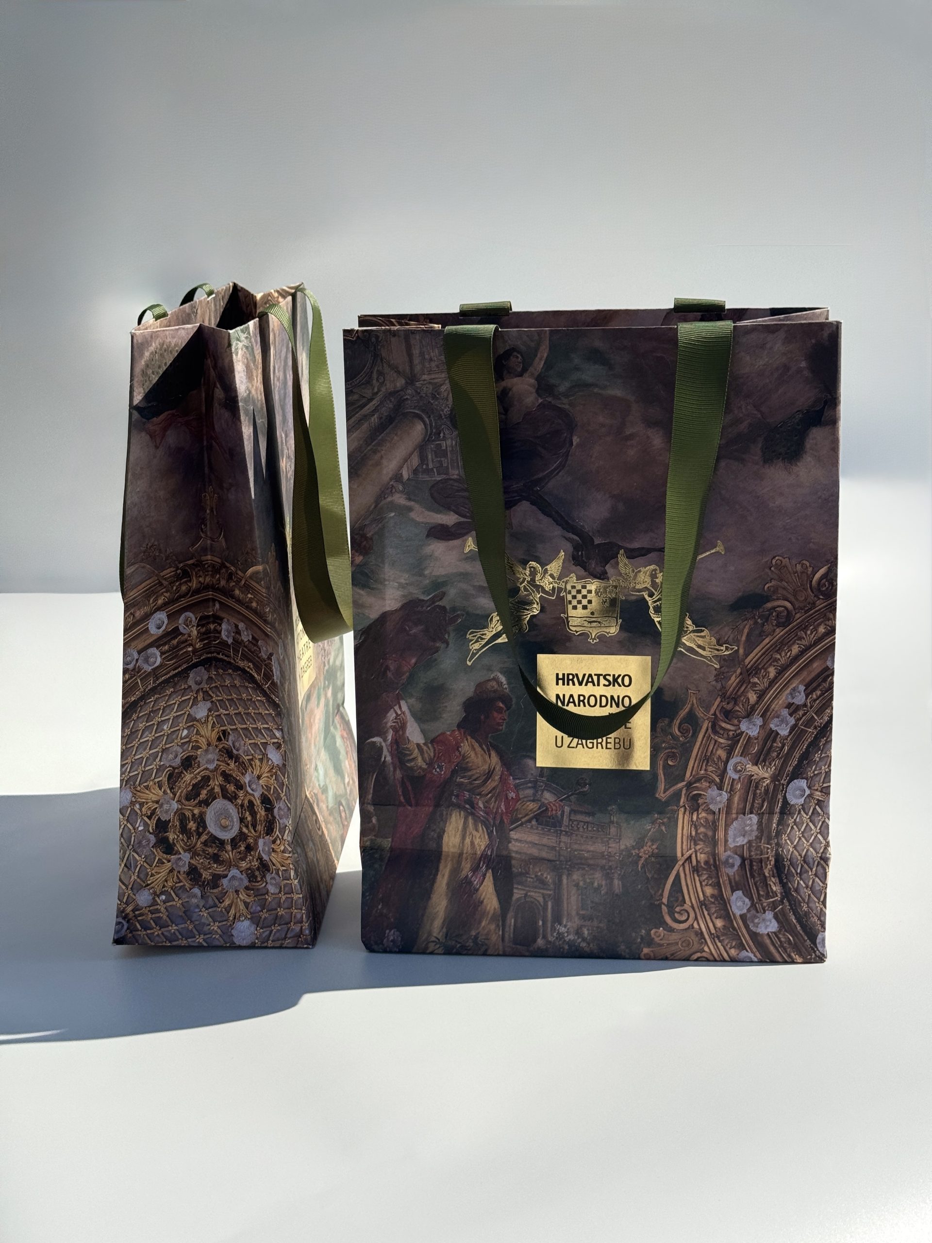
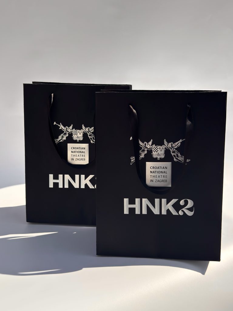
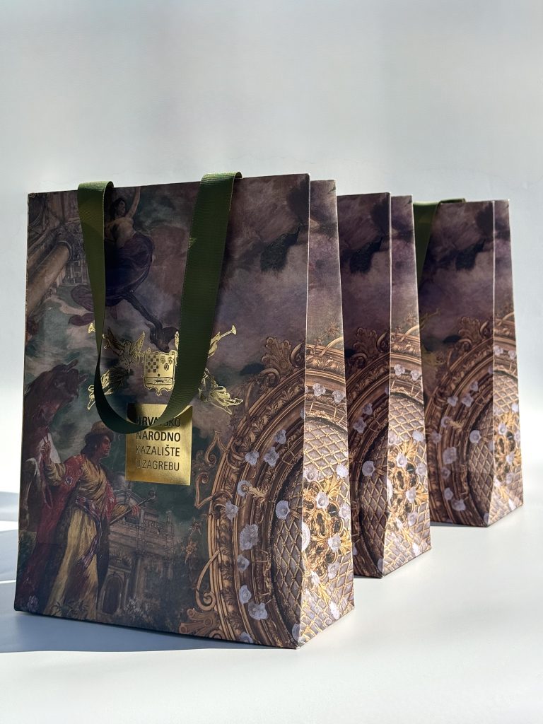
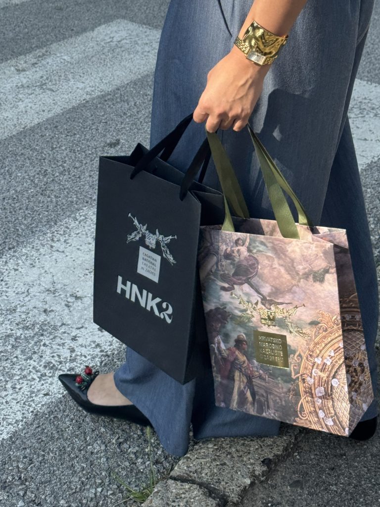
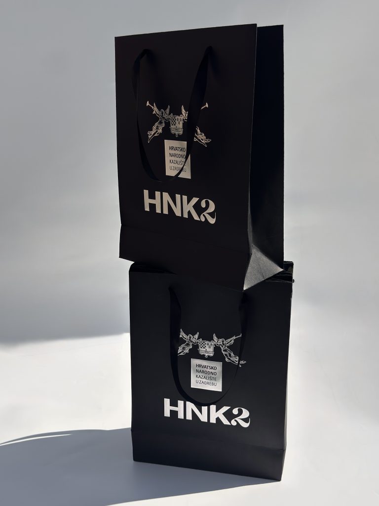
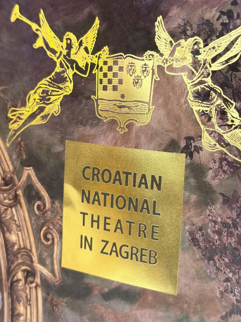
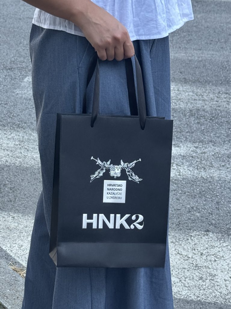
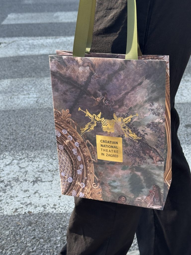
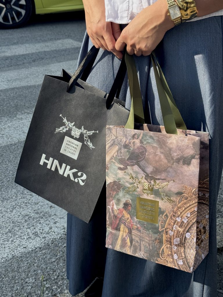
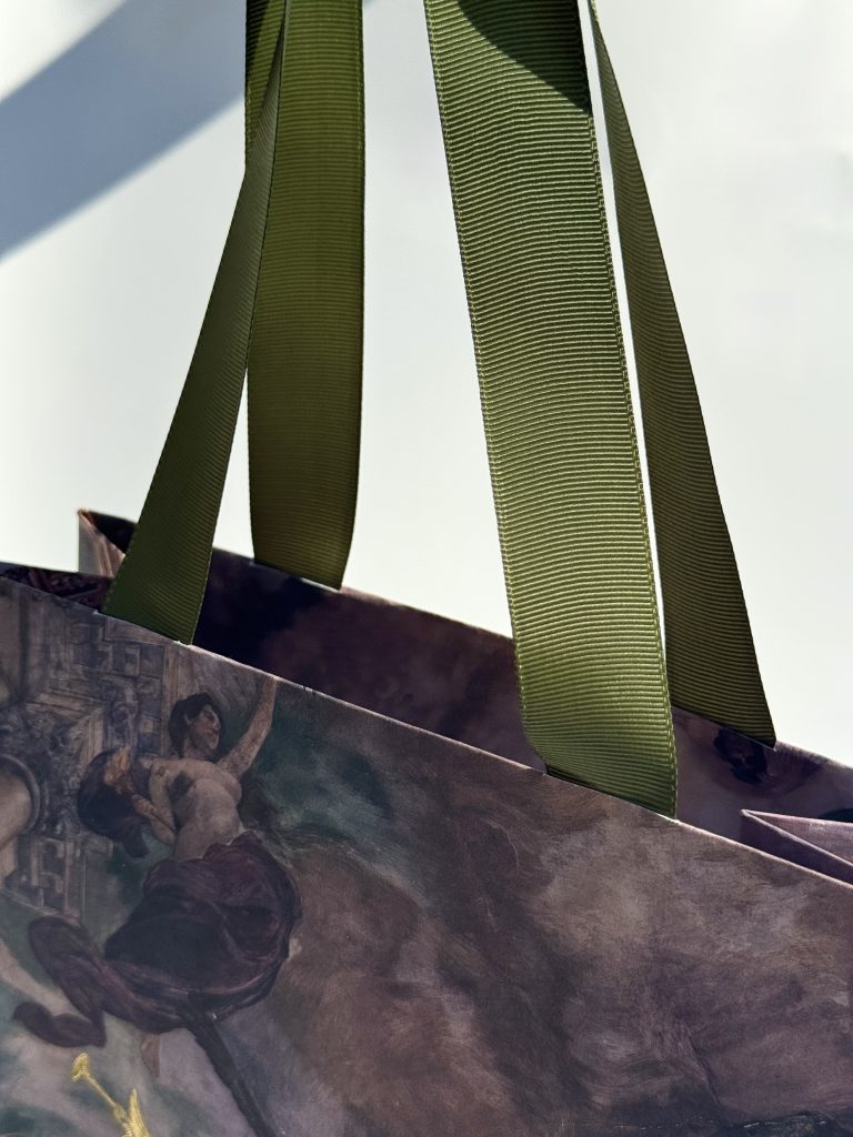
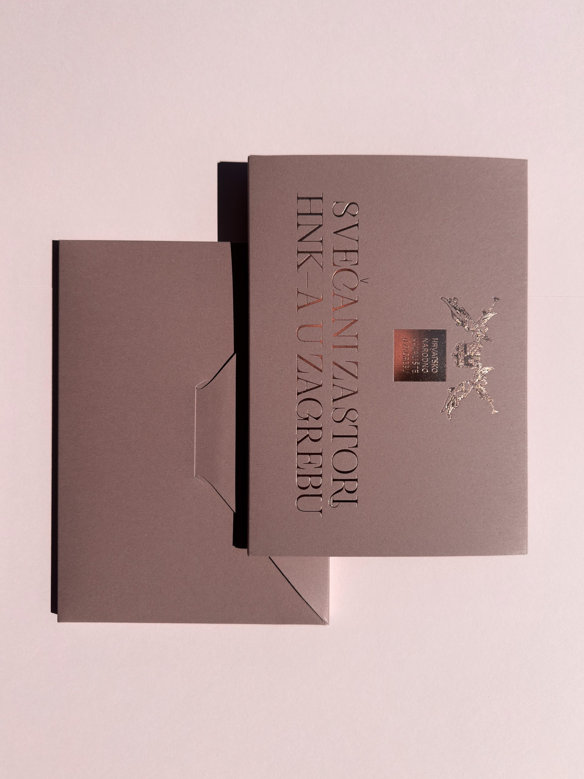
For the National Theatre in Zagreb, we developed a bespoke collection of paper gift bags designed to extend and enrich the institution’s visual identity beyond its core promotional materials. Rather than treating packaging as a purely functional object, we approached it as an integral part of the brand experience: one that reflects the theatre’s cultural significance, artistic excellence, and timeless sophistication. 

Industry

Marketing, FMCG, creative industry

Design

Roberta Bratović

Tags

#editorialstationery #brandedmaterials #luxurystationery #paperbags #luxurypackaging

Project

HNK paper bags

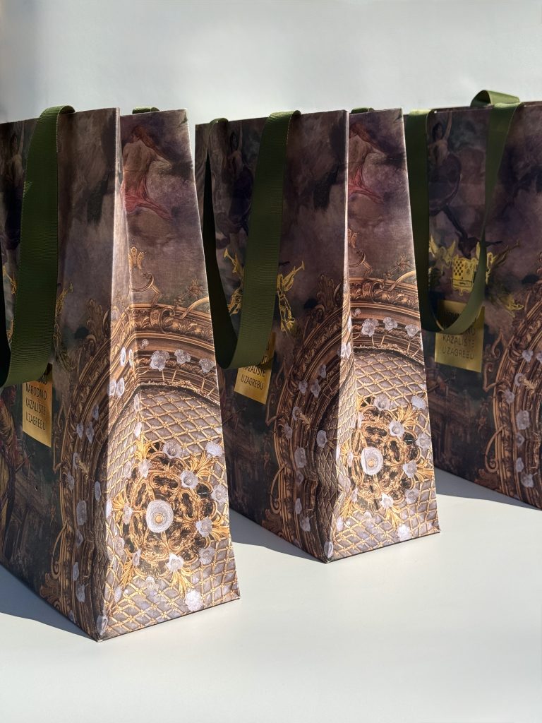
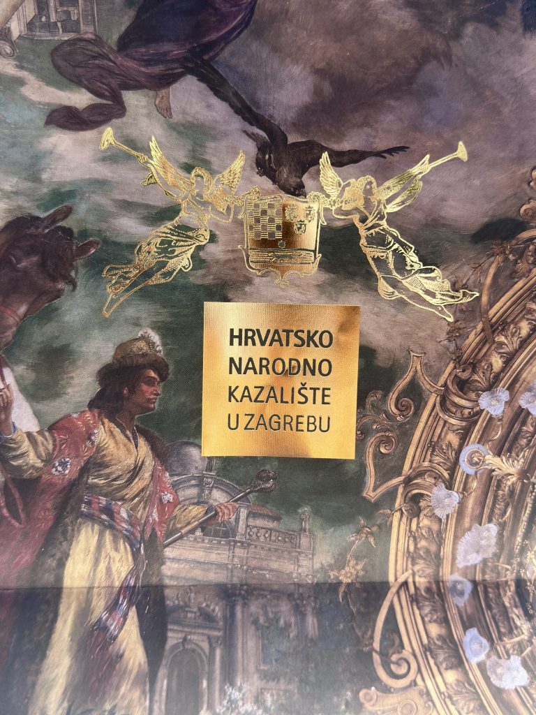
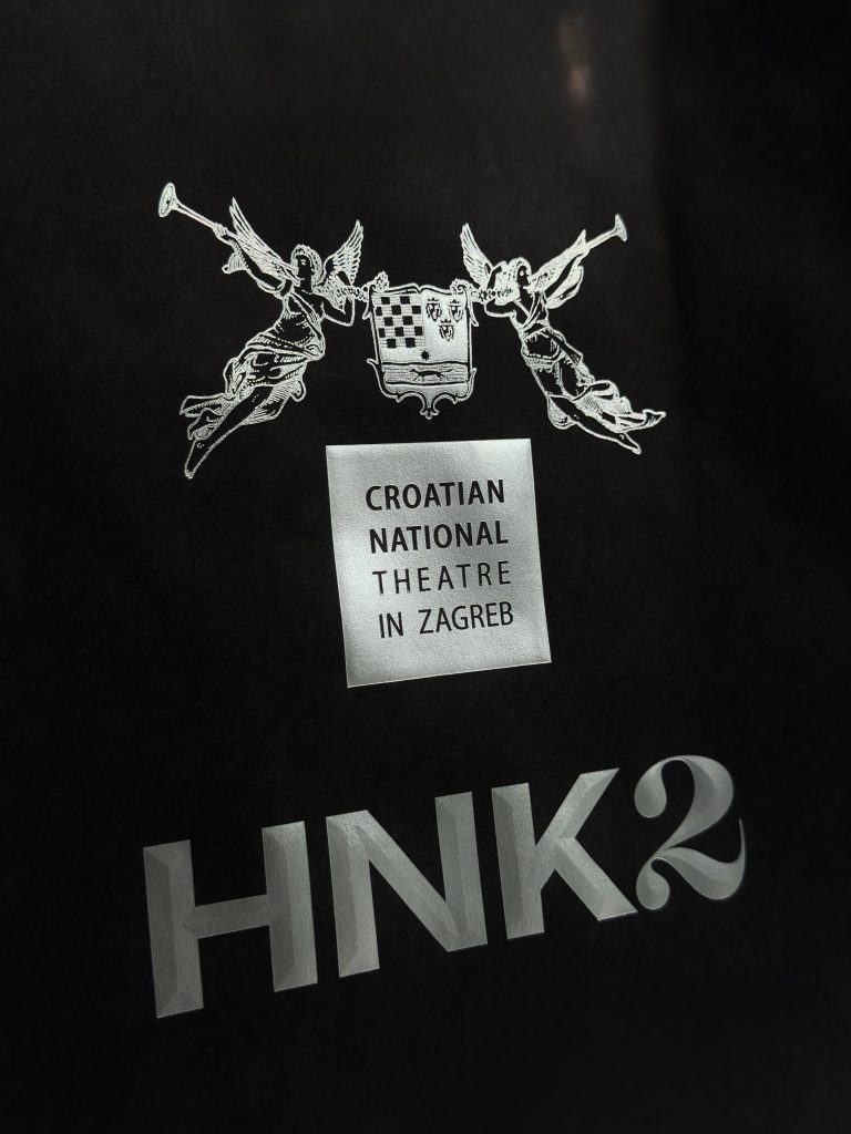
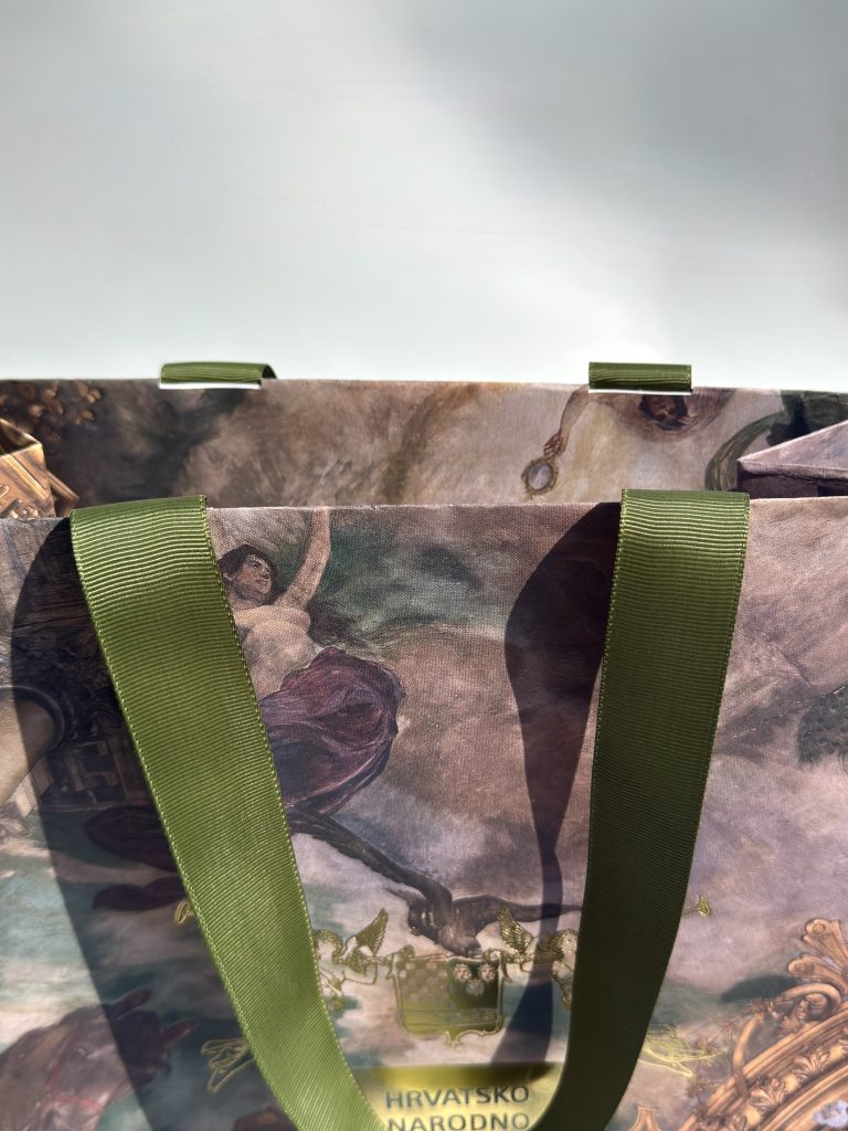
The collection consists of two distinct yet complementary designs, each communicating a different aspect of the theatre's personality. The first embraces understated elegance through the use of premium black Pergraphica paper, whose rich texture immediately conveys quality and refinement. A three-dimensional logotype, finished with matte silver hot foil, creates a subtle play of light and shadow, adding depth without overpowering the composition. The restrained palette and tactile materials evoke a sense of quiet luxury, making the bag feel as carefully crafted as the performances it represents.In contrast, the second design offers a bold visual statement. Featuring expressive printed graphics enhanced with gold foil accents, it captures attention while maintaining a sense of sophistication. The dynamic composition transforms the gift bag into a memorable object that stands out long after an event has ended, reinforcing the theatre's identity through striking visual storytelling.Thoughtfully designed branded materials have the power to communicate far more than information. They create atmosphere, evoke emotion, and strengthen the connection between an institution and its audience.

PRINT TECHNOLOGY

2D hot foil,

3D hot foil

Digital print

Digital cut

Prototyping

When every detail, from paper selection to finishing techniques, is considered with intention, even the simplest promotional item becomes a meaningful extension of the brand.

Your branded materials should feel editorial, carefully curated rather than merely produced. They should expand your visual language beyond the expected, combining exceptional materials, refined craftsmanship, and compelling design to create objects that leave a lasting impression.

ZAGREB CLASSIC MAGNETS

Zagreb Classic magnets

Client

Category

Production

Year

Share

Zagreb Tourist Board

For events

Macan Atelier

2026

+ About project

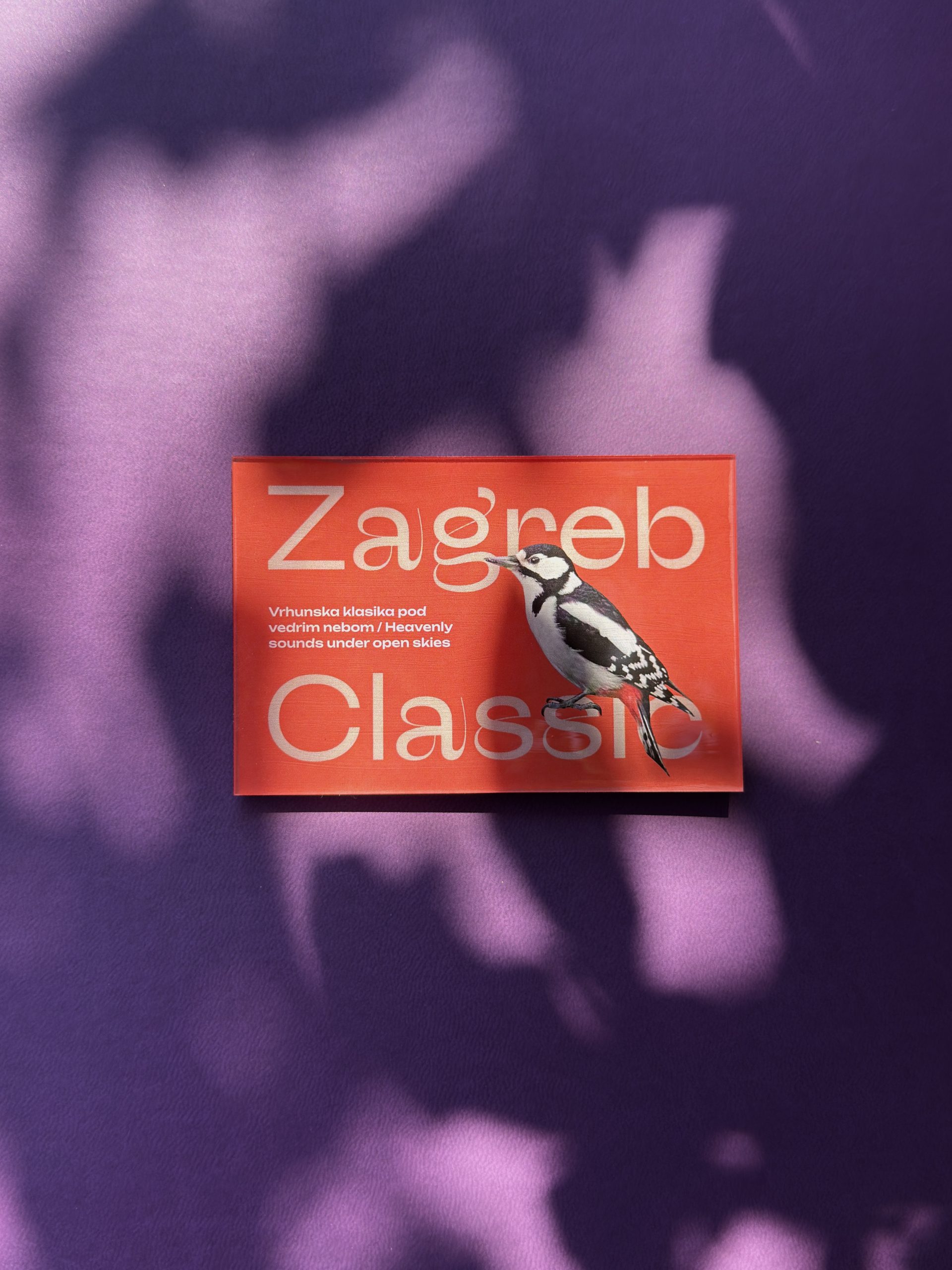
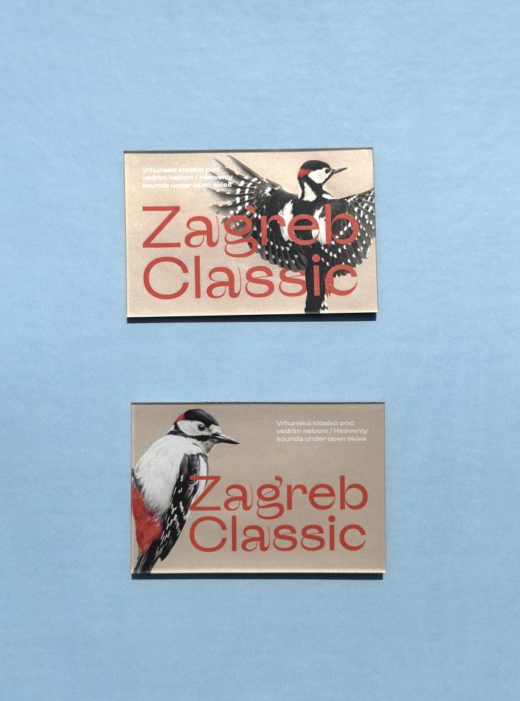
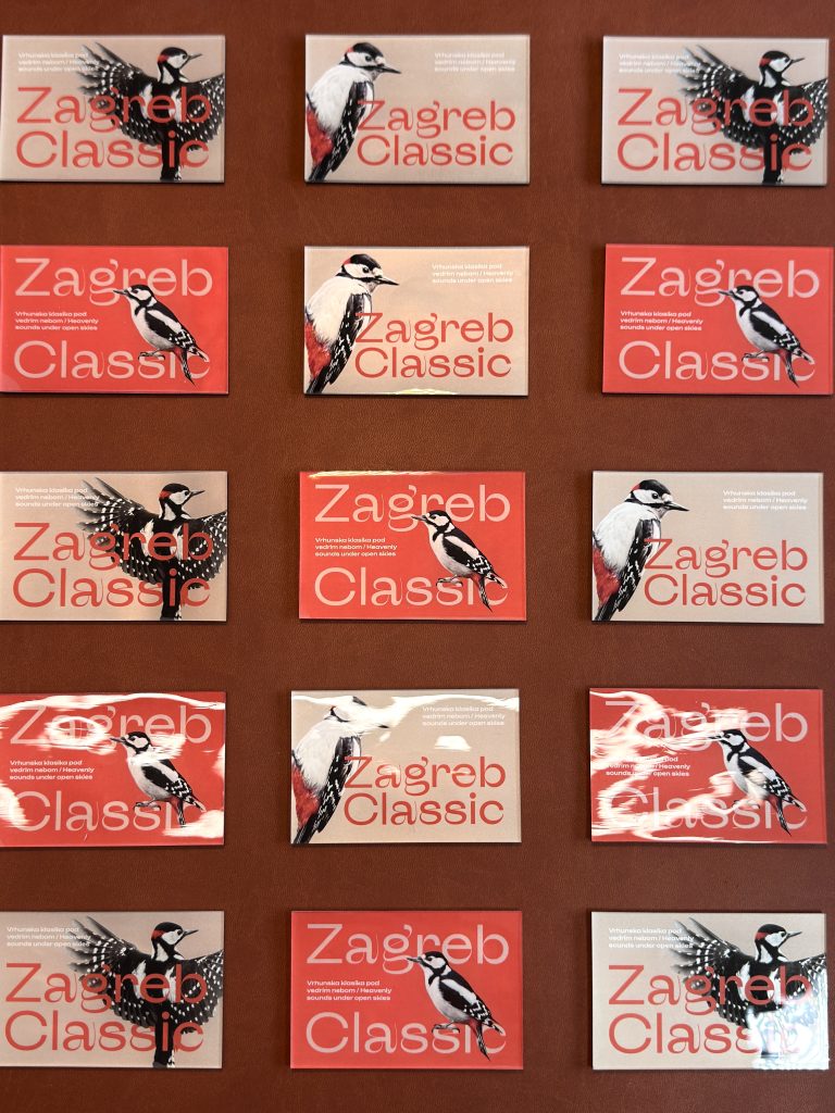
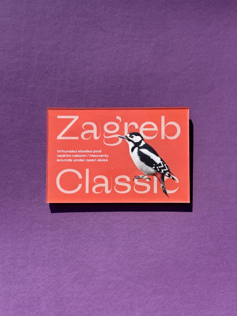
For the 2026 edition of Zagreb Classic, we produced a custom promotional magnet celebrating one of Zagreb’s most beloved cultural events. Held from 19 June to 3 July at King Tomislav Square, Zagreb Classic transforms the city center into a spectacular open-air stage, bringing together renowned Croatian and international artists, orchestras, choirs, and soloists for a series of free concerts.

Industry

Marketing, FMCG, event, turizam, promo

Design

kuna zlatica

Tags

magnets, zagreb classic, zagreb, magneti, promomaterijali

Project

Zagreb classic magnets

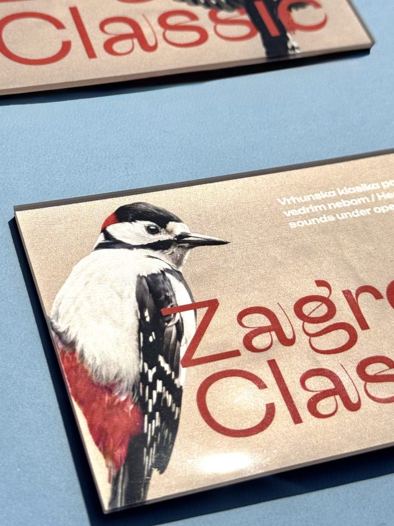
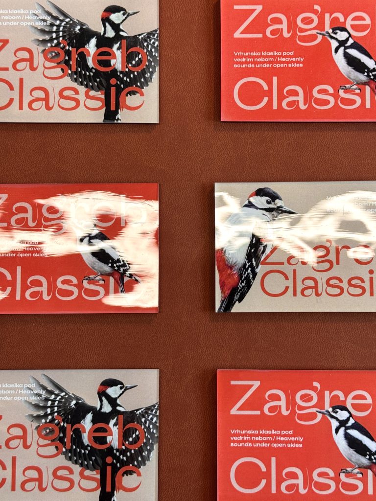
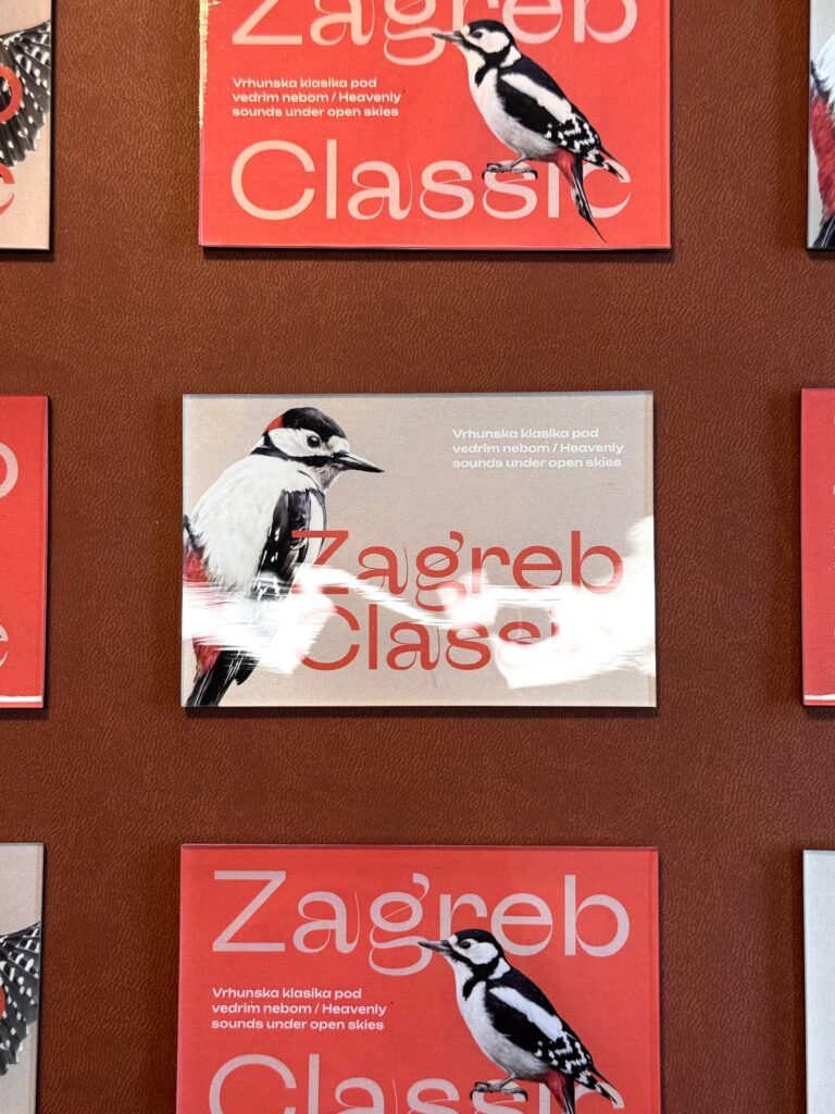
More than just a promotional item, this magnet was designed to celebrate the unique atmosphere of Zagreb Classic. It captures the charm of warm summer nights, world-class music and the vibrant energy. A small keepsake with a lasting connection to the memories, emotions, and cultural experiences that make the festival so special.The magnet was produced with digital print combined with die cutting that creates the sophisticated sharp edge. The final touch was adding thick layer of UV varnish that creates a glossy surface that bounces off the light and adds a premium touch to this custom-made event merch.

PRINT TECHNOLOGY

Digital print

Die cut

UV varnish

This custom magnet serves as a memorable keepsake, capturing the unique atmosphere and cultural spirit of Zagreb Classic.

MAP CEREMONIAL CURTAINS OF THE CROATIAN NATIONAL THEATRE IN ZAGREB

MAP CEREMONIAL CURTAINS OF THE CROATIAN NATIONAL THEATRE IN ZAGREB

Client

Category

Production

Year

Share

Croatian National Theatre in Zagreb

Brand collateral

Macan Atelier

2025

+ About project

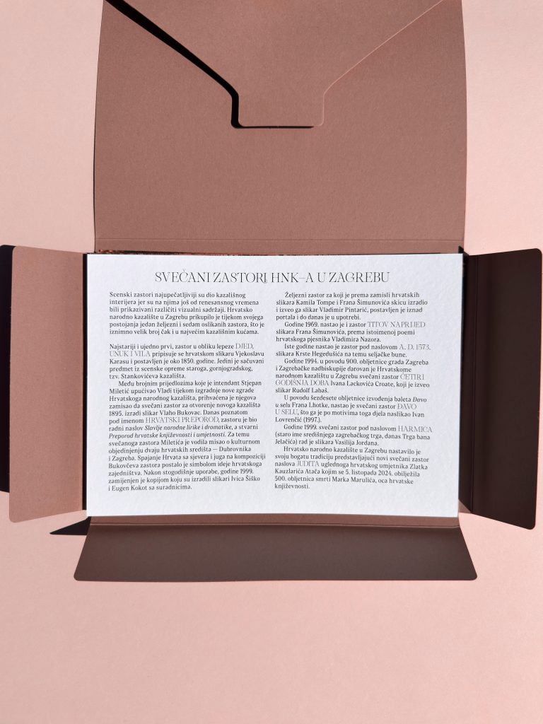
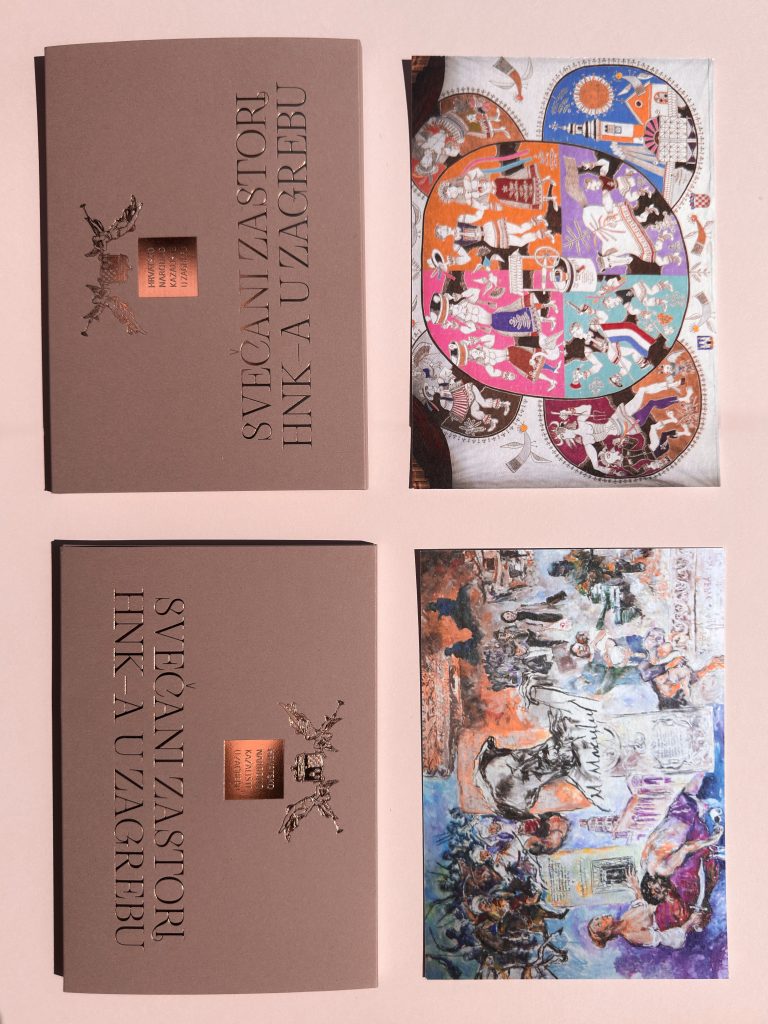
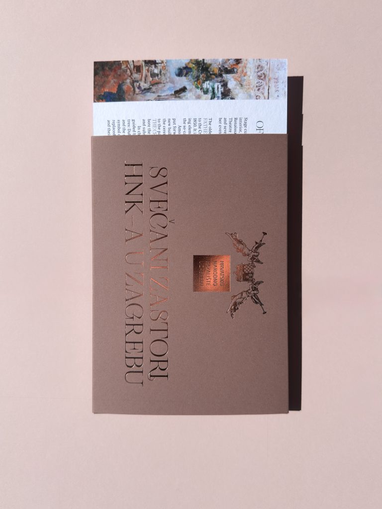
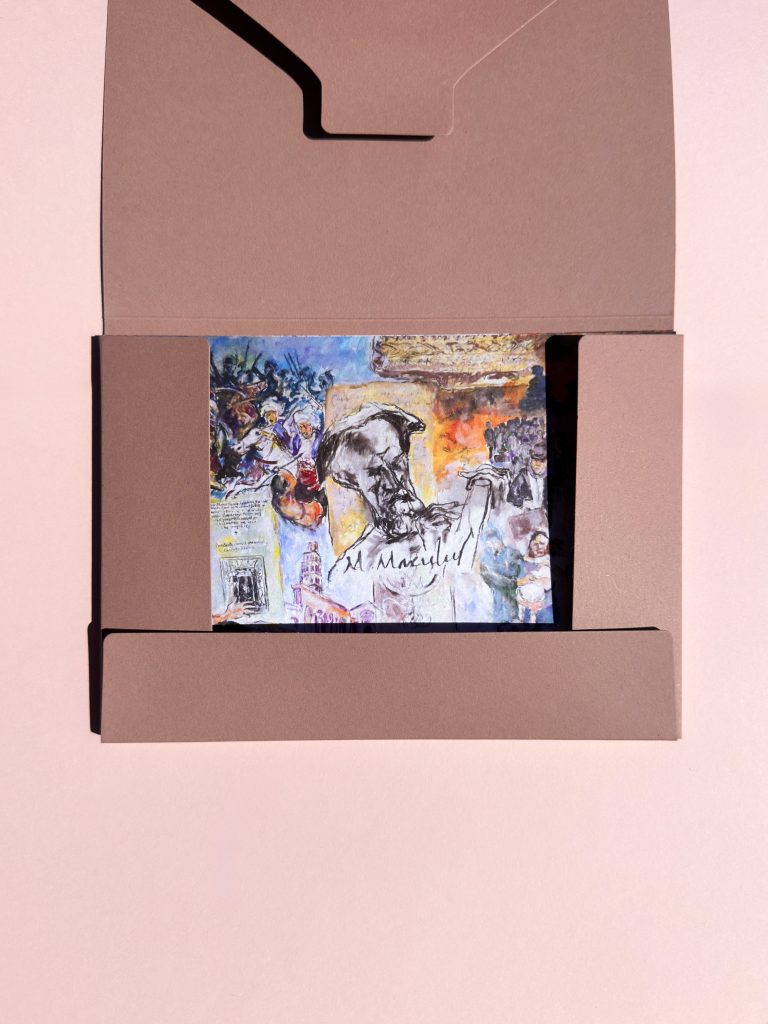
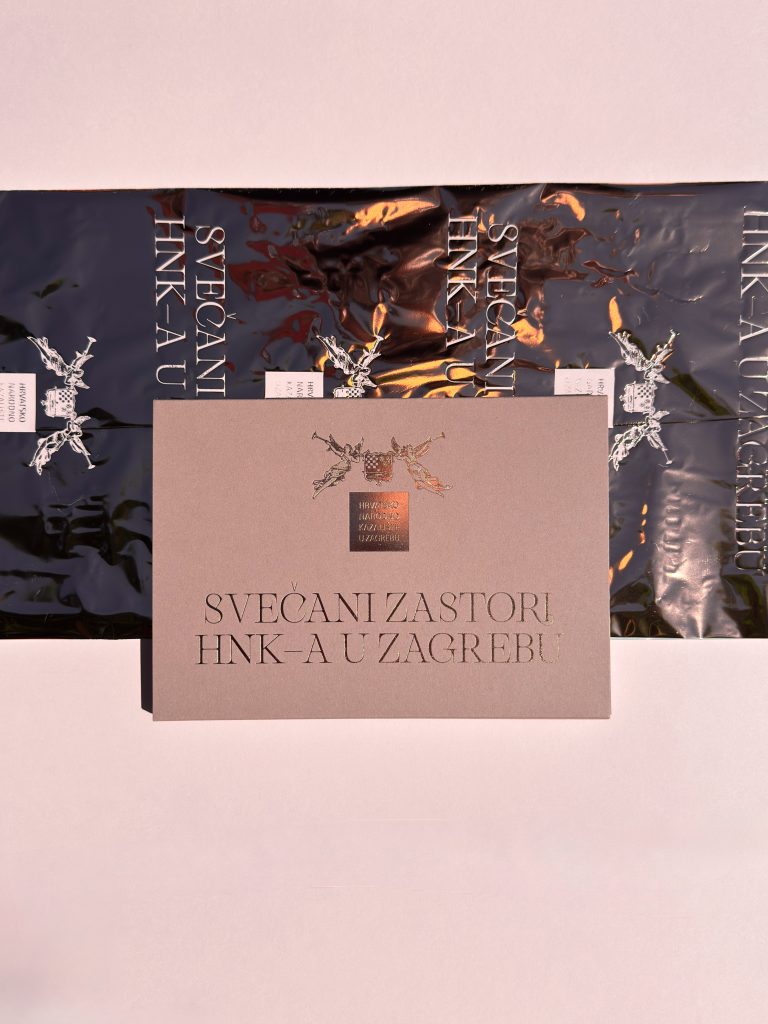
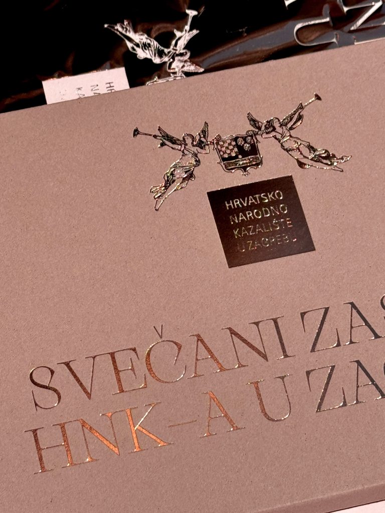
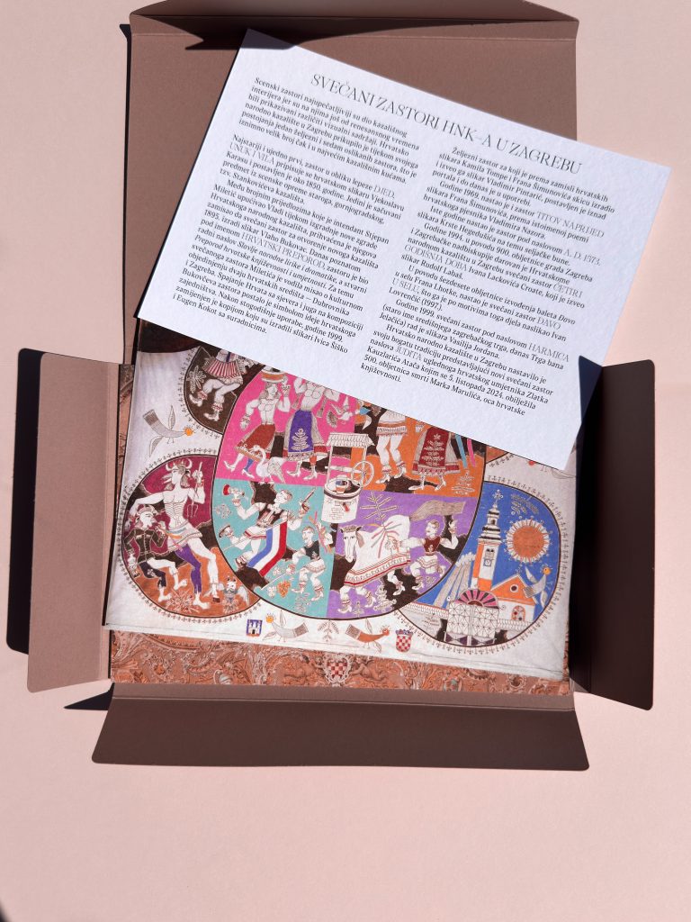
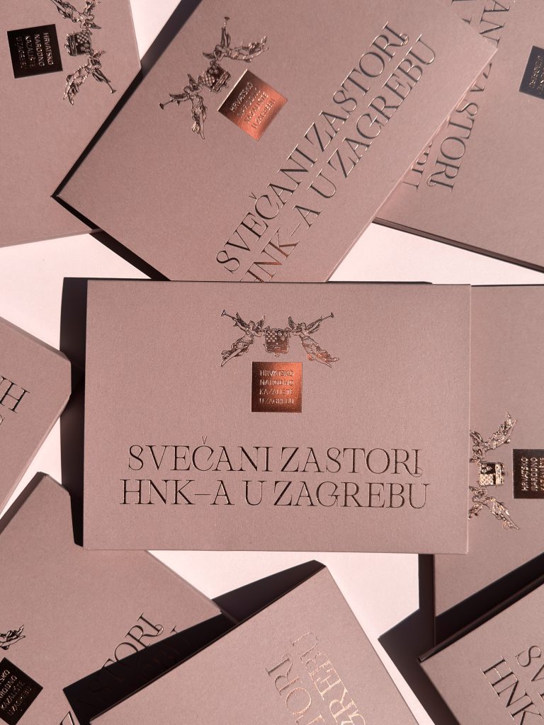
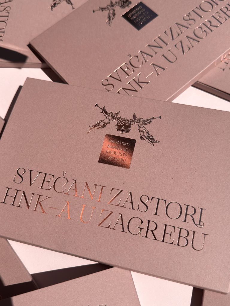
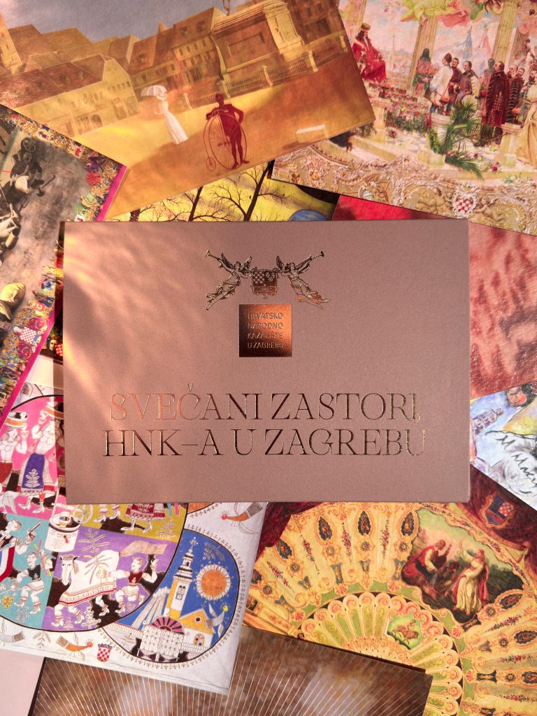
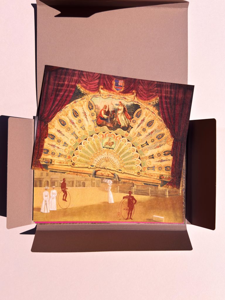
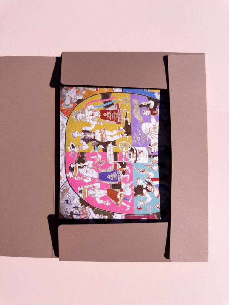
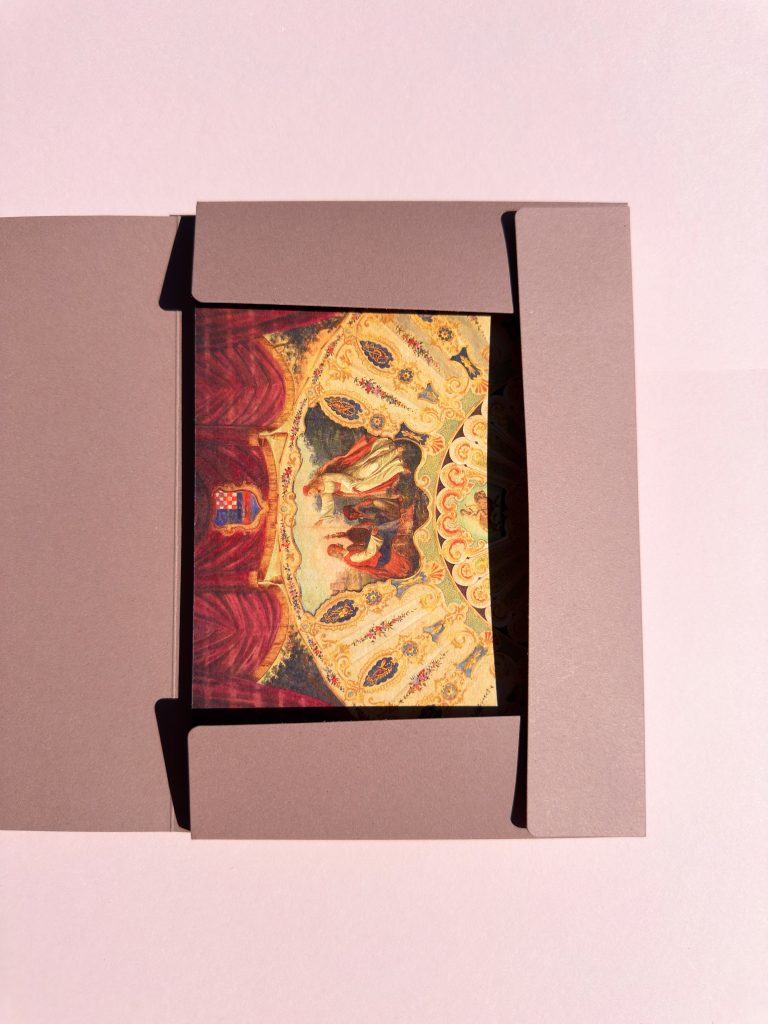
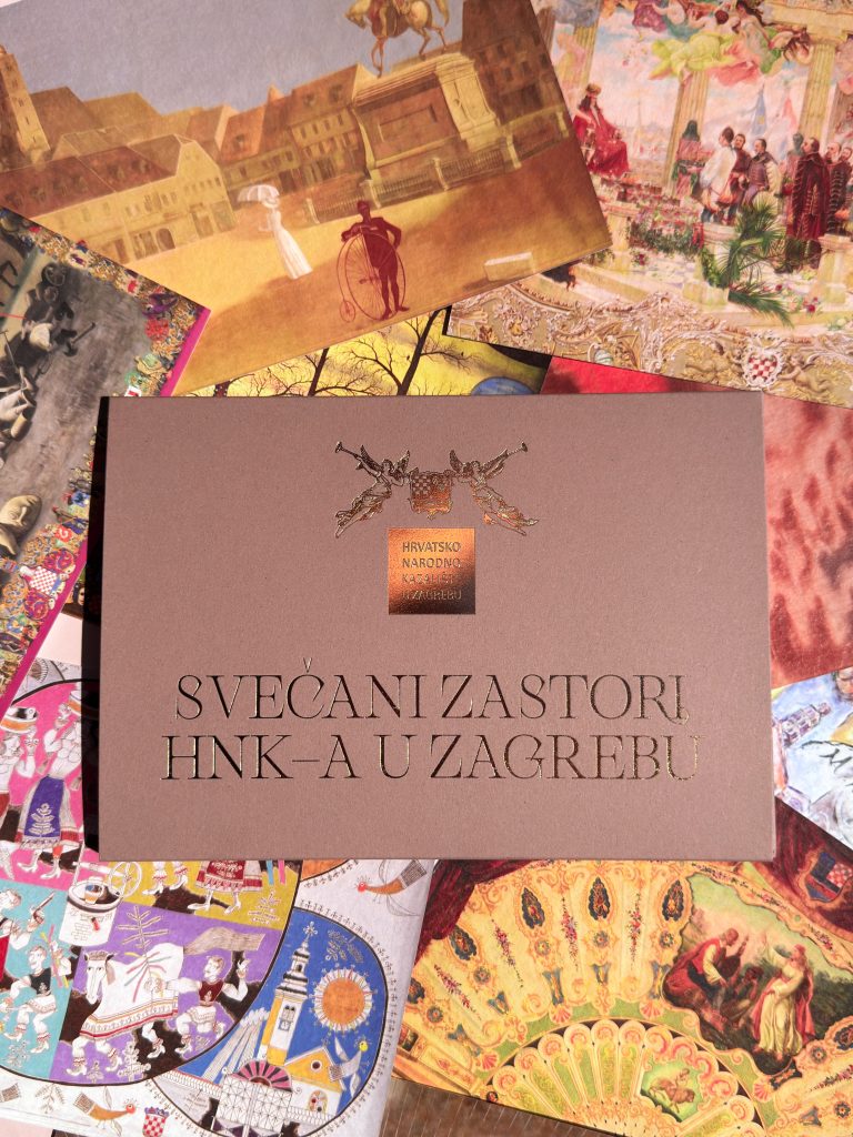
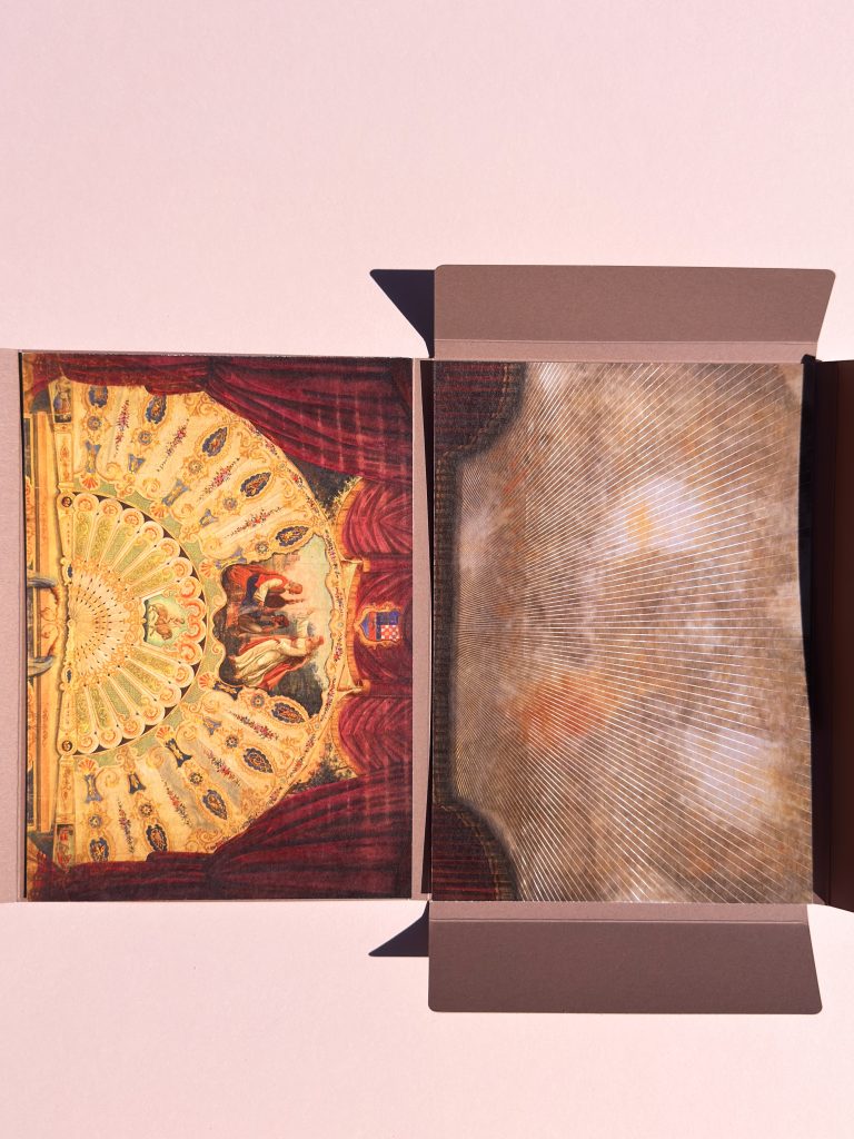
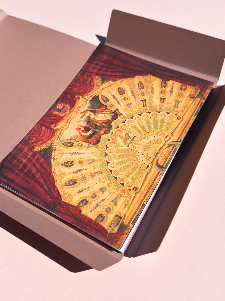
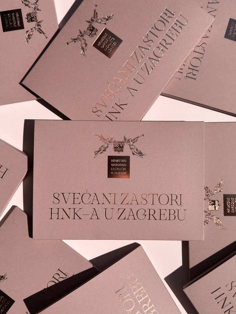
For the Croatian National Theatre in Zagreb, we produced a map accompanied by a series of postcards dedicated to one of the theatre’s most fascinating collections – its historic stage curtains. Since the Renaissance, stage curtains have been among the most captivating elements of theatre interiors, serving not only as functional objects but also as monumental works of art. Throughout its history, the Croatian National Theatre in Zagreb has assembled an extraordinary collection consisting of one iron curtain and seven painted curtains.

Industry

Design

Creative industry

Roberta Bratović

Tags

mapa, map, hnk, razglednice, luxury print, zlatotisak

Project

Map Ceremonial curtains of the Croatian National Theatre in Zagreb

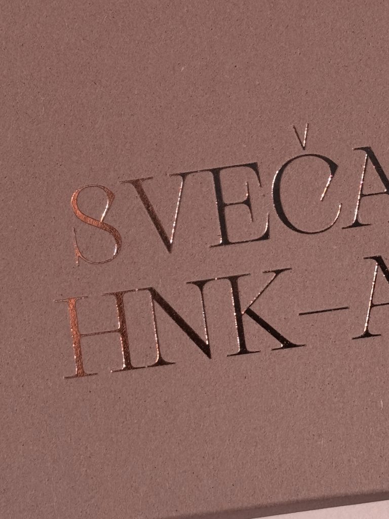
Projects like this allow us to combine craftsmanship, design, and print production with stories that deserve to be remembered and celebrated. Every detail from the map to the postcards was carefully produced with respect to the subject matter and the rich history it represents. It is always a privilege when our work can support institutions that preserve, document, and present cultural treasures for future generations.

PRINT TECHNIQUES

Foil print

Digital cut

Digital print

Every detail from the map to the postcards was carefully produced with respect to the subject matter and the rich history it represents.

AQUAESTIL DOMED LABELS

Aquaestil domed labels

Client

Category

Production

Year

Share

Aquaestil

Brand promo

Macan Atelier

2026

+ About project

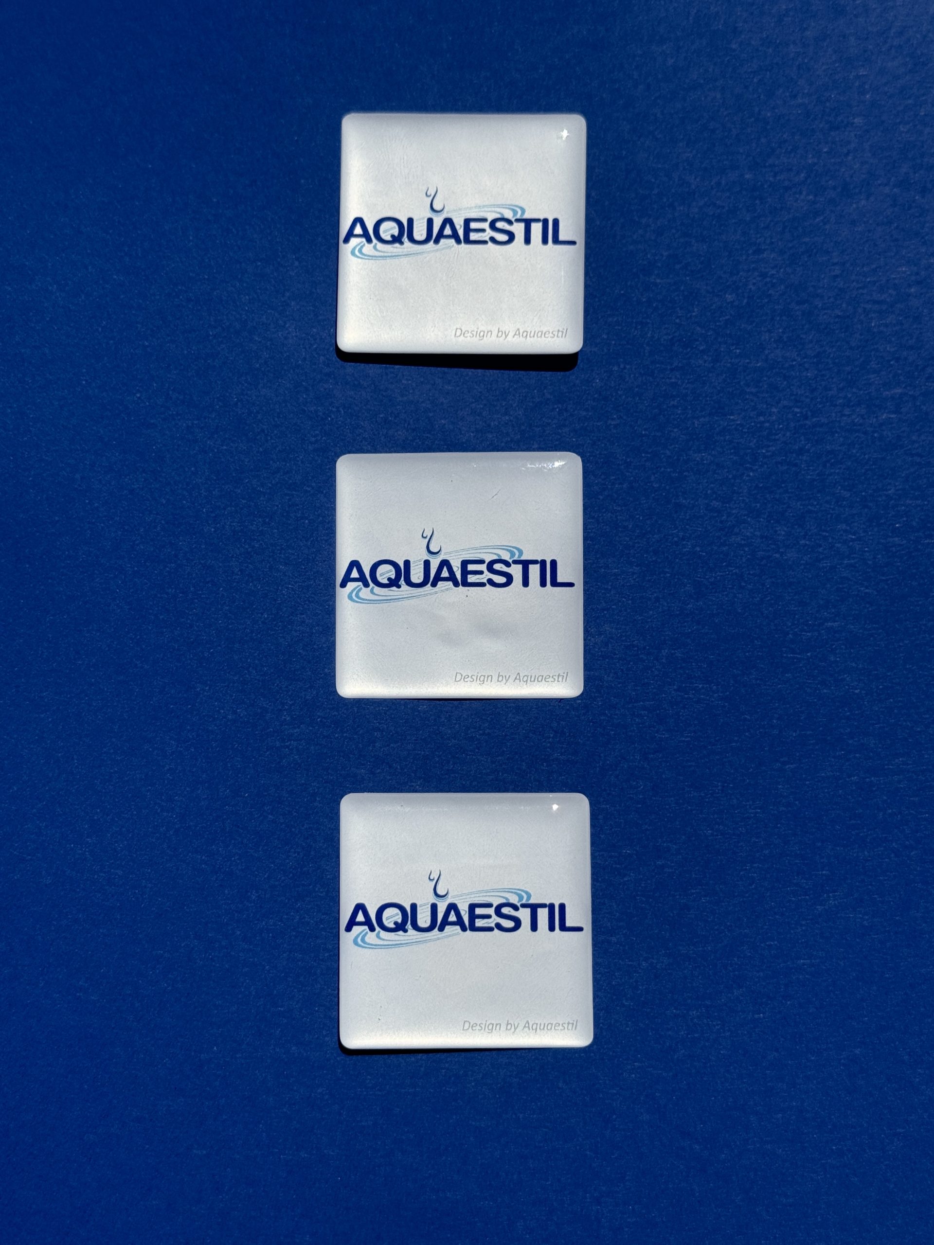
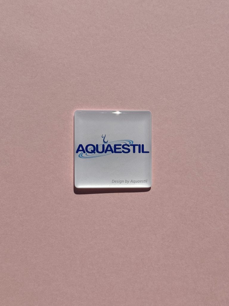
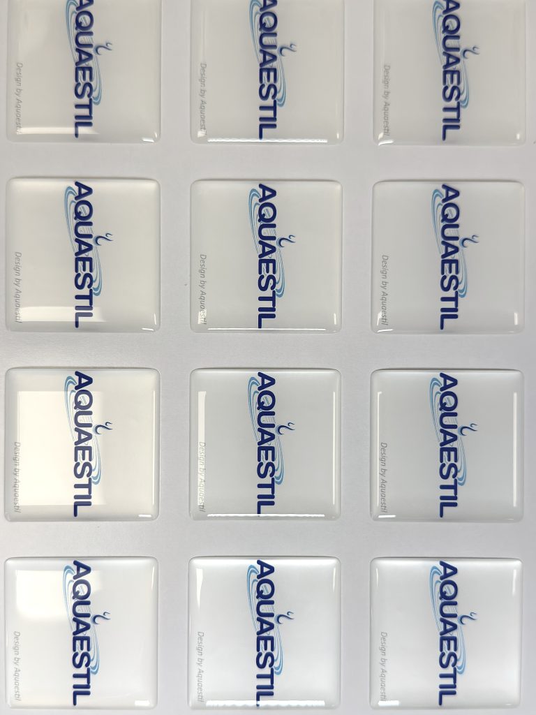
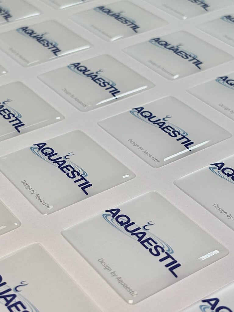
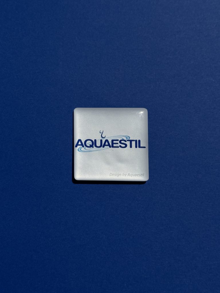
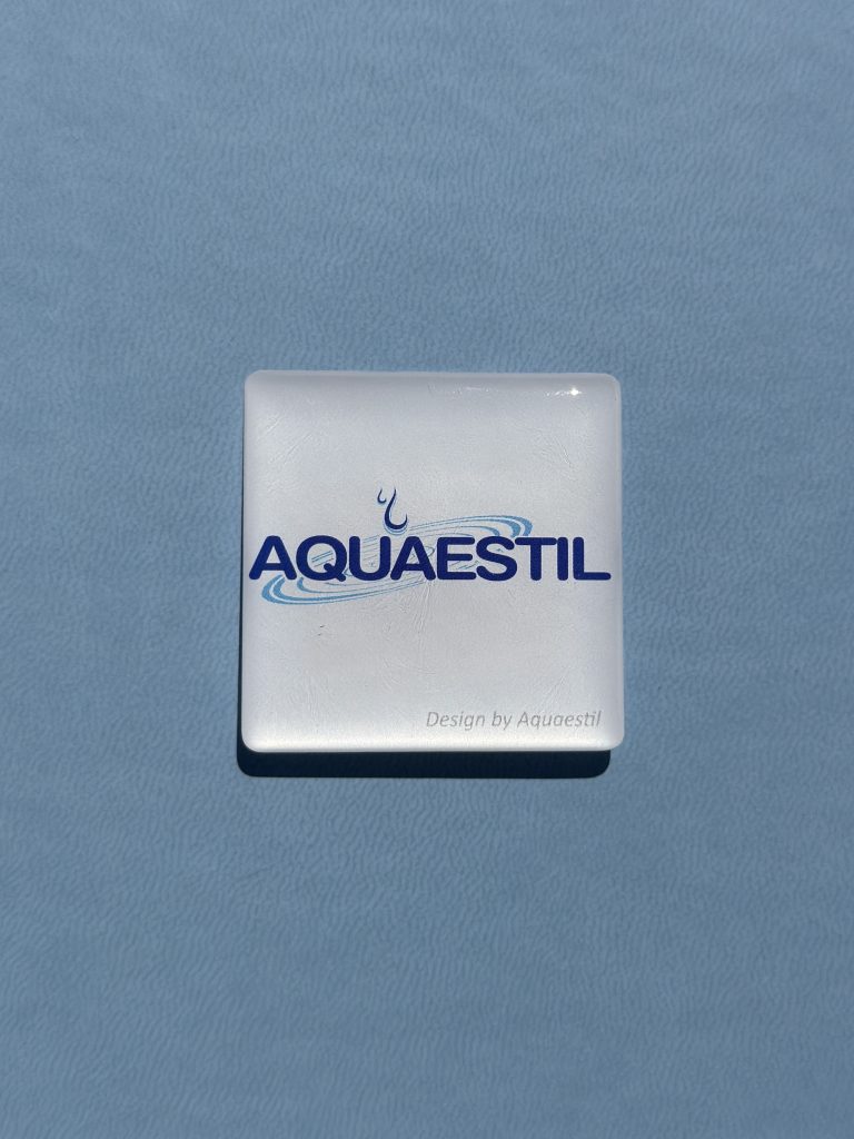
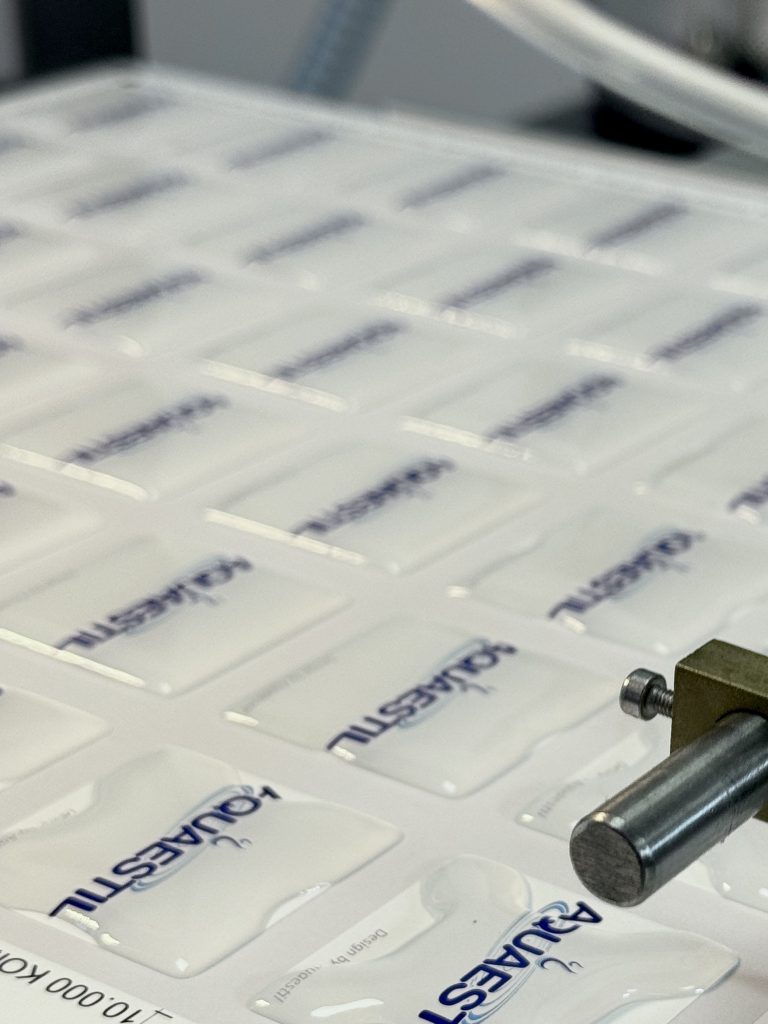
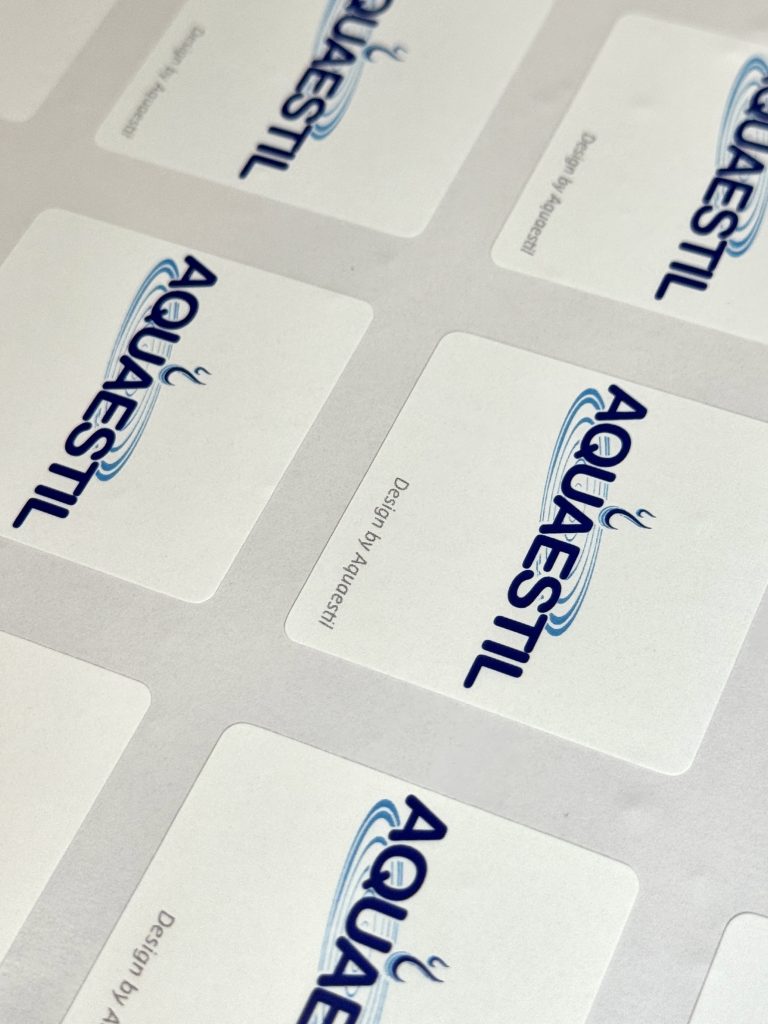
For Aquaestil, we produced custom domed labels that transform a simple brand mark into a premium branding asset. With their distinctive 3D appearance, glossy finish, and exceptional durability, domed labels naturally attract attention and elevate the perceived value of any product they are applied to.

Whether placed on products, equipment, displays, packaging, mobile phones, laptops or promotional items, domed labels act as a subtle but constant advertisement for your brand. They create touchpoints, increase brand visibility, and help customers remember who you are.

Industry

Marketing, promo

Design

Aquaestil

Tags

doming naljepnice, brendirani promo, domed labels

Project

Domed labels

High-quality domed label stays in use for years, they travel with the product, remain visible over time, and continuously reinforce brand recognition wherever they are placed.For brands looking to strengthen their identity, increase recognition, and add a premium finish to their products, domed labels are a small investment with long-lasting impact. Sometimes the most effective advertising isn't the loudest but it's the detail that people notice, touch, and remember.

PRINT TECHNOLOGY

domed labels

digital print

MAISTRA MAP

Maistra map

Client

Category

Production

Year

Share

Maistra Collection

Brand collateral

Macan Atelier

2025

+ About project

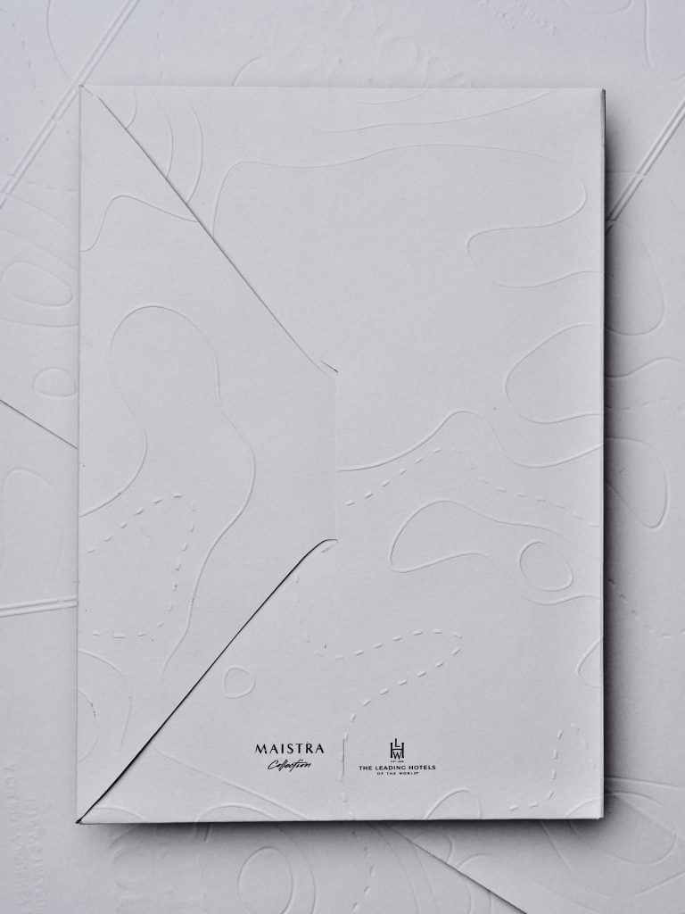
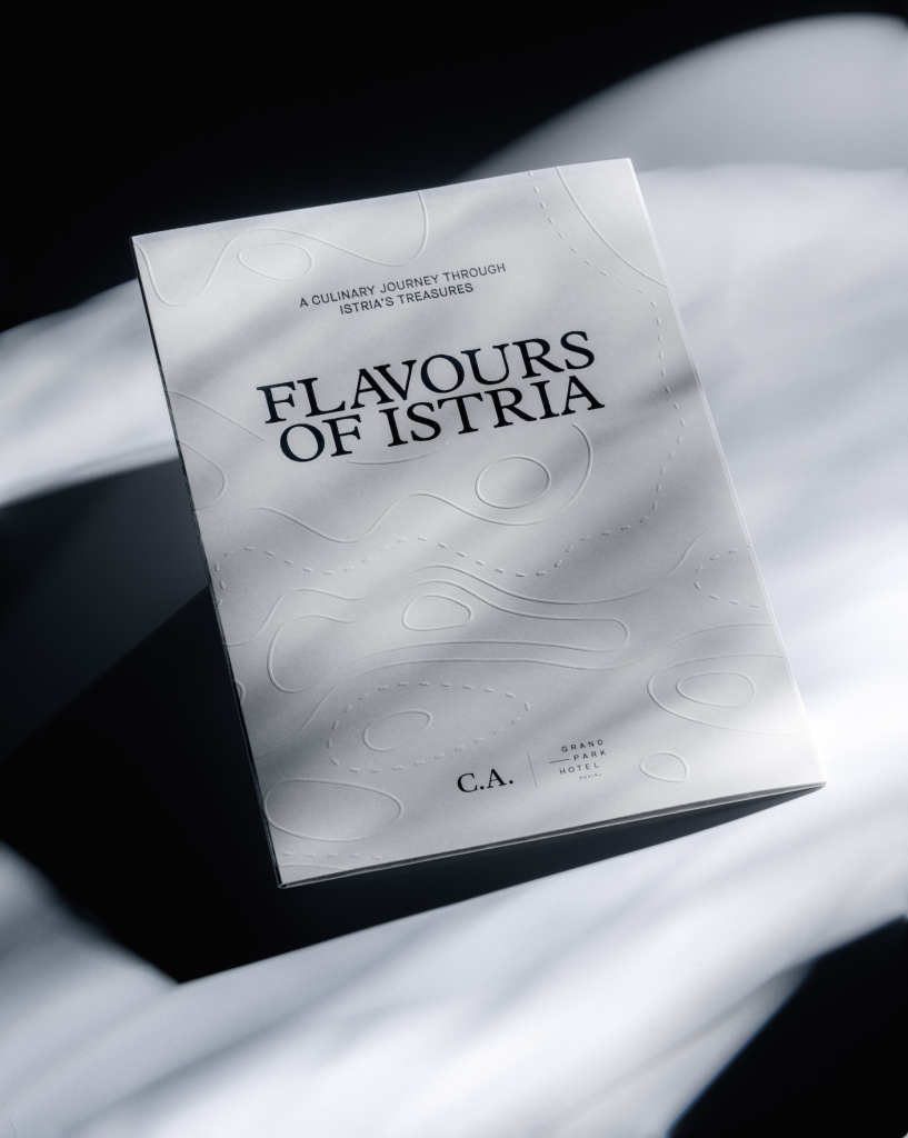
For Maistra, we developed a series of maps crafted as refined printed pieces that merge precision, craftsmanship, and tactile elegance. Produced in our printing atelier, each map was carefully designed and executed with a focus on material quality and detail, turning a functional object into a considered piece of print design.

Industry

Photo

Hospitality

Future folklore

Tags

mapa, map, embossing, premium and lux hotels

Project

Map

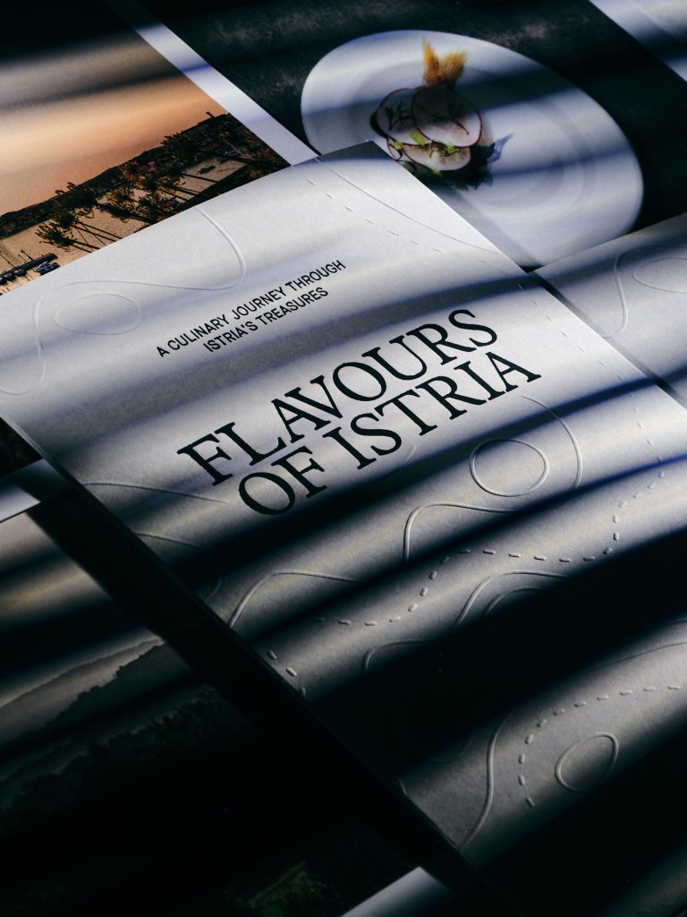
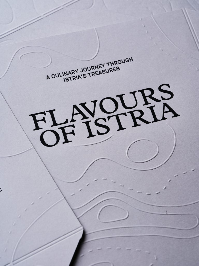
Subtle embossing details were applied to introduce depth and texture, creating a quiet but distinctive sense of luxury that reveals itself through touch as much as sight. Every detail was carefully considered to reflect Maistra’s premium hospitality world, where print becomes part of the brand experience.The result is a series of maps that go beyond information delivery, they become tactile brand artefacts that align with the sophistication and atmosphere of the Maistra identity.

PRINT TECHNIQUES

Foil print

Embossing

This project reflects our atelier approach to print: precise, material-driven, and rooted in the belief that print can be both functional and deeply expressive.

YACHT CATALOG

Yacht catalog

Client

Category

Production

Year

Share

Promo Event agency

Events

Macan Atelier

2025

+ About project

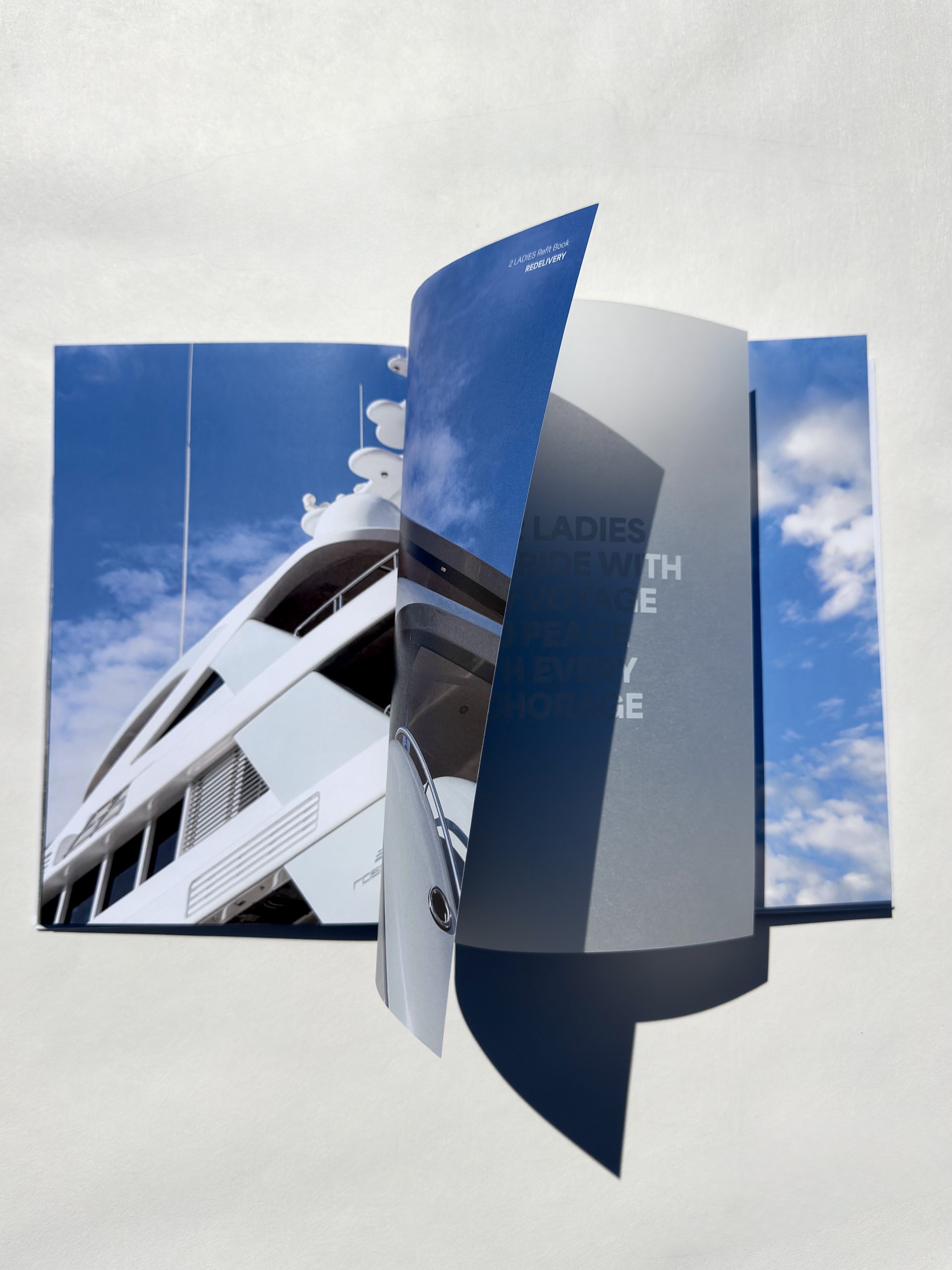
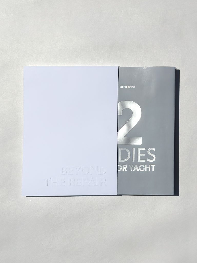
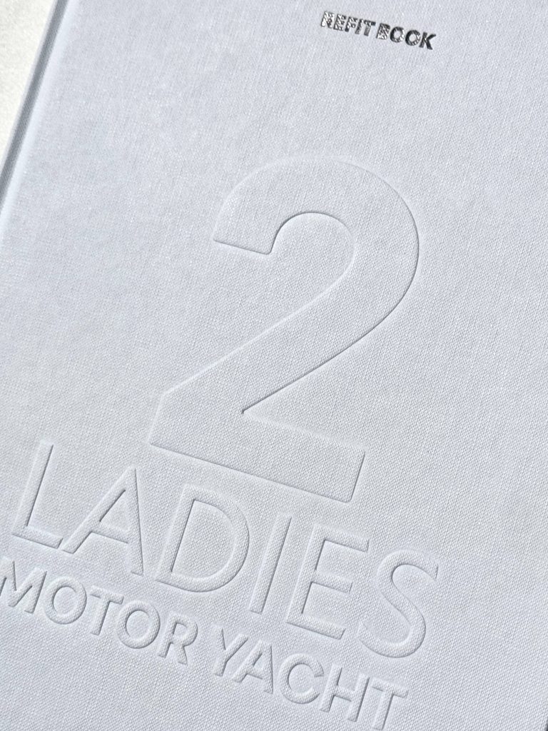
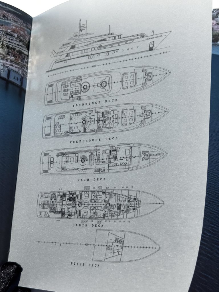
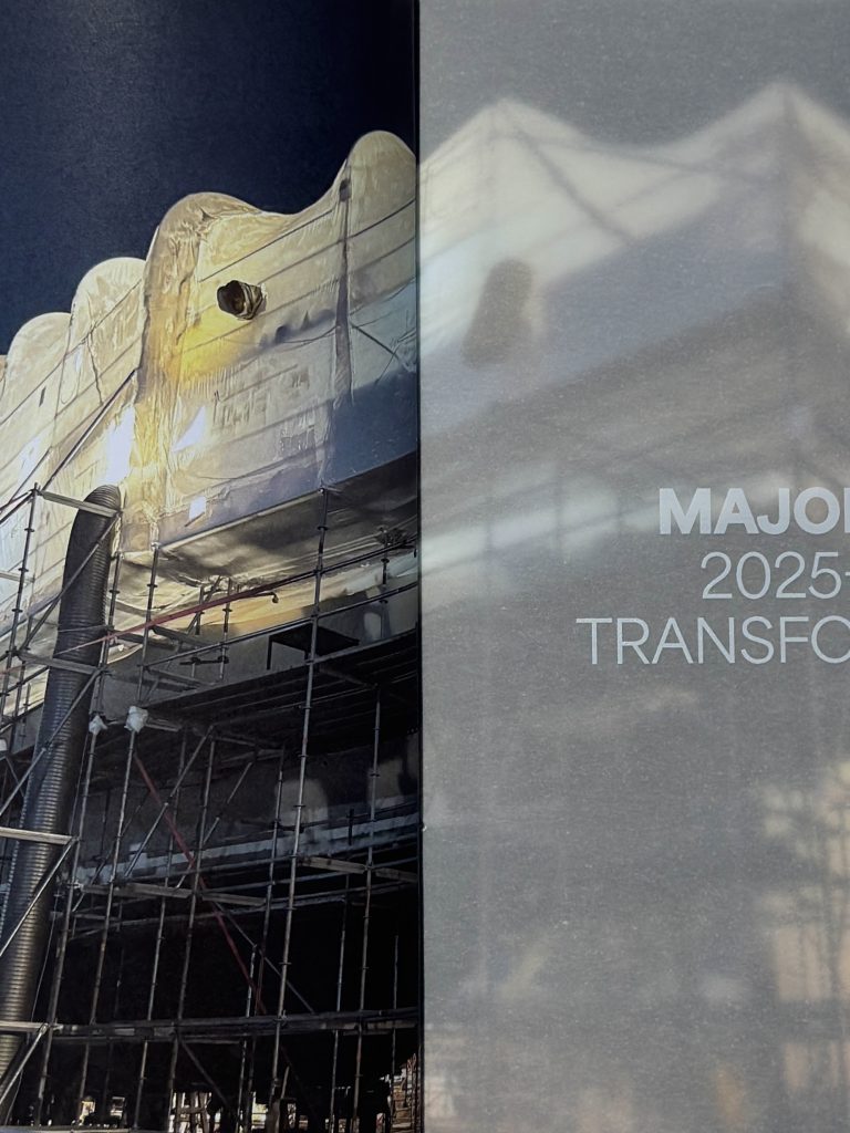
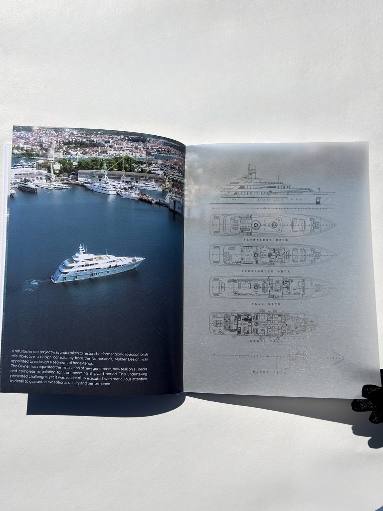
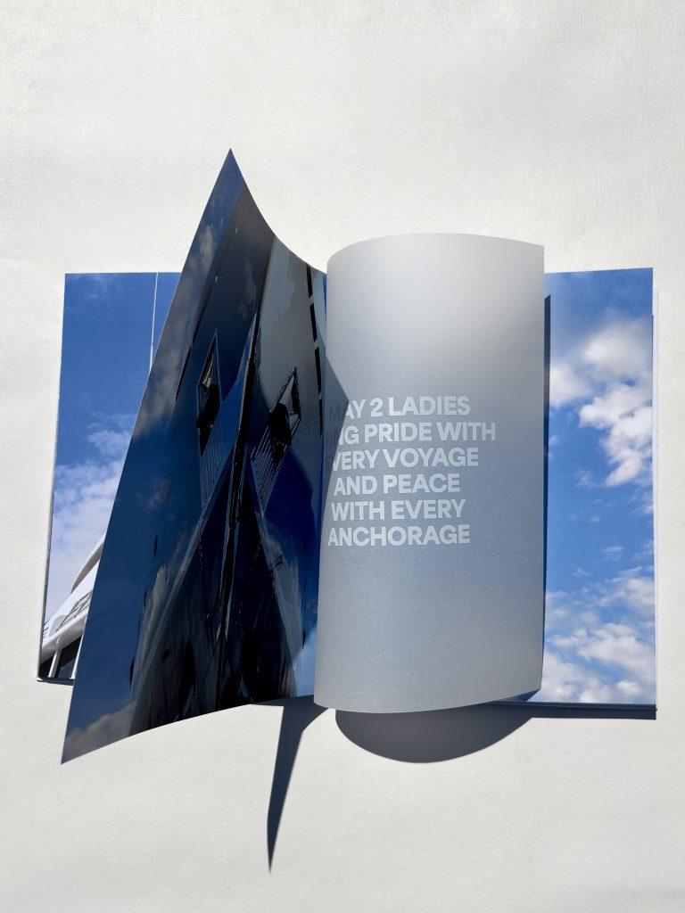
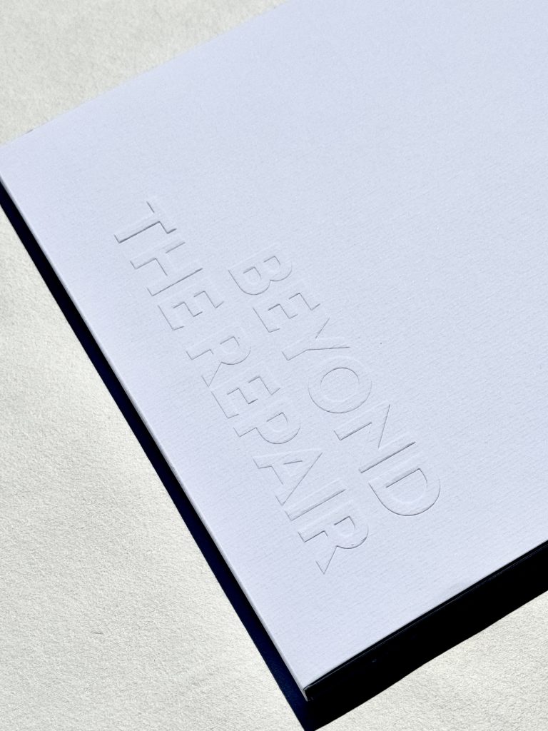
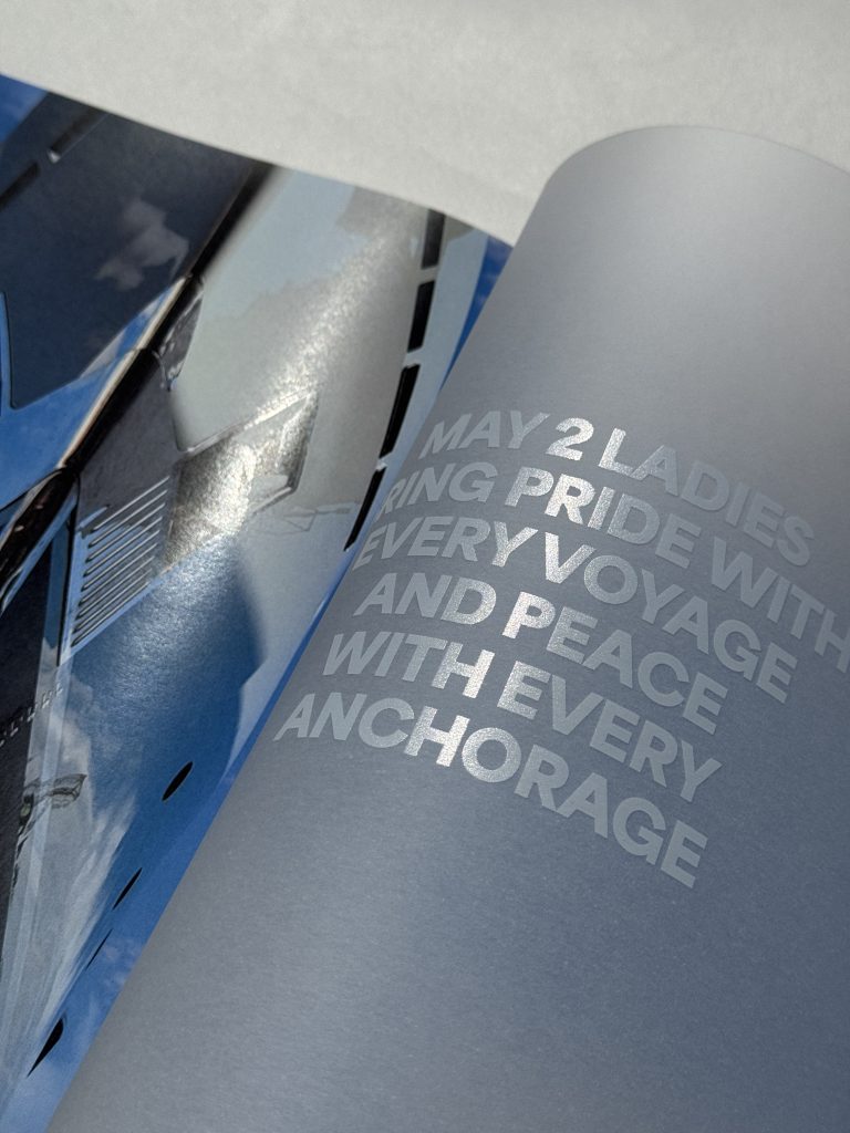
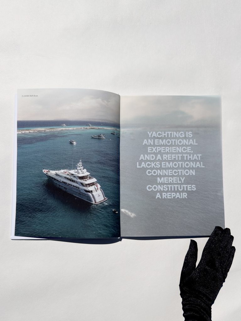
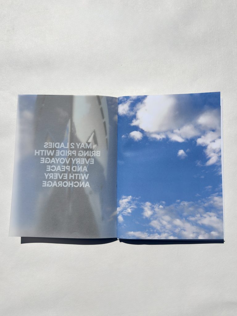
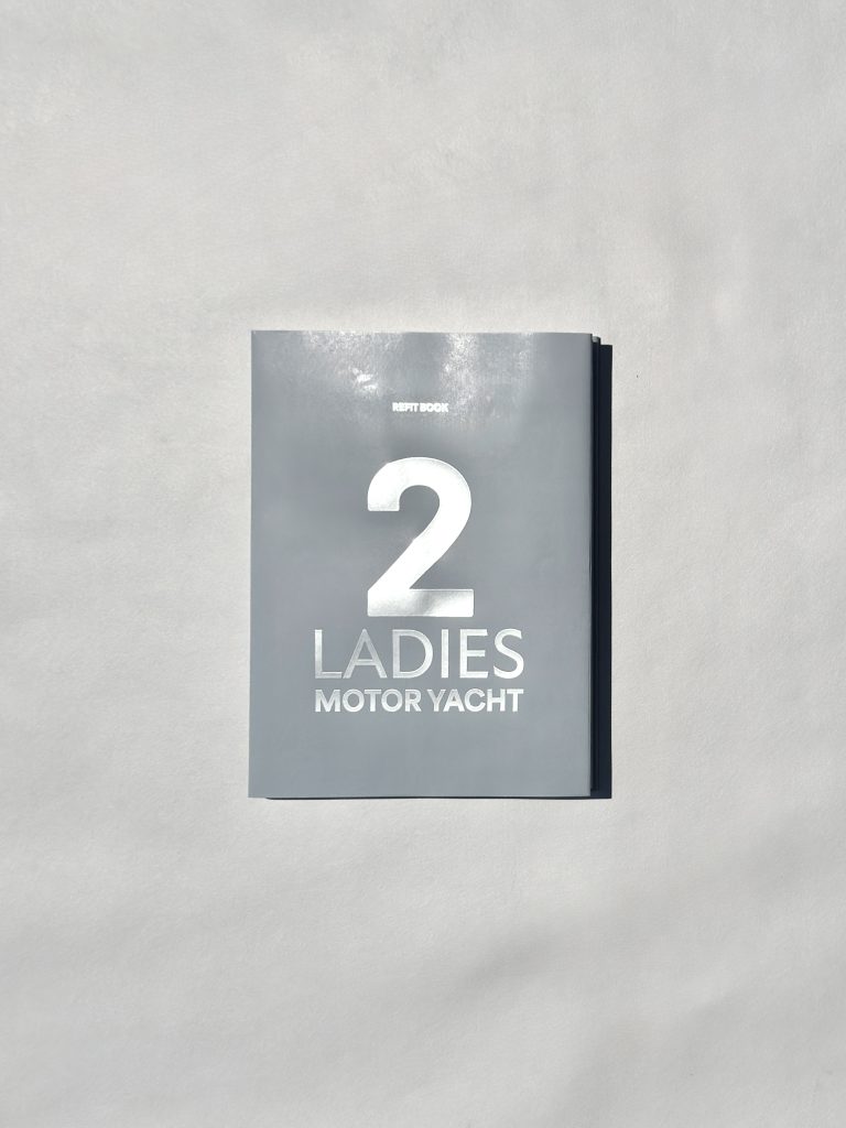
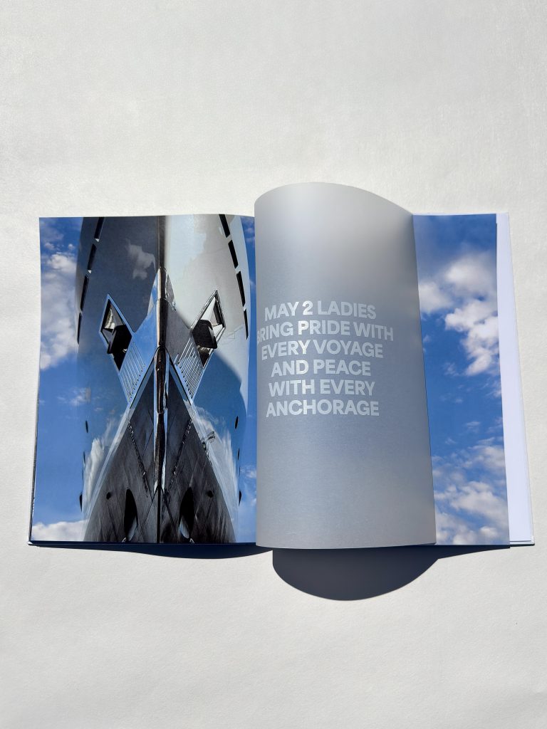
For our client Promo Event agency, we printed a premium yacht catalog designed to leave a lasting impression. Known for seamlessly blending business and pleasure, as well as creativity and expertise, Promo Event specializes in organizing corporate, public, and private events across Croatia and international markets.

Industry

Promo, PR, Events, Marketing

Paper

Cover: IMITLIN Tela Neve

Outer sleeve: Pulse Laid White 220 gr

Inner sleeve: Munken White 300 gr

Book block: Munken White 150 gr, Glama Basic 150gr

Tags

catalog, katalog, embossing

Project

Catalog

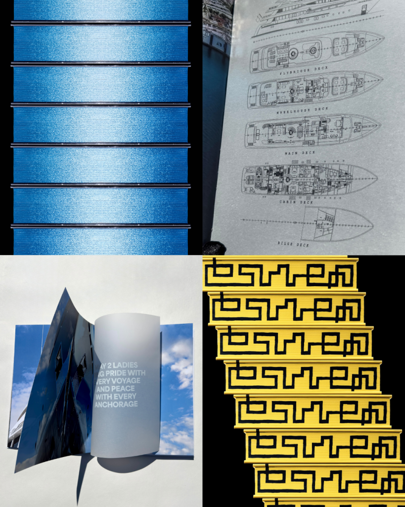
By combining foil print, embossing, UV printing, and digital print, we achieved a layered, sophisticated finish, with each technique adding depth, contrast, and a sense of exclusivity. The goal of this project was to reflect our client’s high standards, resulting in a catalog that truly mirrors the agency’s commitment to quality and memorable experiences.

PRINT TECHNIQUES

Foil print

Embossing

UV print

Digital print

Leave a lasting impression

THE BEE STING

The Bee Sting

Client

Category

Production

Year

Share

Lumen izdavaštvo

Books

Macan Atelier

2025

+ About project

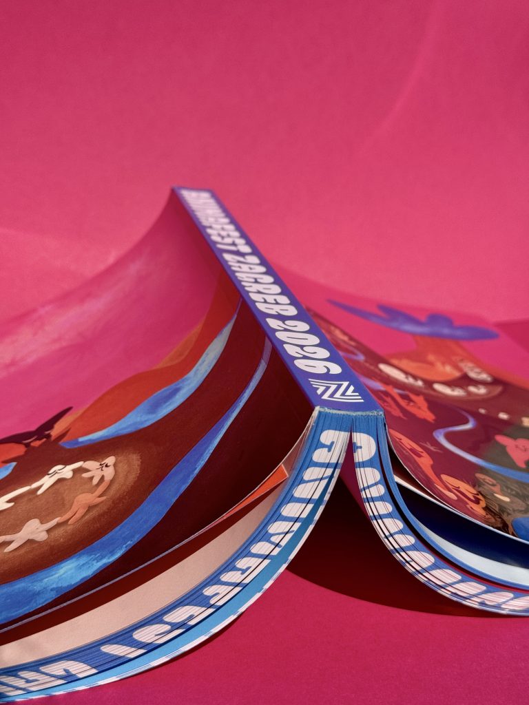
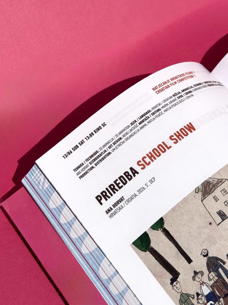
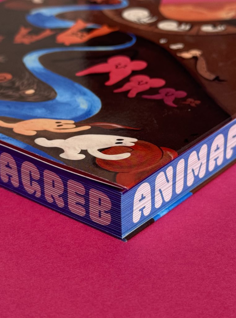
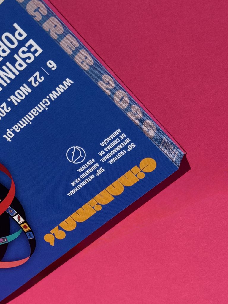
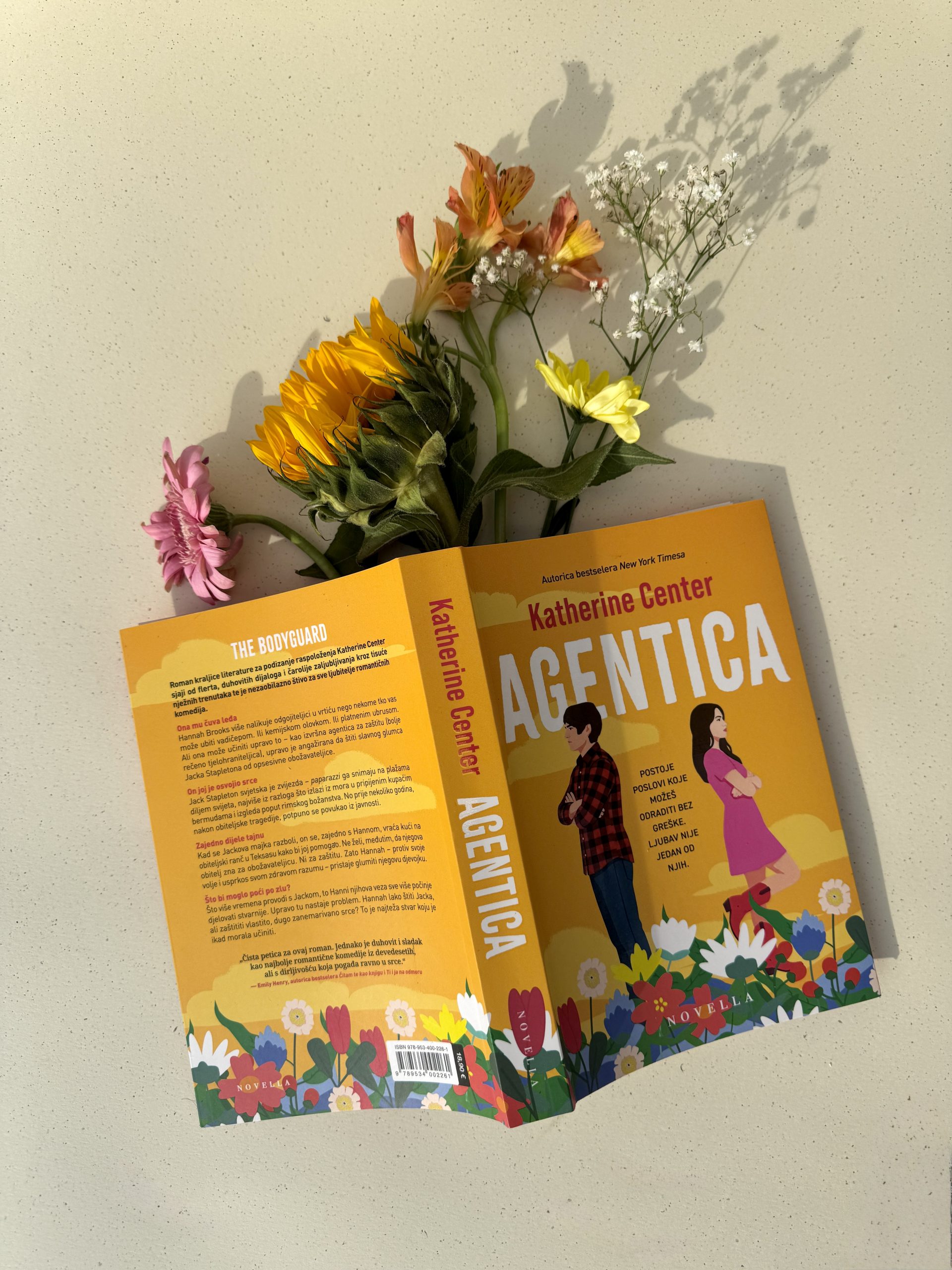
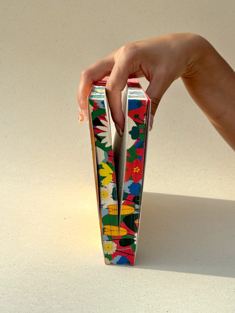
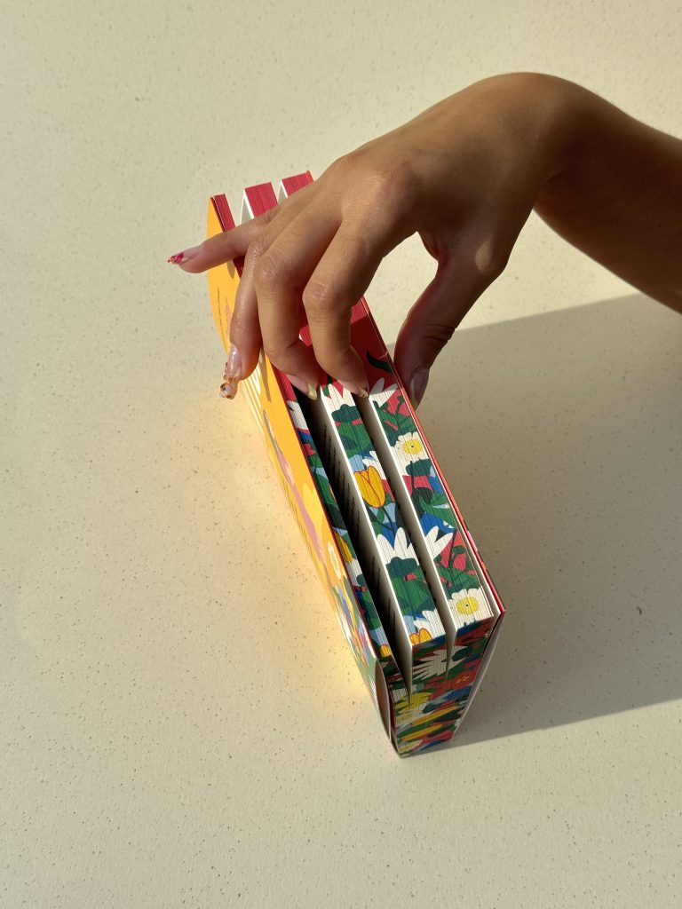
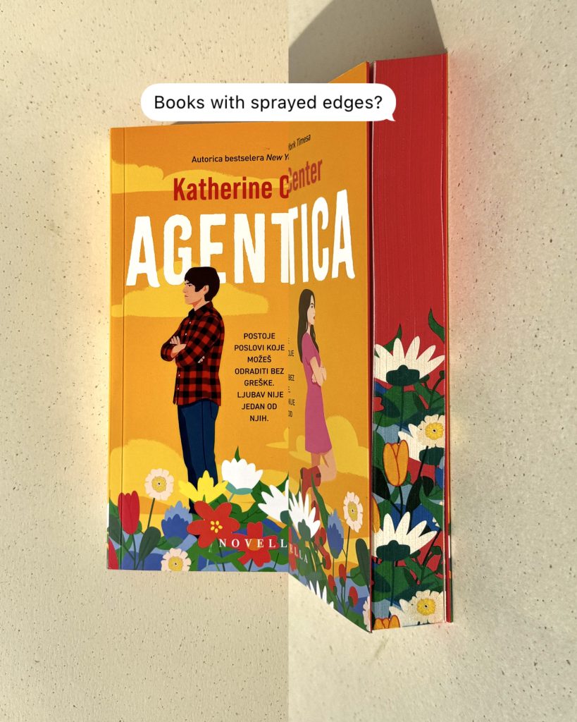
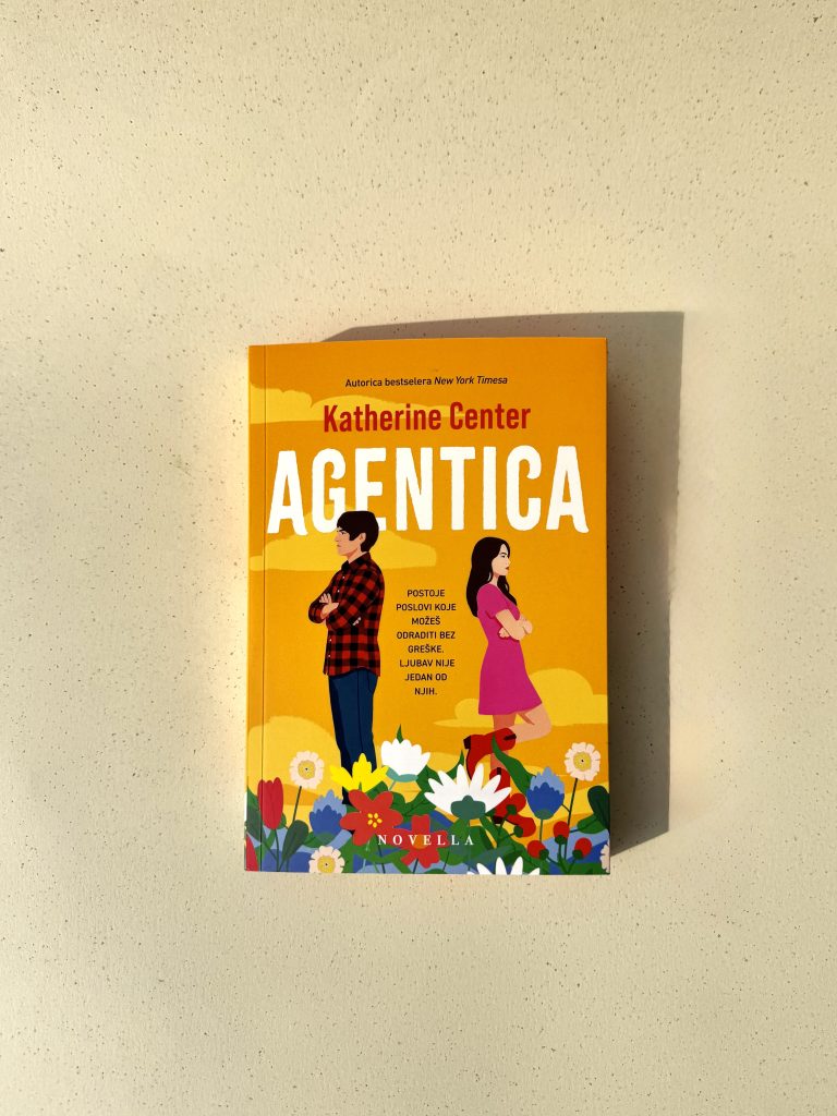
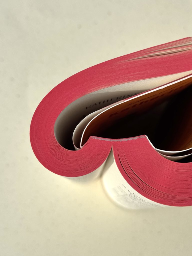
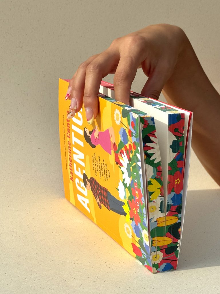
This is where stories meet craftsmanship – where every detail is intentionally designed to elevate the act of reading into a visual and tactile experience. Printed edges frame the book like a piece of art, while light-catching UV varnish reveals subtle layers as the surface shifts under light. Each page turn carries a sense of precision and luxury, inviting the reader to slow down and fully engage with the object in their hands.

Industry

Izdavaštvo, publishing

Cover print

Photo

Macan Atelier

Future Folklore

Tags

books, knjige, edge print, special edition

Project

The Bee Sting

Because some stories deserve more than to be read, this project explores the idea of the book as a sensory medium. Texture, light, and materiality work together to create a lasting impression, one that goes beyond content and into experience. The result is not just a publication, but a carefully crafted artifact designed to be touched, seen, and remembered.Developed in collaboration with Lumen izdavaštvo, this edition demonstrates how thoughtful production can transform a familiar format into something extraordinary.By combining advanced print techniques with a refined design approach, the book becomes more than a carrier of information - it becomes an experience in itself.

PRINT TECHNIQUES

Edge print

UV varnish

The book becomes an experience in itself

THE TEARSMITH BOOK

The Tearsmith

Client

Category

Production

Year

Share

GZH

Books

Macan Atelier

2025

+ About project

For the bestselling international sensation, “The Tearsmith” by Erin Doom, coming soon to Netflix, we created a special edition for our client GZH focused on refined, premium details. Each finishing technique was carefully selected to support the narrative and elevate the overall design. A story this powerful deserves a print finish that leaves a lasting impression.

Industry

Izdavaštvo, publishing

Publisher

Photo

Lumen izdavaštvo

Future Folklore

Tags

books, knjige, edge print, special edition

Project

The Tearsmith

A deep blue edge print adds elegance and depth to every copy, while foil print introduces a subtle shine that enhances key design elements. Combined with 3D UV varnish, the butterfly motif comes to life.Projects like this show how thoughtful print finishing can elevate a book beyond the ordinary and strengthen its visual identity. Every detail is designed to match the impact of the story itself.

PRINT TECHNIQUES

3D UV varnish

Foil print

Edge print

DOMED LABELS

Domed labels

Category

Production

Year

Share

Branded collateral

Macan Atelier

2025

+ About project

Premium domed labels and stickers are an effective way to elevate brand visibility, introducing a refined, high-end visual identity to any product, packaging, or piece of equipment. Their distinctive appearance immediately communicates quality, making them an ideal choice for brands looking to stand out in competitive markets. By combining functionality with a premium aesthetic, domed labels transform even the simplest surfaces into recognizable brand touchpoints.

Industry

Marketing, promo

Design

Macan Atelier

Tags

doming naljepnice, brendirani promo, domed labels

Project

Domed labels

With their crystal-clear 3D finish, these labels create a strong and lasting first impression while emphasizing precision and attention to detail. The domed resin layer enhances colours, depth, and contrast, giving each design a vibrant, polished look that captures attention from every angle. This dimensional effect is also highlighted through foil print details. The 3D silver digital foil letters and metallic 2D effect not only improves visual appeal but also reinforce the perception of value and craftsmanship.The final product is an aesthetically powerful and technically precise solution that seamlessly combines durability with design. Engineered with strong, long-lasting adhesive and a scratch-resistant surface, domed stickers are built to withstand daily use across a wide range of environments. Fully customizable in shape and size, they serve as a permanent communication element—strengthening brand recognition, increasing perceived value, and leaving a lasting impression on the end user.

PRINT TECHNOLOGY

2D digital foil print

3D digital foil print

3D domed labels