SENSE ENGINEERING

Sense Engineering

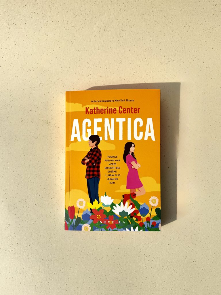
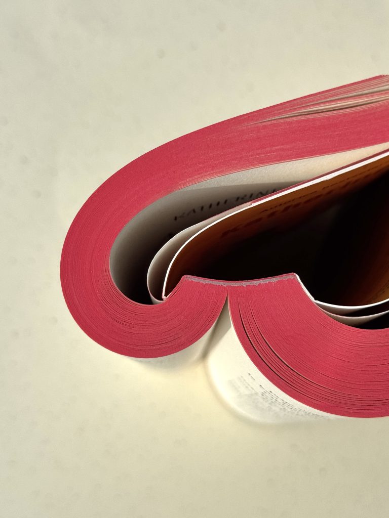
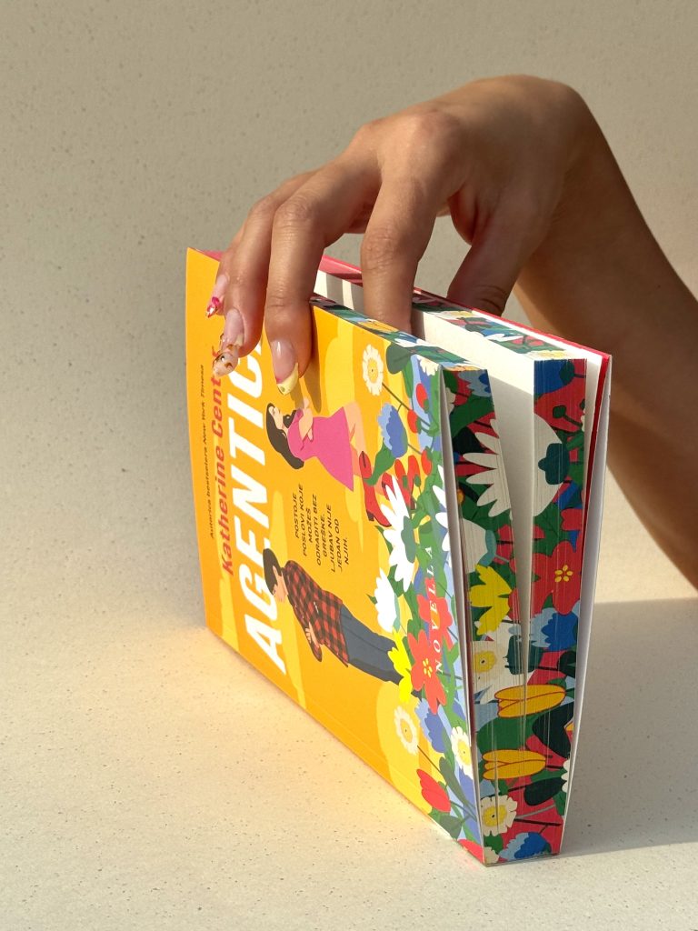
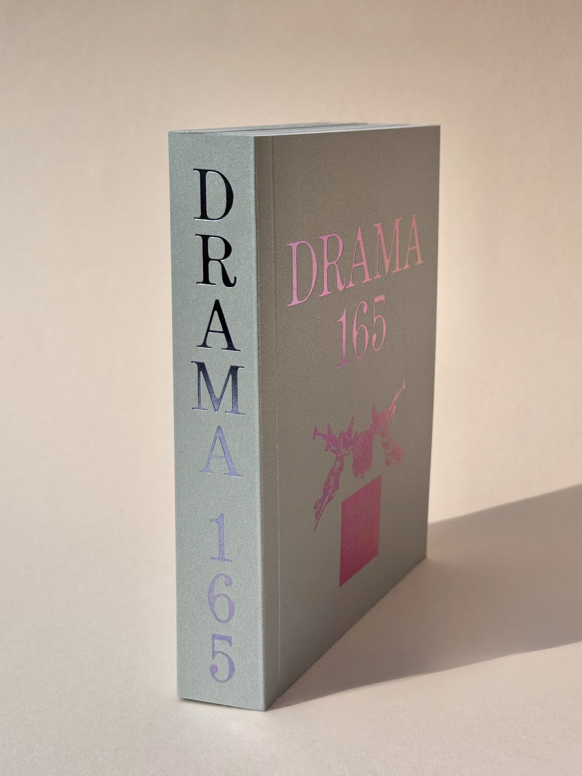
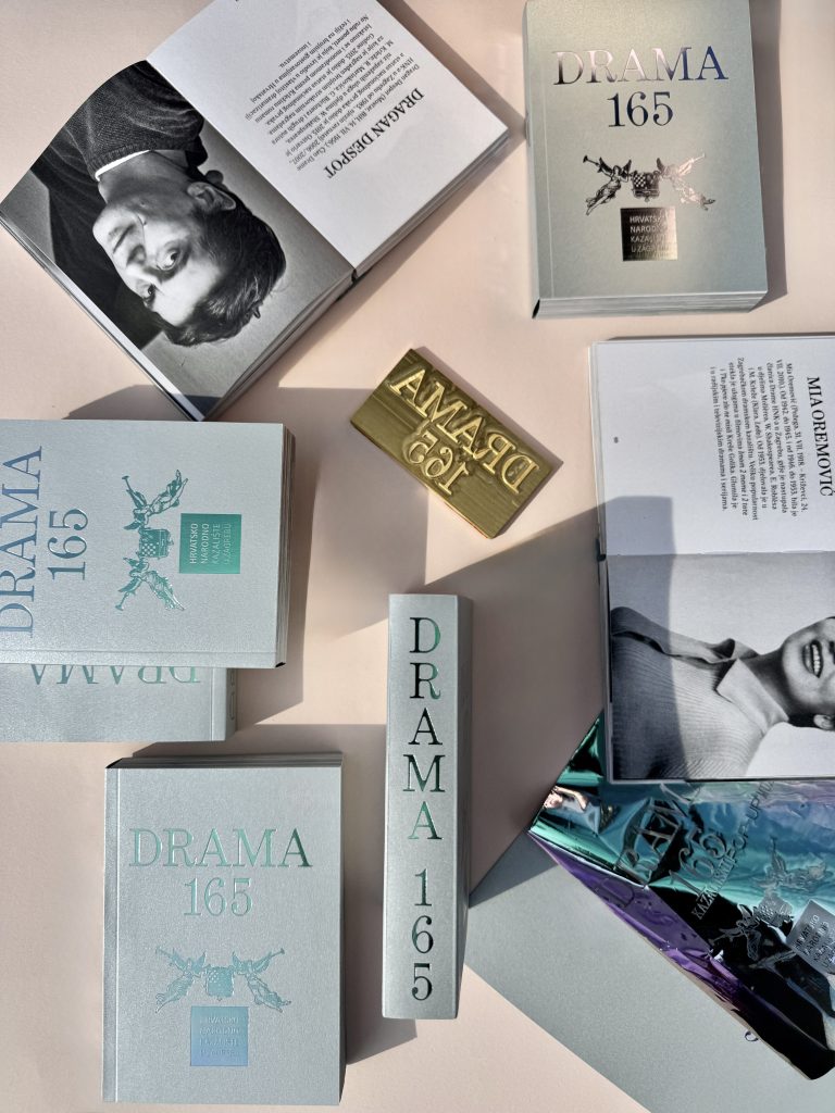
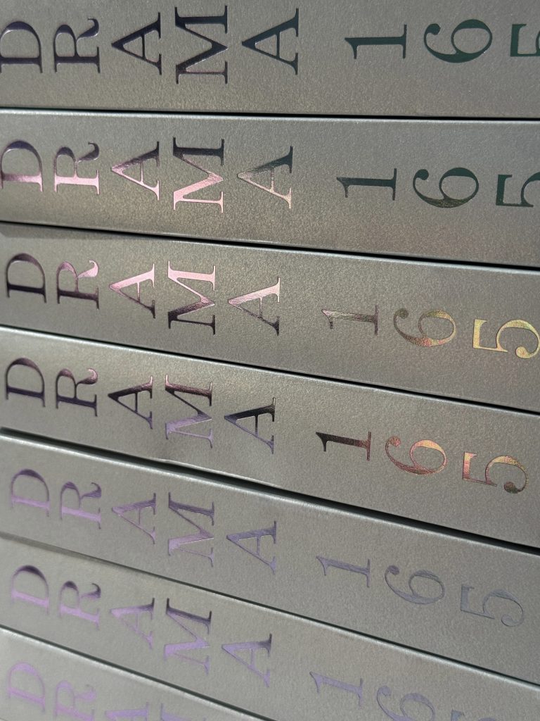
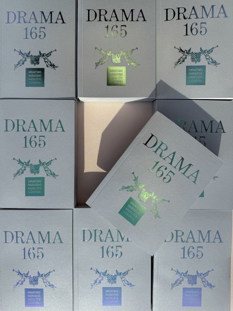
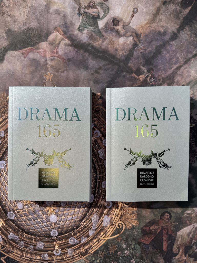
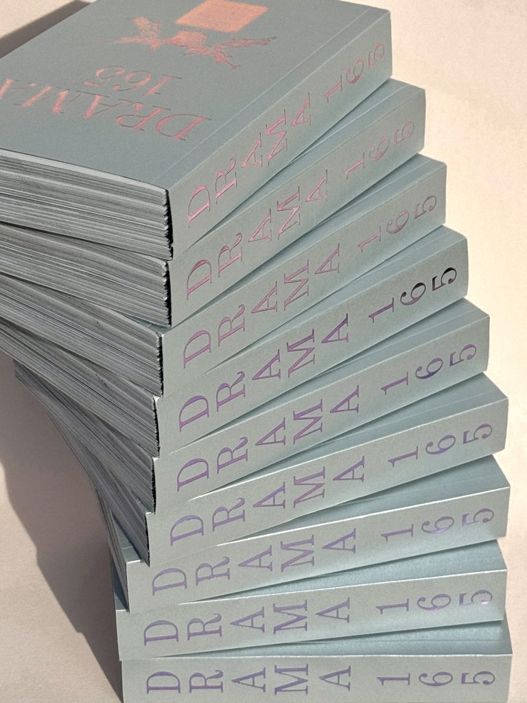
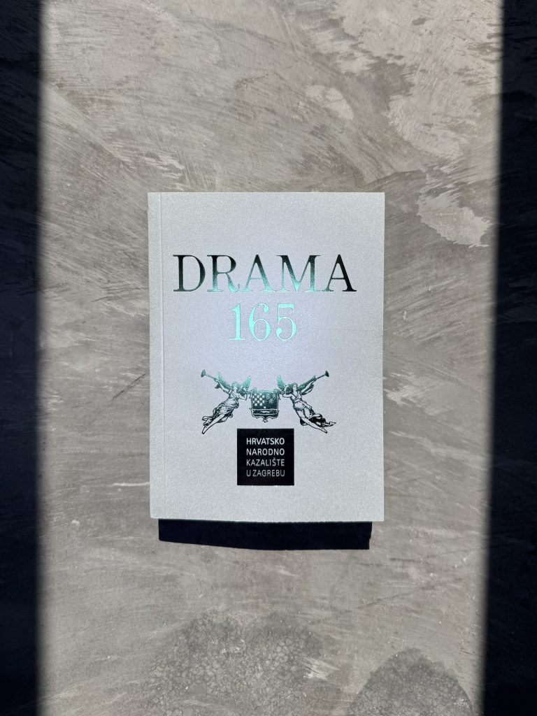
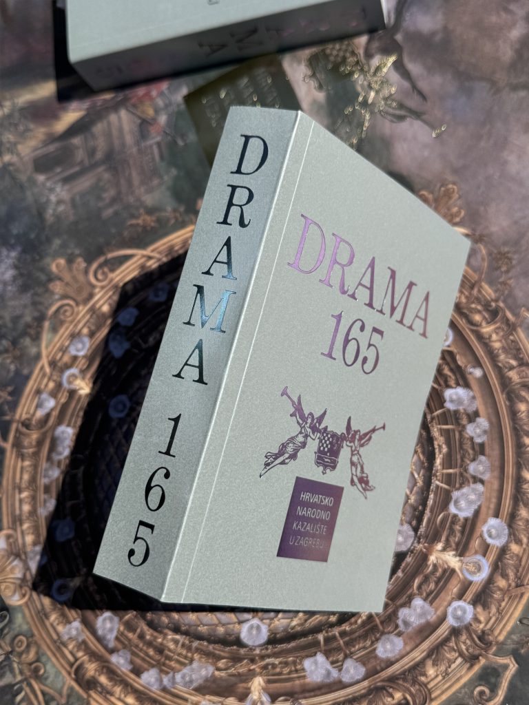
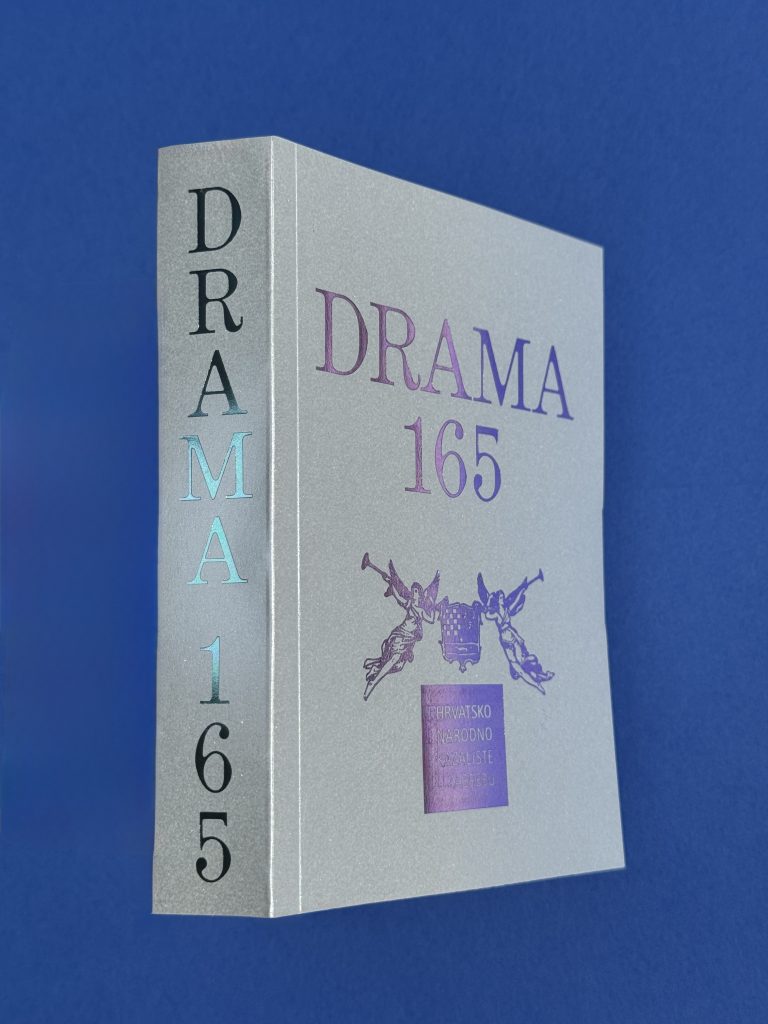
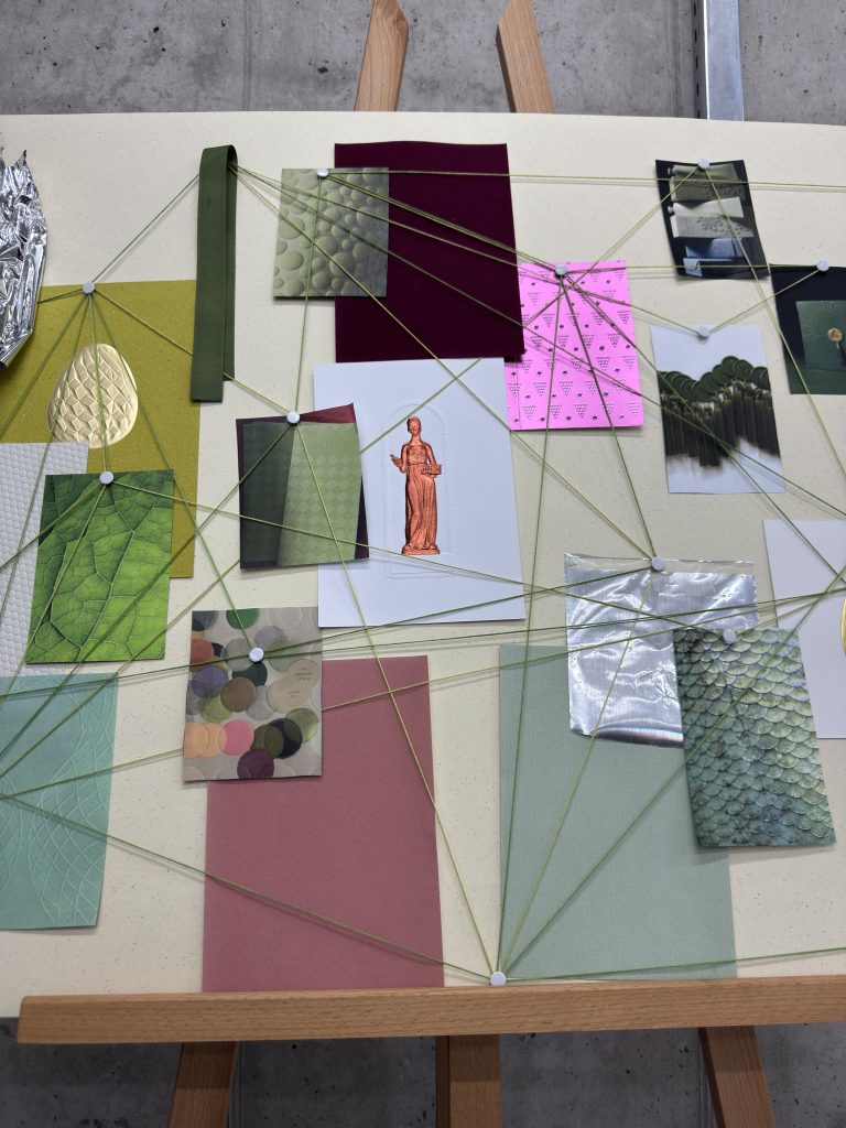
From visual overload to louder logos and endless “quiet luxury” claims: for too long, branding has focused on what we see on screen, while overlooking how we feel. As a response to the digital fatigue, the idea was created to showcase how physical products, from packaging to books, resonate within all our senses: vision, hearing, smell, taste and touch.

Sense Engineering™

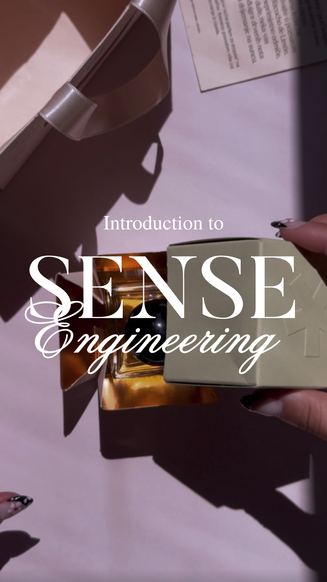
Sense Engineering ™ is a framework exploring how the five human senses shape perception, influence emotion and transform materials into memorable brand experiences. 

We’ll break down each sense and reveal the psychology, craftsmanship and design decisions behind them, as they play big role in marketing and printing industry. 

Because the strongest brands aren’t just seen. They’re sensed.  

Industry

Marketing, FMCG, creative industry, kreativna industrija, kultura, printing industry, tiskarstvo

Tags

#SenseEngineering #LuxuryPackaging #PrintDesign #BrandDNA #Craftsmanship #Foilprint #Foliotisak #zlatotisak #humansenses #senses

Sense 01:

VISION

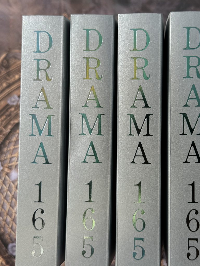
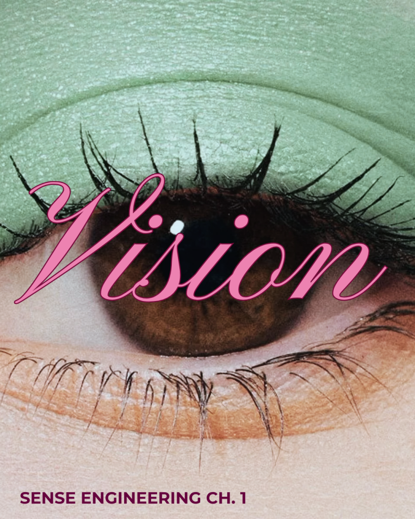
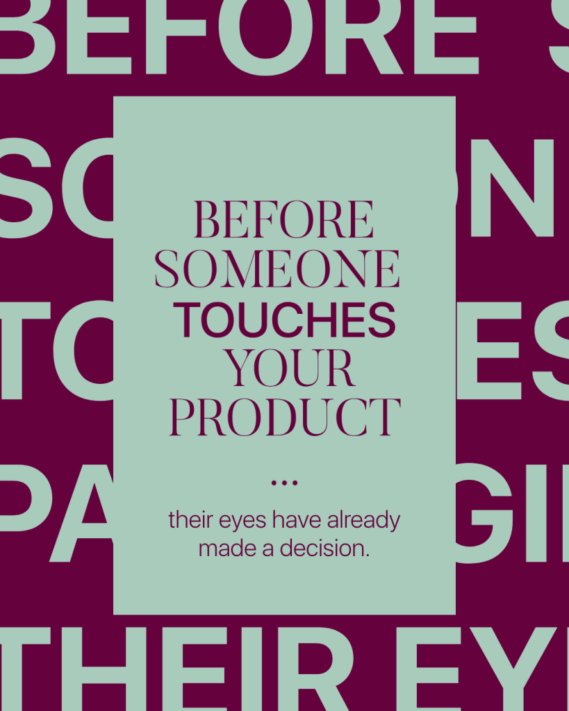
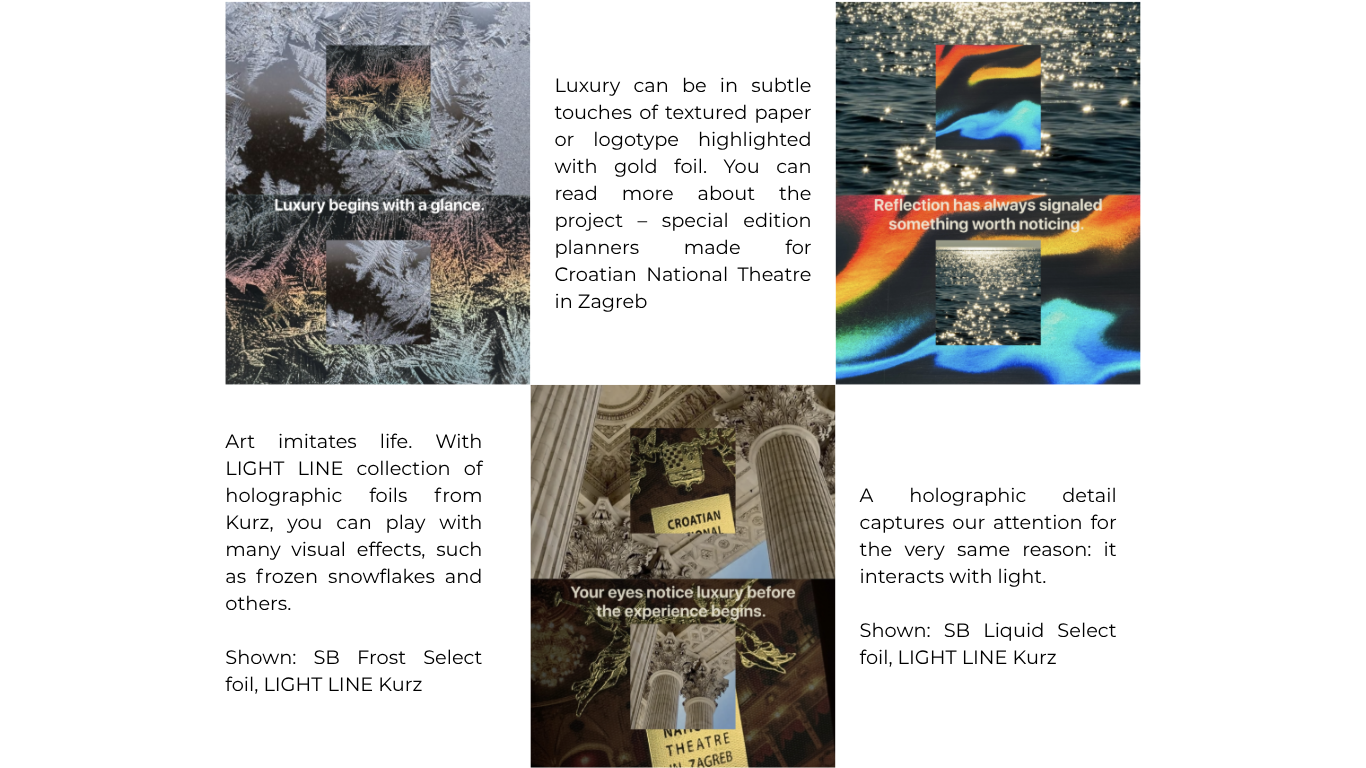
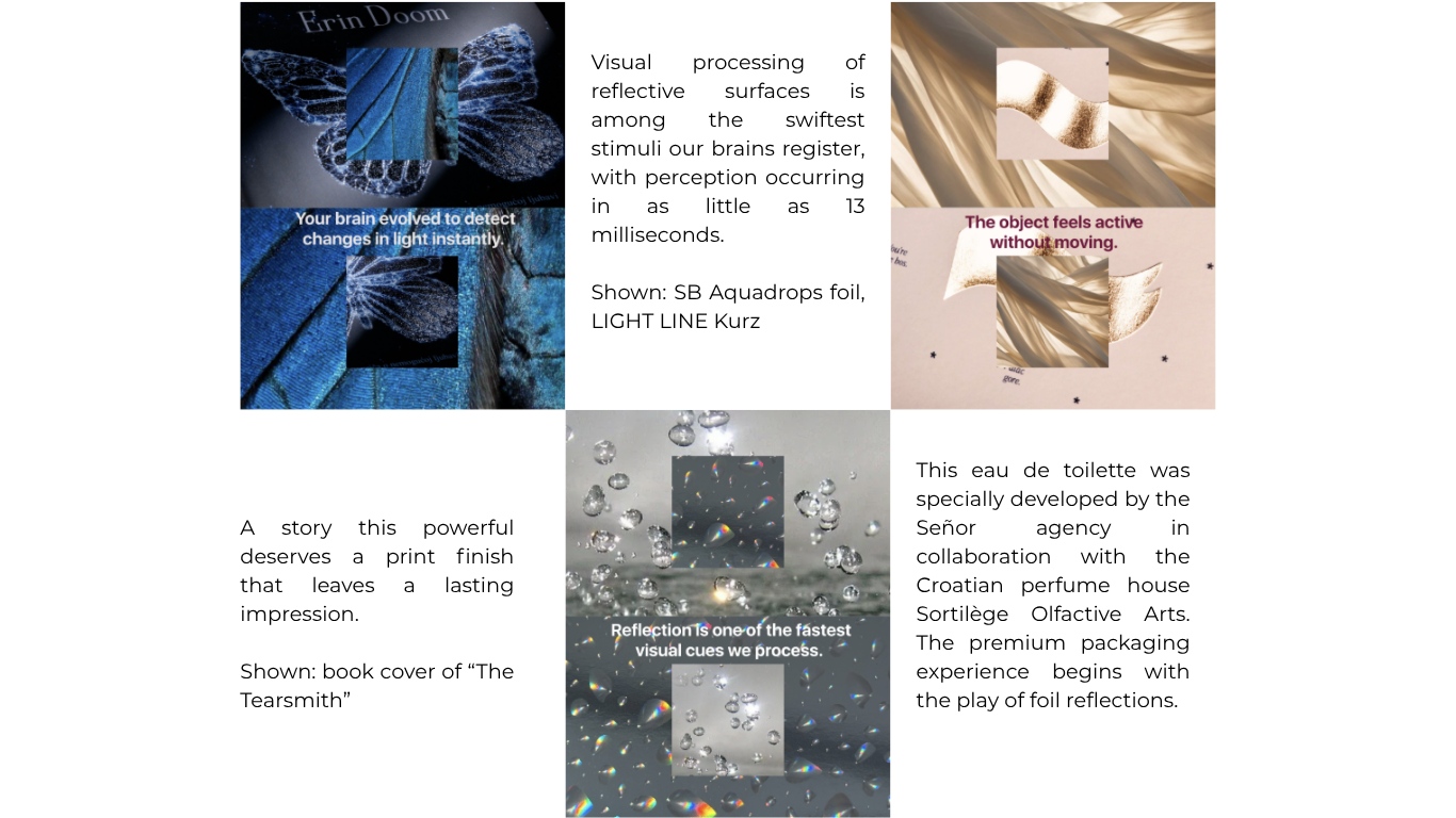
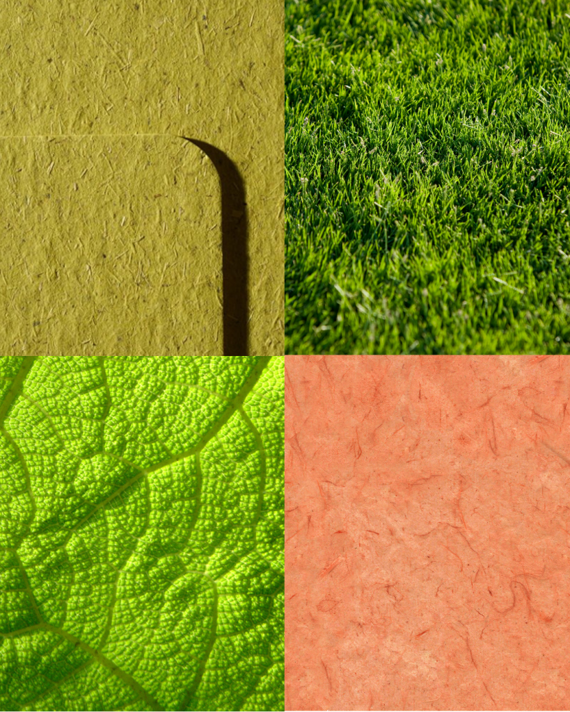
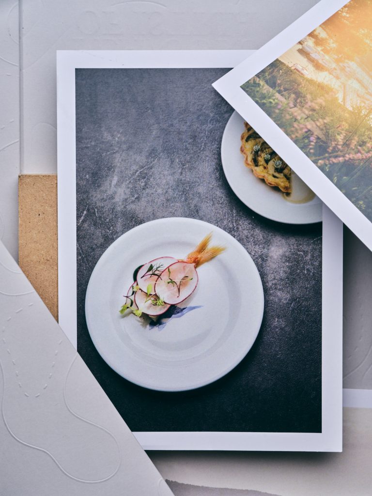
𝙔𝙤𝙪𝙧 𝙚𝙮𝙚𝙨 𝙣𝙤𝙩𝙞𝙘𝙚 𝙡𝙪𝙭𝙪𝙧𝙮 𝙗𝙚𝙛𝙤𝙧𝙚 𝙮𝙤𝙪𝙧 𝙢𝙞𝙣𝙙 𝙛𝙞𝙣𝙙𝙨 𝙩𝙝𝙚 𝙬𝙤𝙧𝙙𝙨.Long before we touch an object, long before we judge its craftsmanship, long before we decide whether we like it - we see it.Our brains are remarkably efficient visual processors. They constantly search for changes in light, contrast and movement, a survival instinct shaped over thousands of years. Water shimmered. Wet surfaces reflected sunlight. Polished stone revealed its form. Reflection often signaled something worth noticing.That instinct never disappeared in modern world, and it is a significant factor for all creative industries, including marketing, graphic and printing industry. It evolved into Sense Engineering™. Before you touch any product, your eyes have already made a decision.

How to incorporate this sense in your design?

Collapse all

Sense 02:

HEARING

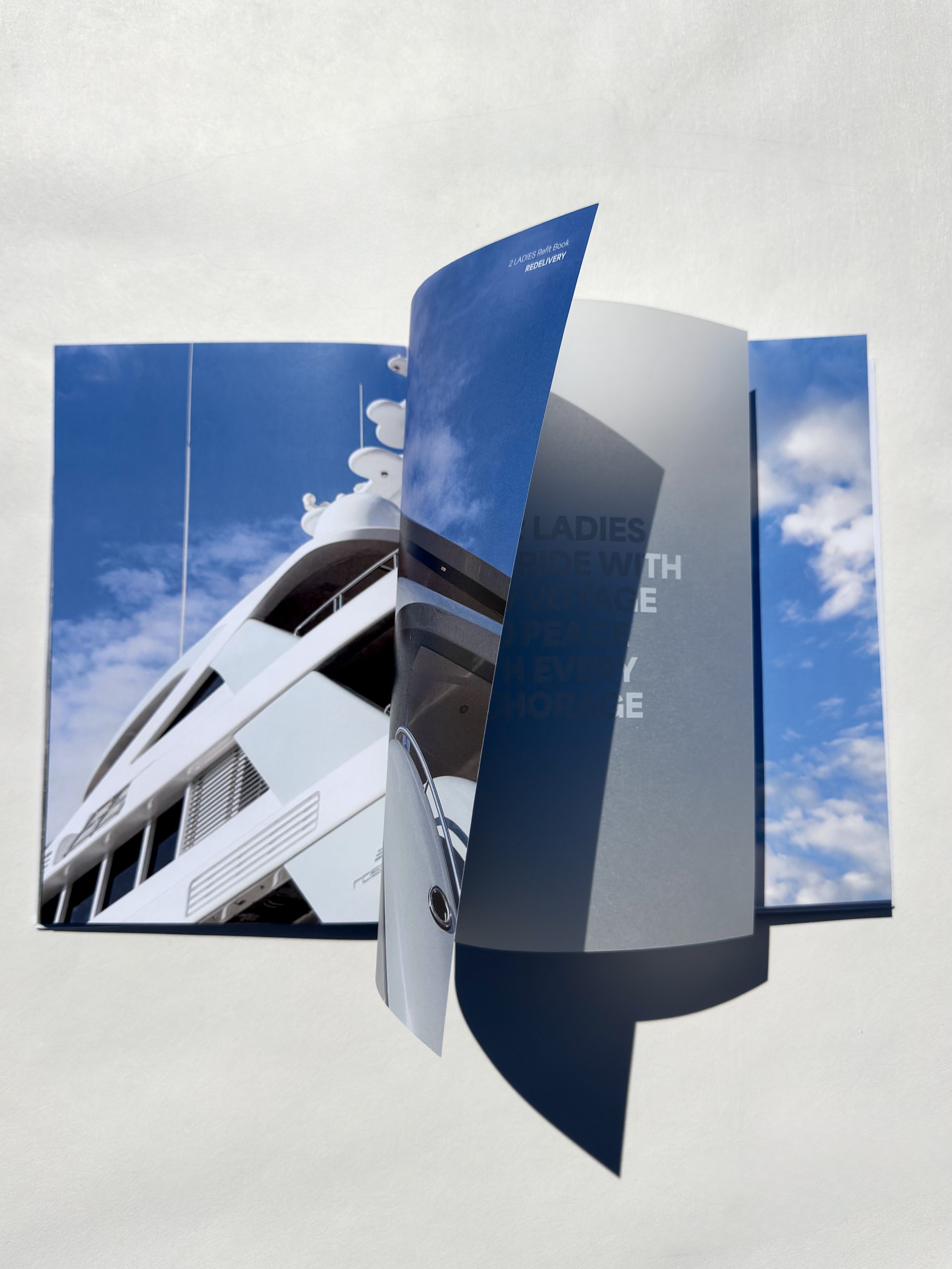
Print begins with a sound. Not the printer, but the experience. The brush of fingertips across textured paper. The slow turn of a heavyweight page. The gentle lift of a rigid box. The whisper of tissue paper unfolding. The satisfying click of a magnetic closure. Every sound tells the brain something before the product is even revealed. Sound signals quality through confidence, not volume.We rarely think of hearing as part of brand design. Yet some of the world's most memorable products are recognized by sound alone. The closing of a luxury car door. The click of a mechanical watch. The opening of a beautifully crafted box.These aren't accidents. They're designed and print is no different. Because print isn't only seen, it’s also heard through Sense Engineering™.

How to incorporate this sense in your design?


The first step is to design with the entire customer experience in mind. Before choosing materials or production techniques, consider the feeling you want your audience to have. Should opening your packaging feel luxurious and deliberate? Exciting and energetic? Calm and understated? Once you've defined the emotional response you want to create, every design decision can support that vision. 

Material selection plays a significant role in the sounds your printed product makes. Heavier paper stocks tend to produce quieter, more muted sounds when handled, creating a sense of quality, stability, and sophistication. Lighter-weight papers, on the other hand, often generate a crisper rustle that can make a product feel more dynamic, playful, or approachable. 

The way your packaging opens is another important consideration. A magnetic closure creates a satisfying click that signals quality and precision. A rigid box lid lifting away slowly produces a gentle release of air, adding a sense of anticipation. Sleeves, folds, ribbons, and pull-tabs all create distinct sounds that become part of the unboxing experience. Rather than treating these as incidental, think of them as design features that enhance the story your packaging tells. 

Thoughtfully chosen materials, finishes, and construction methods transform ordinary interactions into memorable moments, making your print not only seen and felt, but heard as well. That's why companies carefully design packaging sounds to create a positive first impression before you even use the product. 

Collapse all

Sense 03:

SMELL

Smell the moment. Whether is the smell of new book, your favourite perfume, freshly cut grass or simply packaging of new product, every scent is created by a unique combination of materials, molecules, and processes. A single scent can trigger recognition, create associations and bring back memories.Sense Engineering™ shows that print isn't just visual, even the smell becomes part of the final experience. Your nose can recognize thousands of different smells, so it’s important to pay attention to every single detail. The choice of paper, inks, coatings, and finishing techniques influences not only how a final product looks and feels, but also how it is experienced through scent.Smell is one of the most powerful human senses, directly connected to areas of the brain responsible for memory and emotion. Smell is an important part of how we perceive quality, craftsmanship and emotion.

How to incorporate this sense in your design?

Designing with scent doesn't necessarily mean adding fragrance to your printed products. Often, the most memorable sensory experiences come from carefully selecting materials that have their own natural character.

Start by choosing paper intentionally. Uncoated and premium cotton papers often retain their natural fibre scent, creating a warm, authentic impression. Coated papers, on the other hand, have a cleaner, more neutral smell, making them suitable when you want the focus to remain on the design itself.

Consider your printing and finishing techniques. Different inks, varnishes and laminates can subtly alter the scent of a finished product. If smell is an important part of the experience, request production samples and evaluate them once they have fully cured, as freshly printed materials often smell very different from the final product.

For a more immersive experience, explore scented finishes or microencapsulated fragrance coatings. These specialised finishes release a fragrance when rubbed or handled, making them particularly effective for perfume, cosmetics, food, hospitality and luxury brands. As with any design element, the fragrance should complement your brand identity rather than overpower it.


Collapse all

Every scent tells a story. Your next favourite memory might start with a smell.

Sense 04:

TASTE

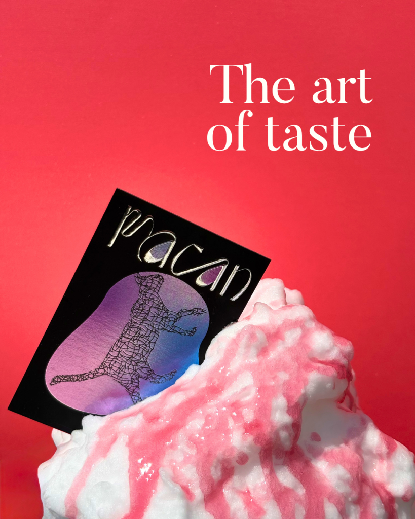
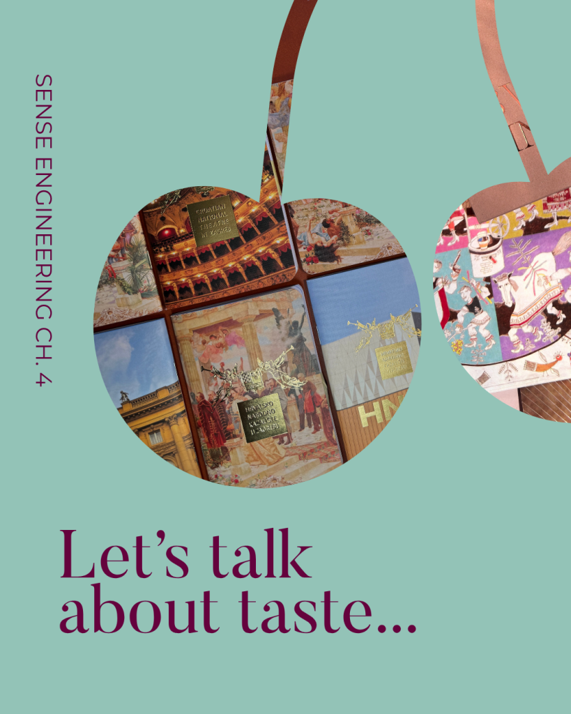
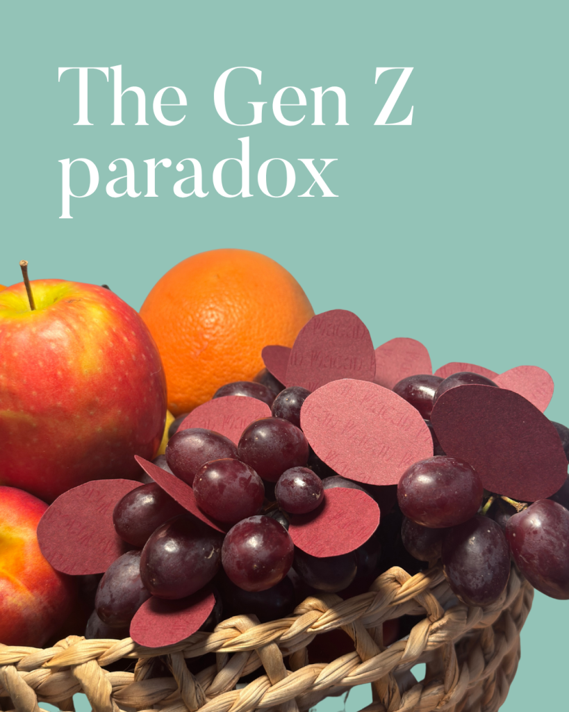
When we talk about taste, it’s not about aesthetics or literal taste. It's not luxury, it's not personal preference. It's judgement - the ability to know what deserves to exist in the first place.So what becomes valuable when creation and production become abundant?A PwC study on “The Gen Z paradox: Spending less, expecting more”, shows that the hesitation to spend less isn't driven by frugality, but by intentionality.The volume is just too high to evaluate individually, so they stop trying altogether. They outsource the decision to someone they trust. The question every brand should now be asking is simple: Is that someone you?And the next time you're approving a piece of work, ask yourself: Why does this deserve to exist?

How to incorporate this sense in your design?

Great design starts with the courage to think beyond the expected. A brand book should provide direction, not limitations. Don't be afraid to explore new formats, materials, techniques or ideas that challenge the usual approach. Creativity often begins when you allow yourself to experiment, test new possibilities and question what has always been done.

At the same time, creativity needs to work hand in hand with practicality. Understand the capabilities of different production methods and use them as part of the creative process. The best designs work with production, not against it, turning technical considerations into opportunities rather than restrictions.

Finally, create a memorable moment. It doesn't matter whether your approach is minimal or expressive - the key is having an element that makes people stop and remember. This could be an unexpected structure, a unique material, a tactile finish or an innovative printing technique. Stay curious about new technologies and production possibilities, as they continue to expand what can be achieved in print.

The goal is not to add more for the sake of it, but to create something purposeful, distinctive and worth experiencing. Tasteful does not mean safe or predictable. The best designs still surprise. When every detail earns its place, it is an experience that feels memorable and valuable.

Collapse all

Sense 05:

TOUCH

When we talk about taste, it’s not about aesthetics or literal taste. It's not luxury, it's not personal preference. It's judgement - the ability to know what deserves to exist in the first place.So what becomes valuable when creation and production become abundant?A PwC study on “The Gen Z paradox: Spending less, expecting more”, shows that the hesitation to spend less isn't driven by frugality, but by intentionality.The volume is just too high to evaluate individually, so they stop trying altogether. They outsource the decision to someone they trust. The question every brand should now be asking is simple: Is that someone you?And the next time you're approving a piece of work, ask yourself: Why does this deserve to exist?

How to incorporate this sense in your design?

In an increasingly digital world while screens capture attention, materials create connection and the simple act of holding thoughtfully made product has become more worthwhile. Texture, weight, and finish aren't just design choices, they're powerful branding tools that transform ordinary product into unforgettable experience.

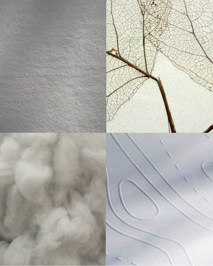
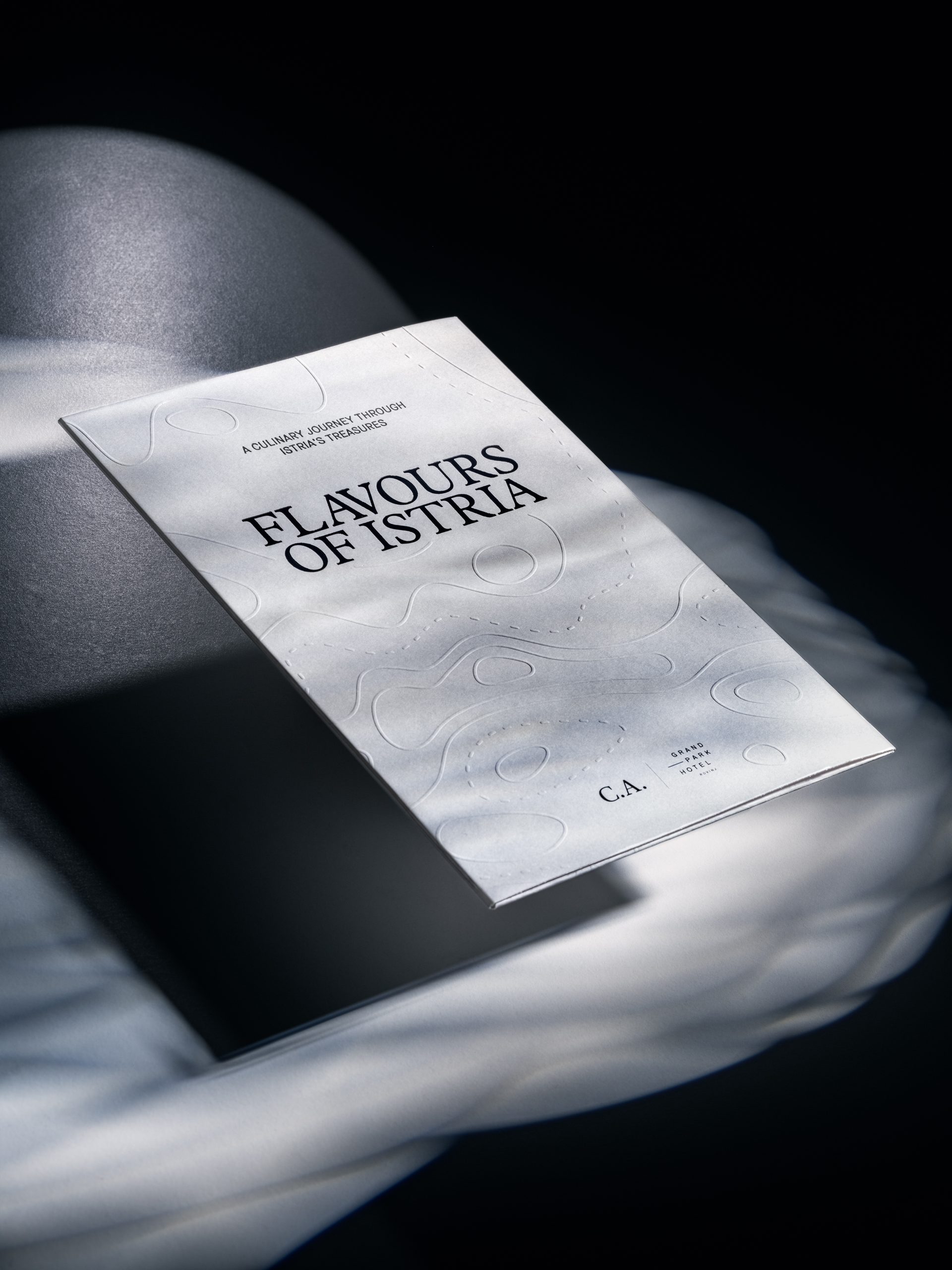
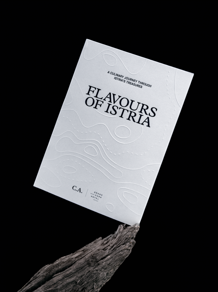
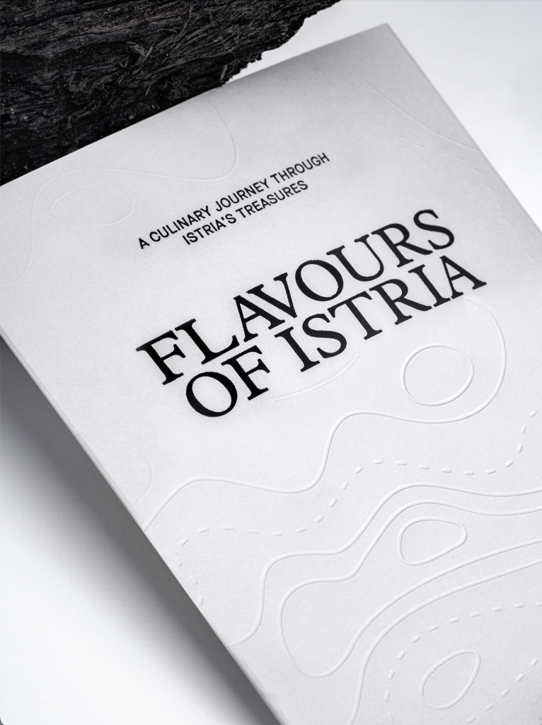
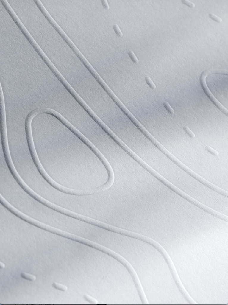
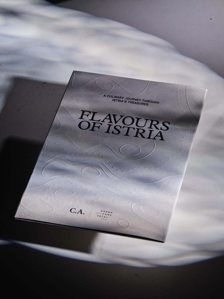
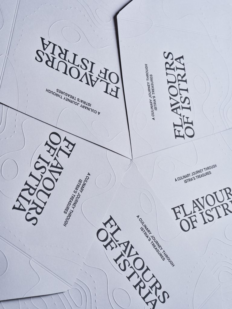
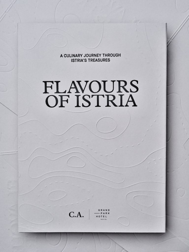
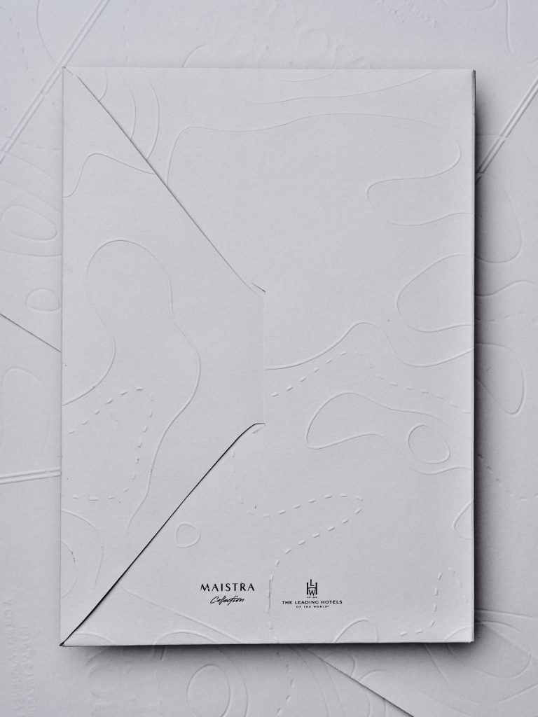
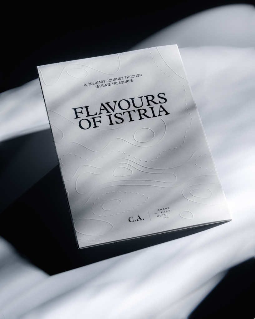
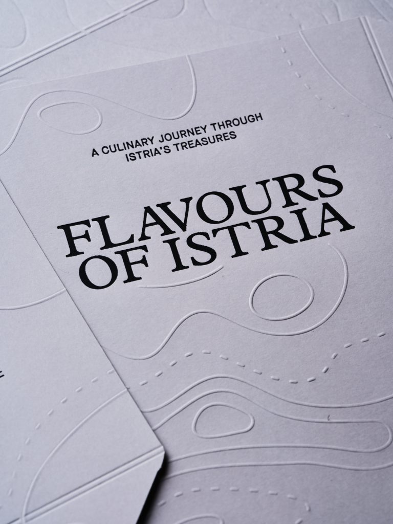
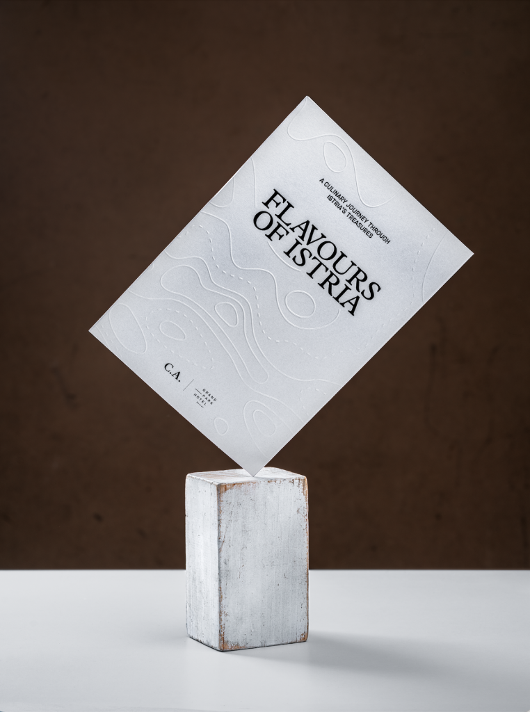
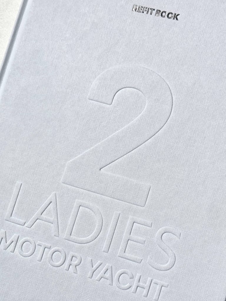
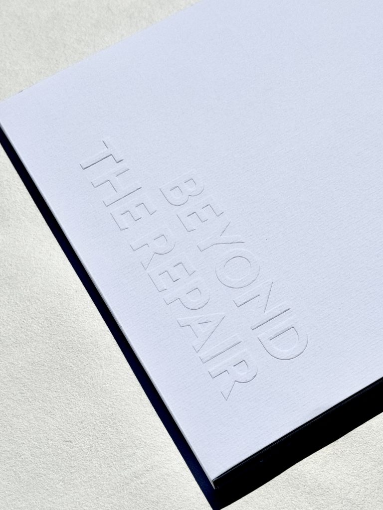
Explore texture to create a more memorable interaction. Embossing, debossing, textured finishes and specialty papers invite people to engage physically with the product. A raised logo, a subtle pattern or a unique surface can turn a simple printed piece into something people want to touch and explore. The attention to texture can be either on micro-level with micro embossing, that plays with the illusion of texture, or the mega tactile approach with 3D embossing and debossing that creates multiple levels in the paper.

Finishing techniques can further shape how a product is perceived. Soft-touch coatings create a smooth, velvety experience that often feels premium and modern, while spot varnishes, raised effects and specialty coatings can transform certain details into moments of surprise.

Touch is one of the most powerful ways we experience the world.

Collapse all

Sense Engineering

In a time when more experiences are becoming digital, physical design has gained a new kind of importance. Experience cannot be measured in pixels. It cannot be compressed into a screen. It exists only in the physical world.Sense Engineering™ is the sound of cotton paper. The resistance of an embossed surface beneath your fingertips. The shimmer of foil as light moves across it. The subtle click of opening a beautifully crafted box. The instinctive feeling that tells you, this is worth keeping.Screens can deliver information instantly, but they cannot replicate the emotional connection created through all of our senses. This is where printing becomes more than production. It becomes a way of expressing craftsmanship and directly interact with your senses. Every choice, from the paper to the way a product is opened, contributes to the story a brand tells.

The most powerful designs are not simply seen. They are experienced.

HNK VREĆICE

HNK vrećice

Klijent

Kategorija

Proizvodnja

Godina

Dijeli

Hrvatsko narodno kazalište u Zagrebu

Packaging

Macan Atelier

2026

+ O projektu

Za Hrvatsko narodno kazalište u Zagrebu smo razvili kolekciju papirnatih vrećica dizajniranih s ciljem proširenja postojećeg vizualnog identiteta institucije i trenutnih promotivnih materijala. Umjesto sagledavanja vrećice kroz samo leću funkcionalnosti, pristupili smo joj kao integralnom dijelu brend iskustva: iskustvo koje reflektira kazališni kulturni značaj, umjetničku izvrsnost i bezvremensku sofisticiranost.

Industrija

Marketing, FMCG, creative industry, kreativna industrija, kultura

Dizajn

Roberta Bratović

Tagovi

#editorialstationery #brandedmaterials #luxurystationery #paperbags #luxurypackaging #FOILPRINT #foliotisak #hotfoil #zlatotisak

Projekt

HNK papirnate vrećice

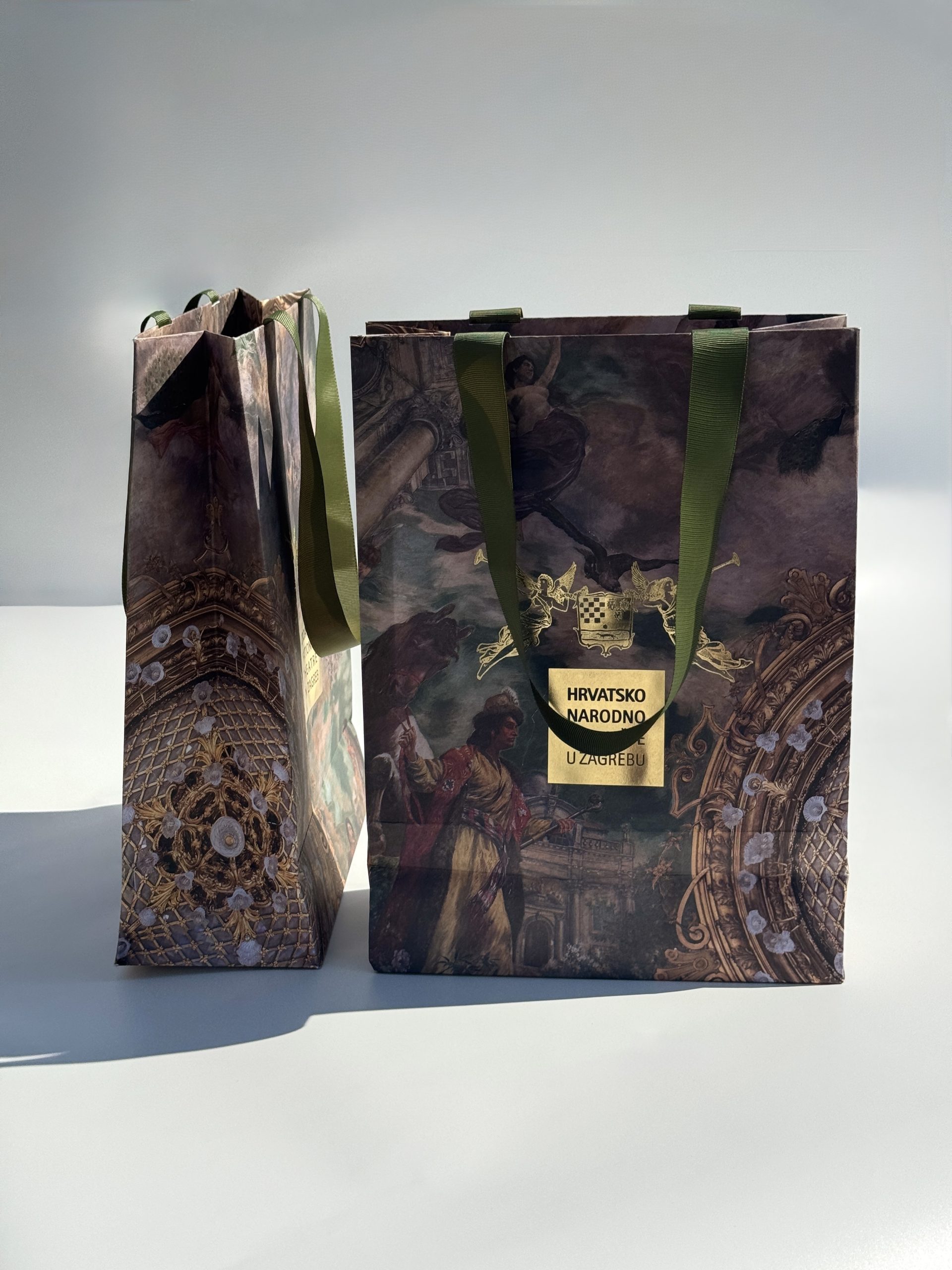
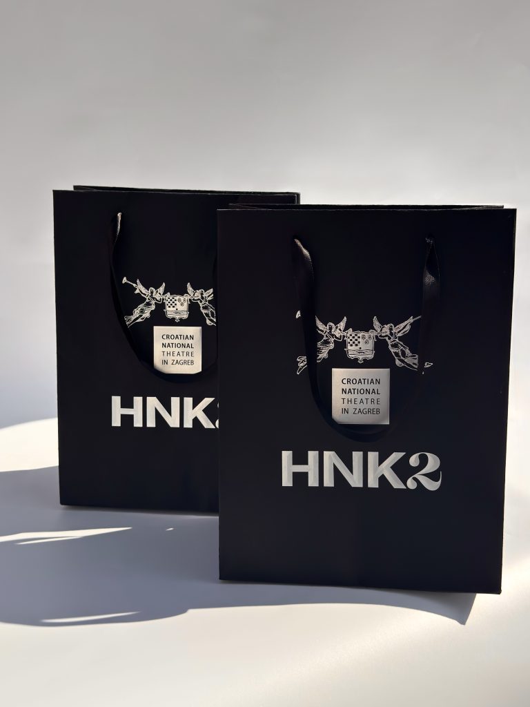
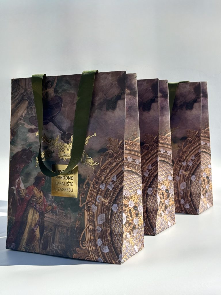
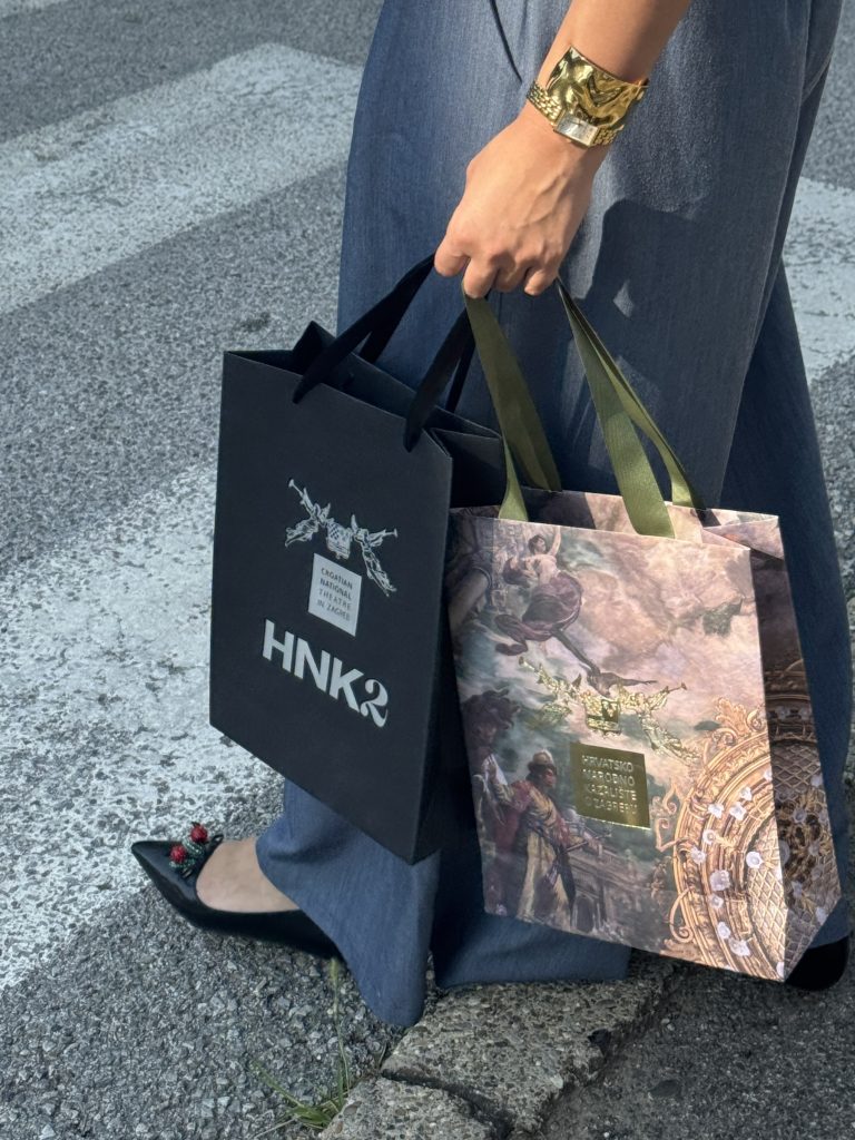
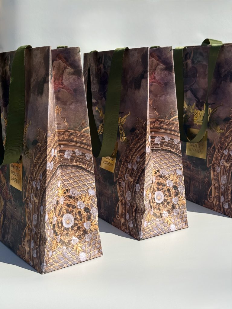
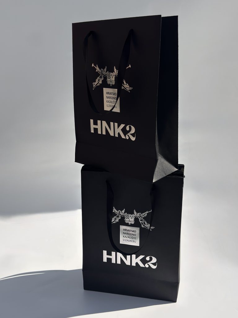
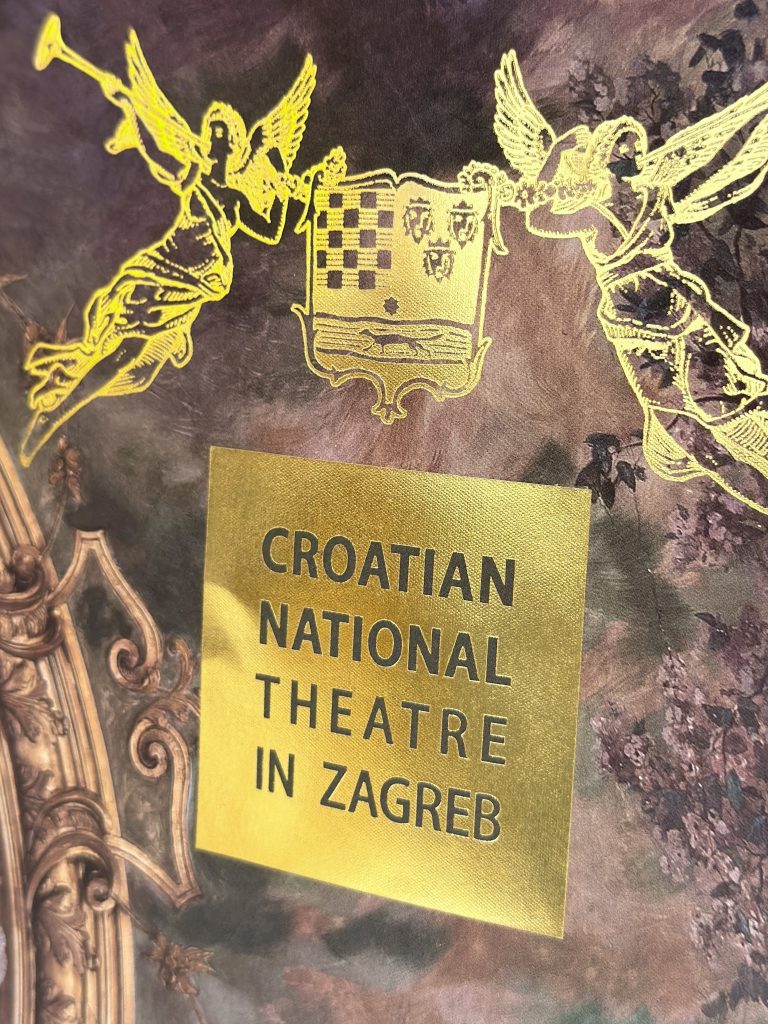
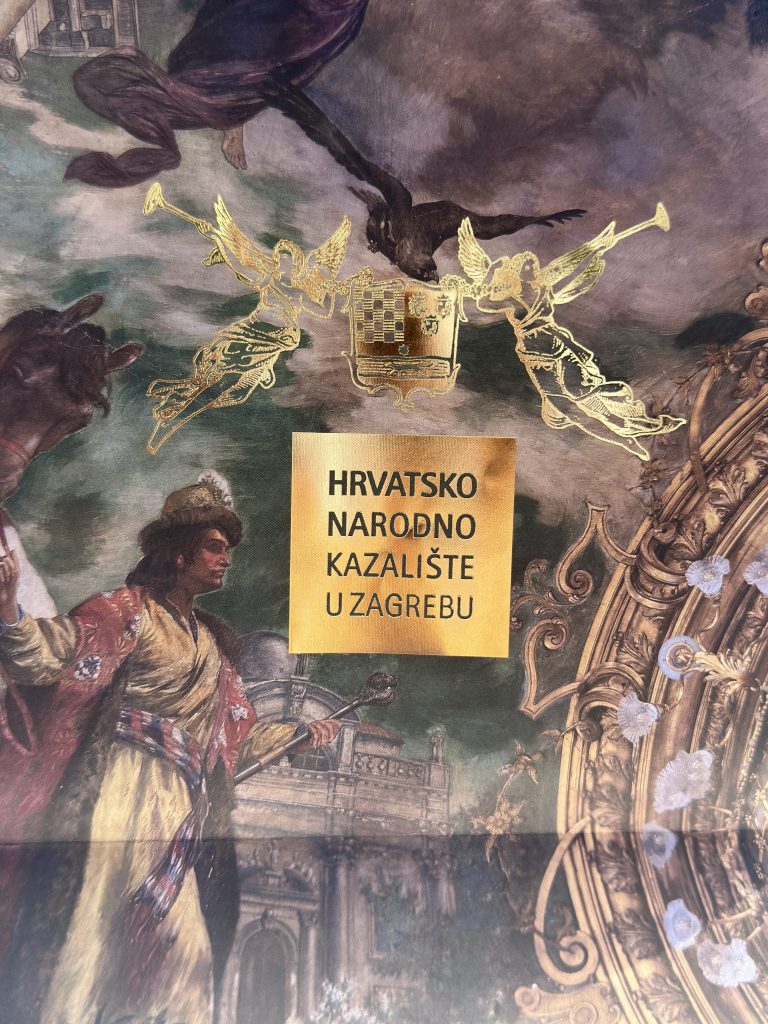
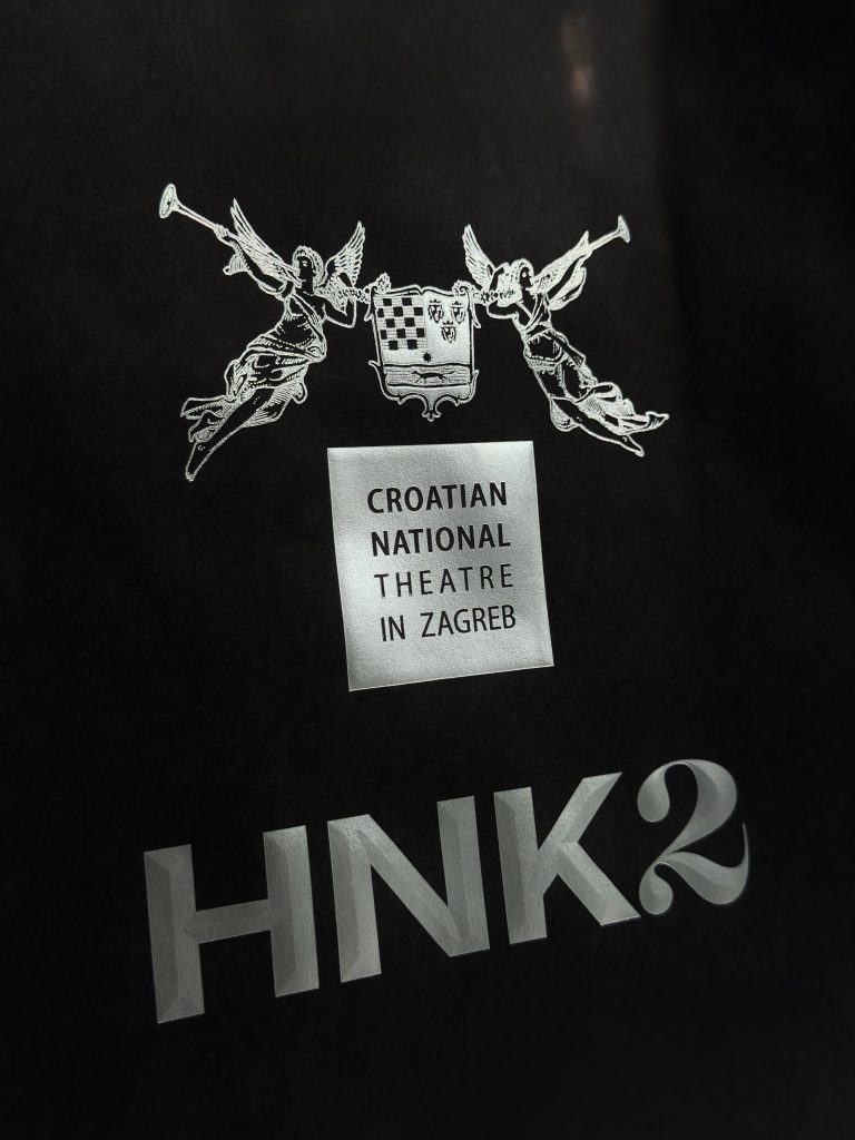
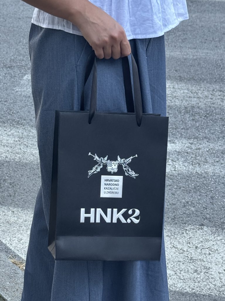
Ova kolekcija sastoji se od dva posebna, ali komplementarna dizajna, svaki od kojih komunicira drugačiji aspekt osobnosti HNK-a u Zagrebu. Prvi dizajn obuhvaća suptilnu eleganciju korištenjem crnog premium Pergraphica papira, gdje luksuzna tekstura papira prenosi osjećaj kvalitete i uglađenosti. S trodimenzionalnim logotipom otisnutim s 3D foliotiskom na najmodernijem stroju za foliotisak marke Gietz, kreira se suptilna igra svjetlosti i sjene. Dodaje se dubina u dizajn bez nadjačavanja kompozicije. Ova suzdržana paleta i taktilnost materijala bude osjećaj “tihog luksuza”, čineći vrećicu tako pažljivo izrađenom kao i niz odličnih predstava i izvedbi koje HNK izvodi. Drugi dizajn, postavljen u kontrastu s prvim, nudi odvažan vizualni “statement”. S ekspresivnom grafikom isprintatom po cijeloj površini vrećice na teksturiranom Fedrigoni papiru i akcentima zlatne folije, ova vrećica plijeni pažnju uz zadržavanje osjećaja sofisticiranosti. Dinamika kompozicije transformira ovu poklon vrećicu u predmet koji ostaje u sjećanju dugo nakon što je događaj završio, čime etablira kazališni brand identitet kroz vizualni storytelling. Pažljivo dizajnirani brendirani materijali imaju moć komunicirati puno više od puke informacije. Oni kreiraju atmosferu, bude emocije i osnažuju povezanost između institucije i njene publike.

TECNOLOGIJE

2D zlatotisak

3D foliotisak

Digitalni print

Digitalni cut

Prototipiranje

Kada je svaki detalj – od vrste papira do embellishment tehnika tiska – pomno odabran, čak i najjednostavniji promotivni materijal postaje značajni element brenda.

Vaši brendirani materijali trebaju biti u duhu editorijala – trebaju biti pažljivo kreirani, a ne samo proizvedeni. Oni mogu proširiti Vaš vizualni jezik kombinacijom posebnih materijala, profinjene izrade i snažnog dizajna za stvaranje predmeta koji ostavljaju trajan dojam.

ZAGREB CLASSIC MAGNETI

HNK bags

Client

Category

Production

Year

Share

Croatian National Theatre in Zagreb

Packaging

Macan Atelier

2026

About project

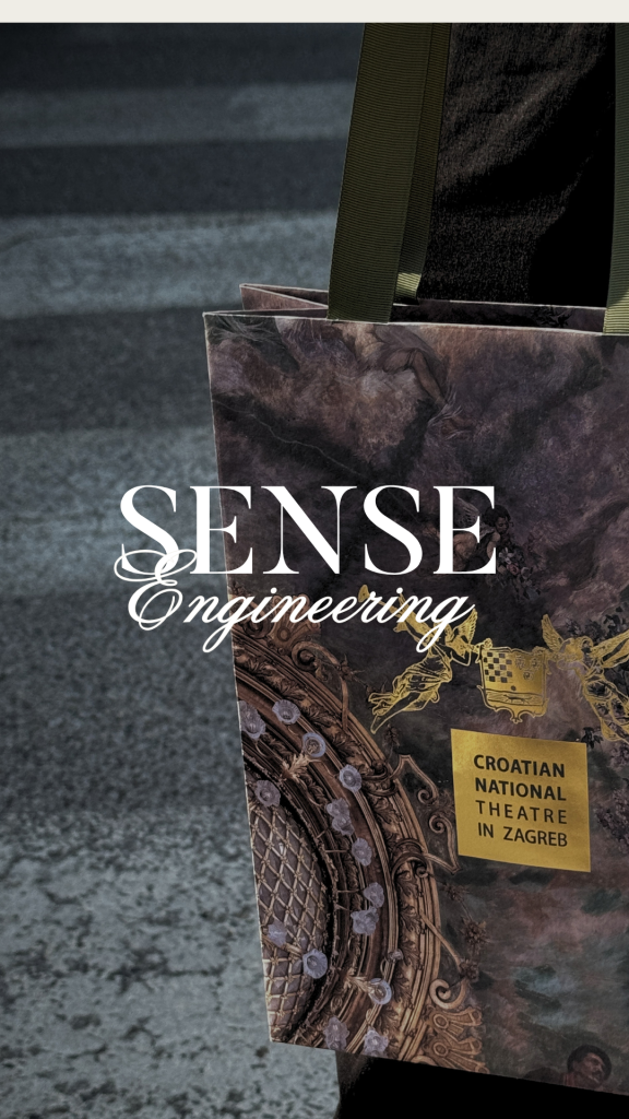
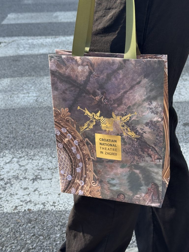
For the National Theatre in Zagreb, we developed a bespoke collection of paper gift bags designed to extend and enrich the institution’s visual identity beyond its core promotional materials. Rather than treating packaging as a purely functional object, we approached it as an integral part of the brand experience: one that reflects the theatre’s cultural significance, artistic excellence, and timeless sophistication. 

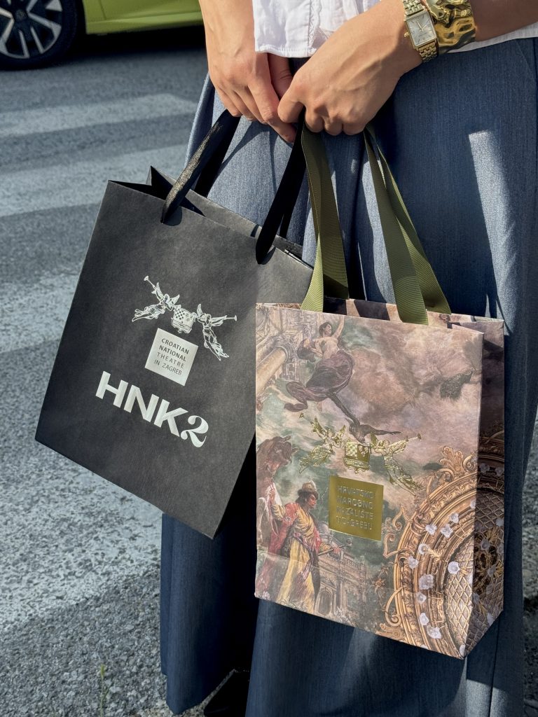
The collection consists of two distinct yet complementary designs, each communicating a different aspect of the theatre’s personality. The first embraces understated elegance through the use of premium black Pergraphica paper, whose rich texture immediately conveys quality and refinement. A three-dimensional logotype, finished with matte silver hot foil, creates a subtle play of light and shadow, adding depth without overpowering the composition. The restrained palette and tactile materials evoke a sense of quiet luxury, making the bag feel as carefully crafted as the performances it represents. 

Industry

Marketing, FMCG, event, culture, creative, promo

Design

Roberta Bratović

Tags

#editorialstationery #brandedmaterials #luxurystationery #paperbags #luxurypackaging 

Project

HNK paper bags

The collection consists of two distinct yet complementary designs, each communicating a different aspect of the theatre's personality. The first embraces understated elegance through the use of premium black Pergraphica paper, whose rich texture immediately conveys quality and refinement. A three-dimensional logotype, finished with matte silver hot foil, creates a subtle play of light and shadow, adding depth without overpowering the composition. The restrained palette and tactile materials evoke a sense of quiet luxury, making the bag feel as carefully crafted as the performances it represents. 

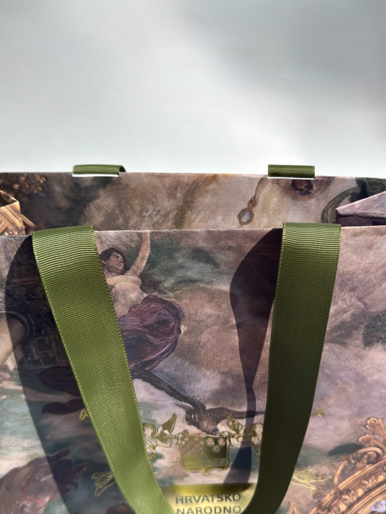
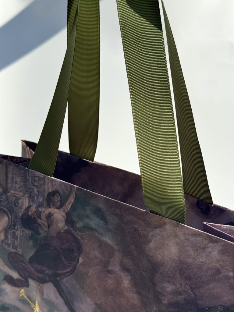
In contrast, the second design offers a bold visual statement. Featuring expressive printed graphics enhanced with gold foil accents, it captures attention while maintaining a sense of sophistication. The dynamic composition transforms the gift bag into a memorable object that stands out long after an event has ended, reinforcing the theatre's identity through striking visual storytelling. 

Thoughtfully designed branded materials have the power to communicate far more than information. They create atmosphere, evoke emotion, and strengthen the connection between an institution and its audience. When every detail, from paper selection to finishing techniques, is considered with intention, even the simplest promotional item becomes a meaningful extension of the brand. 

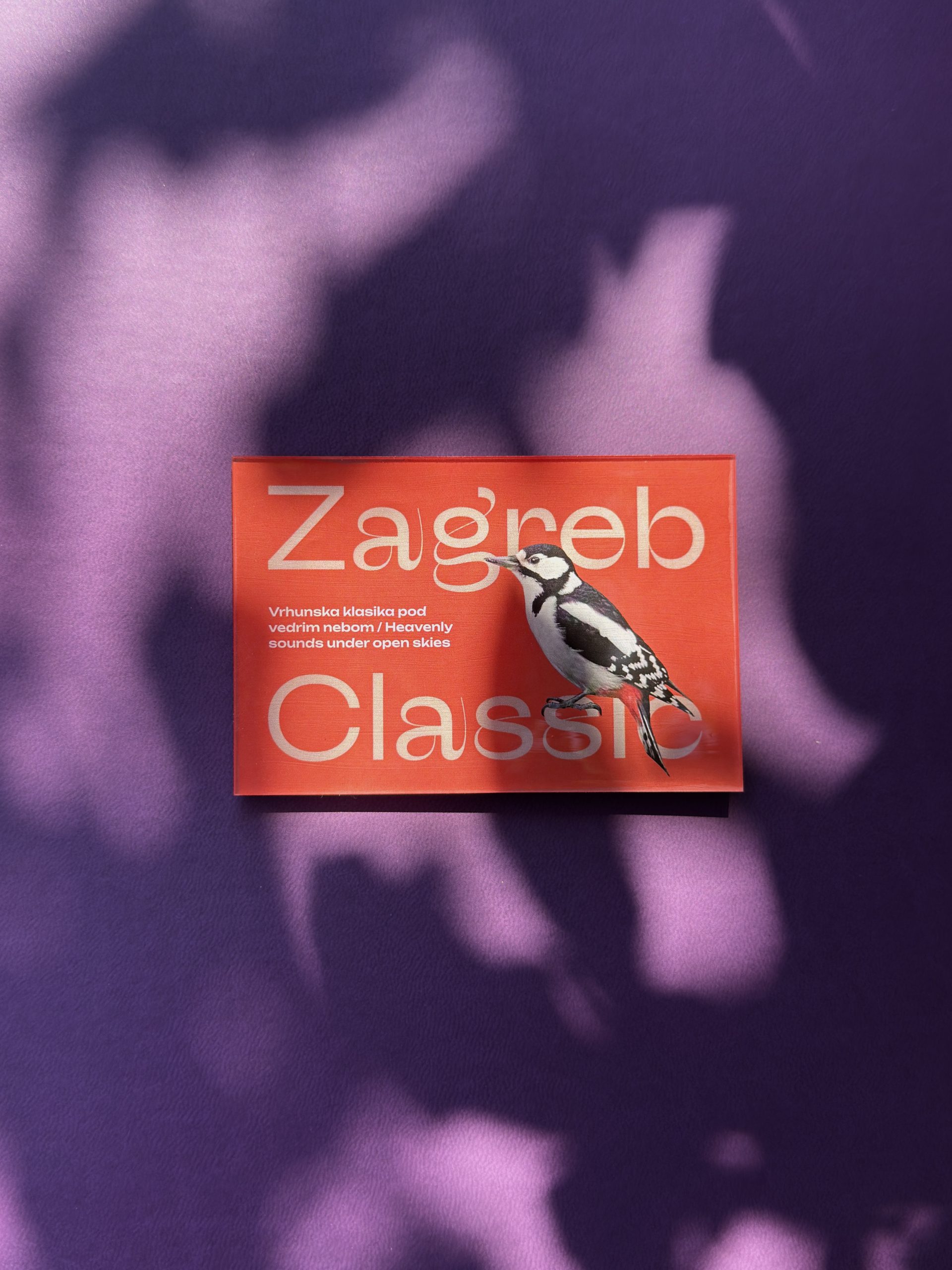
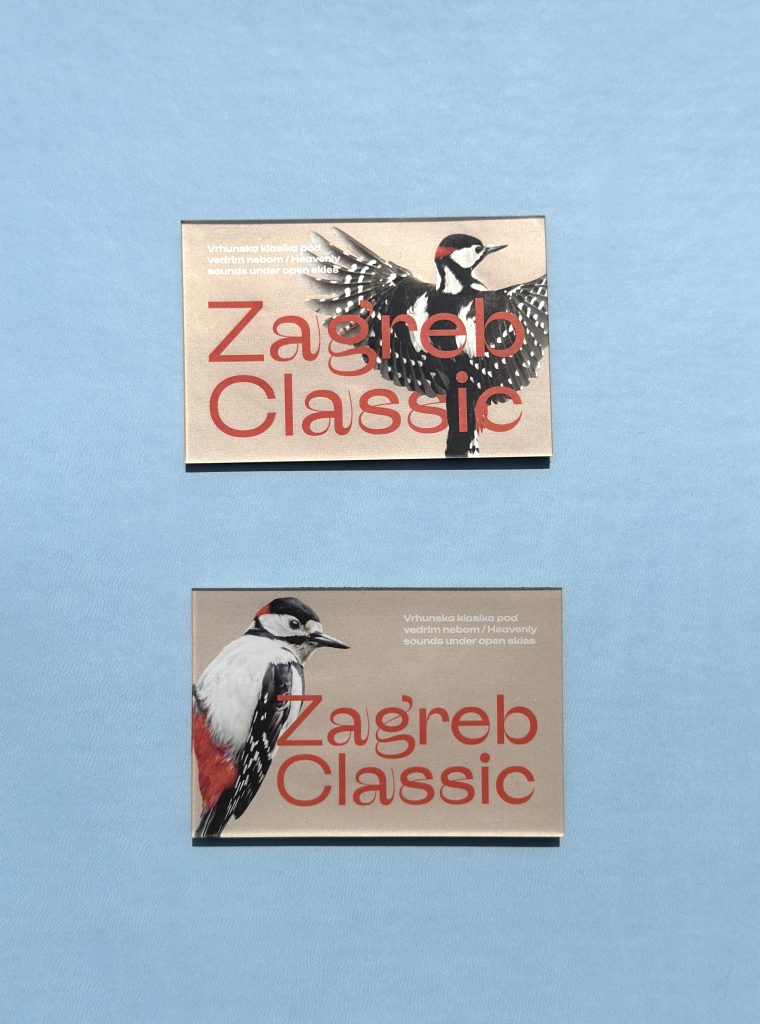
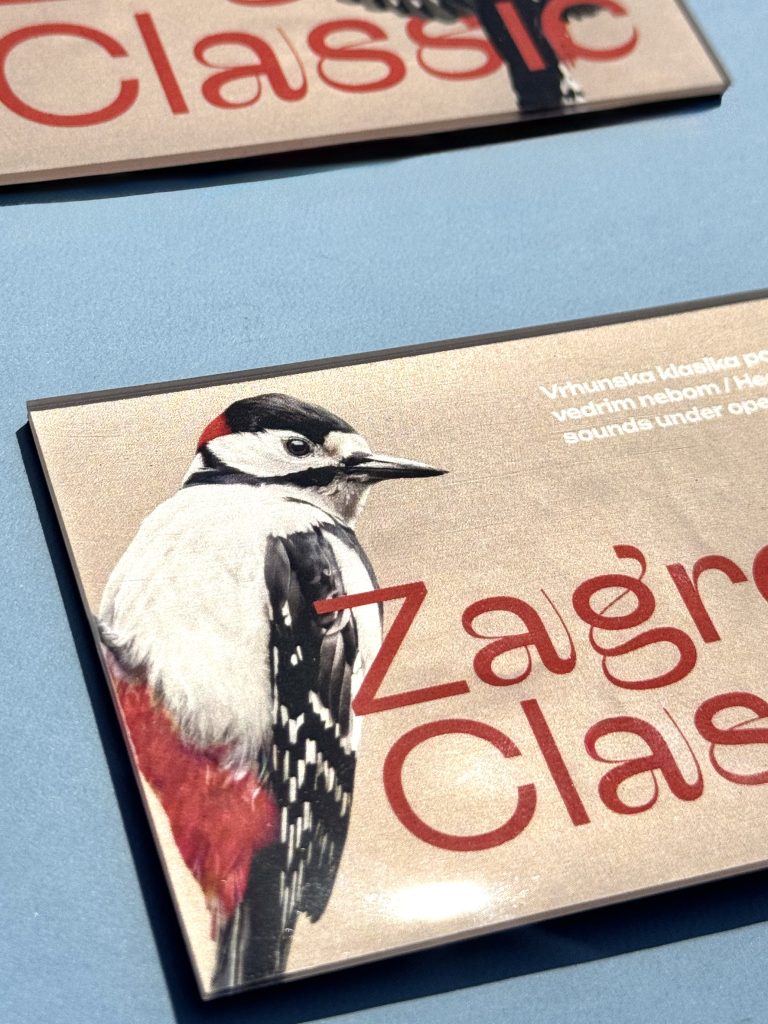
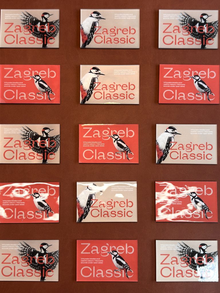
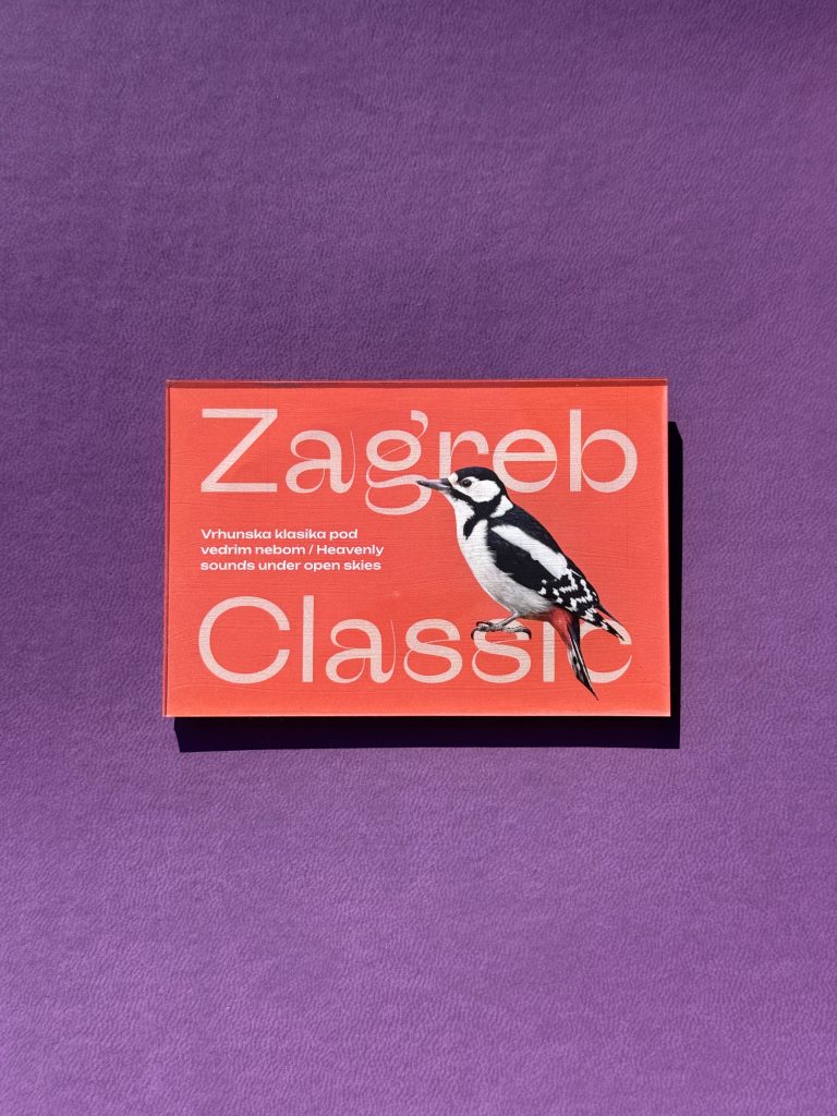
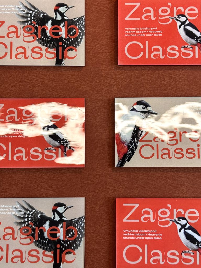
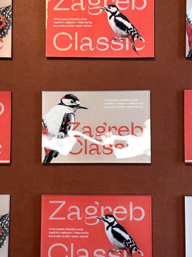
Ovaj magnet osmišljen je kao mali podsjetnik na posebnu atmosferu Zagreb Classica – toplih ljetnih večeri ispunjenih glazbom, druženjem i jedinstvenim doživljajem kulture u srcu grada. Više od promotivnog artikla, magnet je suvenir koji čuva uspomenu na trenutke zbog kojih se publika iz godine u godinu vraća ovom festivalu.Za izradu magneta korišten je digitalni tisak u kombinaciji sa štancanjem, što mu daje prepoznatljiv oblik i uredne, čiste rubove. Završni sloj UV laka daje mu elegantan sjaj i dodatno naglašava detalje dizajna i stvara dojam kvalitete. Rezultat je kvalitetan i upečatljiv suvenir koji vjerno prenosi duh Zagreb Classica.

TEHNIKE TISKA

Digitalni print

Štancanje

UV lak

Ovaj magnet je kvalitetan i upečatljiv suvenir koji vjerno prenosi duh Zagreb Classica.

MAPA SVEČANI ZASTORI HNK-A U ZAGREBU

MAPA: SVEČANI ZASTORI HNK-A U ZAGREBU

Klijent

Kategorija

Proizvodnja

Godina

Podijeli

Hrvatsko narodno kazalište u Zagrebu

Brendirani promo

Macan Atelier

2025

+ O projektu

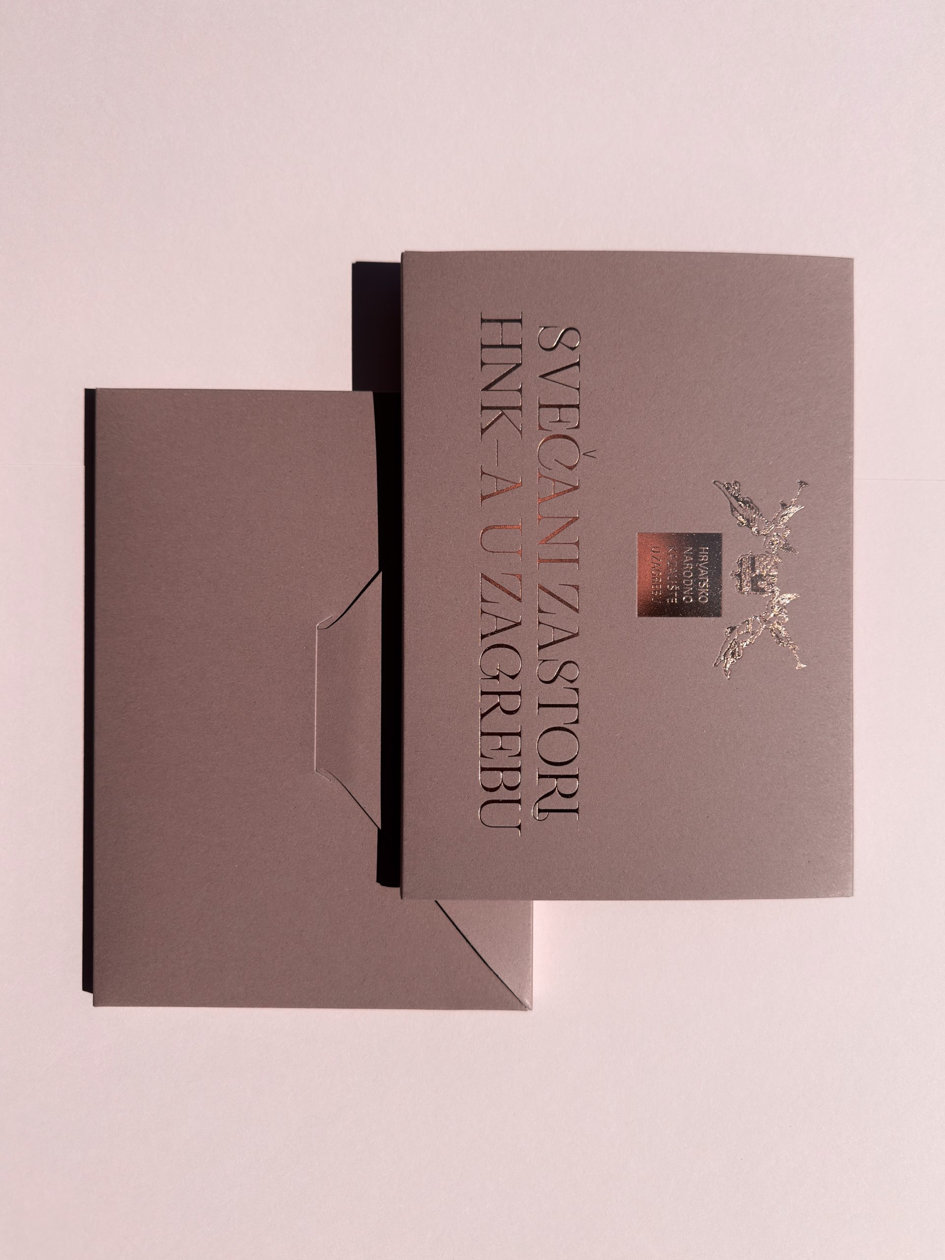
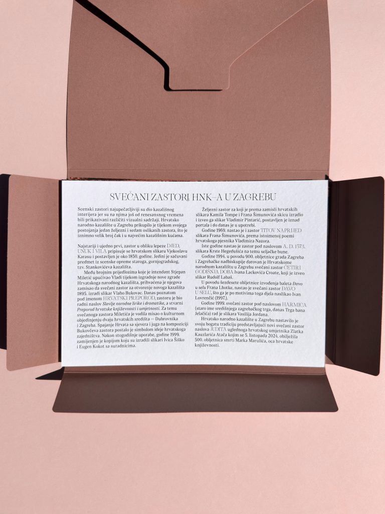
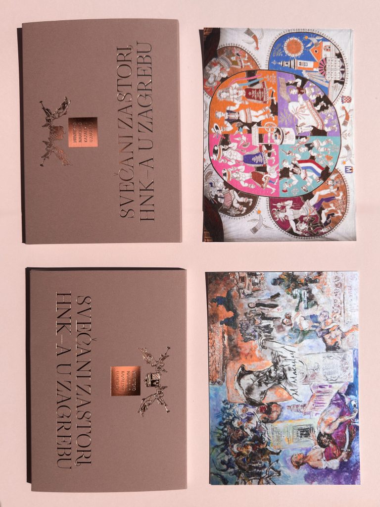
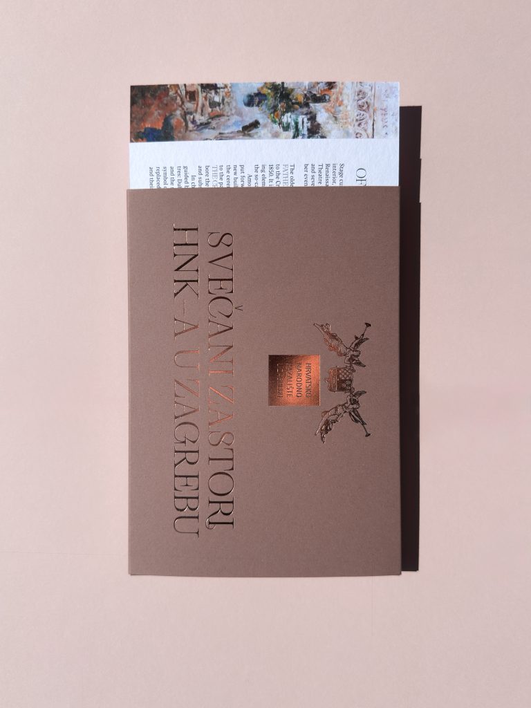
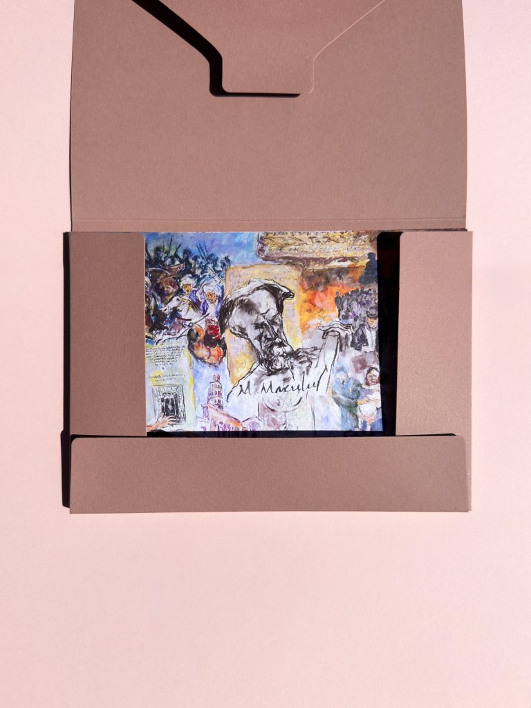
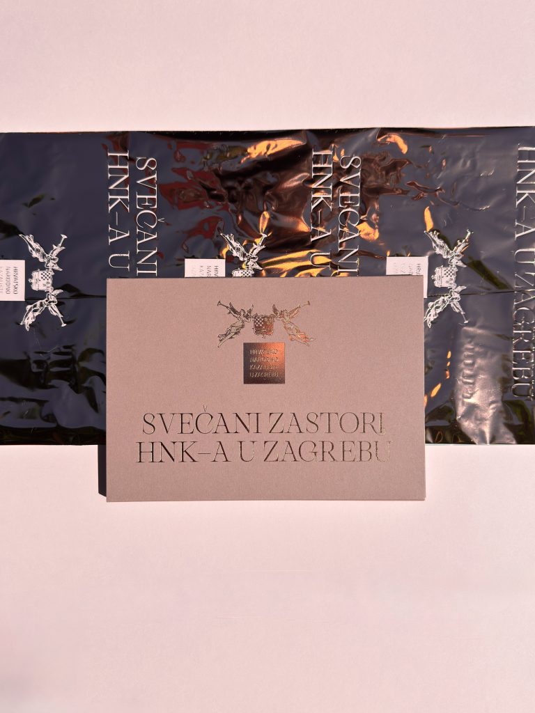
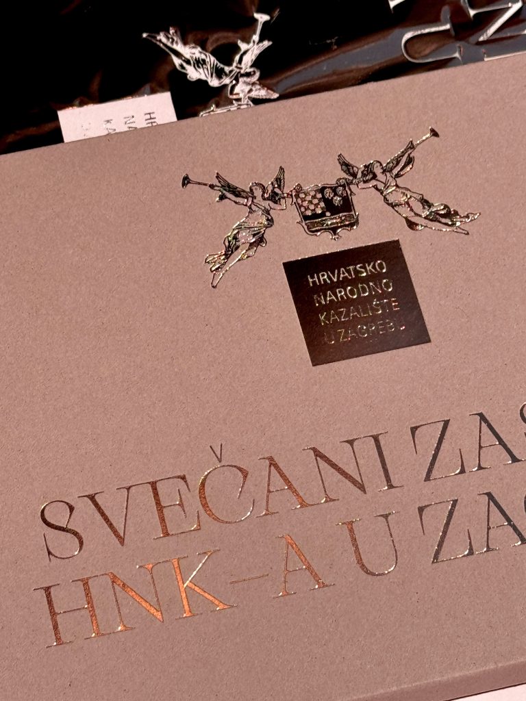
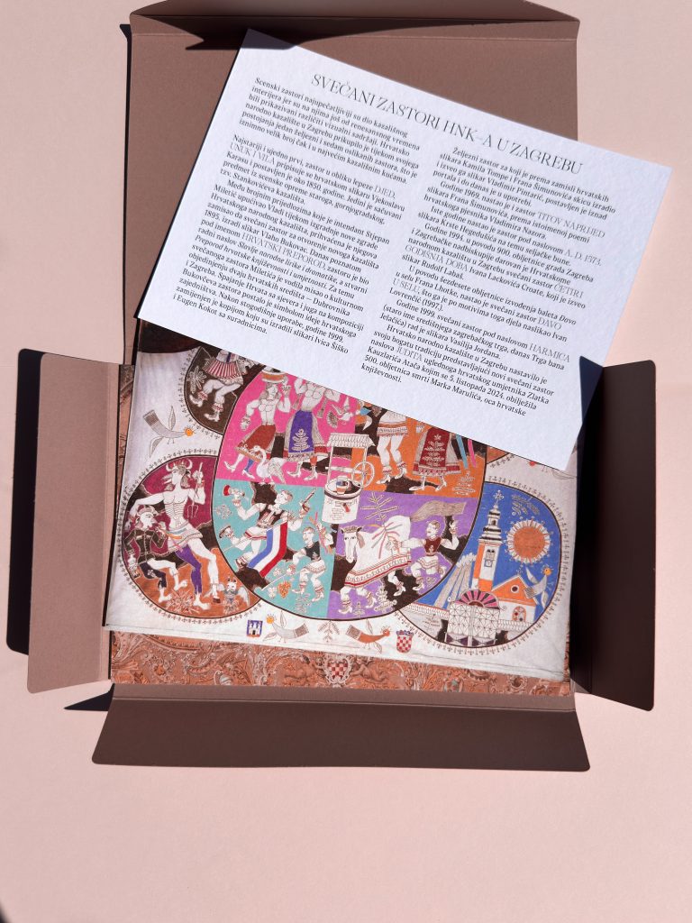
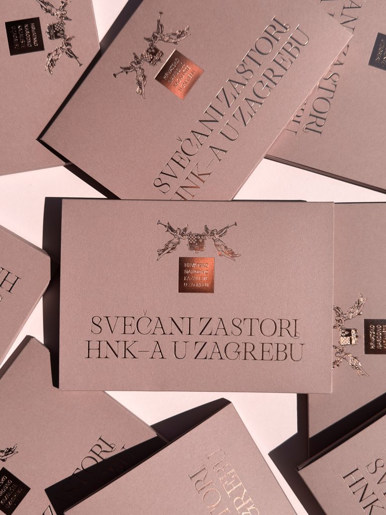
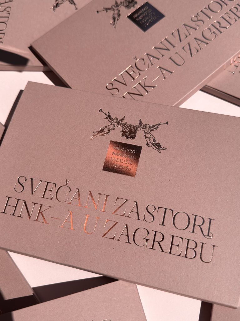
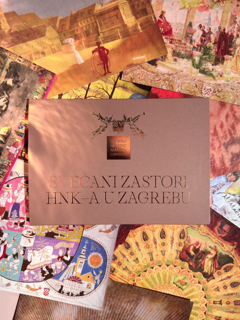
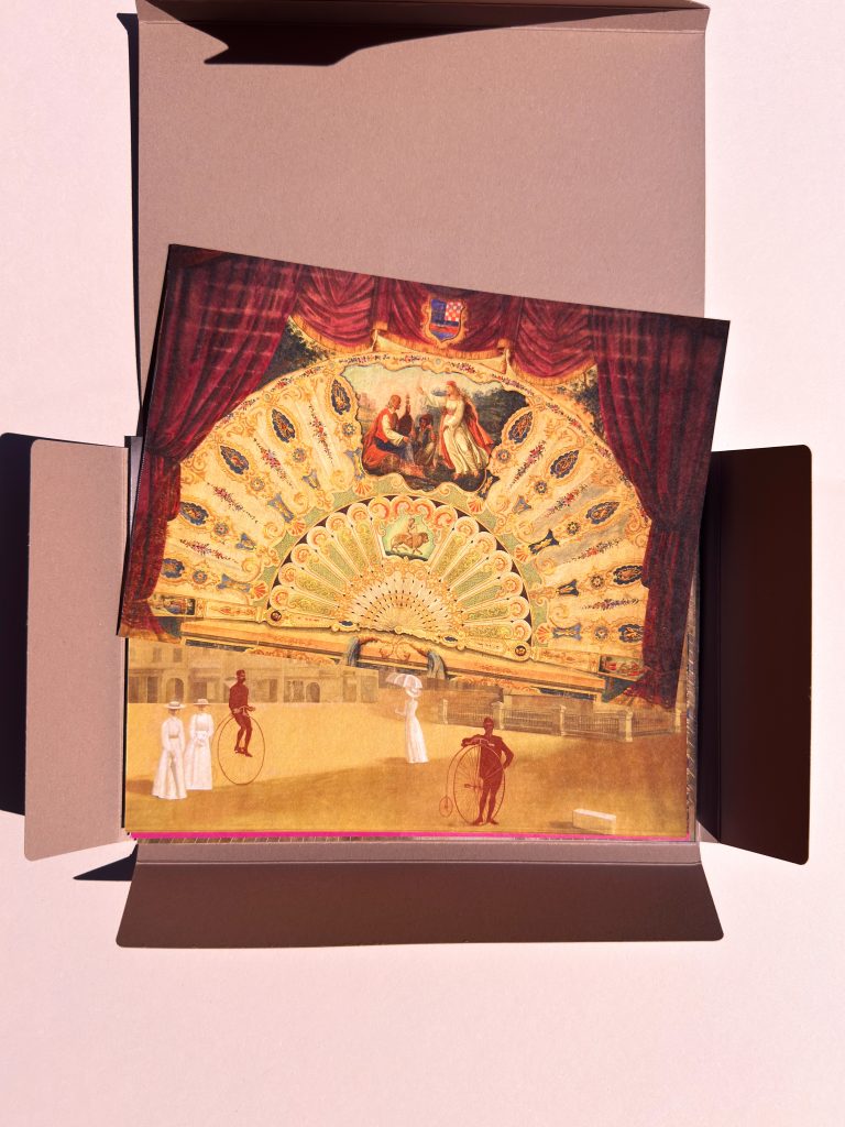
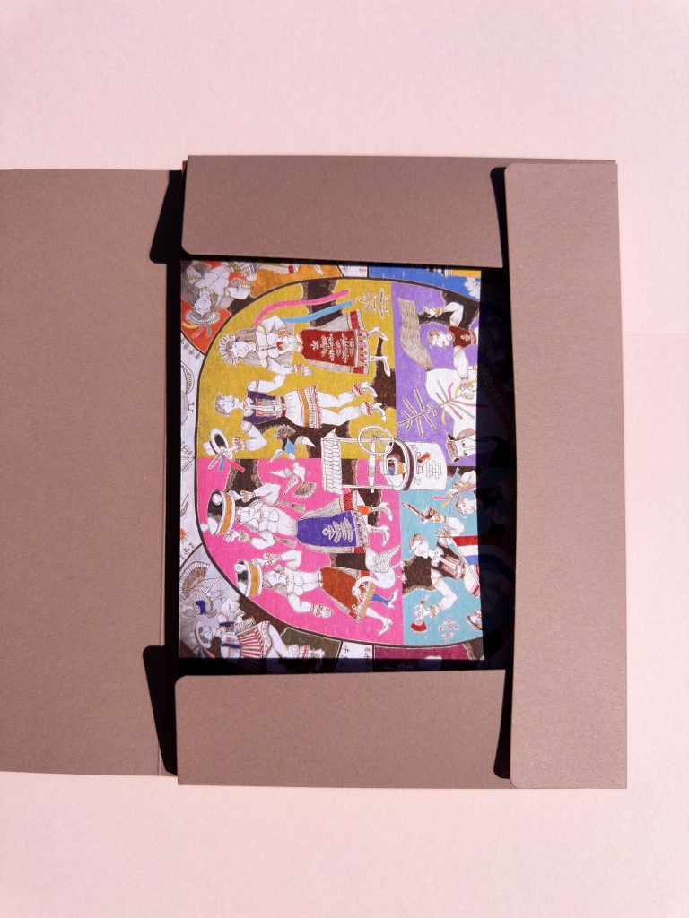
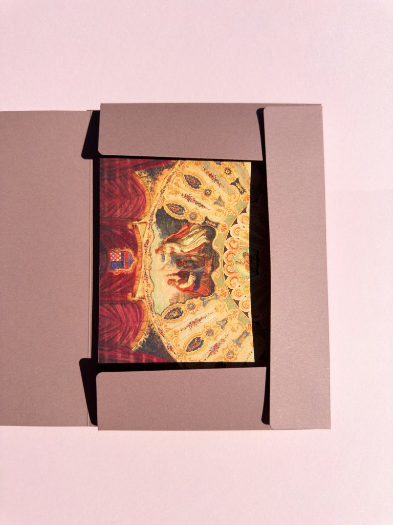
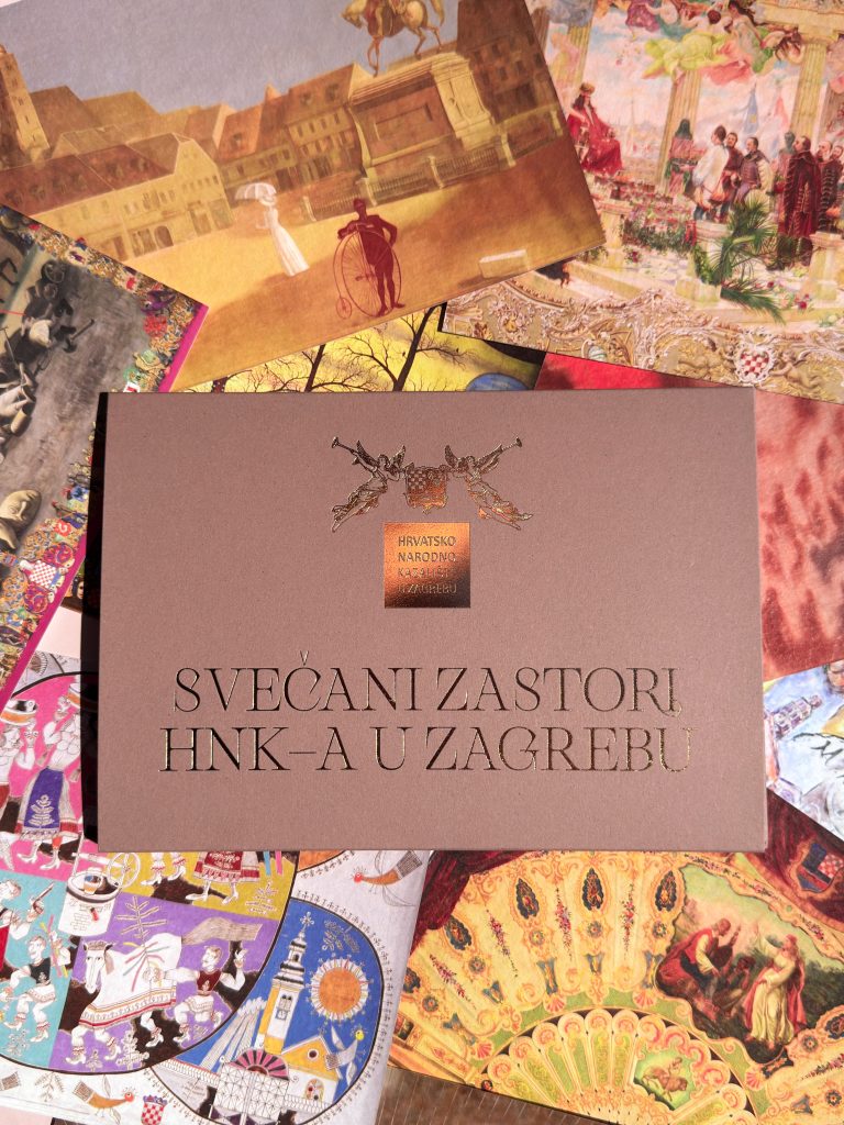
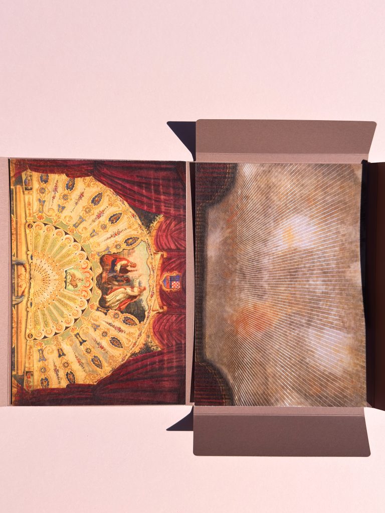
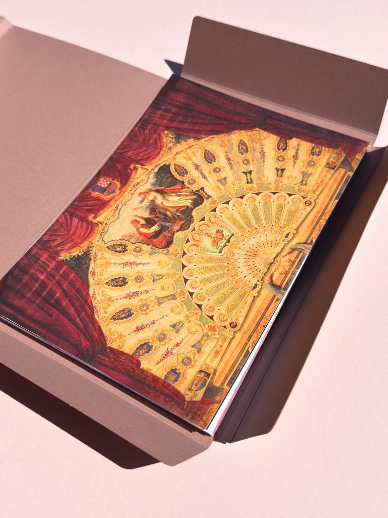
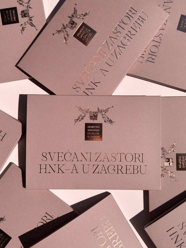
Za Hrvatsko narodno kazalište u Zagrebu osmislili smo mapu s kompletom razglednica posvećenih jednoj od najzanimljivijih kazališnih zbirki – zbirci povijesnih scenskih zastora. Još od renesanse, scenski su zastori među najupečatljivijim elementima kazališnih interijera. Osim svoje praktične funkcije, često predstavljaju i monumentalna umjetnička djela koja svjedoče o estetskim i kulturnim vrijednostima svojega vremena. Hrvatsko narodno kazalište u Zagrebu tijekom svoje je povijesti prikupilo iznimnu zbirku zastora koju čine jedan željezni i sedam oslikanih svečanih zastora.

Industrija

Dizajn

Kreativna industrija

Roberta Bratović

Tagovi

mapa, map, hnk, razglednice, luxury print, zlatotisak

Projekt

Mapa Svečani zastori HNK-a u Zagrebu

Projekti poput ovoga pružaju nam priliku spojiti dizajn i vrhunsku tiskarsku produkciju s pričama koje zaslužuju biti sačuvane, ispričane i predstavljene novim generacijama. Svaki element, od mape do razglednica, oblikovan je s posebnom pažnjom i poštovanjem prema temi te bogatoj kulturnoj baštini koju predstavlja. Uvijek nam je zadovoljstvo surađivati s institucijama koje predano čuvaju, dokumentiraju i predstavljaju kulturno nasljeđe za budućnost.

TEHNIKE TISKA

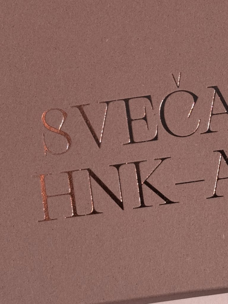
Foilo tisak

Digitalni cut

Digitalni print

Svaki element, od mape do razglednica, oblikovan je s posebnom pažnjom i poštovanjem prema temi te bogatoj kulturnoj baštini koju predstavlja.

AQUAESTIL DOMING NALJEPNICE

Aquaestil doming naljepnice

Klijent

Kategorija

Proizvodnja

Godina

Podijeli

Aquaestil

Brendirani promo

Macan Atelier

2026

+ O projektu

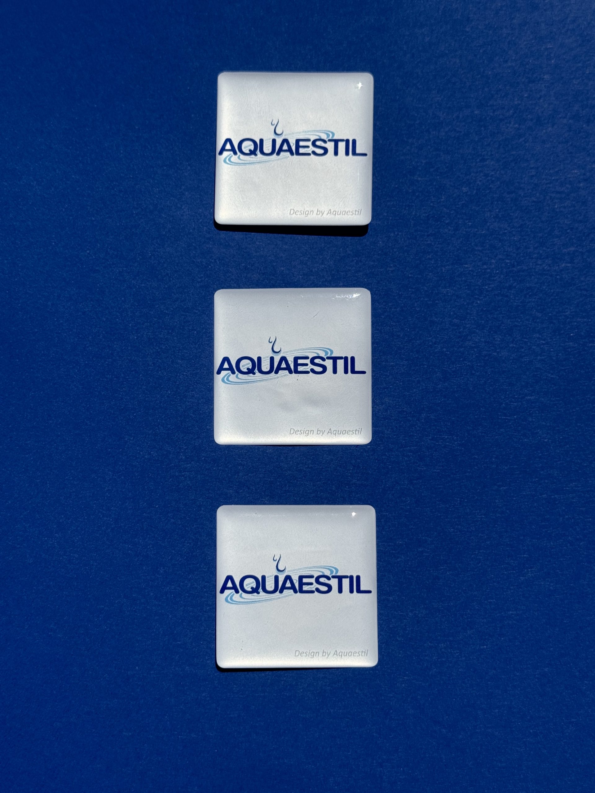
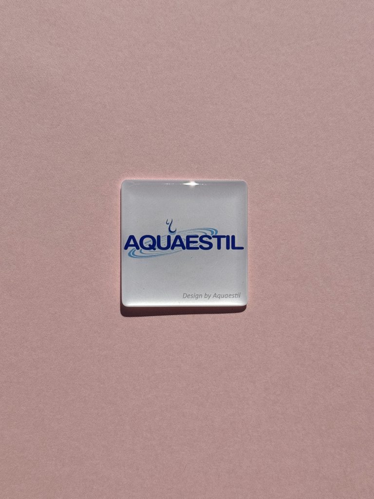
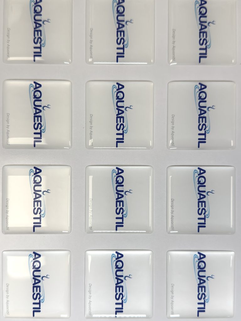
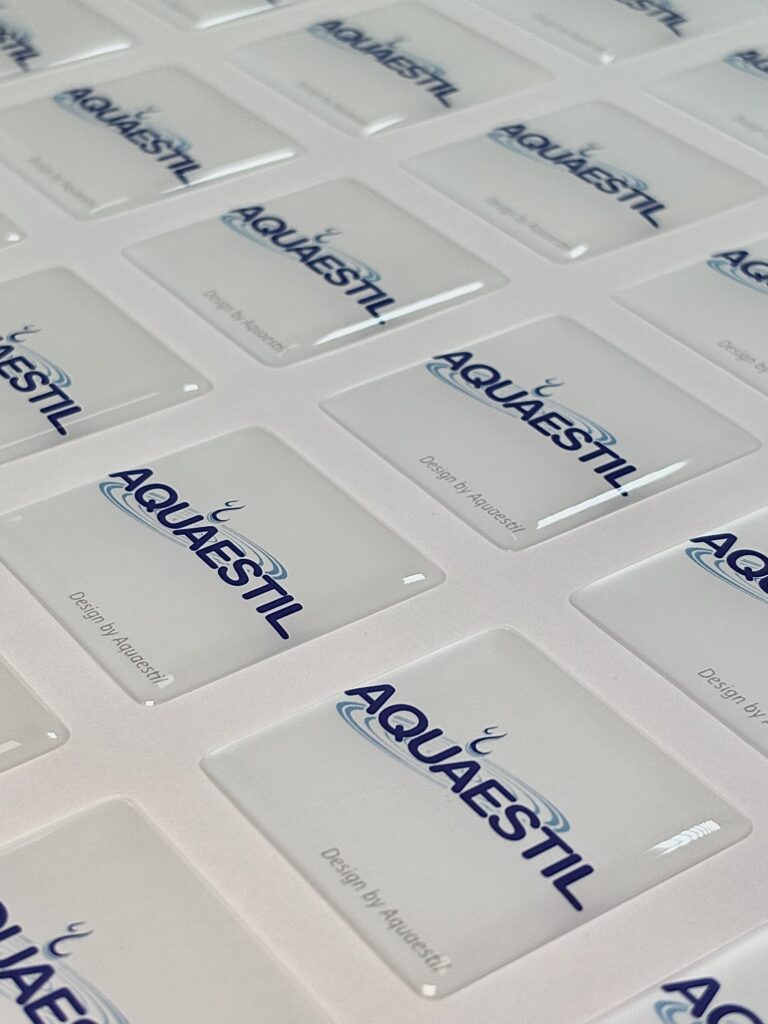
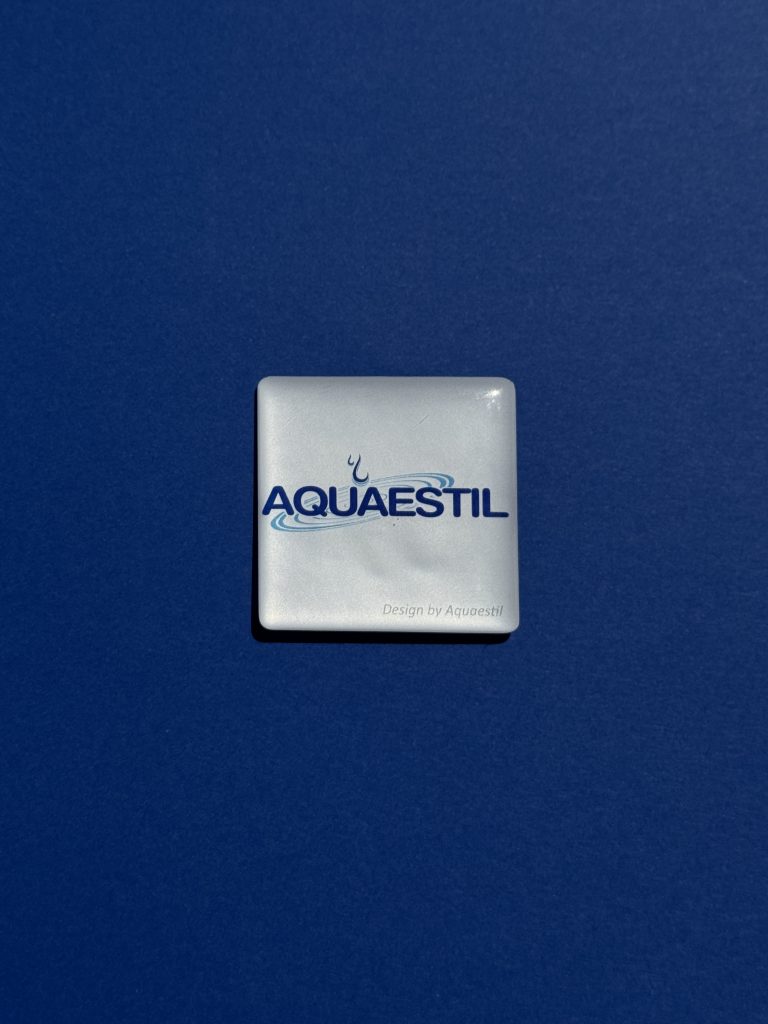
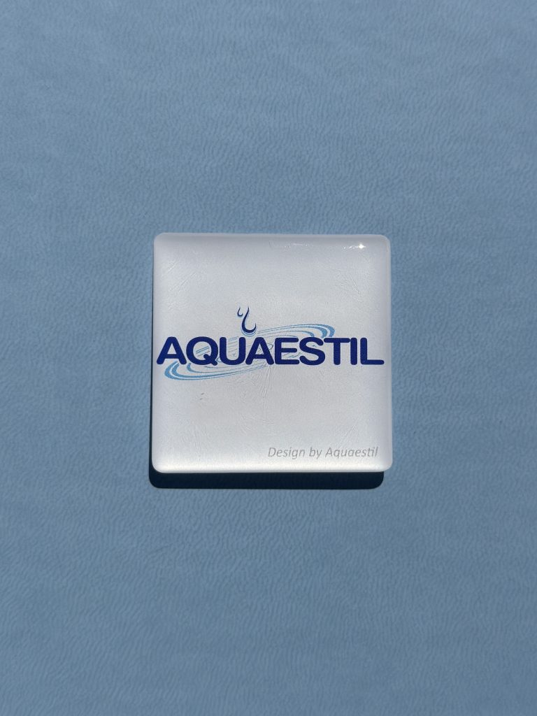
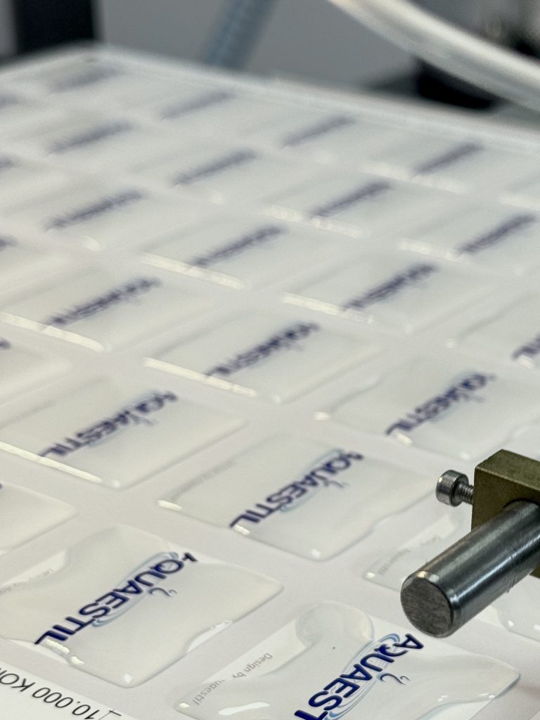
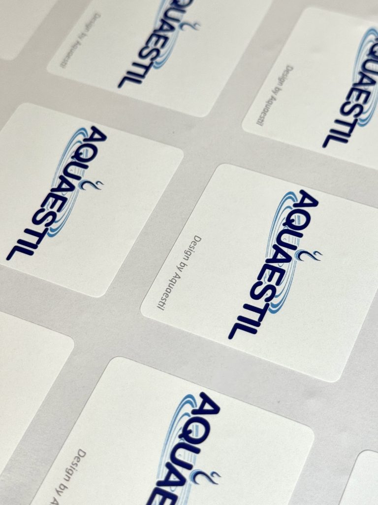
Za Aquaestil smo izradili doming naljepnice koje jednostavan logotip pretvaraju u premium element brenda. Zahvaljujući prepoznatljivom 3D efektu, sjajnoj završnoj obradi i iznimnoj otpornosti, doming naljepnice privlače pažnju, ostavljaju dojam kvalitete i podižu percepciju proizvoda na kojem se nalaze.

Bilo da se postavljaju na opremu, uređaje, ambalažu ili promotivne artikle, doming naljepnice djeluju kao suptilan, ali vrlo učinkovit alat brendiranja. Povećavaju vidljivost brenda, stvaraju dodatne dodirne točke s korisnicima i doprinose dugoročnoj prepoznatljivosti.

Industrija

Marketing, promo

Dizajn

Aquaestil

Tagovi

doming naljepnice, brendirani promo, domed labels

Projekt

Doming naljepnice

Za razliku od mnogih promotivnih materijala koji brzo završe zaboravljeni, kvalitetna doming naljepnica ostaje vidljiva godinama. Putuje zajedno s proizvodom, privlači poglede i kontinuirano jača prisutnost brenda gdje god se nalazi.Za brendove koji žele dodatno naglasiti svoj identitet, povećati prepoznatljivost i svojim proizvodima dati vrhunsku završnu notu, doming naljepnice predstavljaju malu investiciju s dugoročnim učinkom.Jer ponekad najučinkovitija reklama nije ona najglasnija, već detalj koji ljudi primijete, dotaknu i zapamte.

TEHNIKE TISKA

doming naljepnica

digitalni tisak

MAISTRA MAPA

Maistra mapa

Klijent

Kategorija

Proizvodnja

Godina

Podijeli

Maistra Collection

Brendirani promo

Macan Atelier

2025

+ O projektu

Za Maistru smo razvili seriju mapa izrađenih kao profinjeni primjerci koji spajaju preciznost, vještinu izrade i taktilno iskustvo. Svaka je mapa pažljivo dizajnirana i izvedena s naglaskom na kvalitetu materijala, pretvarajući funkcionalni predmet u promišljeni komad tiska.

Industrija

Photo

Ugostiteljstvo

Future folklore

Tagovi

mapa, map, embossing, premium and lux hotels

Projekt

Mapa

Suptilni detalji embossinga primijenjeni su kako bi se uvela dubina i tekstura, stvarajući prepoznatljiv osjećaj luksuza koji se otkriva dodirom koliko i pogledom. Svaki je detalj pažljivo razmotren kako bi odražavao Maistrino premium ugostiteljstvo, gdje tisak postaje dio iskustva brenda.Rezultat je serija mapa koje nadilaze puko pružanje informacija, one postaju taktilni artefakti brenda koji se usklađuju sa sofisticiranošću i atmosferom Maistrinog identiteta.

TEHNIKE TISKA

Foilo tisak

Embossing

Ovaj projekt odražava naš ateljerski pristup tisku: precizan, vođen materijalima te utemeljen na uvjerenju da tisak može biti i funkcionalan i duboko ekspresivan.

KATALOG JAHTI

Katalog jahti

Klijent

Kategorija

Proizvodnja

Godina

Podijeli

Promo Event agencija

Eventi

Macan Atelier

2025

+ O projektu

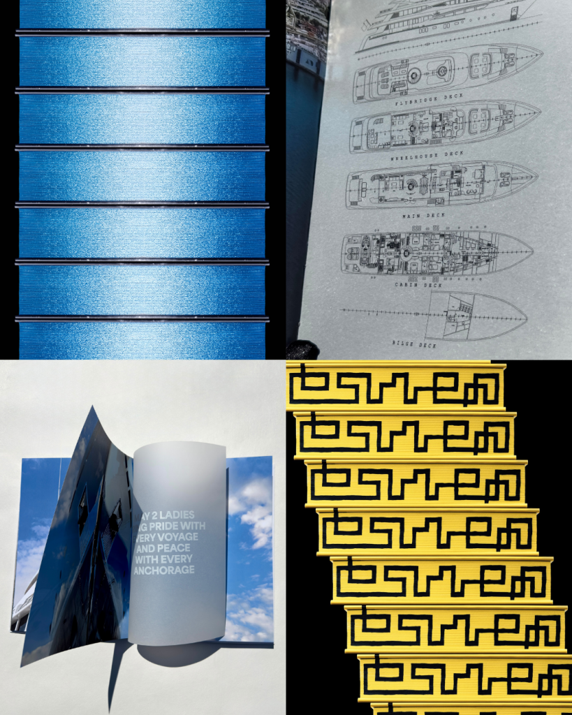
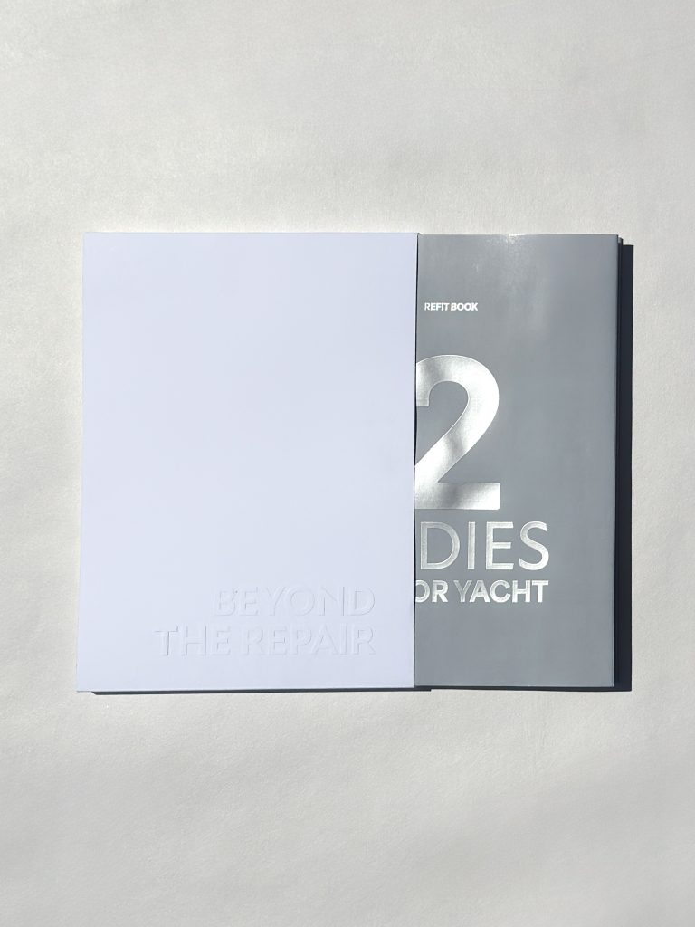
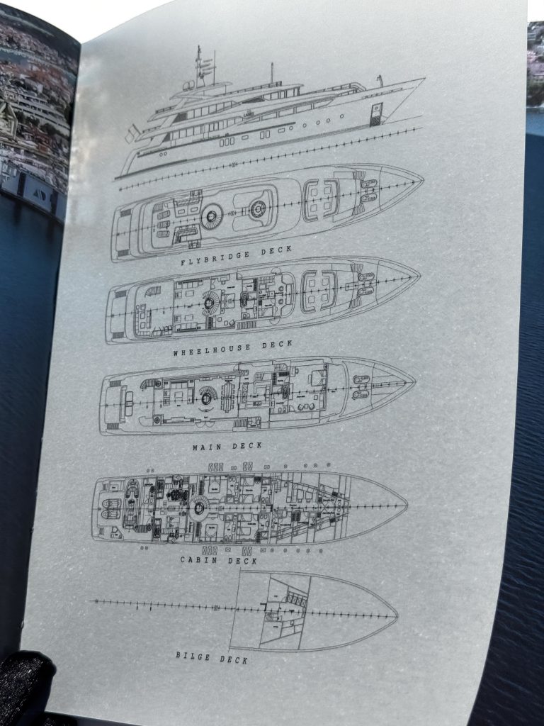
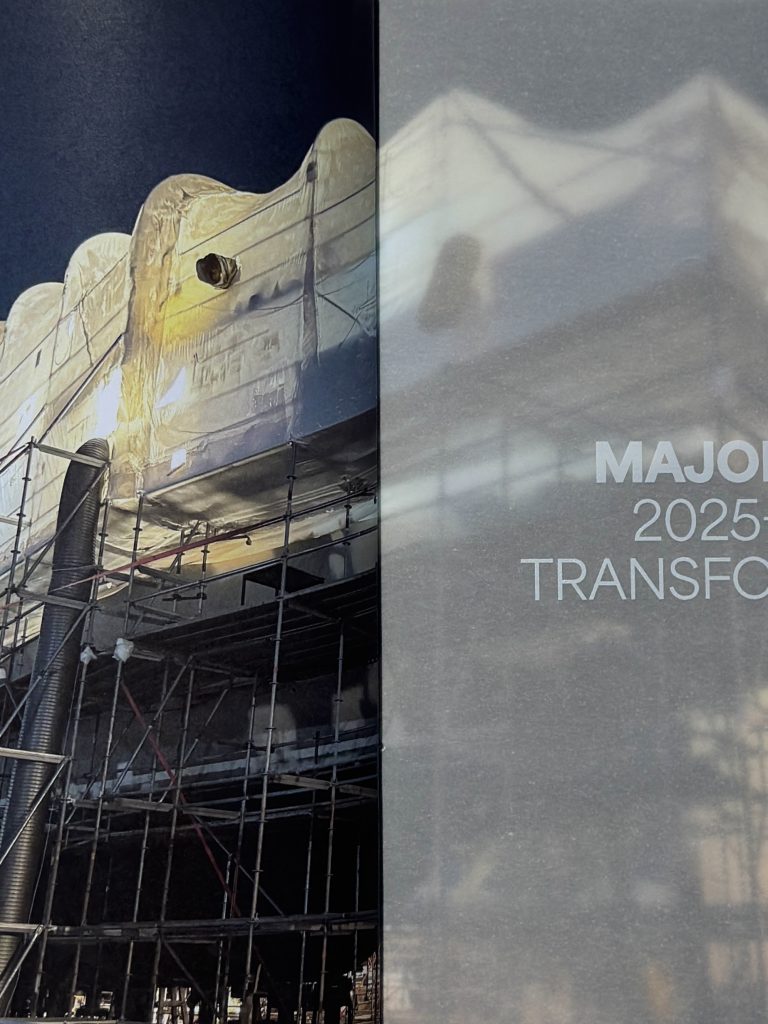
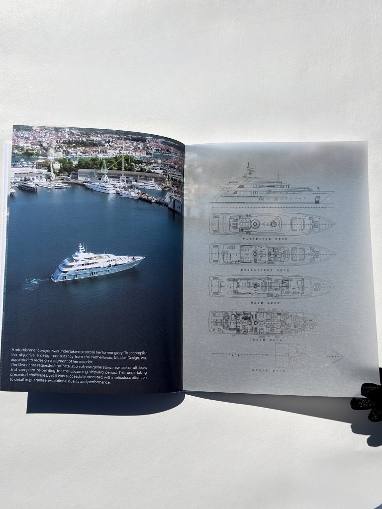
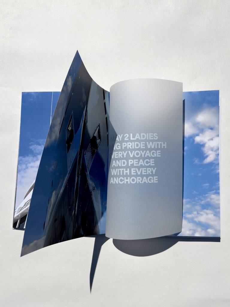
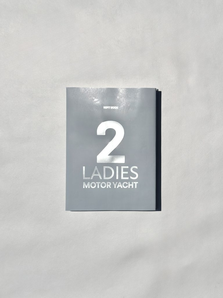
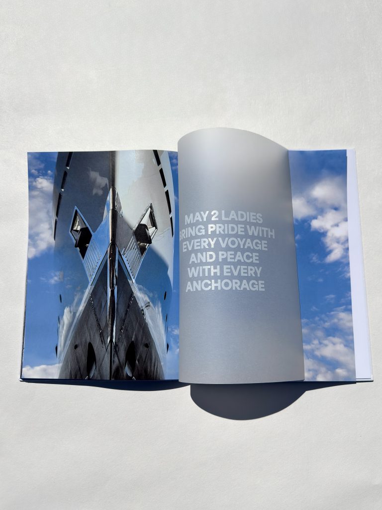
Za našeg klijenta, agenciju Promo Event, izradili smo premium katalog jahti osmišljen kako bi ostavio snažan dojam. Promo Event je agencija za organizaciju korporativnih, javnih i privatnih manifestacija i događanja na domaćem i inozemnim tržištima te je poznata po besprijekornom spajanju poslovnog i užitka, kao i spajanju kreativnosti i stručnosti.

Industrija

Promo, PR, Events, Marketing

Papir

Naslovnica: IMITLIN Tela Neve

Vanjski ovitak: Pulse Laid White 220 gr

Zaštitni ovitak: Munken White 300 gr

Knjižni blok: Munken White 150 gr, Glama Basic 150gr

Tagovi

catalog, katalog, embossing

Projekt

Katalog

Kombinacijom folio tiska, embossinga, UV tiska i digitalnog tiska postigli smo slojevitu, sofisticiranu završnu obradu, pri čemu svaka tehnika dodaje dubinu, kontrast i osjećaj ekskluzivnosti. Cilj ovog projekta bio je odraziti visoke standarde našeg klijenta, što je rezultiralo katalogom koji istinski odražava predanost agencije kvaliteti i nezaboravnim iskustvima.

TEHNIKE TISKA

Foilo tisak

Embossing

UV print

Digitalni print

Ostavite snažan dojam

UBOD PČELE KNJIGA

Ubod pčele

Klijent

Kategorija

Proizvodnja

Godina

Podijeli

Lumen izdavaštvo

Knjige

Macan Atelier

2025

+ O projektu

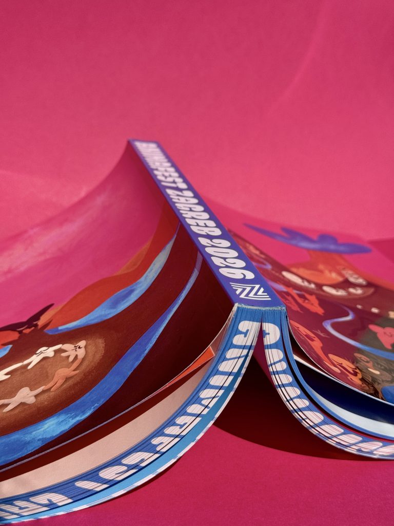
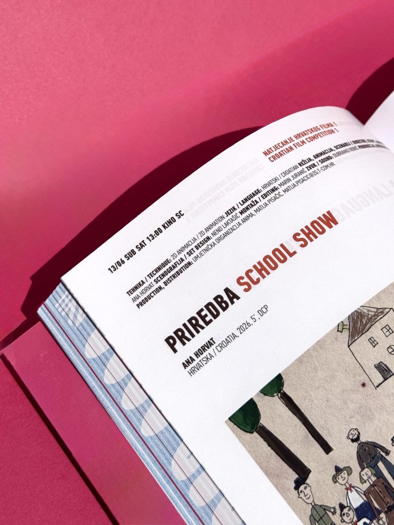
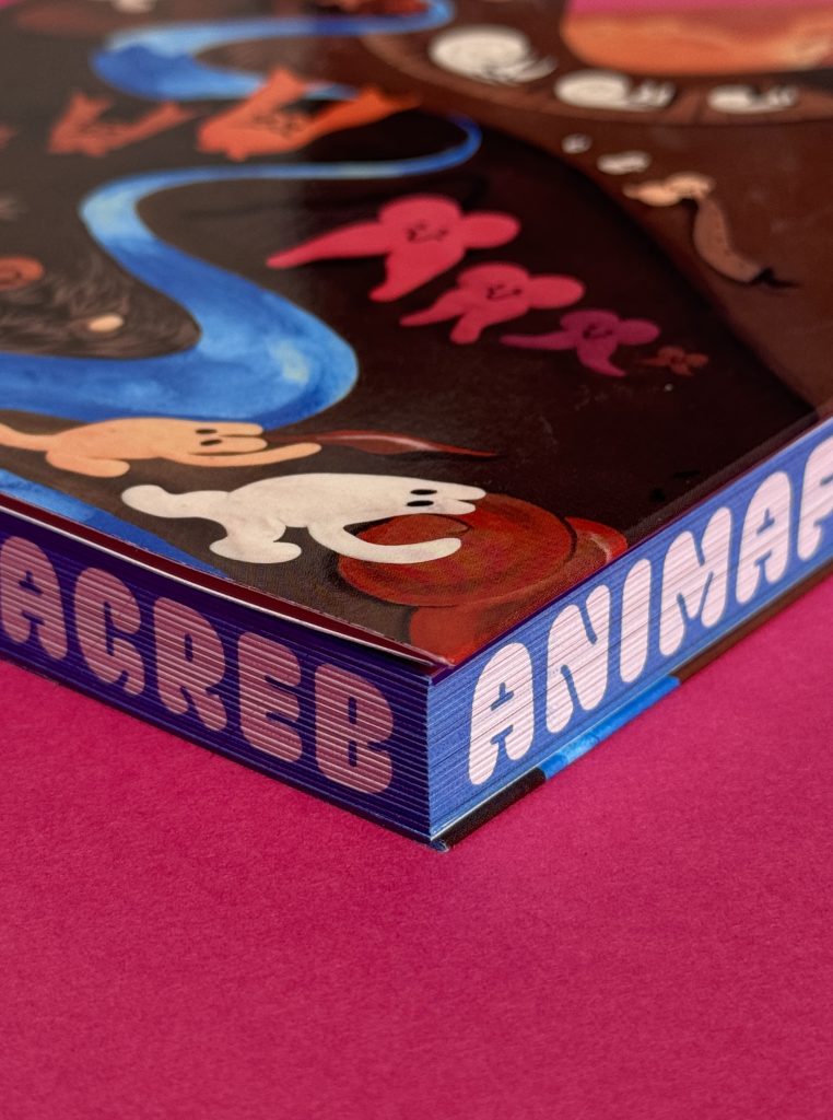
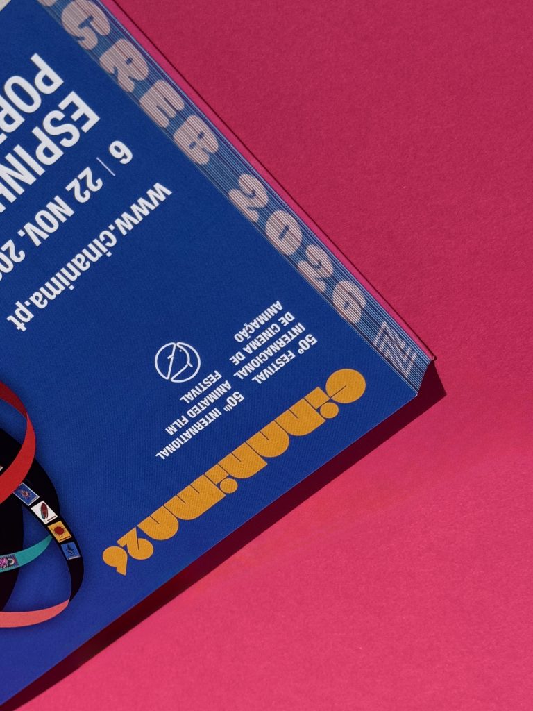
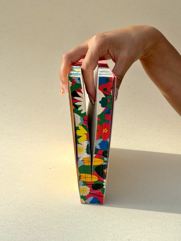
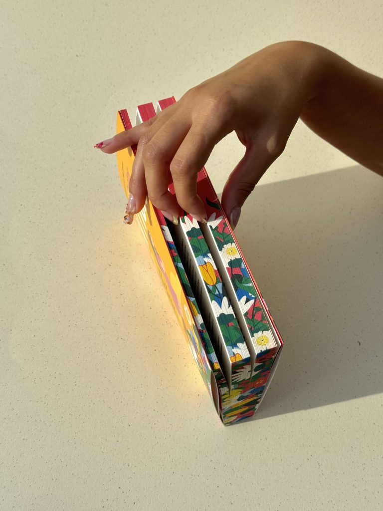
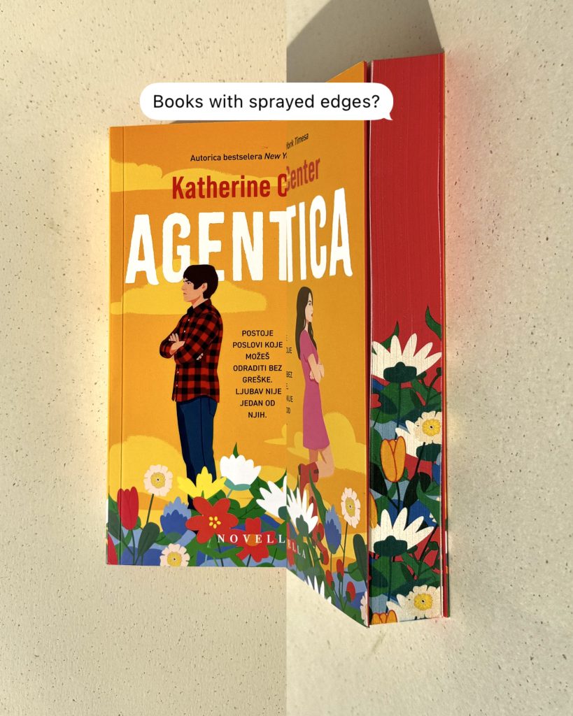
Ovdje se susreću priče i vrhunska izrada – gdje je svaki detalj pomno osmišljen kako bi čin čitanja uzdigao u vizualno i taktilno iskustvo. Edge print uokviruje knjigu poput umjetničkog djela, dok UV lak hvata svjetlost koja otkriva suptilne slojeve. Svako okretanje stranice pridonosi osjećaju preciznosti i luksuza, pozivajući čitatelja da uspori i u potpunosti se poveže s predmetom u svojim rukama.

Industrija

Izdavaštvo, publishing

Otisak naslovnice

Photo

Macan Atelier

Future Folklore

Tagovi

books, knjige, edge print, special edition

Projekt

Ubod pčele

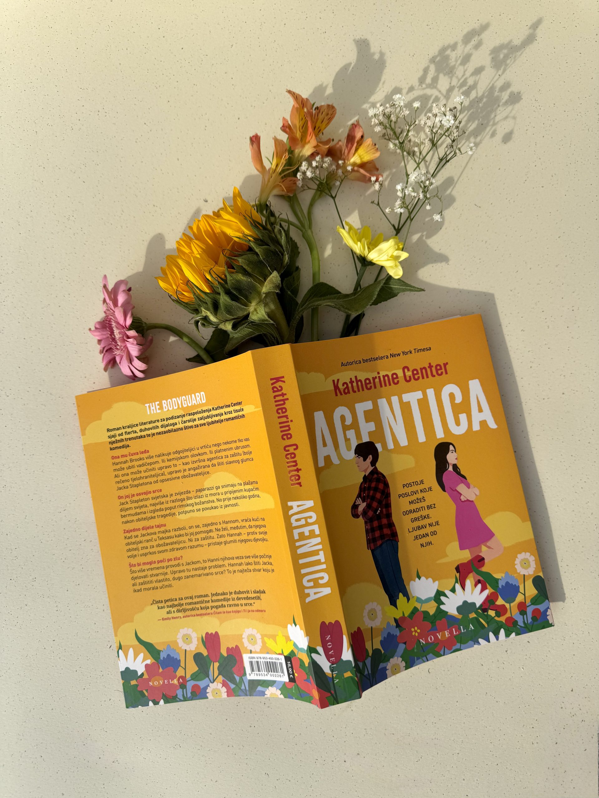
Budući da neke priče zaslužuju više od samog čitanja, ovaj projekt istražuje knjigu kao taktilni medij. Tekstura, svjetlost i materijal zajedno stvaraju trajan dojam, onaj koji nadilazi sadržaj i prelazi u iskustvo. Rezultat nije samo publikacija, već pažljivo oblikovan artefakt stvoren da se dodirne, vidi i pamti.Razvijeno u suradnji sa Lumen izdavaštvom, ovo izdanje pokazuje kako promišljena produkcija može transformirati poznati format u nešto izvanredno.Kombinacijom naprednih tiskarskih tehnika i profinjenog dizajnerskog pristupa, knjiga postaje više od nositelja informacija – postaje iskustvo samo po sebi.

TEHNIKE TISKA

Edge print

UV lak

Knjiga postaje iskustvo samo po sebi

TVORAC SUZA KNJIGA

Tvorac suza

Klijent

Kategorija

Proizvodnja

Godina

Podijeli

GZH

Knjige

Macan Atelier

2025

+ O projektu

Za Tik-Tok senzaciju, „Tvorac suza“ autorice Erin Doom, koja uskoro stiže na Netflix, kreirali smo posebno izdanje za našeg klijenta GZH usmjereno na elegantne, premium detalje. Svaka tehnika završne obrade pažljivo je odabrana kako bi podržala narativ i podigla cjelokupni dizajn. Ovako popularna knjiga zaslužuje završnu obradu tiska koja ostavlja snažan dojam.

Industrija

Izdavaštvo, publishing

Nakladnik

Photo

Lumen izdavaštvo

Future Folklore

Tagovi

books, knjige, edge print, special edition

Projekt

Tvorac suza

Plavi edge print dodaje eleganciju i dubinu svakom primjerku, dok folio tisak unosi suptilni sjaj koji naglašava ključne elemente dizajna. U kombinaciji s 3D UV lakom, motiv leptira dobiva svoju punu dimenziju.Ovakvi projekti potvrđuju koliko promišljena završna obrada tiska može knjigu podići iznad uobičajenog i učvrstiti njezin vizualni identitet. Svaki detalj oblikovan je tako da prati intenzitet same priče.

TEHNIKE TISKA

3D UV lak

Folio tisak

Edge print

DOMING NALJEPNICE

Doming naljepnice

Kategorija

Proizvodnja

Godina

Podijeli

Brendirani promo

Macan Atelier

2025

+ O projektu

Premium doming naljepnice učinkovit su način za podizanje vidljivosti brenda, uvođenjem profinjenog, vrhunskog vizualnog identiteta bilo kojem proizvodu, ambalaži ili opremi. Njihov prepoznatljiv izgled odmah komunicira kvalitetu, što ih čini idealnim izborom za brendove koji se žele istaknuti na konkurentnim tržištima. Kombinirajući funkcionalnost s vrhunskom estetikom, doming naljepnice pretvaraju čak i najjednostavnije površine u prepoznatljive elemente brenda.

Industrija

Marketing, promo

Dizajn

Macan Atelier

Tagovi

doming naljepnice, brendirani promo, domed labels

Projekt

Doming naljepnice

Sa svojom kristalno čistom 3D završnom obradom, ove naljepnice stvaraju snažan i trajan prvi dojam, a istovremeno naglašavaju preciznost i pažnju prema detaljima. Dimenzionalni sloj naljepnice pojačava boje, dubinu i kontrast, dajući svakom dizajnu živahan, uglađen izgled koji privlači pažnju iz svakog kuta. Ovaj dimenzionalni efekt također je istaknut detaljima folio tiska. 3D srebrna digitalna folio slova i metalni 2D efekt ne samo da poboljšavaju vizualnu privlačnost, već i osnažuju percepciju vrijednosti i izrade. Konačni proizvod je estetski snažno i tehnički precizno rješenje koje besprijekorno kombinira izdržljivost s dizajnom. Izrađene s jakim, dugotrajnim ljepilom i površinom otpornom na ogrebotine, domig naljepnice izrađene su da izdrže svakodnevnu upotrebu. Potpuno prilagodljivi po obliku i veličini, služe kao trajni komunikacijski element - jačaju prepoznatljivost brenda, povećavaju percipiranu vrijednost i ostavljaju trajan dojam na korisnika.

TEHNIKE TISKA

2D digitalni foliotisak

3D digitalni foliotisak

3D doming naljepnica