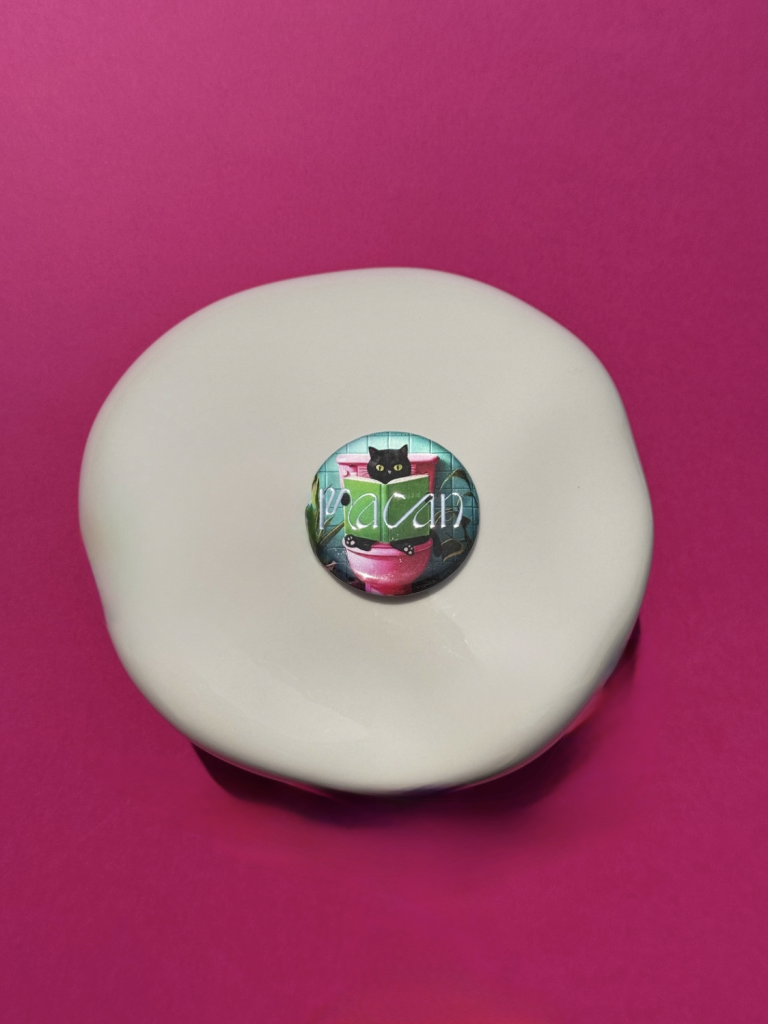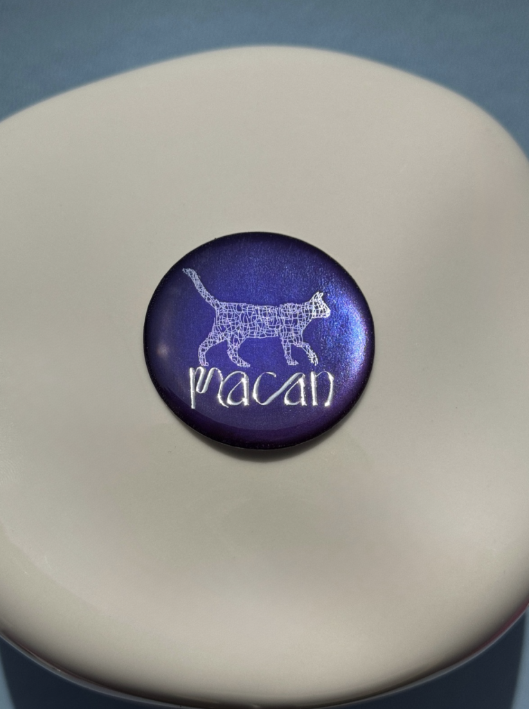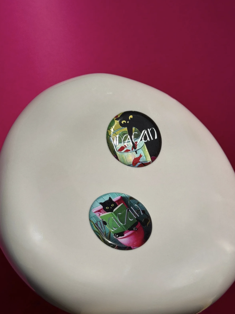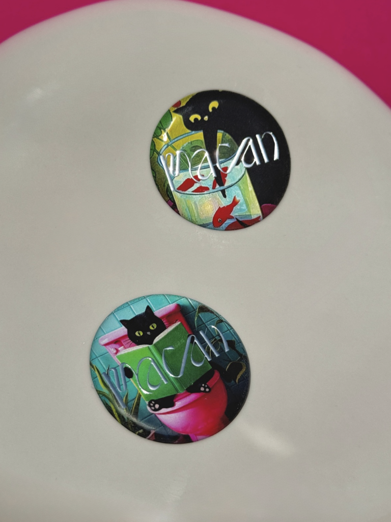
FESTIVAL OF LIGHTS MAGNETS

Festival of lights magnets

Clients

Category

Production

Year

Share

Zagreb Tourist Board

Branded collateral

Macan Atelier

2026

+ About project

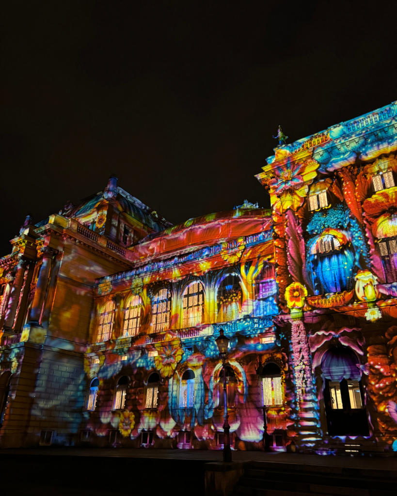
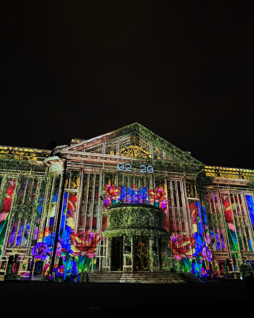
The Festival of Lights is on the list of the best events in Europe, putting Zagreb on the map of the most desirable tourist destinations. This March, for five days, visitors will be able to enjoy art in their favorite parks, squares, and streets. 

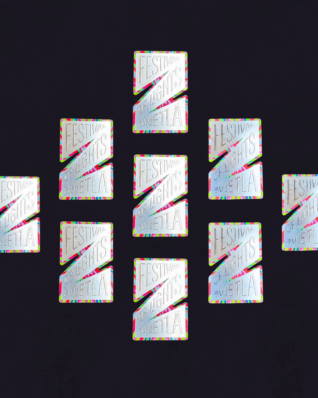
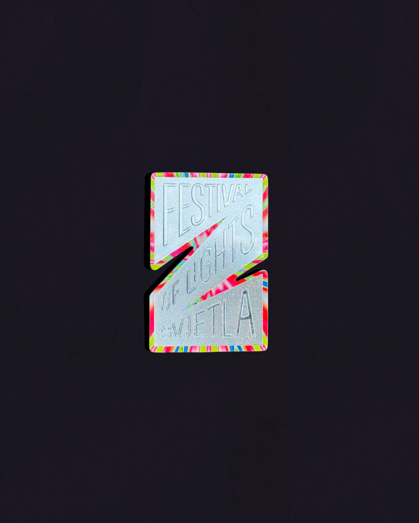
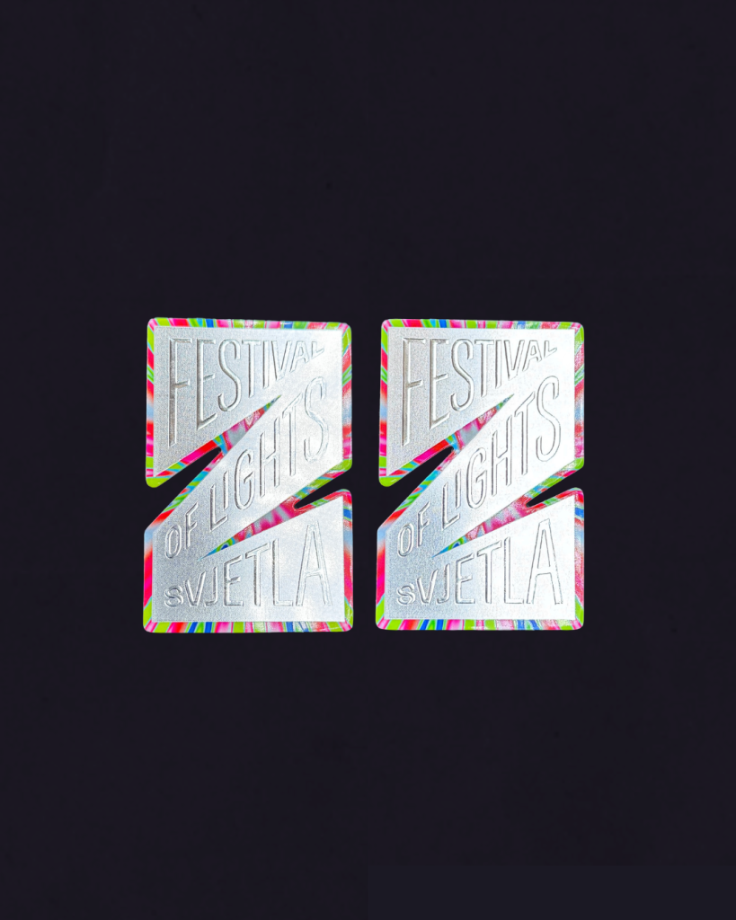
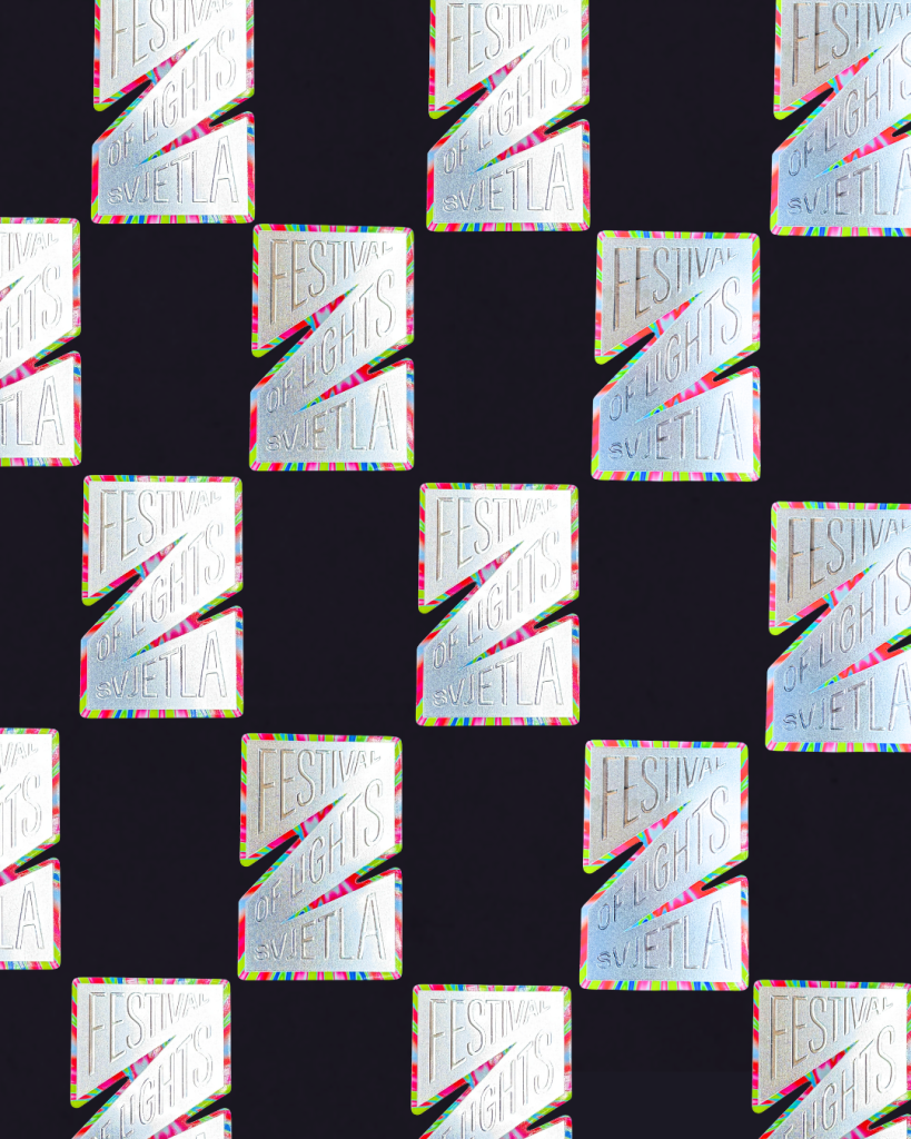
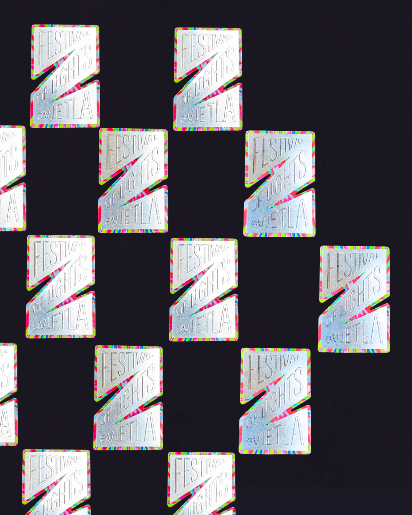
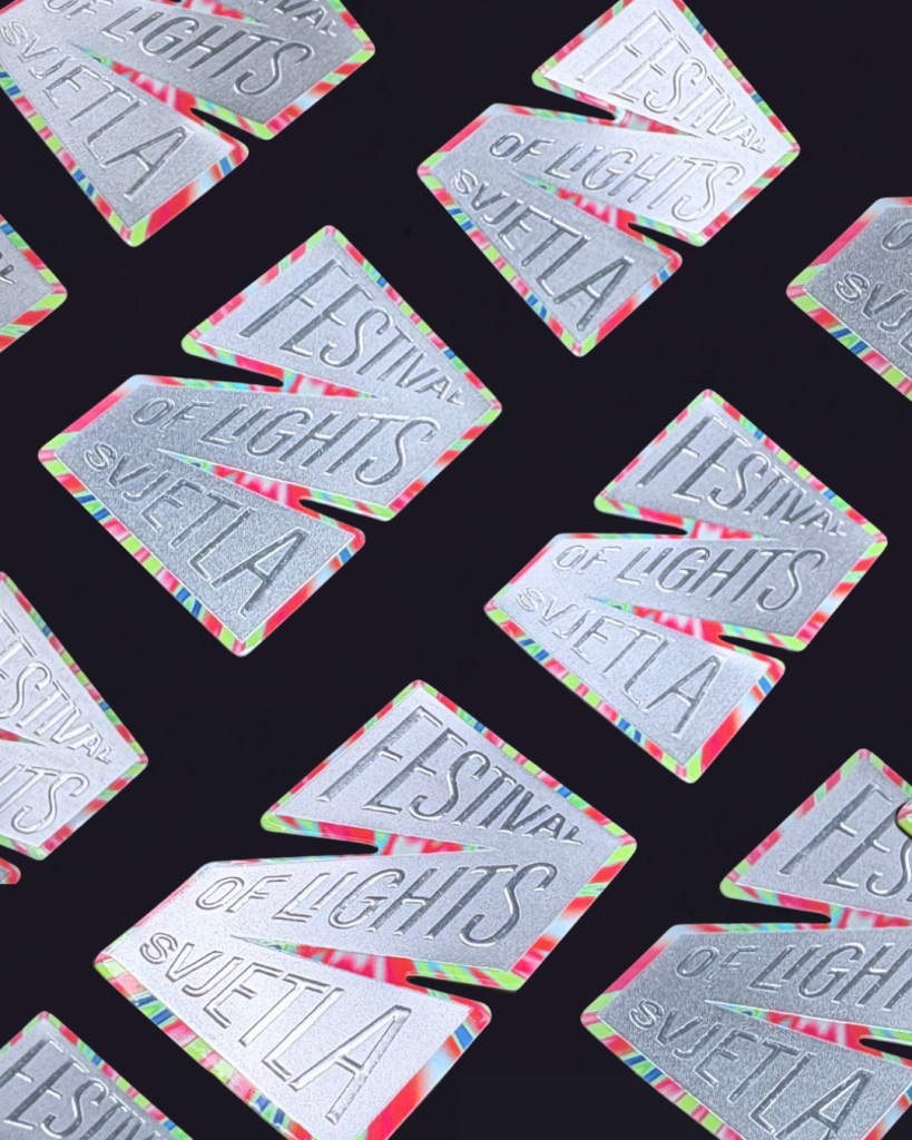
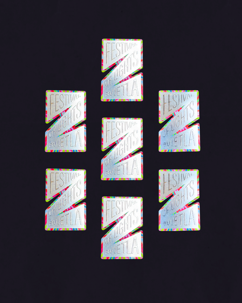
 For this event for our client – Zagreb Touristic Board, we produced a promotional magnet that combines top-quality printing and a strong visual experience. 

Industry

Marketing, FMCG, event, tourism, promo

Design

ĐKĆ studio

Tags

magnets, festival of lights, festival svjetla, zagreb, magneti, promomaterijali

Project

Festival of lights magnets

The magnet, in the complex shape of the letter Z, is made entirely digitally. In a nice silver color, it is first made using the 2D foil printing technique and is later adorned with a 43-micron raised inscription obtained by 3D foil printing. Finally, the magnet is cut into its recognizable shape using custom-made dies and protected with gloss lamination.The final product is an aesthetically strong, technically precisely executed magnet that combines functionality and design and acts as a permanent communication element that strengthens the festival's recognition.This year's festival program combines top-notch visuals and performing arts with innovative technological solutions. However, the Festival of Lights is much more than just the promotion of art and technology, it is an event when the city 'comes to life' and exudes its unique rhythm. This event is a great opportunity for a cultural city break, but also to spend time with loved ones.

PRINT TECHNOLOGY

2D digital foil print

3D digital foil print

Digital print

Lamination

Die-cutting

The goal of the project is to show that using various printing techniques, the atmosphere of light installations and the evening magic of the city can be conveyed in the format of a magnet that will awaken beautiful memories.

LUMEN BUSINESS CARDS

Lumen business cards

Client

Category

Production

Year

Share

Lumen / Školska knjiga

Brand collateral

Macan Atelier

2026

+ About project

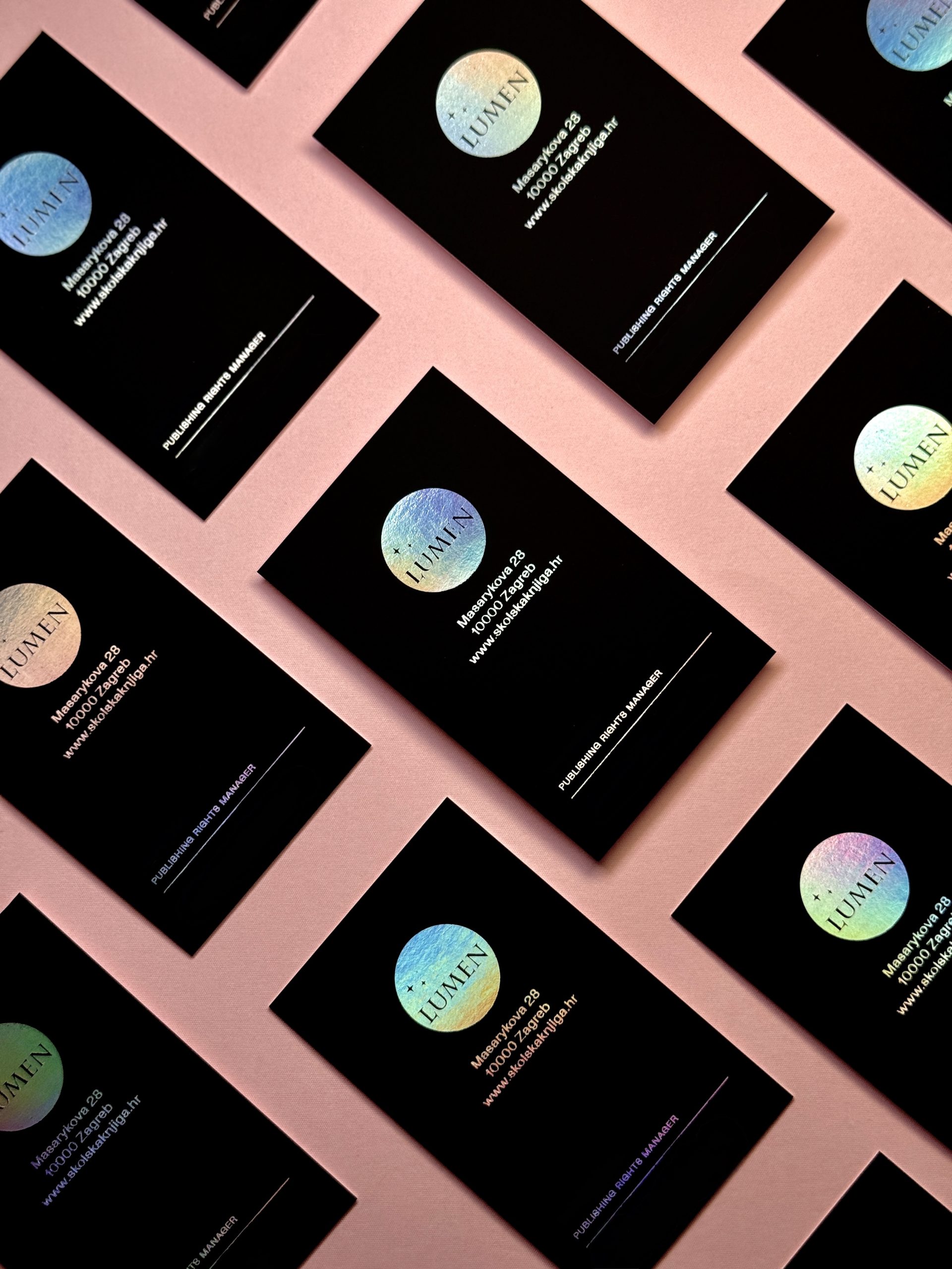
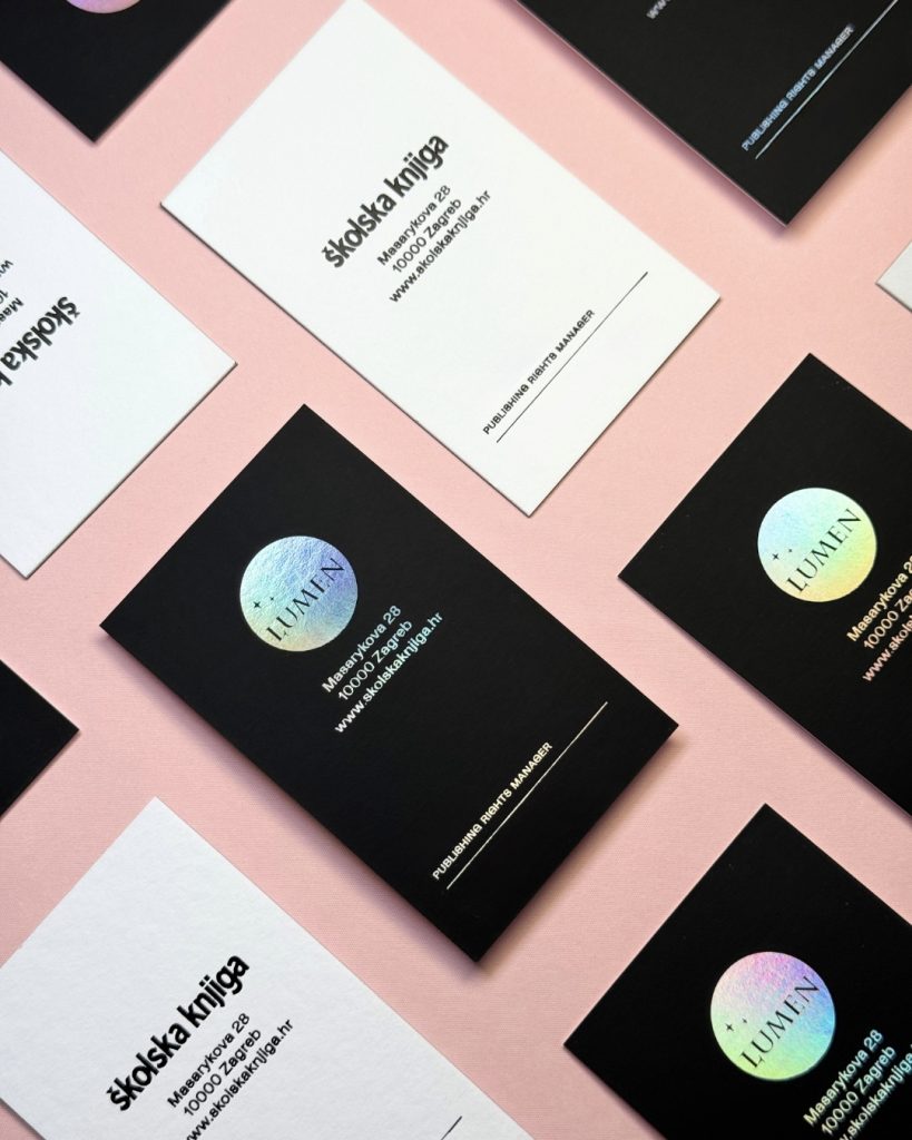
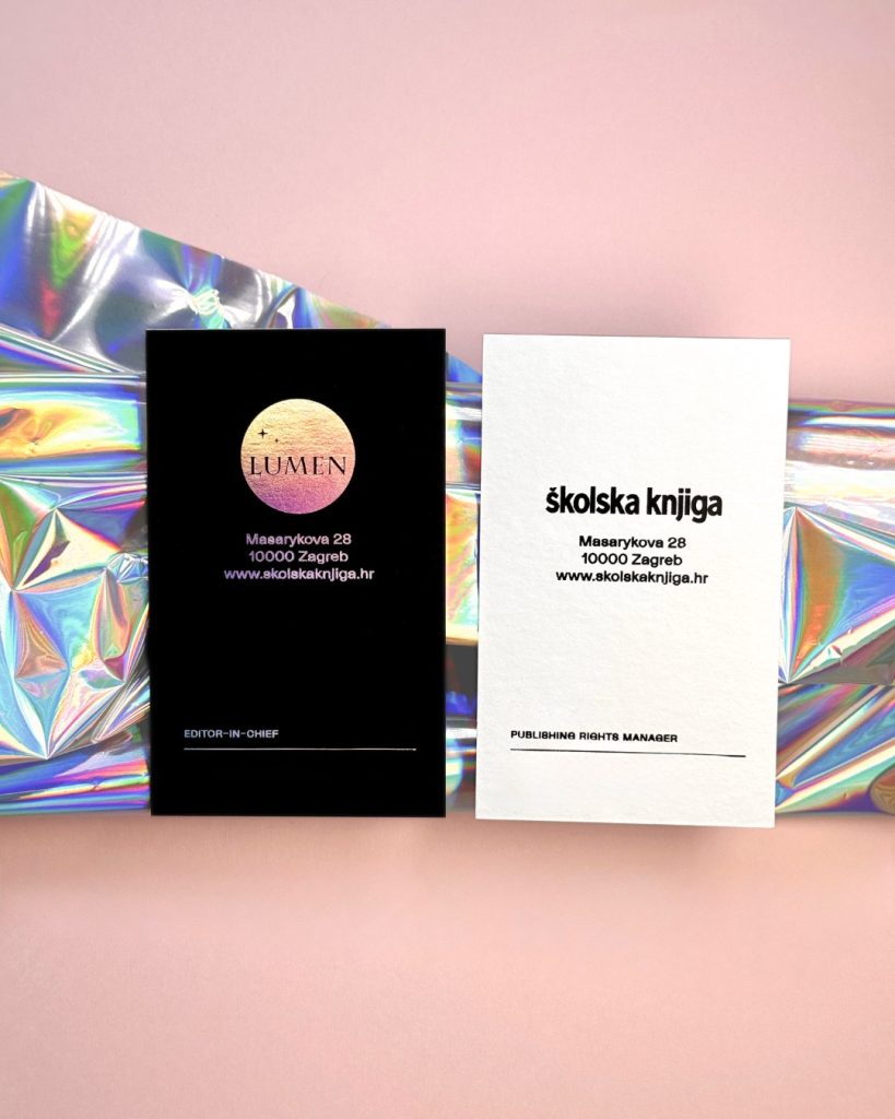
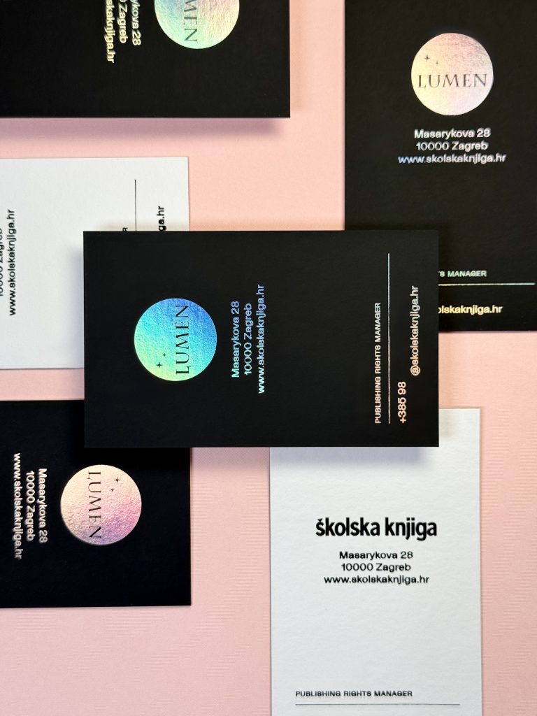
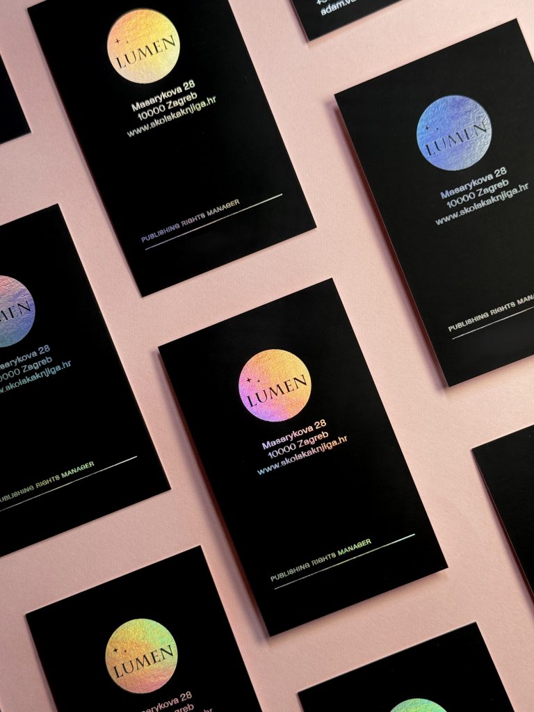
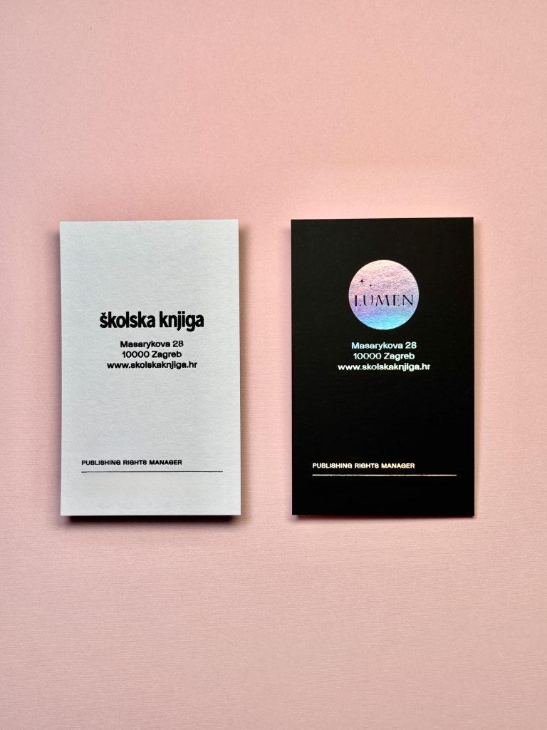
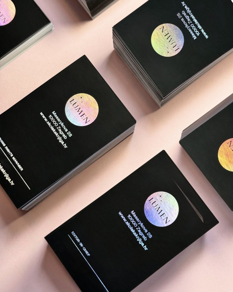
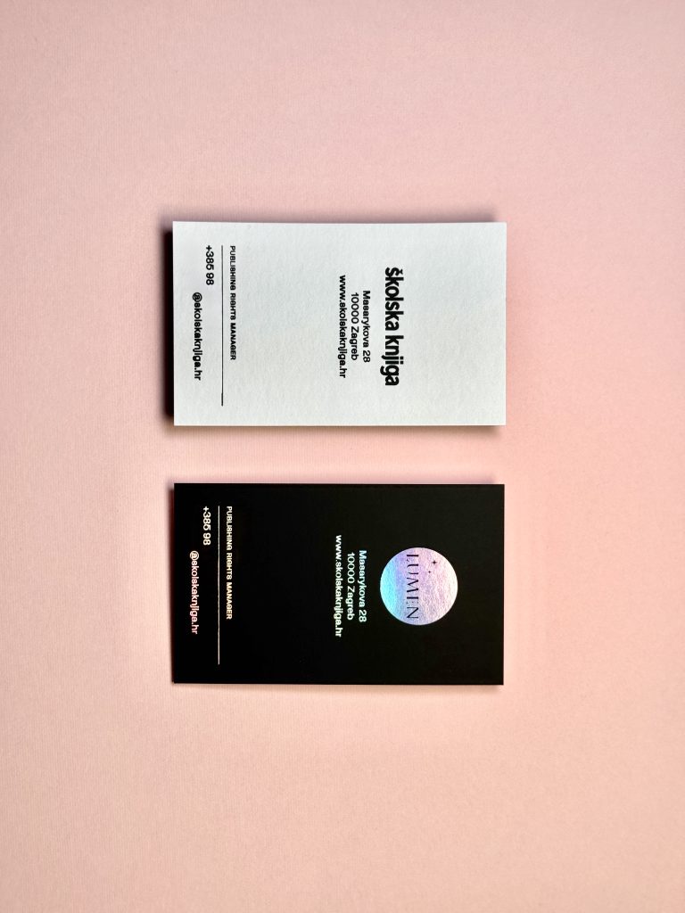
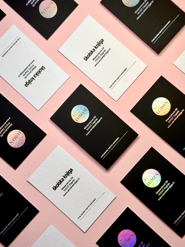
Our client Lumen, a publisher of unique and intelligent books that ignite a passion for reading, entrusted us with the production of all business cards print. The choice of mounting true black paper together with art white paper creates an interesting surface from the beginning. The client chose holographic foil for the black side of the card, which highlights perfectly the playful nature of the metallic effect of the foil itself. Holographic is always a perfect choice for creatives, luxury brands, and anyone who refuses to blend in.

Industry

Marketing, FMCG, Publishing

Tags

business cards, vizitke, posjetnice

Project

Lumen bussines cards

Make them look twice.In our atelier holographic business cards aren’t just printed - they’re engineered to captivate. Inspired by the bold craftsmanship and luxury finishes, each card plays with light, texture, and reflection to create an unforgettable first impression.When the card moves, the surface shimmers in the colors of the rainbow. When you hand it over, it speaks before you do. Whether exchanged in a private salon, across a boardroom table, or beneath the lights of an international fair, each piece performs as a silent ambassador - an object engineered to linger in memory long after the introduction.The technical mastery behind every finish reflects a devotion to craft: calibrated foiling pressures, precision die-stamping, and a disciplined balance between brilliance and restraint. It is contemporary luxury, expressed through material intelligence.

PRINT TECHNIQUES

Hot foilprint

Paper mounting

Cutting

Because in a world of matte and minimal… be iridescent.

ŠKOLSKA KNJIGA MONOGRAPH

Monograph

Client

Category

Production

Year

Share

Školska knjiga

Books

Macan Atelier

2026

+ About project

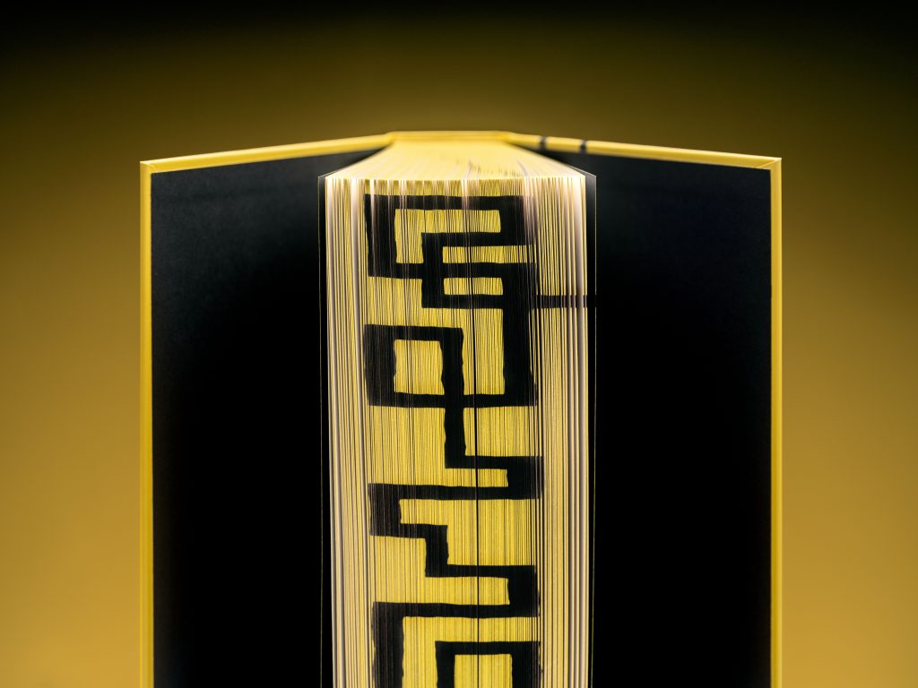
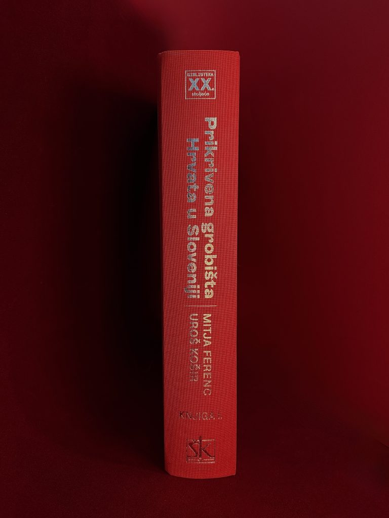
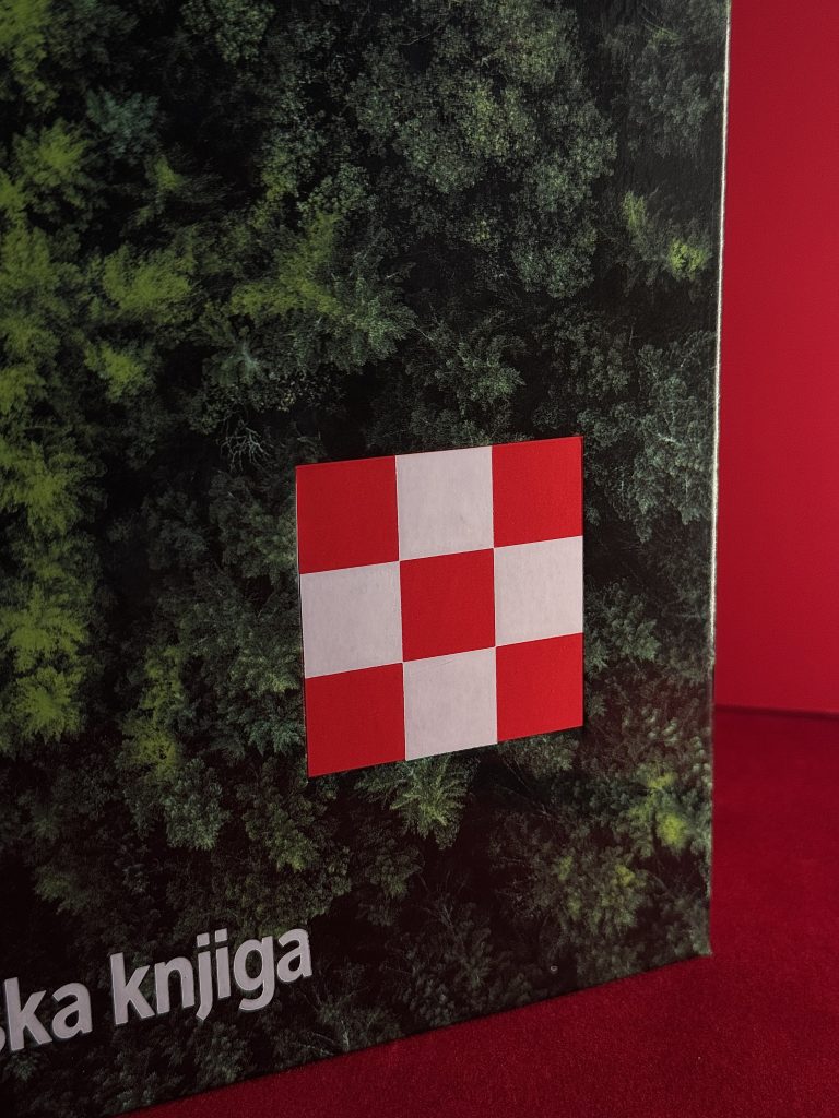
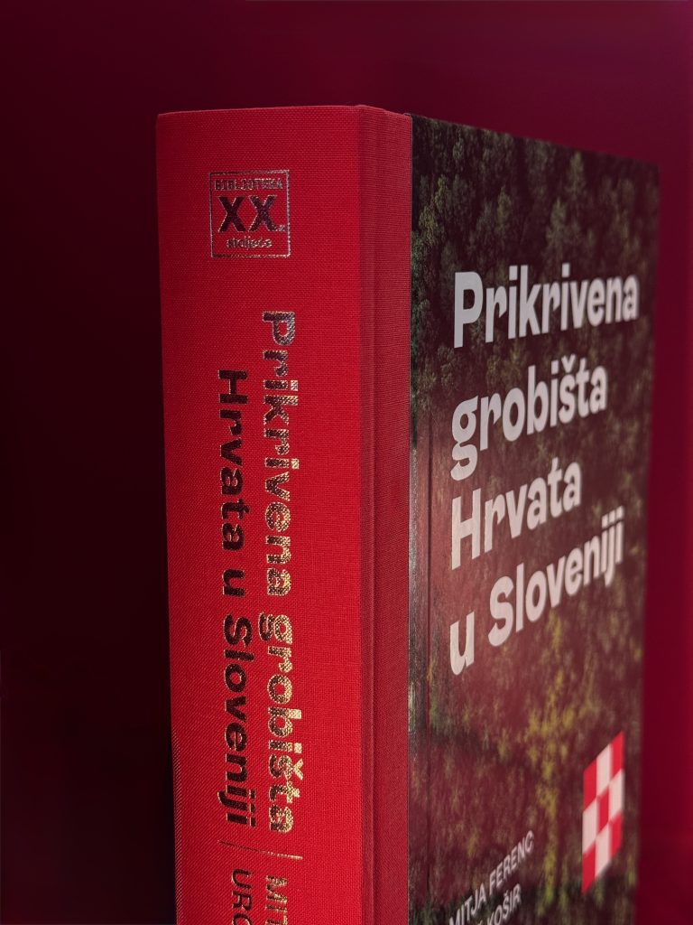
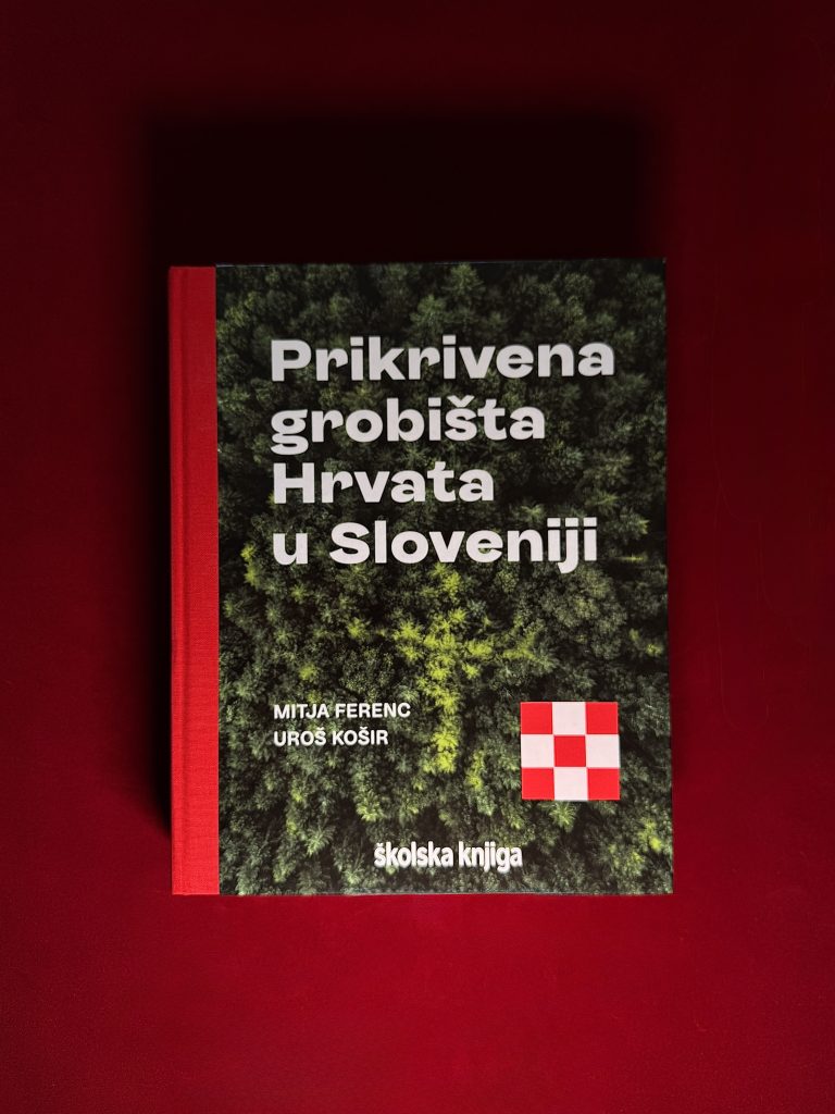
For our long-time client Školska knjiga, we created a cover using our technologies – the title and text on the spine are printed with folio printing, and the checkerboard motif is additionally emphasized with debossing. In this richly documented scientific monograph Hidden Graveyards of Croats in Slovenia, Slovenian authors, historian prof. dr. sc. Mitja Ferenc and archaeologist dr. sc. Uroš Košir, present on more than 700 pages a rounded historiographical, archaeological and political view of the largest mass murders in Europe after the end of World War II. 

Industry

Publishing

Cover print

Macan

Tags

books, knjige, cover print, folio tisak, foilprint

Project

Monograph "Hidden Graveyards of Croats in Slovenia"

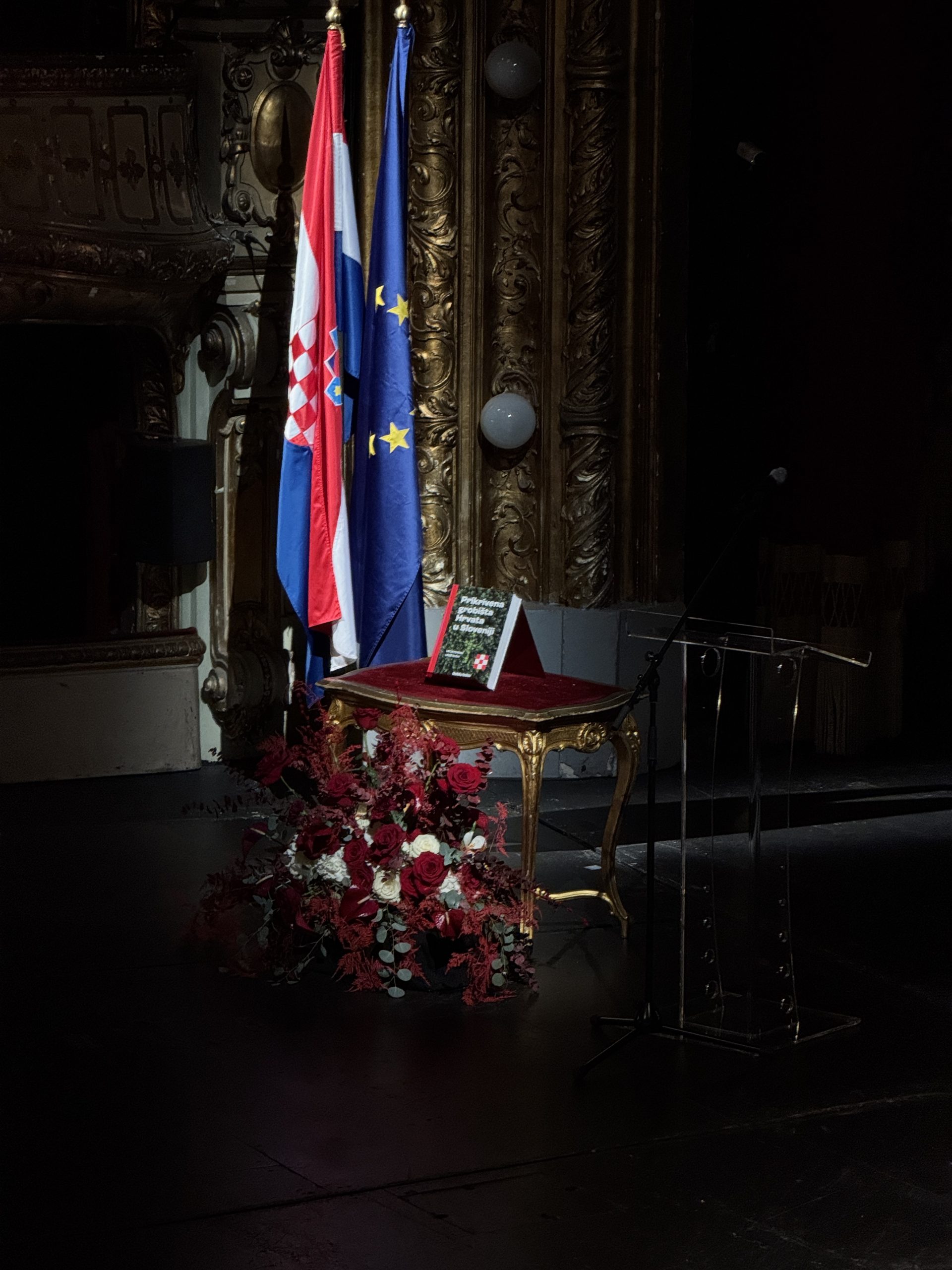
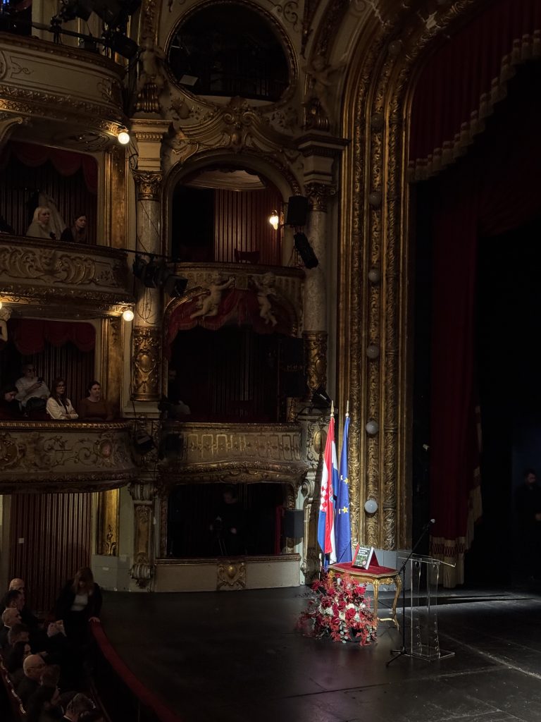
It is well known that white foil stamping is one of the most demanding processes in print finishing. The challenge lies in the pigment’s exceptional sensitivity, the precise control of temperature and pressure, and the stability of the foil itself. Any deviation can affect the purity of the white tone, its coverage, and the overall visual impression. At Macan Atelier, we specialize in foil stamping and the execution of complex projects where details are crucial. That is precisely why working with white foil is a particular pleasure for us - one that requires experience, technical expertise, and complete control of the process. This project was a true fusion of precise technology, classic materials, and minimalist design.The presentation of the comprehensive monograph was held on February 11, 2026 on the stage of the Croatian National Theatre in Zagreb, which we had the honour of attending. Working with the creative Školska knjiga is always a pleasure.

PRINT TECHNIQUES

Foilprint

Debossing

Hardcover

ABYSALTO NOTEBOOKS

Abysalto notes

Client

Category

Production

Year

Share

Abysalto

Stationary

Macan Atelier

2025

+ About project

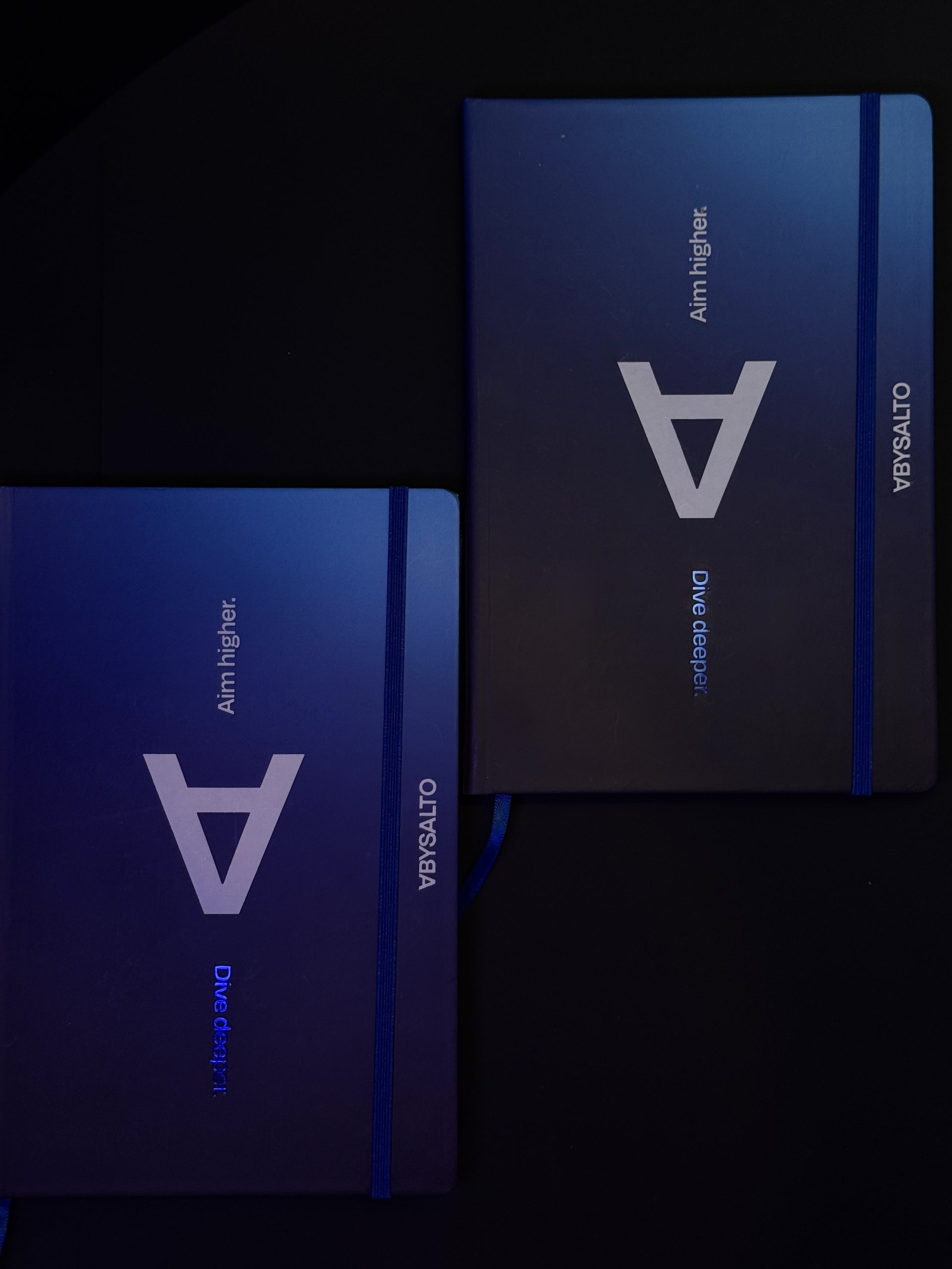
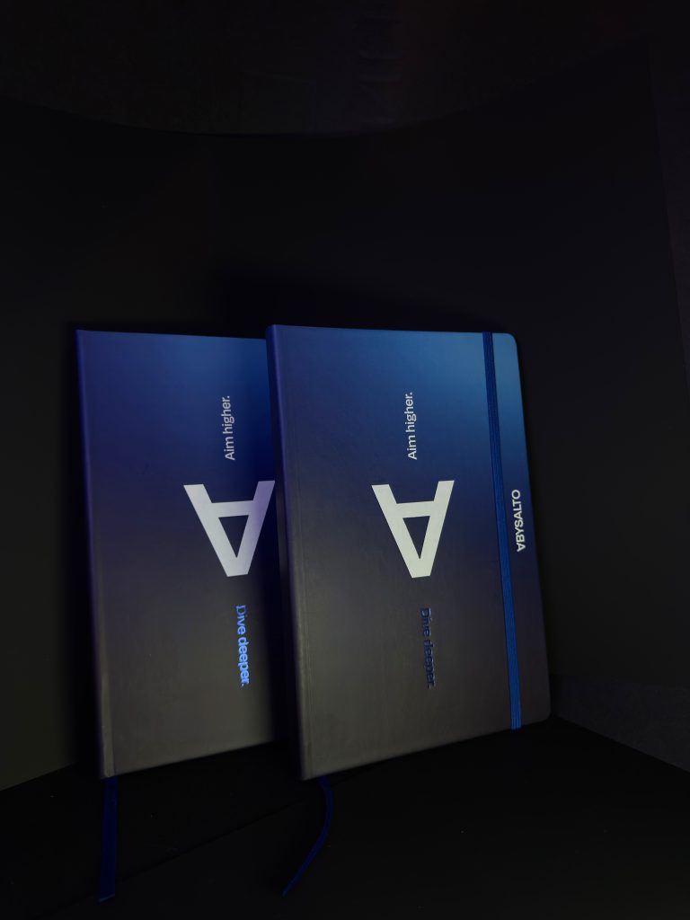
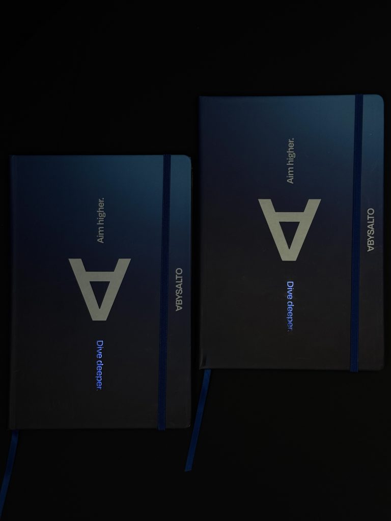
We had the privilege of partnering with Abysalto, a new forward-thinking IT company focused on solving complex technological challenges. Based on their new branding, done by Fabular agency, we crafted unique planners aligned with their both visual communicative expressions. With their modern branding that reflects their innovative spirit, deep thinking, and bold ambitions, the same approach was taken with crafting their printed identity.

Industry

IT, B2B

Client

Design

Abysalto company

Fabular agency

Tags

notebooks, bilježnice, notesi, foliotisak

Project

Abysalto notes

Rebranding isn’t just about a new logo - it’s about redefining how your brand feels in every touchpoint. The results with two-color foil print perfectly reflect their new identity: modern, innovative, and future-focused. Even in a digital-first industry, physical branded materials play an important role: from brand perception during meetings and events to creating a cohesive internal culture. This gradient cover showcases the full range, color accuracy, and smooth transitions achievable with our advanced digital printing technology. The white foil is used on the cover to give a tactile, yet sleek touch for the brand. Dive deeper and aim higher used as the key messages have also a visual reference. A metallic blue foil was used to convey the depth perception, whereas white was used for the symbolism of height.

PRINT TECHNIQUES

Foilprint

Digital print

Hardcover

A well-designed notebook becomes more than stationery, it becomes part of the brand experience, and Abysalto clearly shows that.

LIFE OF A CAT BOOK

Life of a cat

Client

Category

Production

Year

Share

Macan

Books

Macan Atelier

2025

+ About project

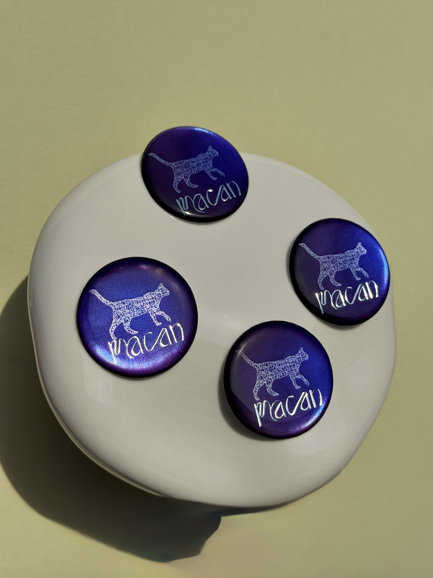
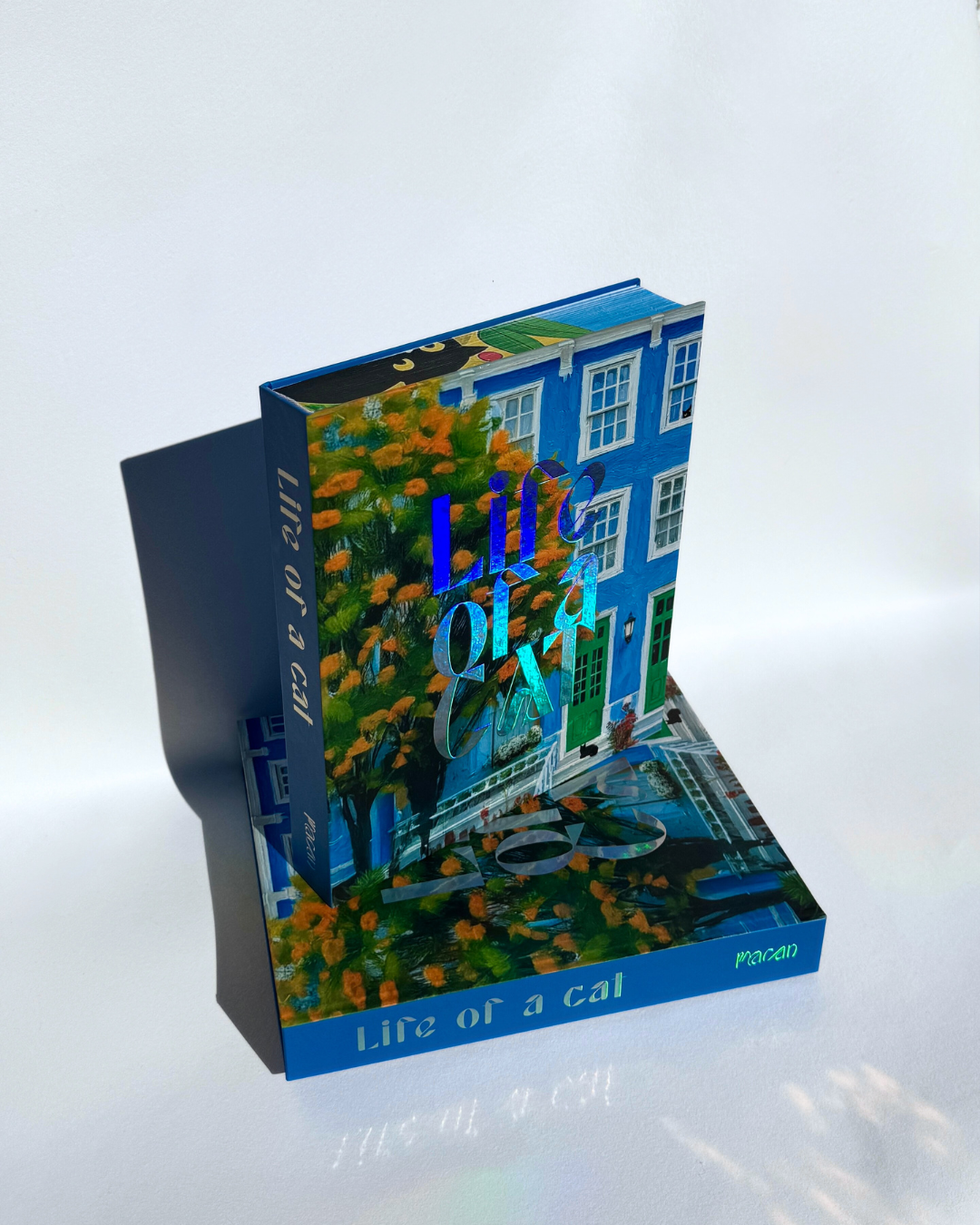
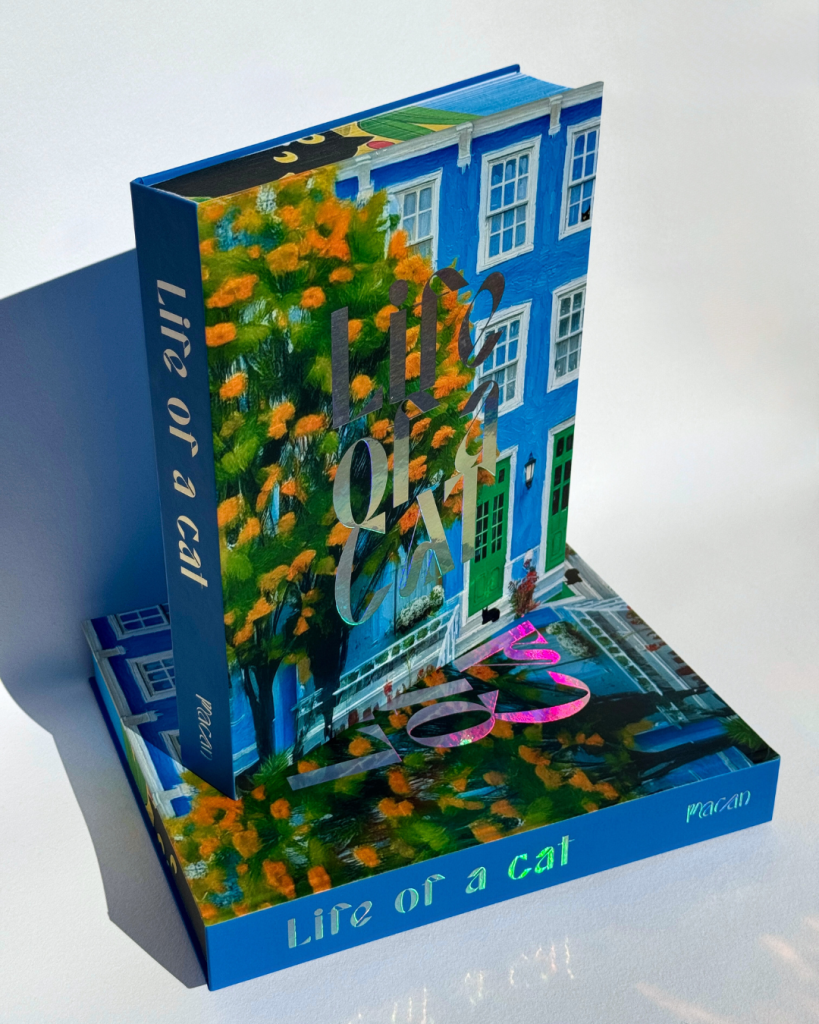
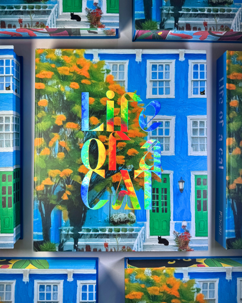
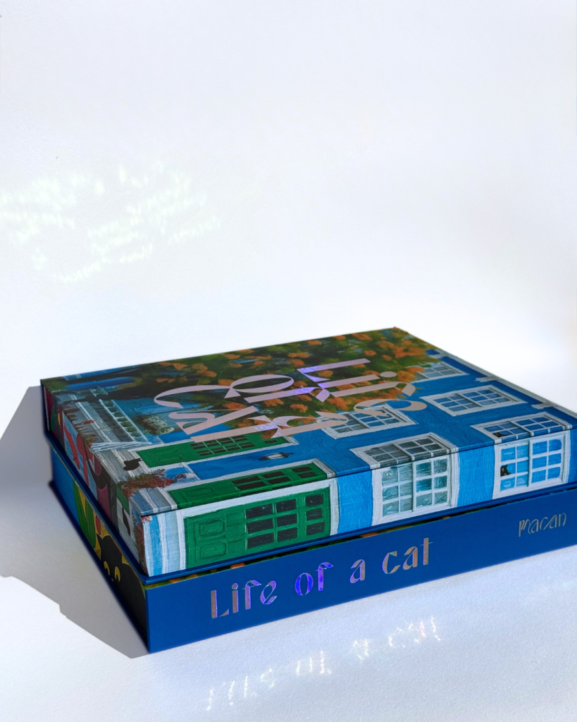
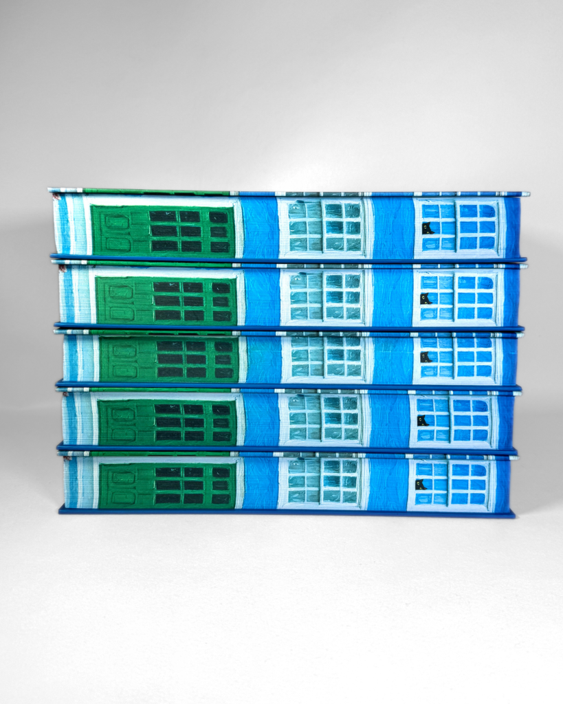
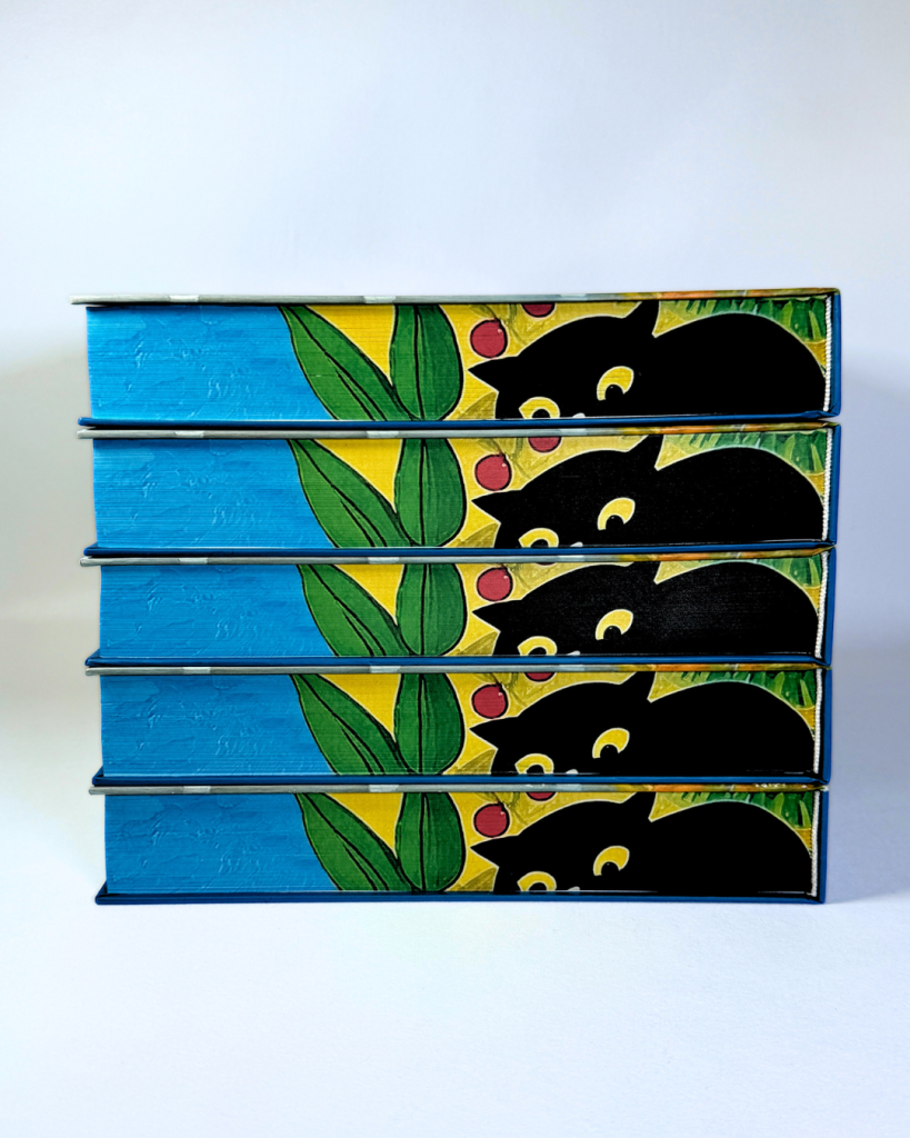
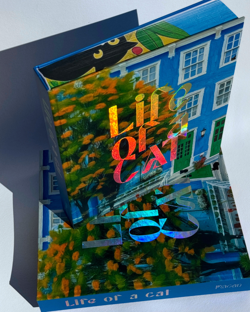
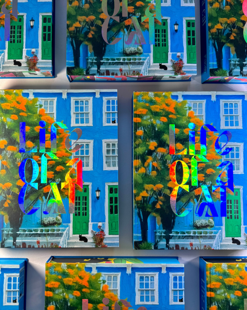
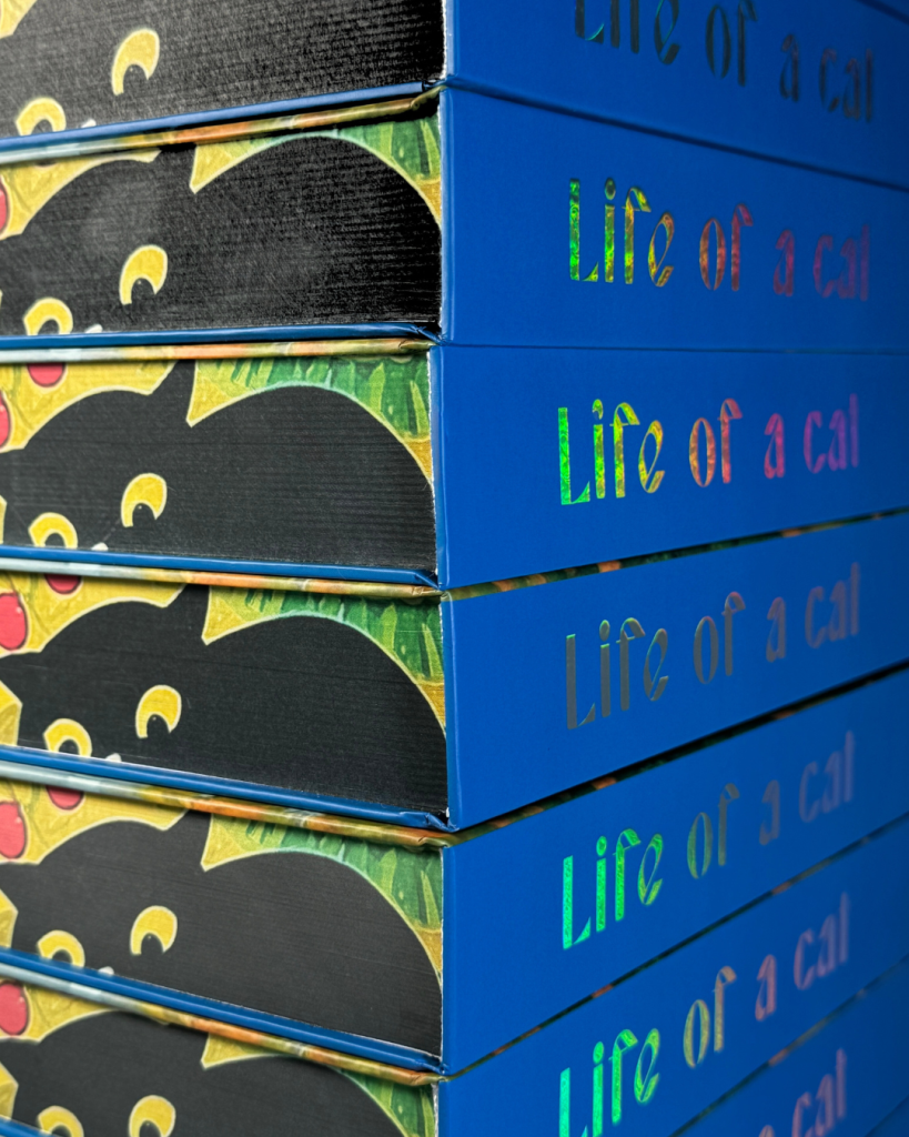
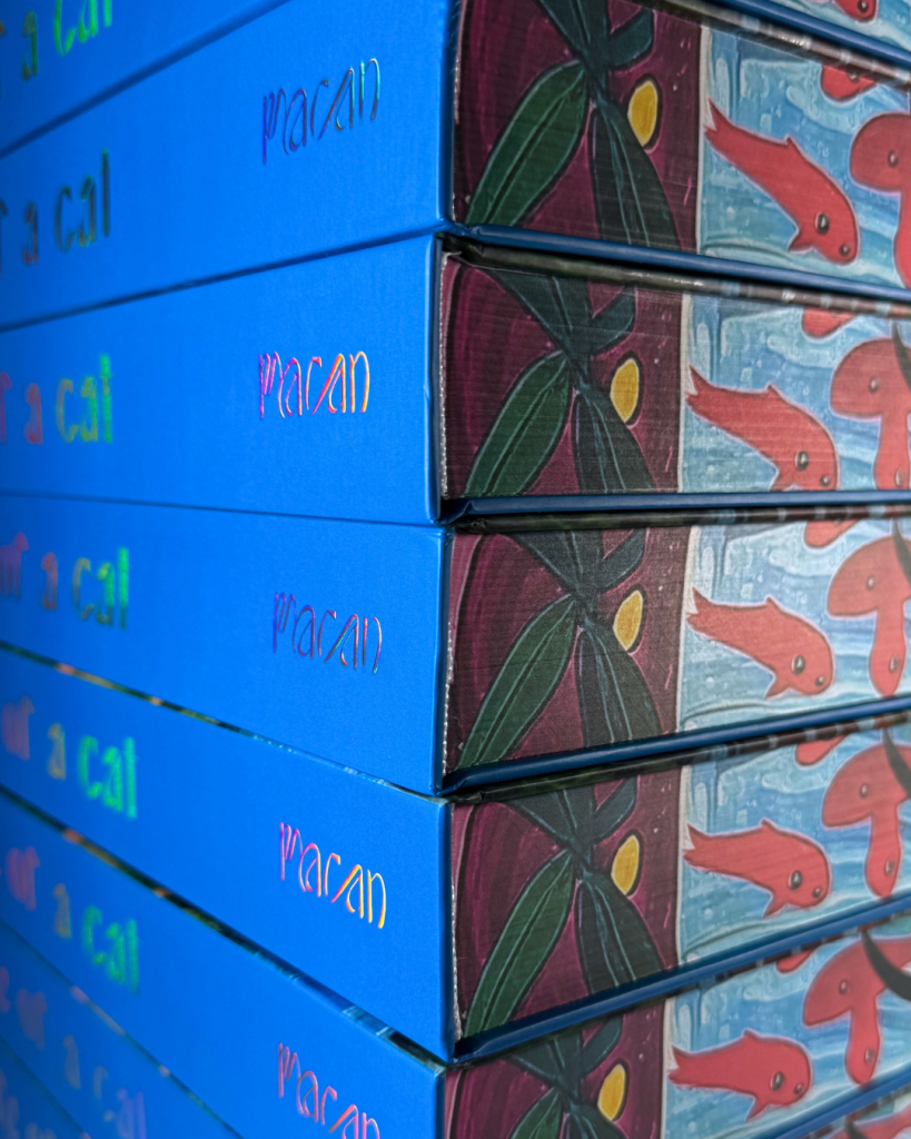
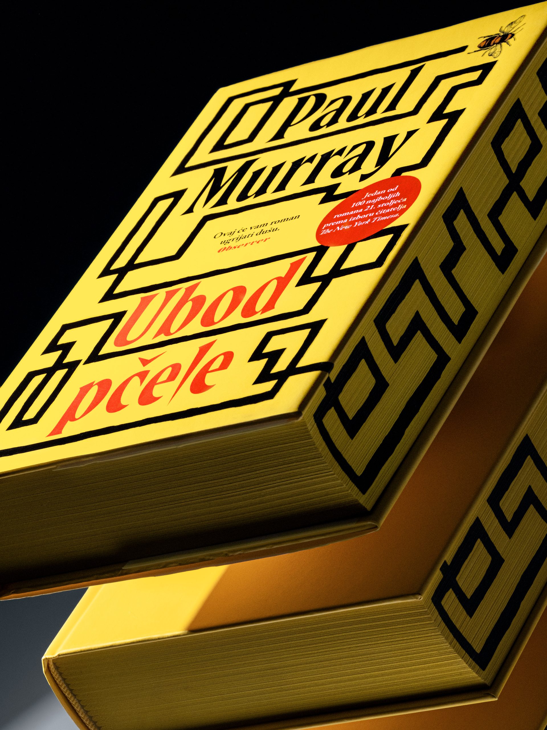
To showcase a fraction of our offer, for one of the biggest world trade showsBuchmesse  Frankfurt we created the book Life of a cat. The idea was born from the wish to show the print impact in the world of publishing, even when there is no famous title or author behind the cover. 

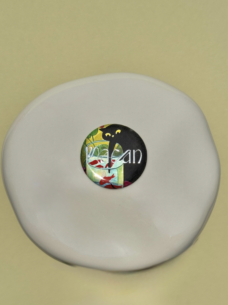
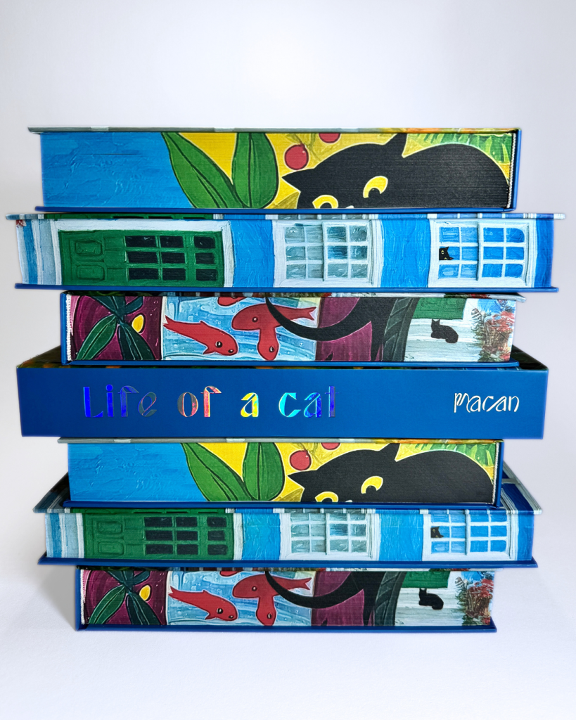
Life of a cat is actually a take on the character of the black cat, where the illustration and the design are original work of our atelier designer Kornelija Macan. The pages of the book are – blank. 

Industry

Izdavaštvo, publishing

Design

Illustration

Kornelija Macan

Kornelija Macan

Tags

books, knjige, edge print, special edition
Project

Life of a cat
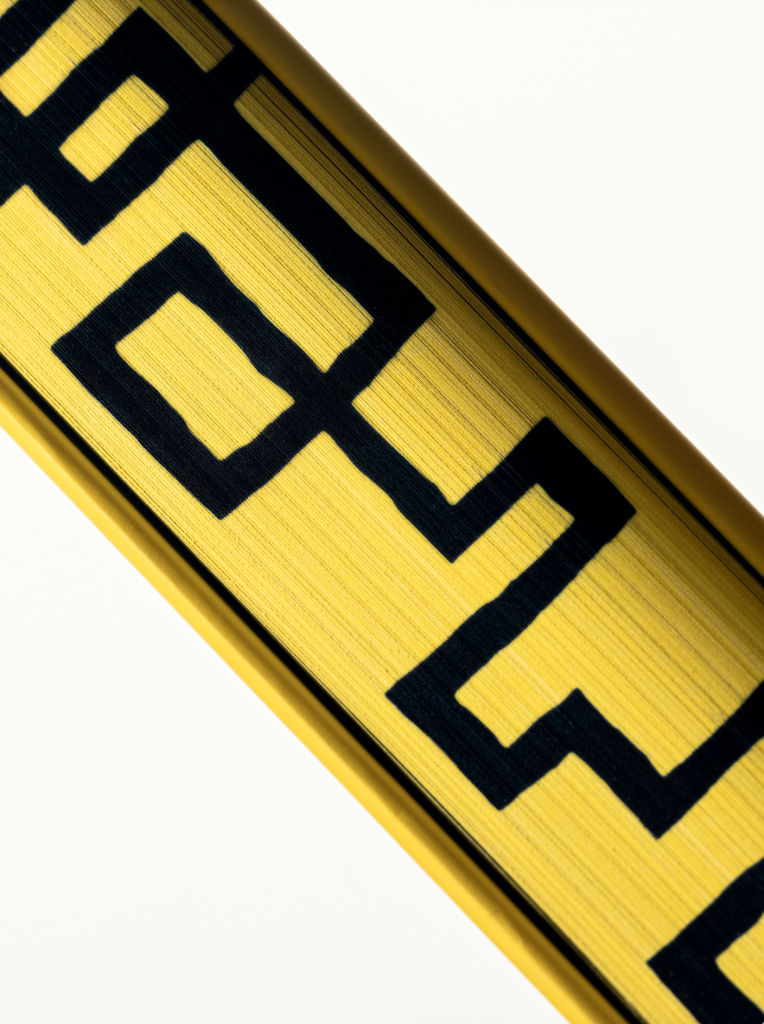
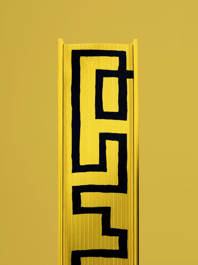
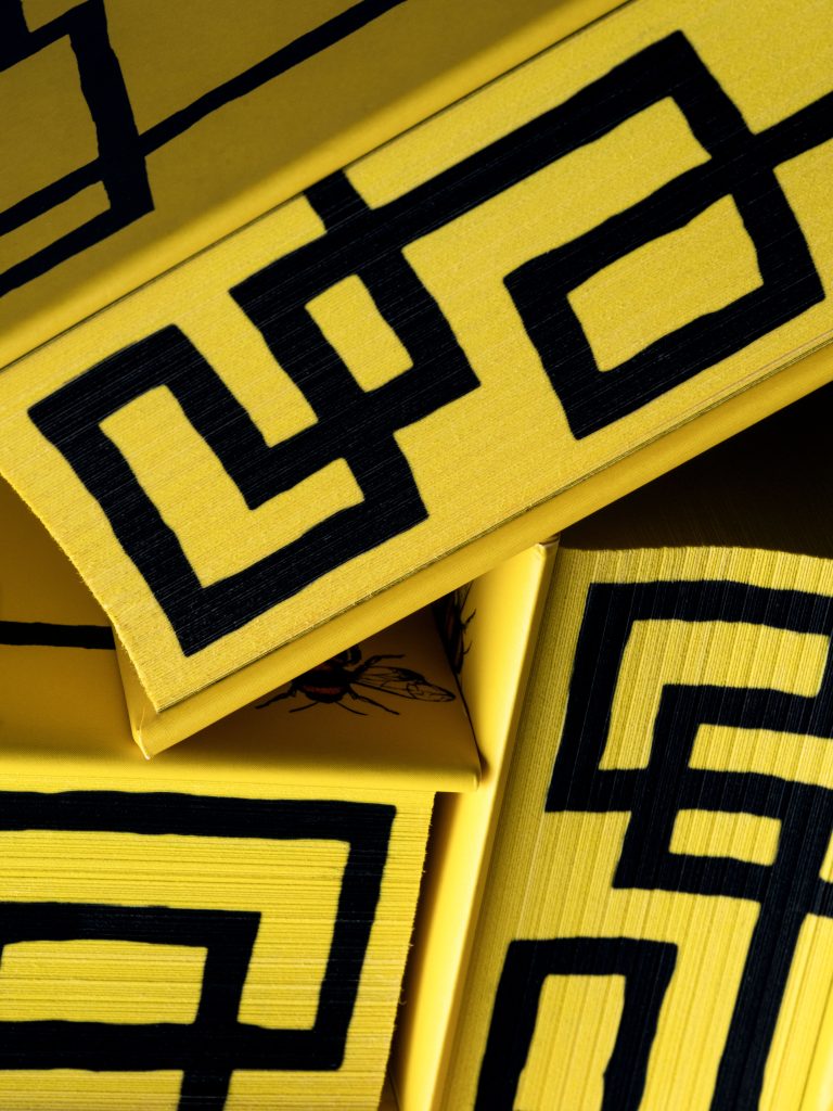
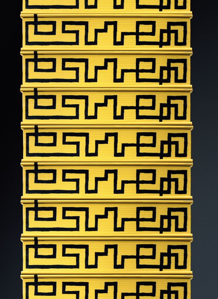
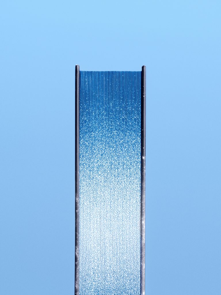
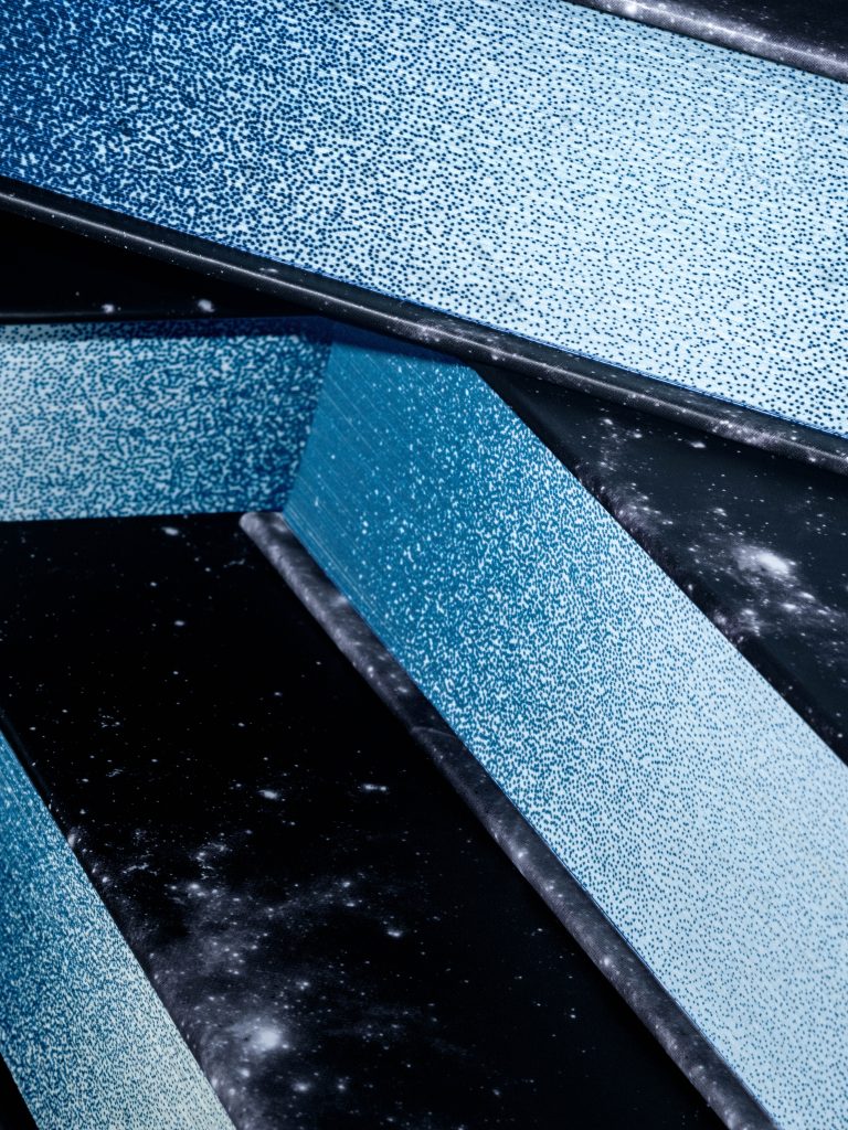
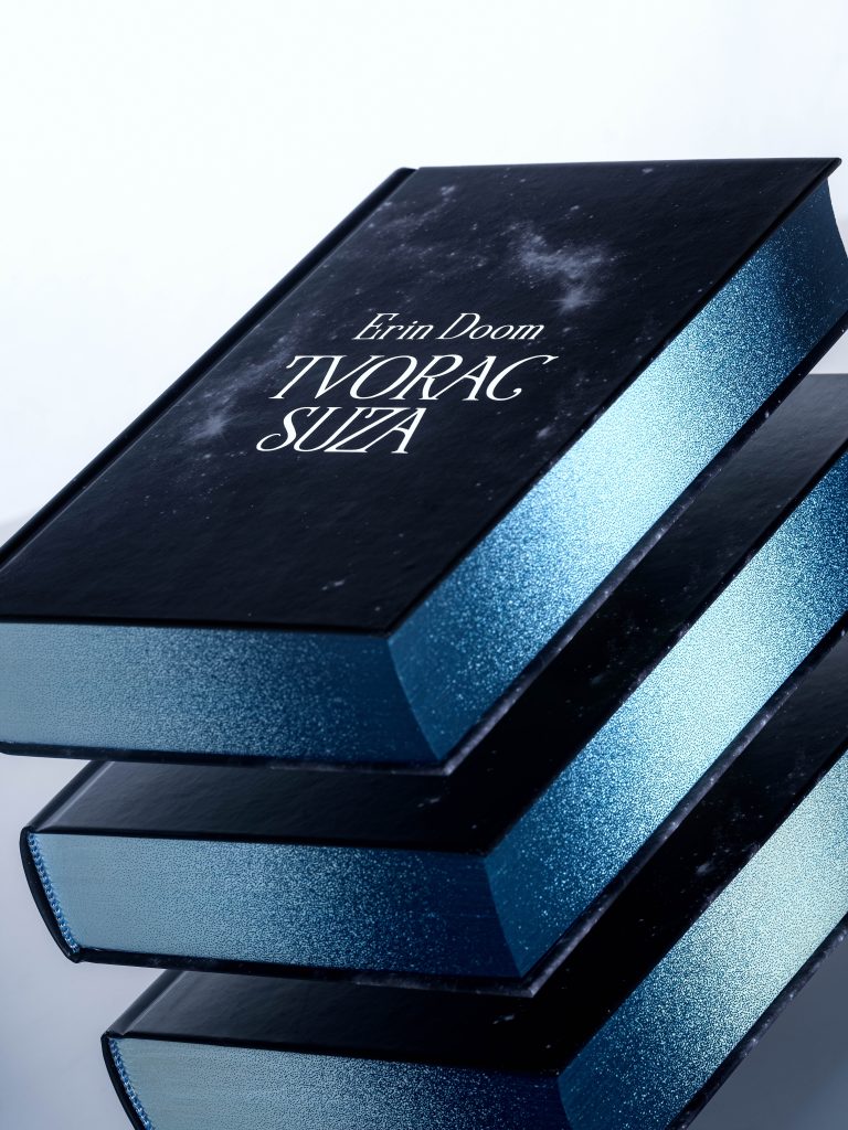
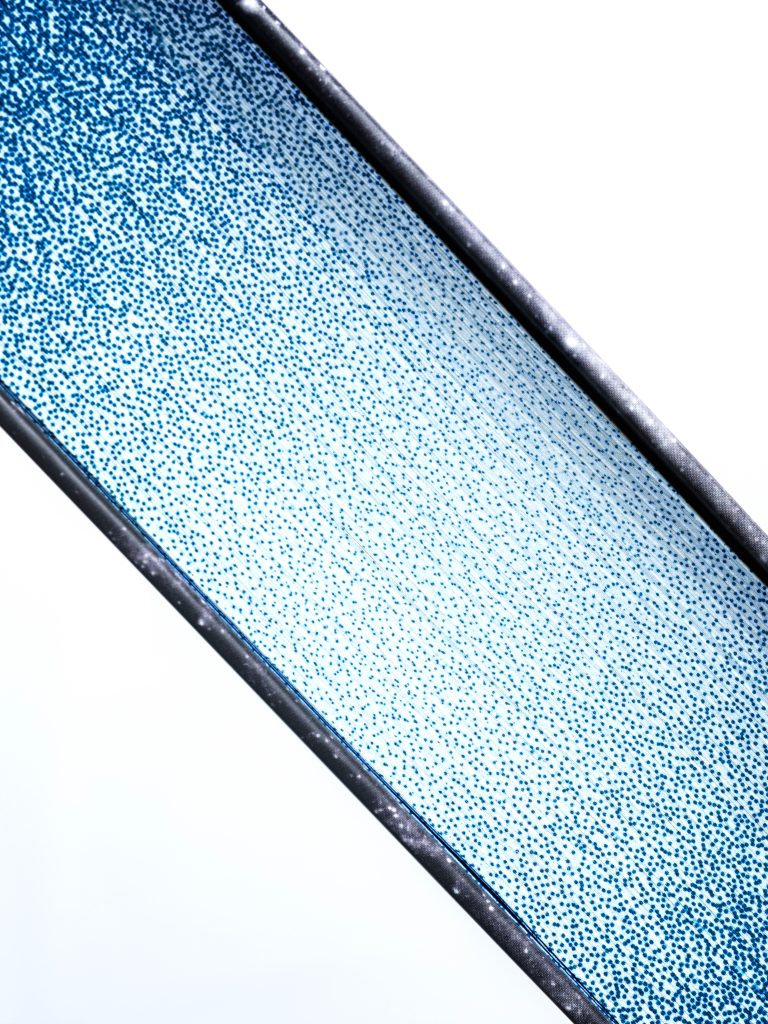
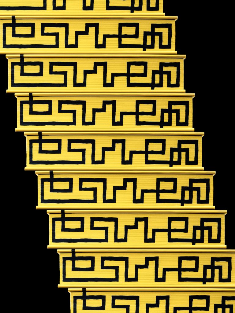
The edges of the book are decorated by interesting illustration produced with edge printing, where every side has its own story to tell through the main character - the black cat.The typography of the cover is based on the official typeface of Macan, and it is made with 3D digital foilprint. We used a dynamic holo foil, which highlights the playful character of the design. Foilprint is one of the timeless print technologies, which in its digital form allows for a higher degree of flexibility in production of books without relying on the die manufacturing.The tactile effect of the digital foilprint achieves up to 72 microns of height, whereas on the spine of the cover, the limit of the technology is tested on the delicate lines of the logo.

PRINT TECHNIQUES

3D digital foilprint

Digital print

Hardcover

Edge print

This book is printed in an especially large format (295x300 mm), weighing over 2,5 kilograms. Within each of the illustrations, there's a hidden cat character.

CHRISTMAS CARD 2025

Christmas card 2025

Client

Category

Production

Year

Share

Macan

Event collateral

Macan Atelier

2025

+ About project

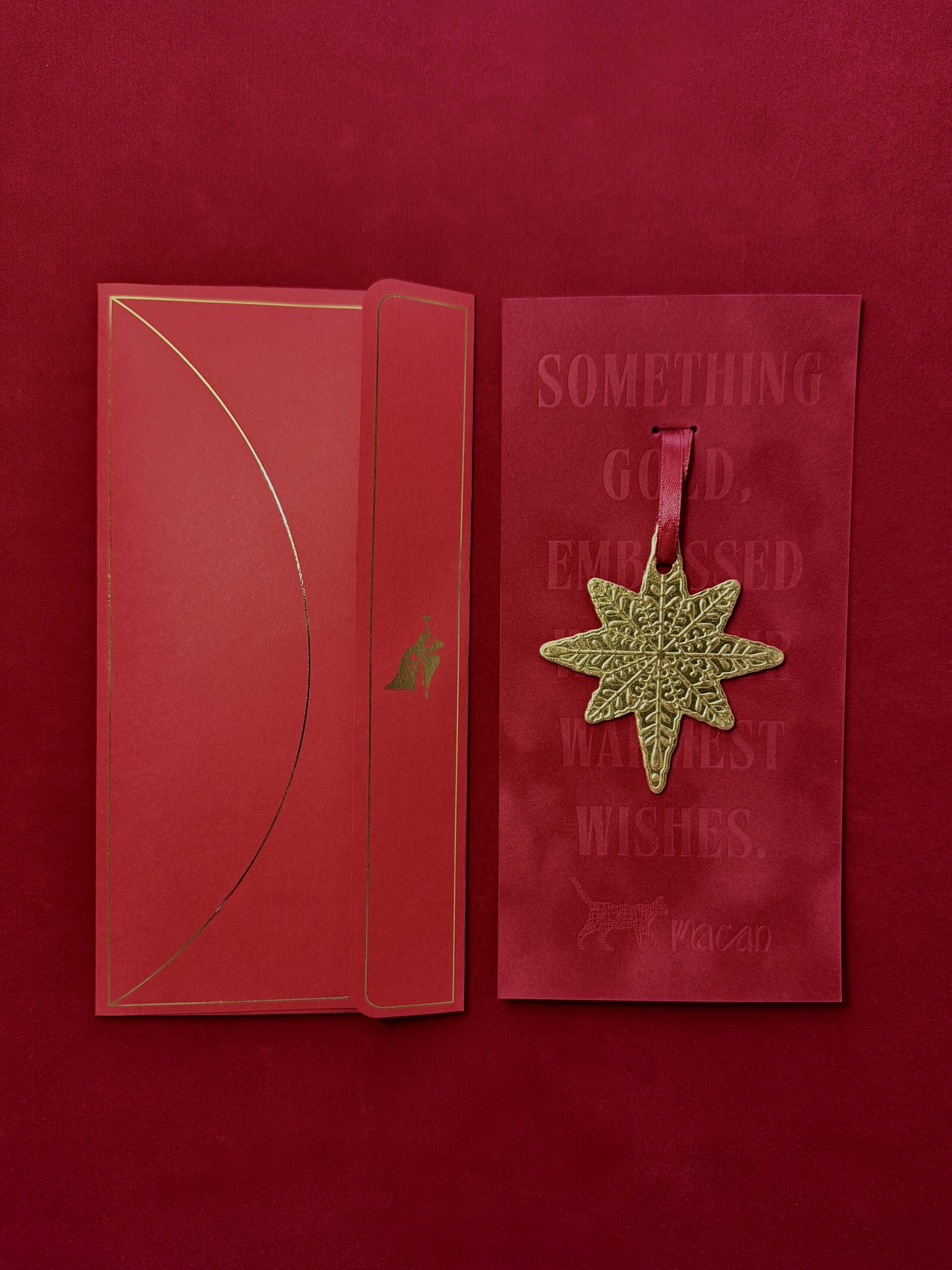
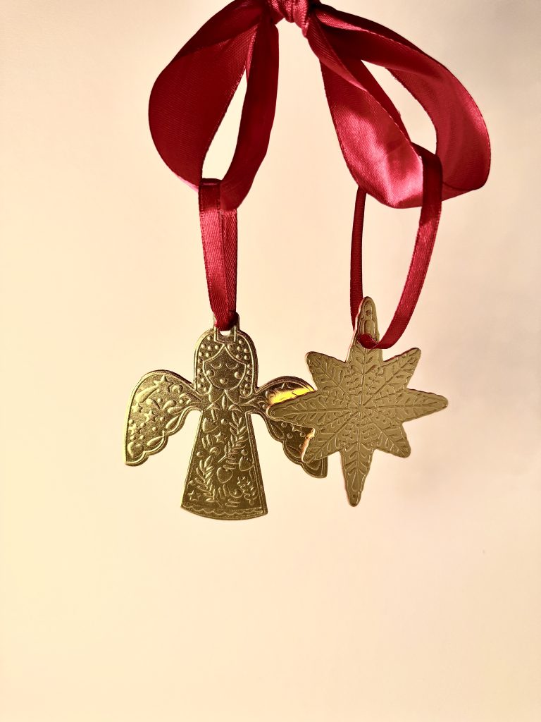
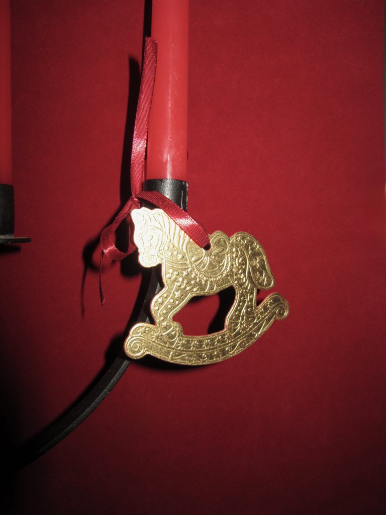
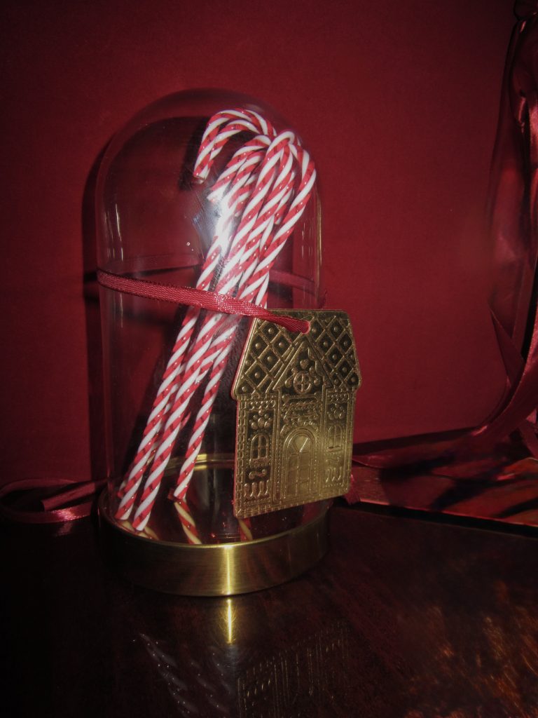
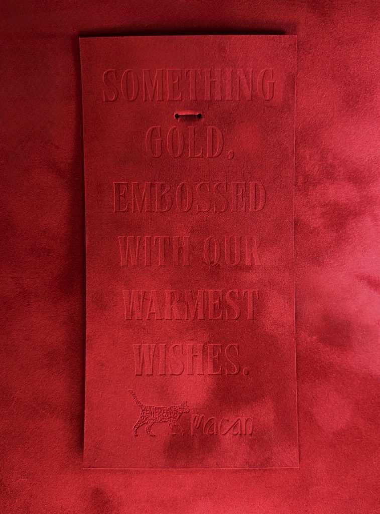
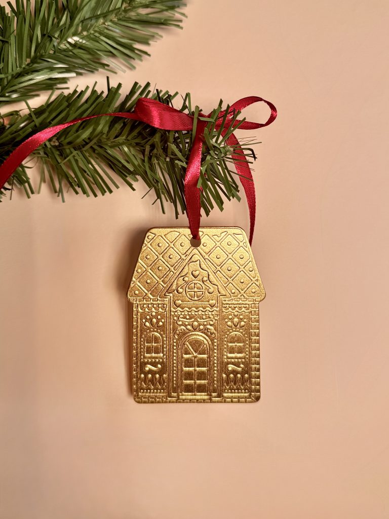
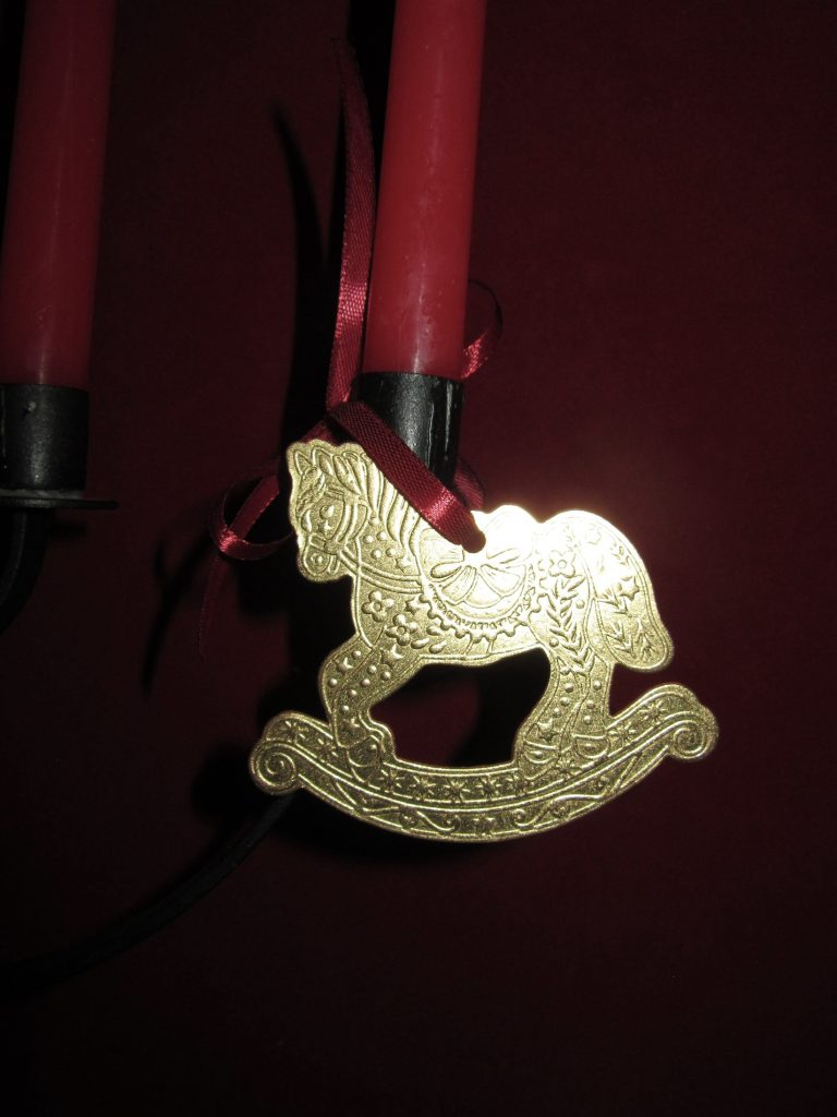
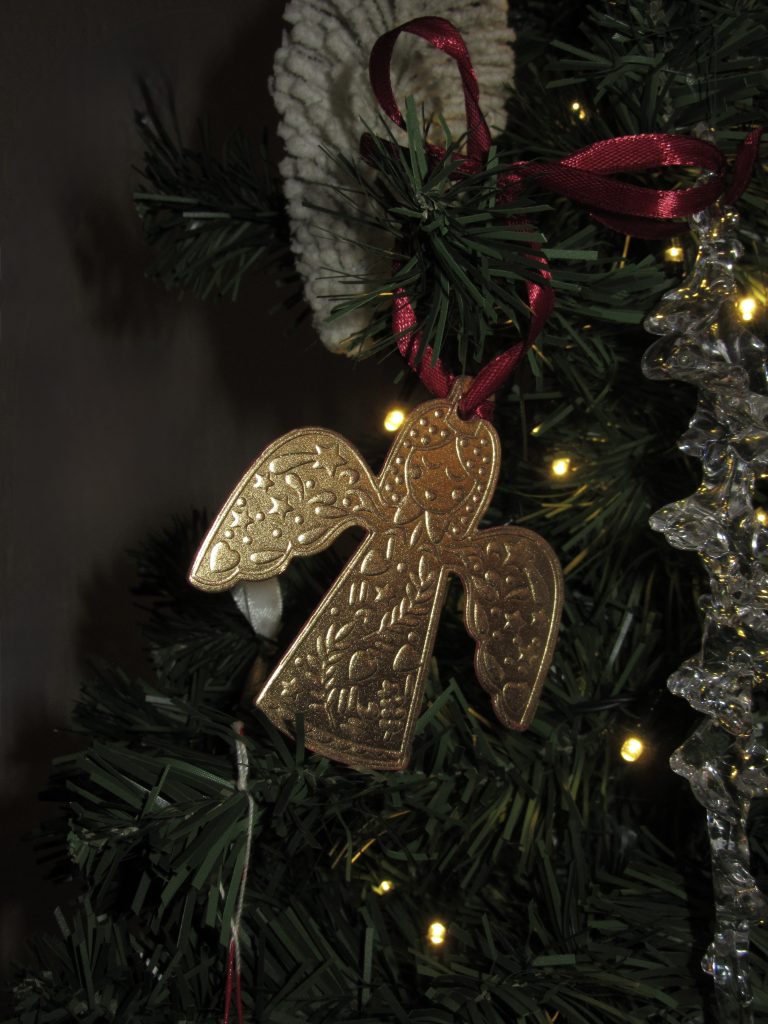
As every year, our creative team has come up with something golden for all our clients and partners, imprinted with our warmest holiday wishes. The star of this year’s card was a uniquely crafted Christmas tree ornament inspired by the shapes of holiday cookies – a rocking horse, an angel, a star and a gingerbread house.

Playful forms are reinterpreted through precise graphic execution and rich finishing, giving classic holiday motifs a new, sophisticated look.

Industry

Marketing, FMCG

Design

Macan atelier

Tags

xmas card, christmas gifts, promomaterial, greeting card, event invitations

Project

Christmas card 2025

Special emphasis is placed on tactility and the experience of touch. The combination of embossed and debossed elements achieves a dynamic surface that invites interaction. Gold details in the foil print reflect light and further emphasize the festive character of the project, while precise stamping gives each element clarity and refinement of form.The decorations are designed so that, in addition to their aesthetic value, they also have a functional one – they can be hung on the Christmas tree, extending the duration of the holiday message throughout the Advent period.The entire project is conceived as a synergy of design, materials and top-notch production. Every detail – from the selection of paper to the final finishing – has been carefully thought out to convey a sense of gratitude and closeness.The result is an elegant, personalized holiday card that goes beyond the form of classic communication and becomes a small collector's item.The subtle shine of gold combined with precise workmanship creates an elegant yet emotional impression that remains even after the card is opened. Tactile elements and embossed surfaces further emphasize the sense of quality and handmade precision, transforming the card into a small holiday artifact to be treasured and remembered. Each ornament carries its own character and symbolism, inviting personal selection and the creation of a small holiday collection. What is your favorite?

TECHNIQUES

Envelope

Digital foilprint

Digital cutting

Hand-finishing

Greeting card

Foilprint

Debossing

Embossing

Die-cutting

Hand-finishing

Each element has been carefully designed to combine the warmth of tradition and the elegance of contemporary design, creating a nostalgic yet luxurious feel.

FUSSNOTA PERFUME PACKAGING

FUSSNOTA perfume packaging

Client

Category

Production

Year

Share

Señor agency

Packaging

Macan Atelier

2025

+ About project

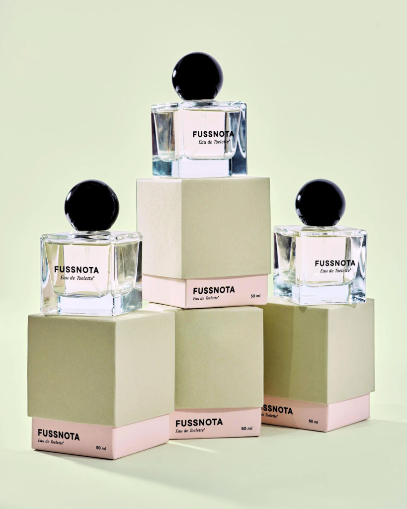
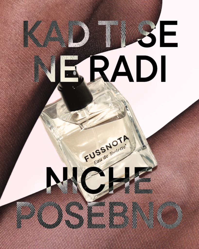
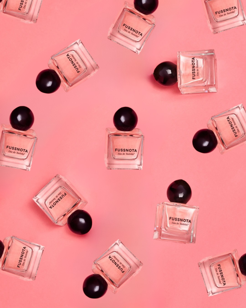
This eau de toilette was specially developed by the Señor agency in collaboration with the Croatian perfume house Sortilège Olfactive Arts. The notes are of walking barefoot on freshly cut grass in a bergamot garden, resting on a blanket with a Spanish cake, Bizcocho de Limón, and napping in the afternoon sun with the scent of a nearby cedar tree.

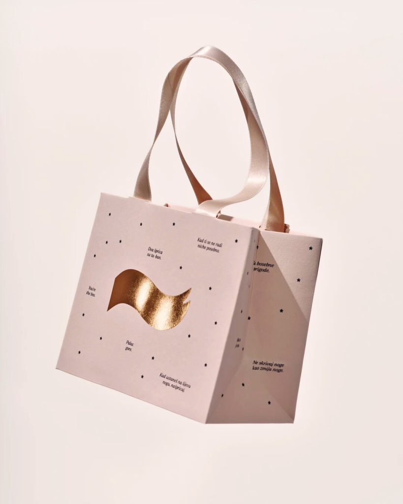
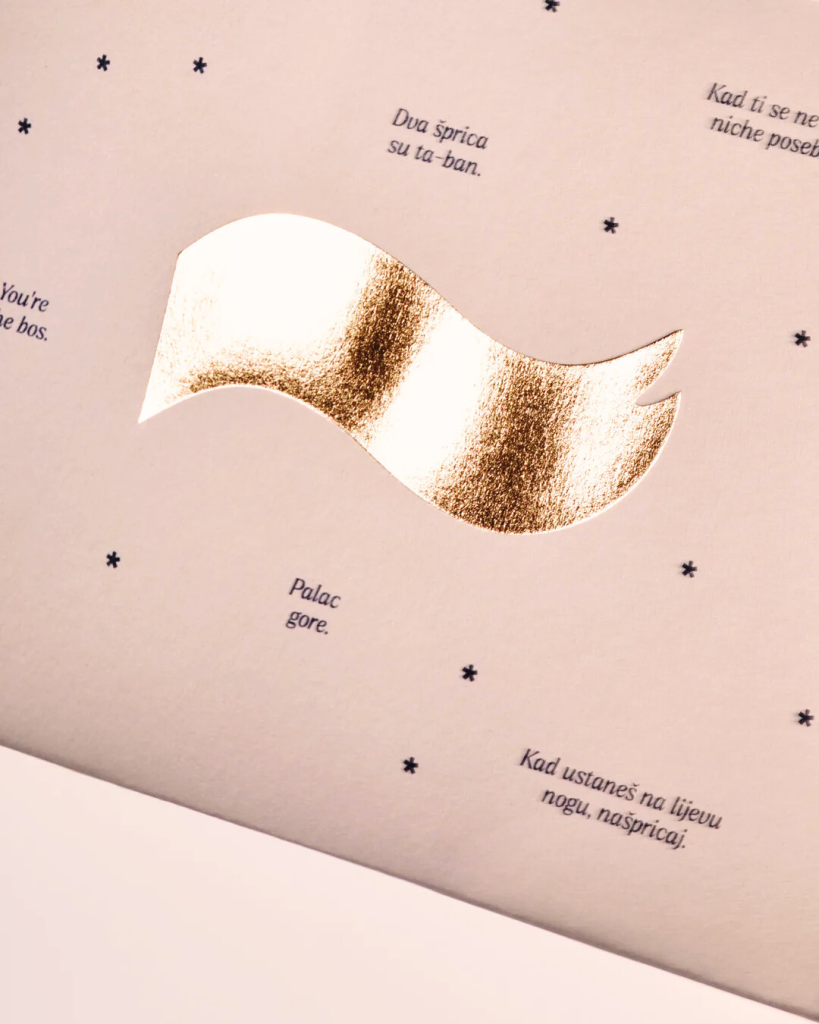
The Señor agency recognized the importance of a premium packaging experience – a focus on the interactive nature of paper and design, further emphasized by the play of foil reflections and tactile embossing effects.

Industry

Marketing, FMCG

Design

Photo

Señor agency

Damir Žižić

Tags

box, packaging, perfume box, paper bag

Project

Fussnota perfume

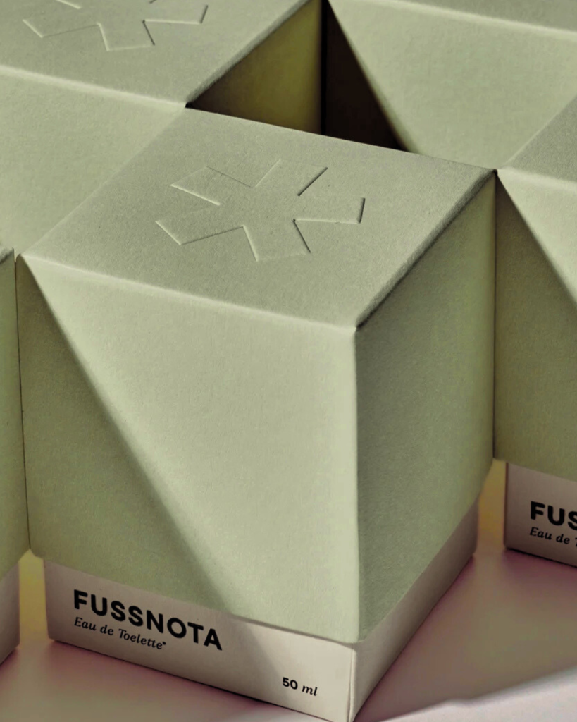
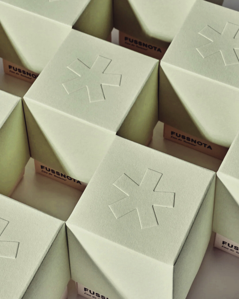
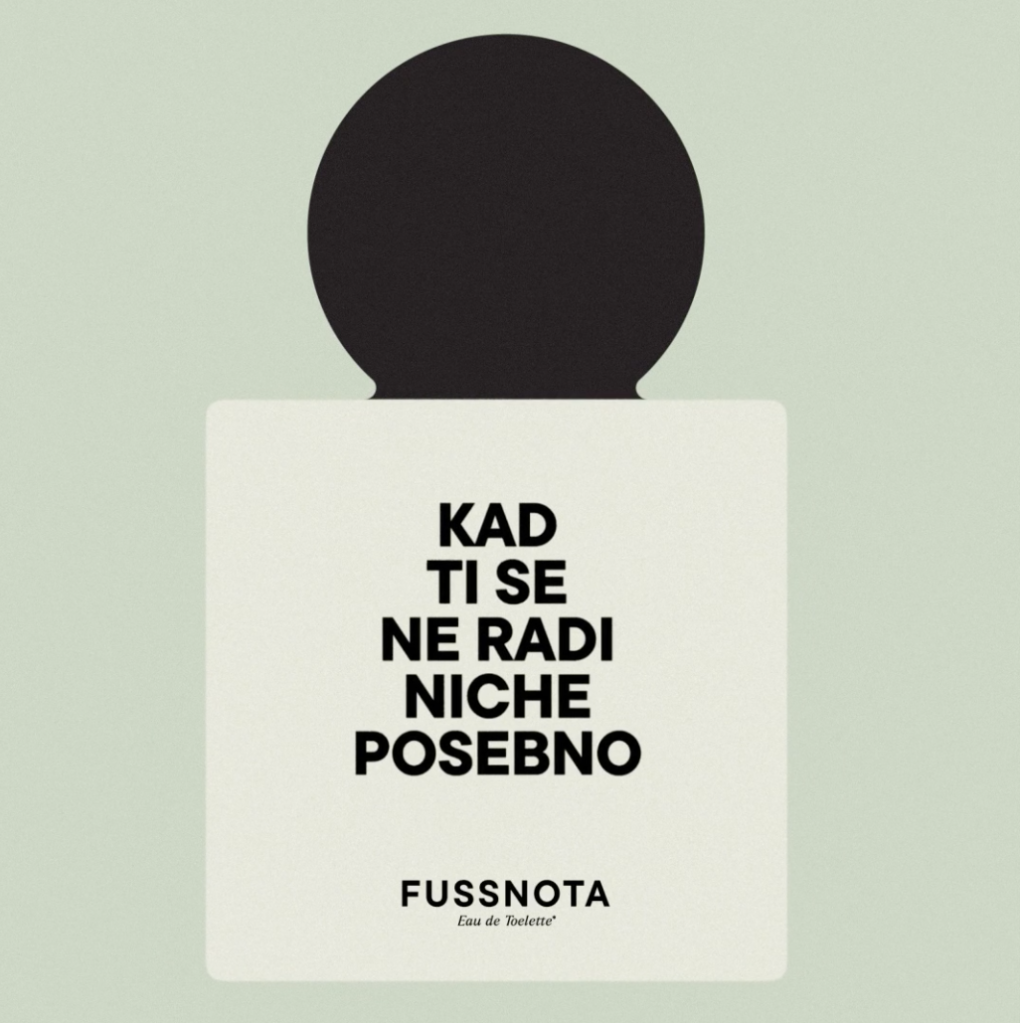
The packaging was inspired by top perfume classics and was developed in collaboration with the Señor agency and paper experts from Europapier Adria.The packaging is made of two parts; lifting the lid reveals a base that blooms, conveying the feeling of opening a gift with each use. The embossed print emphasized the tactility and gave additional depth to the color of the paper through the play of light and shadow. The name of the perfume is further highlighted with a glossy UV varnish.The interior of the box is decorated with rose gold foil, which achieves a reflective, mirror-like surface. The rose gold foil harmoniously complements the delicate pink Koehler Eco Rose Quartz paper and contrasts with the lid in the greenish tone of Koehler Eco Sage. As a finishing touch - foil printing, matching satin ribbon and stamping to create a paper bag - were used to harmoniously round off the outer packaging.

PRINT TECHNIQUES

Box

Digital foilprint

Embossing

UV varnish

Die cutting

Hand-finishing

Paper bag

Foilprint

Digital print

Die cutting

Hand-finishing

Embossing is a logical choice to highlight the typography on the top of the lid.

HNK PLANNERS

HNK planners

Client

Category

Production

Year

Share

Croatian National Theatre in Zagreb

Stationery

Macan Atelier

2025

+ About project

For the National Theatre in Zagreb, a standard printed piece simply wouldn’t suffice. To echo the theatre’s architectural poise and cultural legacy, we produced a set of three notebooks engineered as a structural object with a contrasting gold foiled signature. 

In close collaboration with the theatre’s team, we developed an exceptional project that reflects the theatre’s life beyond the stage. We approached the paper as the theatre approaches performance — with discipline, rhythm, and respect for atmosphere. The result does not simply represent the institution; it extends its presence beyond the stage and into everyday ritual. 

Industry

Marketing, FMCG

Design

Photo copyright

Roberta Bratović

Vjekoslav Skledar

Tags

notes, notebook, stationery, planner, planeri, bilježnice

Project

HNK planeri

Printed on textured paper, the surface carries a quiet luminosity, while the gold hot foil detailing, executed with precision by our newest machine, introduces a ceremonial note, reminiscent of stage light. The challenge lay in balance: preserving refinement while ensuring durability, allowing every detail to feel intentional and composed.

TECHNIQUES

Foilprint

Digital foilprint

Digital print

Binding

Hand-finishing

Designed as both a functional accessory and a lasting object, the planners translate the architectural elegance and cultural significance of the theatre into paper form, where artistry on stage meets artistry on paper.